The Tissue Engineering KPI Dashboard in Excel is a comprehensive, ready-to-use tool for monitoring the performance and progress of tissue engineering projects. This dashboard serves as a centralized hub to track crucial KPIs like treatment success, patient enrollment, cost efficiency, and research progress, allowing stakeholders to make data-driven decisions that improve outcomes.
Key Features of the Tissue Engineering KPI Dashboard
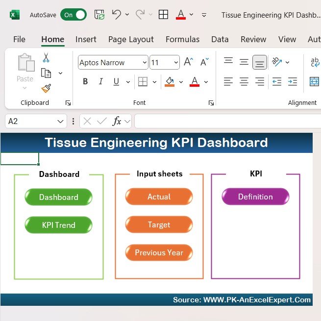
This dashboard contains seven core worksheets, each focusing on a different aspect of tissue engineering research:
Home Sheet:
This sheet serves as an index, featuring six buttons that allow easy navigation to all relevant sections of the dashboard.

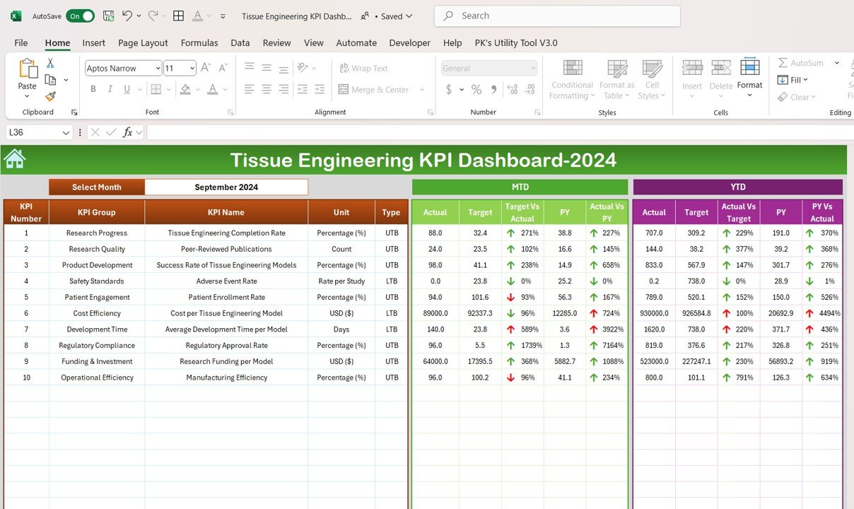
Dashboard Sheet Tab:
The main tab, where all KPIs are displayed. Select the month from a dropdown (Range D3), and the entire dashboard updates dynamically. This section shows:
- MTD (Month-to-Date) actual, target, and previous year data.
- YTD (Year-to-Date) actual, target, and previous year data.
- Visual comparisons of Target vs Actual and PY vs Actual with up/down arrows indicating performance trends.

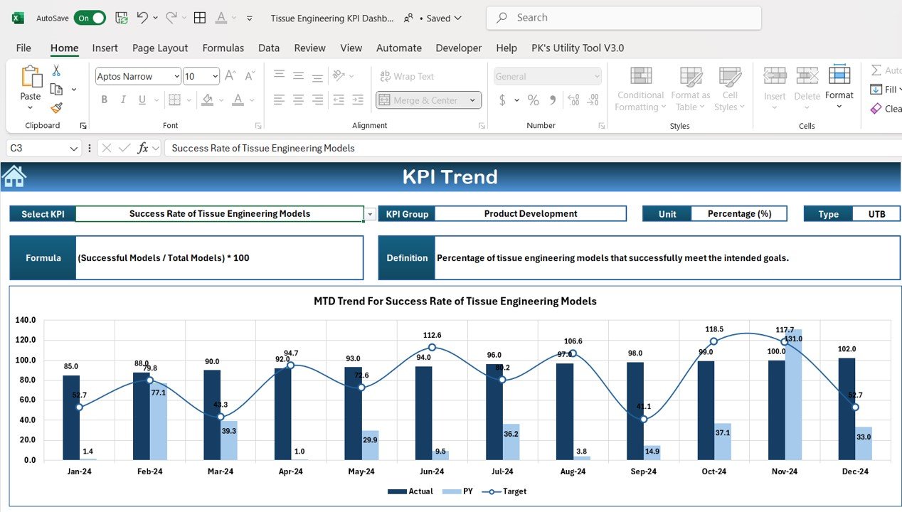
KPI Trend Sheet Tab:
This tab allows you to select a KPI and view detailed information including:
- KPI Group
- Unit of Measurement
- Whether the KPI is “lower the better” or “upper the better”
- Formula and detailed KPI definition.

Actual Number Sheet Tab:
Input actual data for MTD and YTD for any given month. Simply update the month in Range E1, and the data will be automatically populated.
Target Sheet Tab:
Enter target values for each KPI, both for MTD and YTD, to track performance against goals and compare progress.
Previous Year Data Sheet Tab:
Input previous year’s data to track progress and compare it to the current year’s performance, offering a historical view of trends.
KPI Definition Sheet Tab:
Contains KPI definitions, units, formulas, and groupings, ensuring clarity and consistency in tracking each metric.


