The Transportation KPI Dashboard in Power BI is a powerful tool designed to help businesses in the transportation sector track and analyze key performance indicators (KPIs) effectively. By consolidating data from various sources, this dashboard enables managers to monitor performance in real-time, optimize resources, and make data-driven decisions to improve efficiency. This ready-to-use solution simplifies the complexity of transportation data visualization, making it easier to monitor key metrics like on-time delivery, fuel efficiency, and overall cost management.
Key Features of the Transportation KPI Dashboard in Power BI
The Transportation KPI Dashboard is packed with essential features to offer a comprehensive overview of transportation performance. Below are the key features that make this dashboard a must-have for transportation businesses:
Summary Page
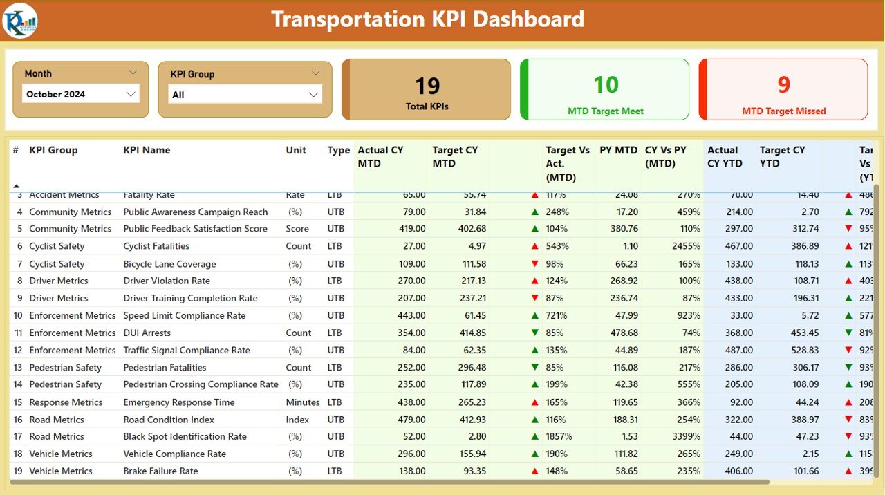
The Summary Page is the core of the dashboard, displaying essential KPIs and providing an overview of performance. With slicers for selecting months and KPI groups, businesses can quickly see key metrics like:
- Total KPIs Count
- MTD Target Met Count
- MTD Target Missed Count
Additionally, a detailed table displays the KPIs, including actual vs. target values, along with percentage comparisons for MTD and YTD.
KPI Trend Page
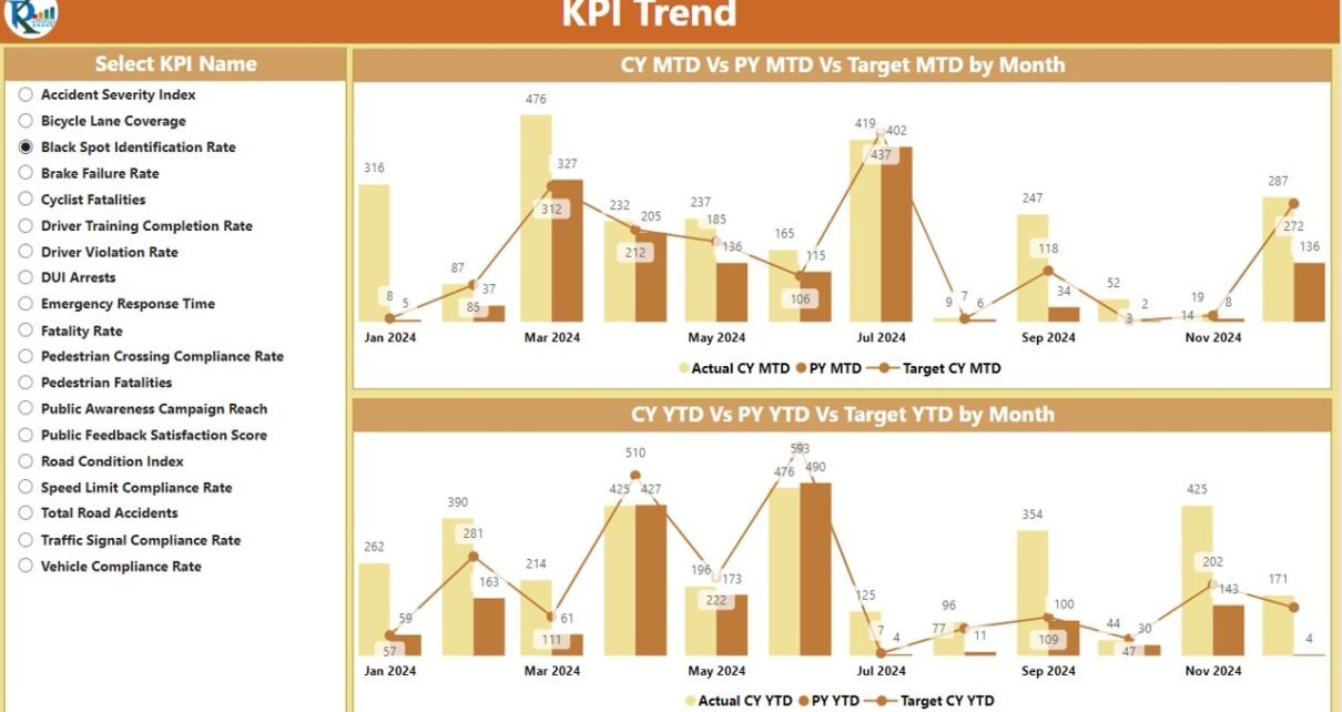
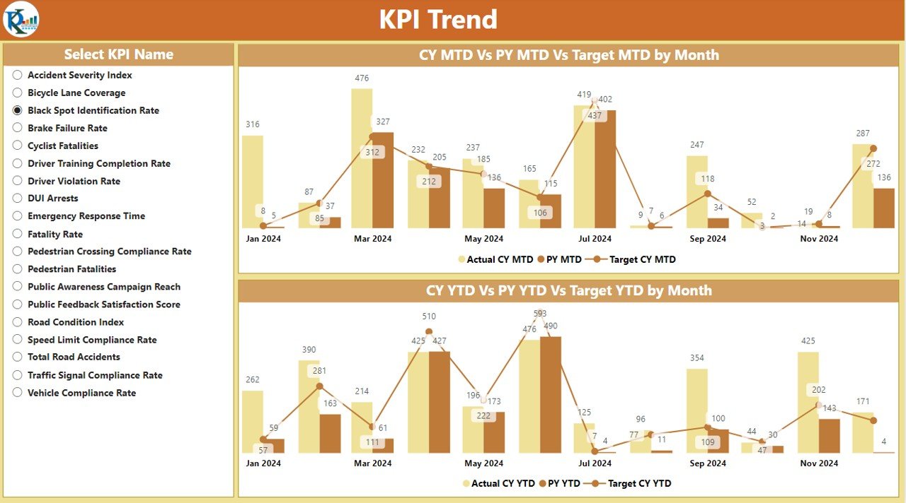
This page provides a detailed view of performance trends over time, with combo charts for comparing current and previous year’s KPIs. Users can also filter by specific KPIs to focus on the metrics that matter most.
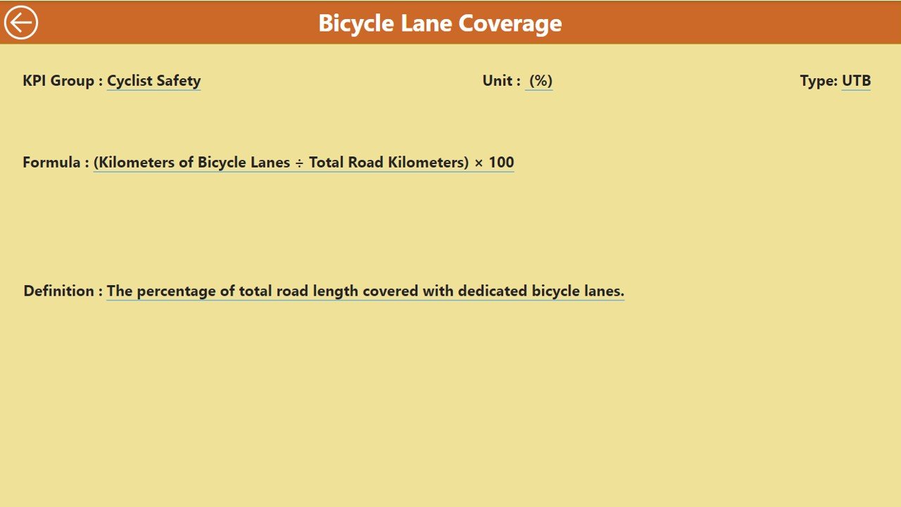
KPI Definition Page
The KPI Definition Page is a drill-through feature that offers detailed explanations of each KPI, including formulas and definitions, making it easy for users to understand the context and calculation behind each metric.
