The Transportation Safety KPI Dashboard in Power BI is an essential tool for monitoring and improving safety performance across the transportation sector. With the critical need to ensure safety standards are met, this dashboard allows transportation managers and executives to track key performance indicators (KPIs) related to safety in real-time. From safety incidents to on-time performance, this dashboard offers a comprehensive view of the data that matters most in enhancing safety measures and optimizing operational efficiency.
The Transportation Safety KPI Dashboard in Power BI is designed to provide stakeholders with a simple, powerful tool to monitor and improve safety in the transportation industry. By tracking various KPIs and integrating data from Excel, this dashboard empowers users to make informed, data-driven decisions that significantly impact the safety of transportation systems.
Key Features of the Transportation Safety KPI Dashboard in Power BI
This dashboard is built to be user-friendly while offering comprehensive insights into transportation safety metrics. Below are the main features of the Transportation Safety KPI Dashboard in Power BI:
1) Summary Page: The Central Hub
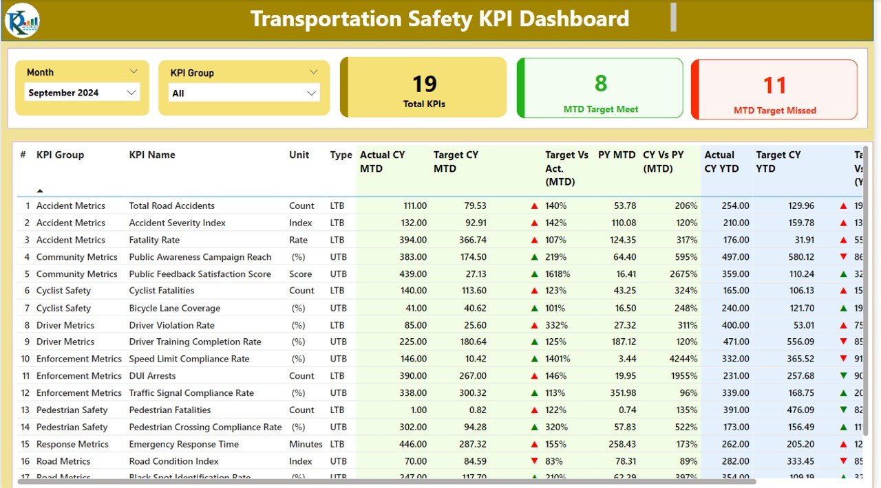
The Summary Page acts as the central hub of the dashboard, providing a comprehensive overview of key safety metrics. The following features are included:
- Month and KPI Group Slicer: This feature allows users to filter the data by selecting the desired month and KPI group for more focused analysis.
- KPIs Display: Shows the total KPIs count, MTD (Month-To-Date) Target Meet count, and MTD Target Missed count.
- Detailed Table View: The table on this page displays:
- KPI Number, KPI Group, KPI Name, Unit of Measurement, and Type (LTB or UTB).
- MTD vs Target: Shows the comparison of actual MTD performance to targets using color-coded indicators (red and green arrows).
- CY vs PY (MTD and YTD): Provides comparisons between the current year’s MTD and YTD data and last year’s performance.
- YTD vs Target: Shows the Year-To-Date target versus actual performance.

2) KPI Trend Page: Tracking Performance Over Time
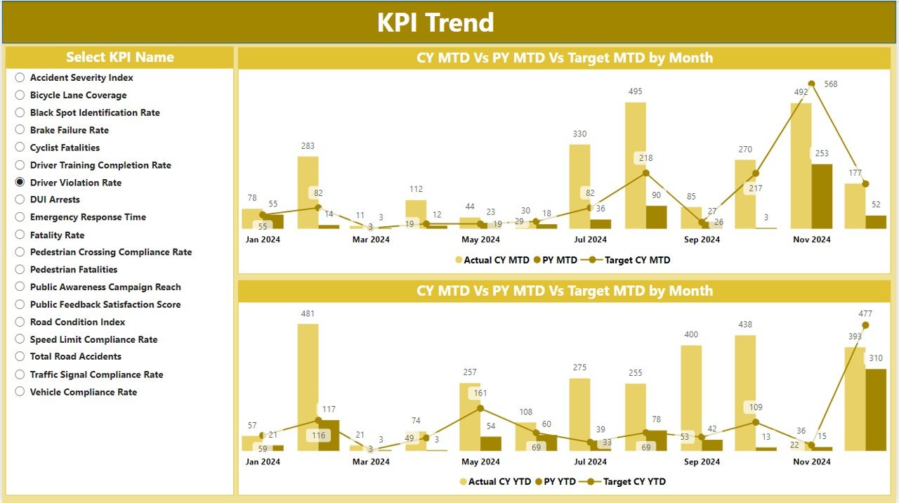
The KPI Trend Page allows users to analyze performance over time using dynamic combo charts:
- Combo Charts for MTD and YTD: These charts display actual numbers for both the current year and previous year, alongside the targets, providing visual insight into trends.
- Slicer for KPI Selection: Users can select specific KPIs to drill deeper into the data.

3) KPI Definition Page: Understanding Each Metric
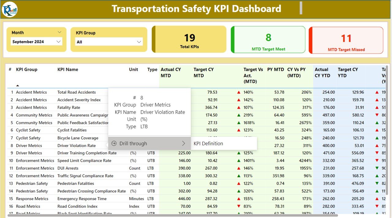
The KPI Definition Page provides detailed information about each KPI, helping users understand the formulas and methodology behind each safety measure:
- Formula and Definition: A drill-through feature allows users to access the formula used for each KPI and its definition.

4) Excel Data Integration
The Transportation Safety KPI Dashboard works seamlessly with an Excel file that serves as the data source:
- Input_Actual Sheet Tab: Enter actual MTD and YTD numbers for each KPI.
- Input_Target Sheet Tab: Input target values for each KPI for the month.
- KPI Definition Sheet: Include detailed KPI information such as KPI number, unit of measurement, formula, and whether the KPI is “Lower the Better” (LTB) or “Upper the Better” (UTB).


