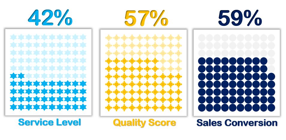
Enhance your data visualization with our “Waffle Charts in Excel Without Macros” template. This ready-to-use tool features a sleek 10×10 grid where each cell represents one percentage point, making it perfect for displaying KPI metrics such as Service Level %, Quality Score %, Sales Conversion %, or Project Completion %. With no macros needed, you can effortlessly create visually appealing charts that clearly communicate your key performance indicators. Ideal for professionals seeking an intuitive and effective way to present their data.
Waffle Charts in Excel Without Macro
24
Jun 2024
12Comments Off on Waffle Charts in Excel Without Macro
PK
Meet PK, the founder of PK-AnExcelExpert.com! With over 15 years of experience in Data Visualization, Excel Automation, and dashboard creation. PK is a Microsoft Certified Professional who has a passion for all things in Excel. PK loves to explore new and innovative ways to use Excel and is always eager to share his knowledge with others. With an eye for detail and a commitment to excellence, PK has become a go-to expert in the world of Excel. Whether you're looking to create stunning visualizations or streamline your workflow with automation, PK has the skills and expertise to help you succeed. Join the many satisfied clients who have benefited from PK's services and see how he can take your Excel skills to the next level!
https://www.pk-anexcelexpert.com
Related Articles
Fully Automated Bulk WhatsApp Sender in Excel
Do you work with WhatsApp regularly and want to send bulk WhatsApp messages quickly and easily? Then You will love
VBA: Split Data into Separate Workbooks
In this article you will learn how we can split our data into multiple workbooks. Every workbook will be saved
Table in Power BI
Table Visual is used to show the tabular data in Power BI. In this visual you can see the headers