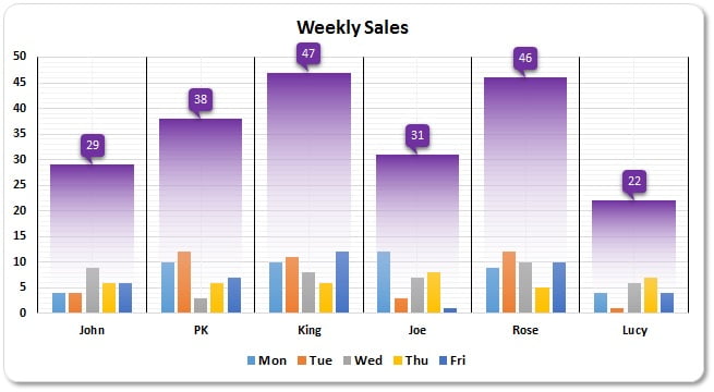
Unlock the power of visual data interpretation with our Paid Excel File on creating a Weekly Sales Chart. This tool is designed to visually break down employee-wise weekly sales, displaying daily trends from Monday to Friday in a comprehensible format. It’s an invaluable resource for managers and team leaders aiming to enhance sales tracking and performance analysis.
Key Features
- Employee-wise Sales Visualization: Clearly see individual sales performance with daily breakdowns, allowing for immediate insight into trends and outliers.
- Advanced Chart Techniques: Learn how to insert and format a combination of clustered column charts and line charts in Excel to display complex data dynamically.
- Customizable and Interactive: Includes steps on adding interactive elements like up/down bars and data labels, making the chart not only informative but also engaging.
Read the detailed blog post