In the fast-evolving education technology (EdTech) landscape, managing Key Performance Indicators (KPIs) is crucial for understanding the impact of educational initiatives, tracking progress, and ensuring that goals are met. To streamline this process, many organizations are turning to advanced tools like Power BI to create insightful, data-driven dashboards. One such example is the EdTech KPI Dashboard in Power BI, a dynamic and ready-to-use solution designed to monitor and evaluate KPIs in the education sector.
This article will provide an in-depth look at the EdTech KPI Dashboard in Power BI, covering its key features, benefits, best practices, and opportunities for improvement.
What is the EdTech KPI Dashboard in Power BI?
The EdTech KPI Dashboard in Power BI is a comprehensive tool designed to monitor and analyze the performance of various educational programs. It allows stakeholders to visualize key metrics and take data-driven decisions. The dashboard consists of several pages, each dedicated to a different aspect of KPI tracking.
With this dashboard, you can seamlessly track your KPIs using data from an Excel file and visualize them in Power BI, enabling efficient management and reporting of educational performance.
Key Features of the EdTech KPI Dashboard in Power BI
The EdTech KPI Dashboard includes three main pages within the Power BI desktop application:
1. Summary Page
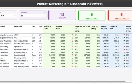
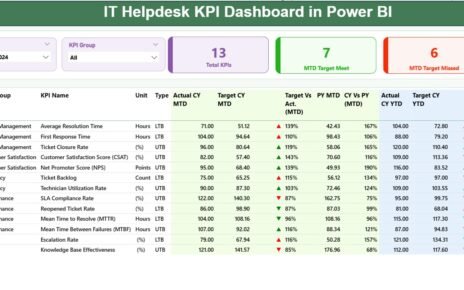
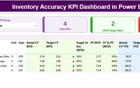
The Summary Page is the heart of the dashboard. It provides an overview of the KPIs and their current performance. Key elements include:
Slicers for Month and KPI Group: These slicers allow users to filter the data by month and category, making the dashboard adaptable to different timeframes and KPI groups.
KPI Count Cards: These cards show the total number of KPIs, the count of KPIs that met the target for the current month-to-date (MTD), and the count of KPIs that missed the target.
KPI Table: The detailed table on this page presents important KPI information, including:
- KPI Number
- KPI Group
- KPI Name
- Unit of Measurement
- Type (e.g., Lower the Better or Upper the Better)
- Actual and Target Values (MTD and YTD)
- Performance Indicators (▼ and ▲ icons for status)
- Year-on-Year Comparisons

Click to Purchase EdTech KPI Dashboard in Power BI
The table’s ability to show detailed data in real-time helps stakeholders make informed decisions based on accurate, up-to-date information.
2. KPI Trend Page
The KPI Trend Page focuses on tracking the trends of KPIs over time. This page includes:
- Combo Charts: These charts display the Actual values of the current year, previous year, and targets for both MTD and YTD.
- KPI Slicer: Users can select the specific KPI they wish to analyze, providing flexibility to focus on individual KPIs and see trends in real-time.

Click to Purchase EdTech KPI Dashboard in Power BI
This page is ideal for visualizing KPI performance over a given period and spotting any significant changes or trends.
3. KPI Definition Page
The KPI Definition Page allows users to drill through from the Summary Page for a detailed look at the specific formulas, definitions, and methodologies behind each KPI. It helps clarify the basis of each KPI’s measurement and ensures

Click to Purchase EdTech KPI Dashboard in Power BI
consistency in performance tracking. This page is hidden by default but can be accessed through a drill-through function.

Click to Purchase EdTech KPI Dashboard in Power BI
The Role of Excel Data in the EdTech KPI Dashboard
The data powering the EdTech KPI Dashboard comes from an Excel file, which includes three critical worksheets:
- Input_Actual Sheet: This sheet contains the actual KPI data, including the MTD and YTD values.

Click to Purchase EdTech KPI Dashboard in Power BI
- Input_Target Sheet: Here, users input the target values for each KPI.

Click to Purchase EdTech KPI Dashboard in Power BI
- KPI Definition Sheet: This sheet houses the details of each KPI, including its number, group, name, unit, formula, and definition.

By organizing data into these separate sheets, users can keep their dashboard data well-structured and easy to update. Simply enter the new data into the relevant sheets, and the Power BI dashboard will automatically update with the latest figures.
Advantages of Using the EdTech KPI Dashboard in Power BI
There are numerous benefits to using the EdTech KPI Dashboard in Power BI. Here are some key advantages:
- Centralized Data Management: The dashboard consolidates data from multiple sources (Excel sheets) into one centralized location. This makes it easier for decision-makers to monitor and analyze KPIs in real time.
- Data Visualization: With Power BI’s interactive visuals, users can quickly identify trends, strengths, and weaknesses in their educational programs. The combination of tables, charts, and slicers allows for dynamic analysis and an intuitive user experience.
- Real-Time Performance Tracking: The ability to track KPIs in real-time ensures that educators and stakeholders can respond swiftly to any discrepancies or areas needing attention, rather than waiting for periodic reports.
- Enhanced Decision-Making: The dashboard’s clear, actionable insights enable stakeholders to make informed decisions that align with the organization’s goals. By identifying areas of improvement, educational institutions can implement targeted interventions that drive better outcomes.
Opportunities for Improvement in the EdTech KPI Dashboard
While the EdTech KPI Dashboard in Power BI is an excellent tool for tracking performance, there are still opportunities for improvement. Consider the following:
- Customization Options: Currently, the dashboard is relatively fixed in terms of the KPIs it tracks. Adding more customization options, such as the ability to add new KPIs or alter the dashboard layout, would provide users with greater flexibility.
- Automated Data Entry: Automating the data entry process can reduce the manual effort required to update the dashboard. Integrating with other data systems or APIs could make this process seamless.
- Mobile-Friendly Design: While Power BI is designed for desktop use, making the dashboard mobile-friendly would allow stakeholders to access it on the go, improving accessibility and convenience.
- Advanced Predictive Analytics: Incorporating advanced predictive analytics into the dashboard can help forecast future performance based on current trends, enabling proactive decision-making.
Best Practices for Using the EdTech KPI Dashboard in Power BI
To make the most of the EdTech KPI Dashboard, consider implementing the following best practices:
- Regular Data Updates: Ensure that the data in the Excel sheets is updated regularly. Regular updates will ensure that the dashboard reflects the most accurate, up-to-date information, helping stakeholders make timely decisions.
- Use Slicers Effectively: Leverage slicers to filter the data based on different dimensions (e.g., by month or KPI group). This helps users focus on specific KPIs or time periods, making the dashboard more interactive and insightful.
- Set Clear KPI Targets: Define clear and realistic targets for each KPI. This will help you track progress effectively and provide a benchmark for success.
- Collaborative Use: Encourage multiple users to interact with the dashboard and collaborate on insights. Power BI’s cloud capabilities make it easy for teams to work together and share findings.
- Training for Users: Ensure that all users are well-trained in using Power BI and understanding the KPIs. This will improve the effectiveness of the dashboard and ensure that everyone is making data-driven decisions.
Conclusion
The EdTech KPI Dashboard in Power BI is a powerful tool for educational institutions seeking to track, analyze, and improve their performance. With its comprehensive features, data visualization capabilities, and real-time tracking, the dashboard helps stakeholders stay informed and make better decisions. By following best practices and focusing on continuous improvement, organizations can maximize the dashboard’s potential and drive greater educational success.
Frequently Asked Questions (FAQs)
What is an EdTech KPI Dashboard in Power BI?
An EdTech KPI Dashboard in Power BI is a data visualization tool used to track and analyze key performance indicators (KPIs) in educational technology programs. It helps stakeholders monitor performance and make data-driven decisions.
How does the EdTech KPI Dashboard improve decision-making?
The dashboard provides real-time, visual insights into KPI performance, allowing decision-makers to quickly identify trends, areas for improvement, and opportunities for intervention.
Can I customize the KPIs in the dashboard?
Yes, although the current version has predefined KPIs, there is an opportunity to enhance customization options, such as adding new KPIs or changing the dashboard layout.
Is the dashboard mobile-friendly?
Currently, the EdTech KPI Dashboard is optimized for desktop use. However, making it mobile-friendly could improve accessibility and allow users to access the dashboard on the go.
What data is required to use the EdTech KPI Dashboard?
To use the dashboard, you need an Excel file containing the actual KPI data, target numbers, and KPI definitions. These should be entered into three specific worksheets: Input_Actual, Input_Target, and KPI_Definition.
Visit our YouTube channel to learn step-by-step video tutorials
View this post on Instagram


