Managing energy consumption efficiently is more important than ever in today’s business world. To ensure your energy management efforts are successful, it’s crucial to track performance through measurable indicators. That’s where an Energy KPI Dashboard in Excel comes in. This powerful tool allows you to monitor and analyze energy usage in a clear and actionable way, helping you achieve your energy goals.
Click to buy Energy KPI Dashboard in Excel
In this guide, we’ll walk you through everything you need to know about the Energy KPI Dashboard, including its features, advantages, best practices, opportunities for improvement, and common questions. Whether you’re an energy manager or a business owner, this article will help you get the most out of your dashboard.
What is an Energy KPI Dashboard?
An Energy KPI Dashboard in Excel is a pre-designed template that tracks and displays key performance indicators (KPIs) related to energy consumption. It helps you measure actual energy use against targets, identify trends, and make informed decisions based on data. This dashboard is particularly useful for organizations aiming to reduce costs, optimize energy usage, and meet sustainability targets.
In this article, we’ll break down the structure and features of the dashboard, explain how to use it, and offer tips for maximizing its effectiveness.
Click to buy Energy KPI Dashboard in Excel
Key Features of the Energy KPI Dashboard
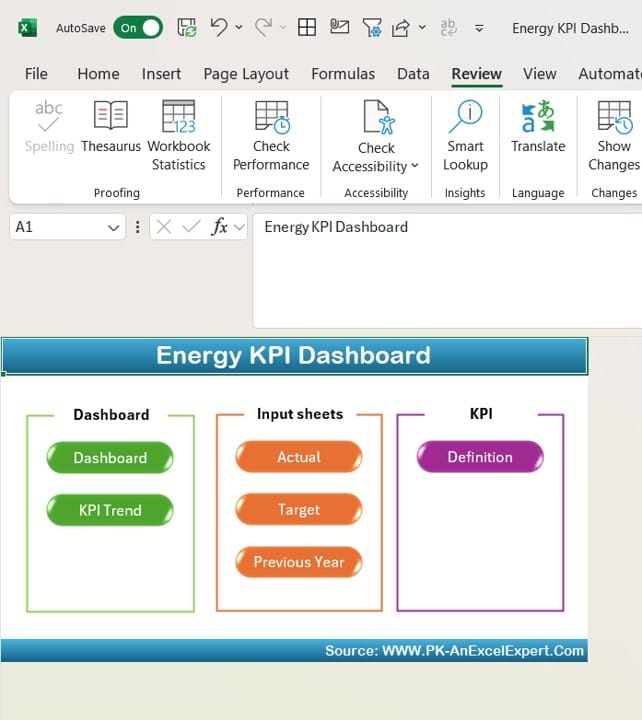
The Energy KPI Dashboard in Excel consists of seven worksheets, each designed to offer specific insights and actions related to energy performance. Let’s explore each of these sheets in detail:
Home Sheet
Click to buy Energy KPI Dashboard in Excel
The Home Sheet serves as the main navigation page of the dashboard. It contains six buttons that allow you to quickly jump to different sections of the dashboard, making it easy to find the information you need without scrolling through multiple tabs.
Dashboard Sheet Tab
Click to buy Energy KPI Dashboard in Excel
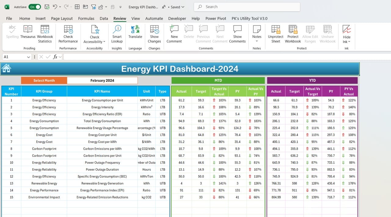
The Dashboard Sheet is the core of the Energy KPI Dashboard. It provides a comprehensive view of your energy KPIs for the selected month. You can choose the month you want to review by using the drop-down menu in cell D3, and all the data will automatically update to reflect that month.
MTD Actual, Target, and Previous Year Data: You’ll see the actual Month-to-Date (MTD) values, targets, and the previous year’s data for each KPI.
Conditional Formatting with Arrows: To make comparisons easier, the dashboard uses up/down arrows to highlight whether actual values are meeting, exceeding, or falling short of targets and last year’s figures.
YTD Actual, Target, and Previous Year Data: Along with MTD data, Year-to-Date (YTD) numbers provide a long-term view of your energy consumption and performance, helping you track progress toward your annual goals.
This section offers a quick, clear snapshot of how your energy KPIs are performing and whether you’re on track to meet your targets.
KPI Trend Sheet Tab
Click to buy Energy KPI Dashboard in Excel
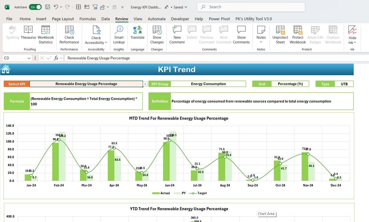
The KPI Trend Sheet allows you to dive deeper into the performance of individual KPIs. By selecting a KPI from the drop-down menu in cell C3, you can view important details such as:
KPI Group, Unit, and Type: This section shows what group the KPI belongs to, its unit of measurement, and whether a lower or higher value is better.
MTD and YTD Trend Charts: Trend charts visualize the Month-to-Date and Year-to-Date performance of the selected KPI, comparing actual values to targets and previous year data.
This sheet is particularly helpful for spotting trends and identifying areas where energy usage can be optimized.
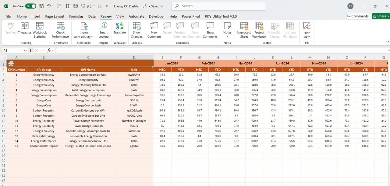
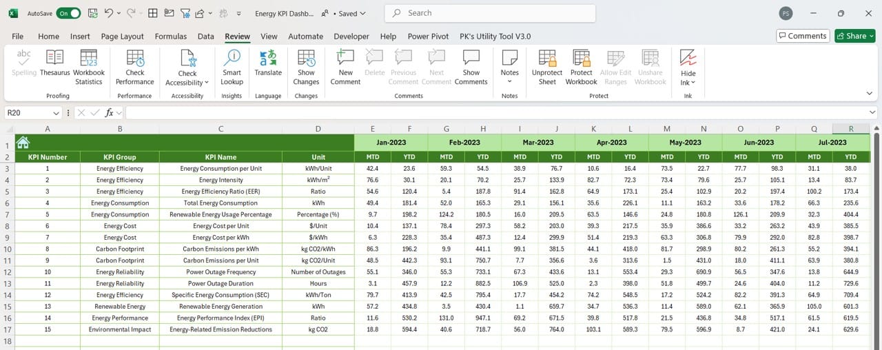
Actual Numbers Input Sheet
Click to buy Energy KPI Dashboard in Excel
The Actual Numbers Input Sheet is where you enter the actual MTD and YTD values for each KPI. This data input is crucial for keeping the dashboard up to date. You can change the month by adjusting the value in cell E1, which allows the sheet to automatically update all MTD and YTD values for that period.
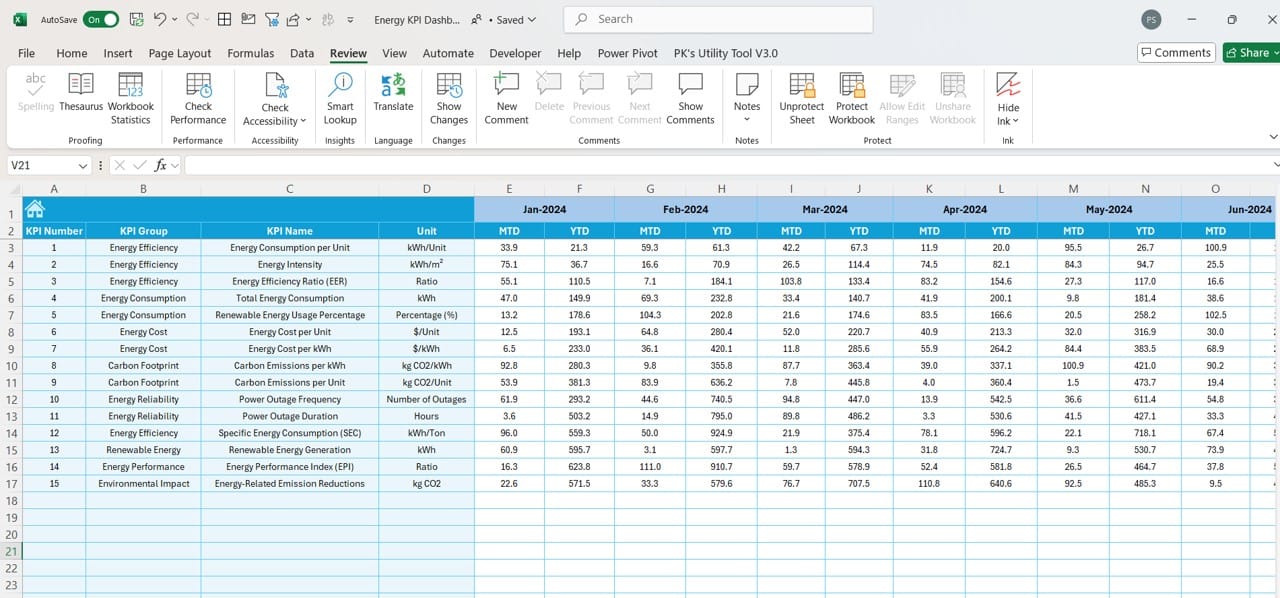
Target Sheet Tab
Click to buy Energy KPI Dashboard in Excel
In the Target Sheet, you input the target values for each KPI. These targets can be set for both MTD and YTD, providing a benchmark against which actual performance is measured. By setting realistic and achievable targets, you can ensure that the dashboard remains an accurate reflection of your energy management efforts.
Previous Year Numbers Sheet Tab
Click to buy Energy KPI Dashboard in Excel
This sheet allows you to enter the previous year’s data for each KPI. These historical numbers provide context for the current year’s performance, making it easier to see whether you’re improving, staying the same, or falling behind.
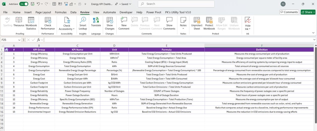
KPI Definition Sheet Tab
Click to buy Energy KPI Dashboard in Excel
The KPI Definition Sheet provides definitions for all of your energy KPIs. It includes fields for the KPI name, group, unit of measurement, formula, and a clear definition. This sheet is essential for ensuring everyone using the dashboard understands what each KPI means and how it’s calculated.
Advantages of Using the Energy KPI Dashboard in Excel
Now that we’ve explored the structure of the dashboard, let’s look at some of the key advantages it offers:
- Improved Decision-Making: The dashboard provides clear, data-driven insights into your energy performance, making it easier to make informed decisions. You can quickly see where you’re meeting your targets and where you need to improve, allowing for more focused energy management strategies.
- Customization: The dashboard is fully customizable. You can modify the KPIs, formulas, and targets to suit your specific energy goals. This flexibility makes it a valuable tool for businesses of all sizes and sectors.
- Real-Time Monitoring: With the Actual Numbers Input Sheet, you can enter up-to-date data and see how your energy KPIs are performing in real time. This allows you to respond quickly to any deviations from your targets.
- Long-Term Performance Tracking: By including previous year’s data, the dashboard lets you track long-term trends in energy consumption. This historical perspective helps you identify areas where energy performance is improving or declining over time.
Click to buy Energy KPI Dashboard in Excel
Best Practices for Using the Energy KPI Dashboard
To get the most out of your Energy KPI Dashboard, it’s important to follow some best practices:
- Update Data Regularly: Make sure you update the actual numbers in the dashboard frequently. The more up-to-date your data, the more accurate your insights will be.
- Set Achievable Targets: When setting targets in the dashboard, aim for numbers that are realistic based on past performance. Setting targets too high or too low can give you a misleading view of your energy performance.
- Use Trend Data: Regularly review the trend charts in the KPI Trend Sheet. These charts give you a visual representation of how your energy KPIs are performing over time, helping you spot patterns and adjust your strategy accordingly.
- Customize the Dashboard to Fit Your Needs: One of the greatest strengths of the Energy KPI Dashboard in Excel is its flexibility. Don’t hesitate to modify it to include KPIs that are specific to your organization’s energy management goals.
Click to buy Energy KPI Dashboard in Excel
Opportunities for Improvement in the Energy KPI Dashboard
While this dashboard is already a powerful tool, there’s always room for improvement. Here are a few opportunities to enhance the functionality of your Energy KPI Dashboard:
- Automated Data Collection: Currently, the dashboard requires manual data entry for actual and target values. Automating this process by integrating smart meters or APIs could save time and reduce the potential for human error.
- Advanced Visualizations: Although the dashboard provides useful visual aids like trend charts and conditional formatting, adding more advanced visualizations (such as dynamic charts or Power BI integration) could make the data even easier to interpret.
- Mobile Compatibility: Another area for improvement is making the dashboard more accessible on mobile devices. A mobile-friendly version would allow users to check energy performance on the go.
- Automated Reports: Including automated reporting features, such as monthly summaries or downloadable PDFs, could streamline the process for energy managers who need to share data with other stakeholders.
Conclusion
The Energy KPI Dashboard in Excel is an indispensable tool for organizations looking to manage their energy consumption effectively. It provides a clear, real-time view of energy performance, enabling you to make data-driven decisions and track progress toward your energy goals. With its user-friendly design and customizable features, this dashboard can help businesses of any size optimize their energy use and meet sustainability targets.
Click to buy Energy KPI Dashboard in Excel
Frequently Asked Questions (FAQs)
Q. What are Energy KPIs?
Energy KPIs are measurable values that track the efficiency and usage of energy in a business. These indicators help organizations monitor their energy performance and identify areas for improvement.
Q. How do I update data in the Energy KPI Dashboard?
To update the data, simply enter the actual numbers in the Actual Numbers Input Sheet and the target values in the Target Sheet Tab. You can update both Month-to-Date (MTD) and Year-to-Date (YTD) values.
Q. Is the Energy KPI Dashboard customizable?
Yes, the dashboard is fully customizable. You can add new KPIs, modify formulas, and adjust targets to fit your organization’s specific needs.
Q. Who can benefit from using an Energy KPI Dashboard?
Any organization that tracks energy usage can benefit from this dashboard, including companies in manufacturing, retail, and service industries. It’s especially useful for businesses aiming to reduce energy costs and meet sustainability targets.
Q. Can I track different energy sources with this dashboard?
Absolutely. The dashboard can be adapted to track multiple energy sources such as electricity, gas, or renewable energy. You can customize the KPIs to include specific metrics for each energy source.
This comprehensive guide provides everything you need to know about using the Energy KPI Dashboard in Excel. By following the best practices and considering opportunities for improvement, you can optimize your
Click to buy Energy KPI Dashboard in Excel
Visit our YouTube channel to learn step-by-step video tutorials
View this post on Instagram
Click to buy Energy KPI Dashboard in Excel