Unlock the full potential of energy management with the Energy KPI Dashboard in Power BI. This guide provides a thorough look into how to effectively utilize the dashboard to monitor and enhance your energy performance metrics using Power BI and Excel as your data source. Whether you’re aiming to meet monthly targets or track year-to-date achievements, this dashboard is your go-to tool for insightful energy analytics.
Click to Energy KPI
How the Energy KPI Dashboard Works in Power BI
- The Energy KPI Dashboard in Power BI is meticulously designed to function seamlessly with data captured in an Excel file. It features a three-page layout in the Power BI desktop application, each tailored to specific analytical needs:
Click to Energy KPI
Summary Page:
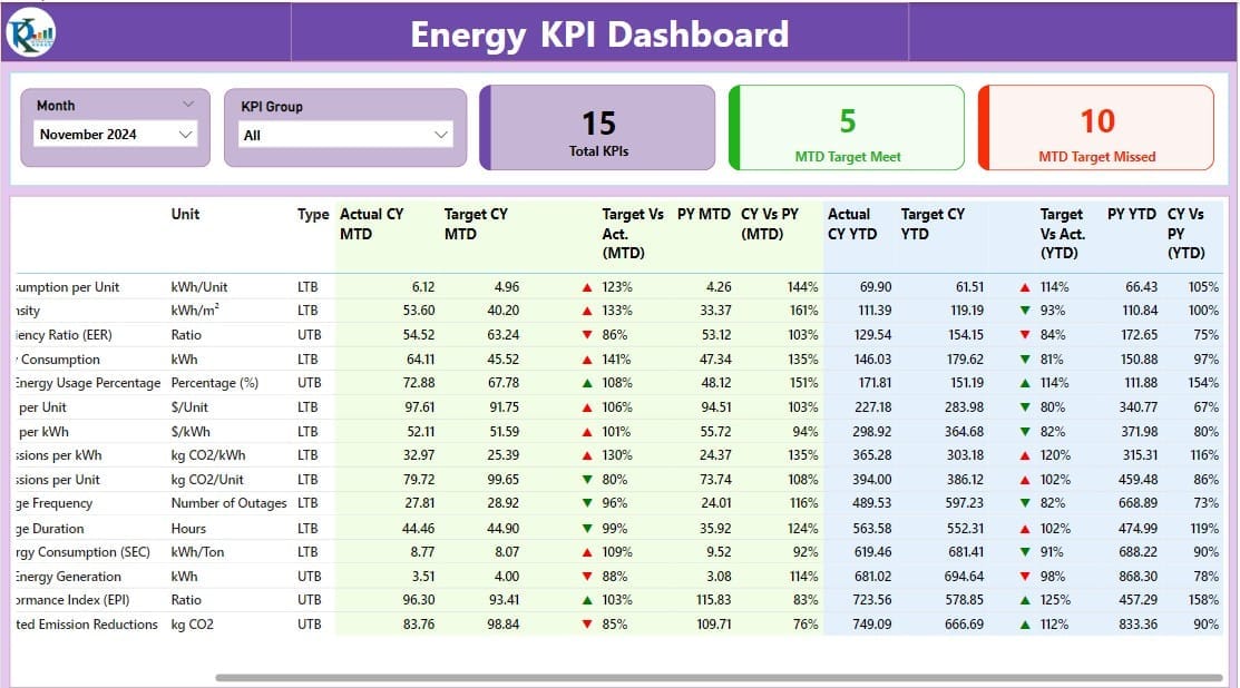
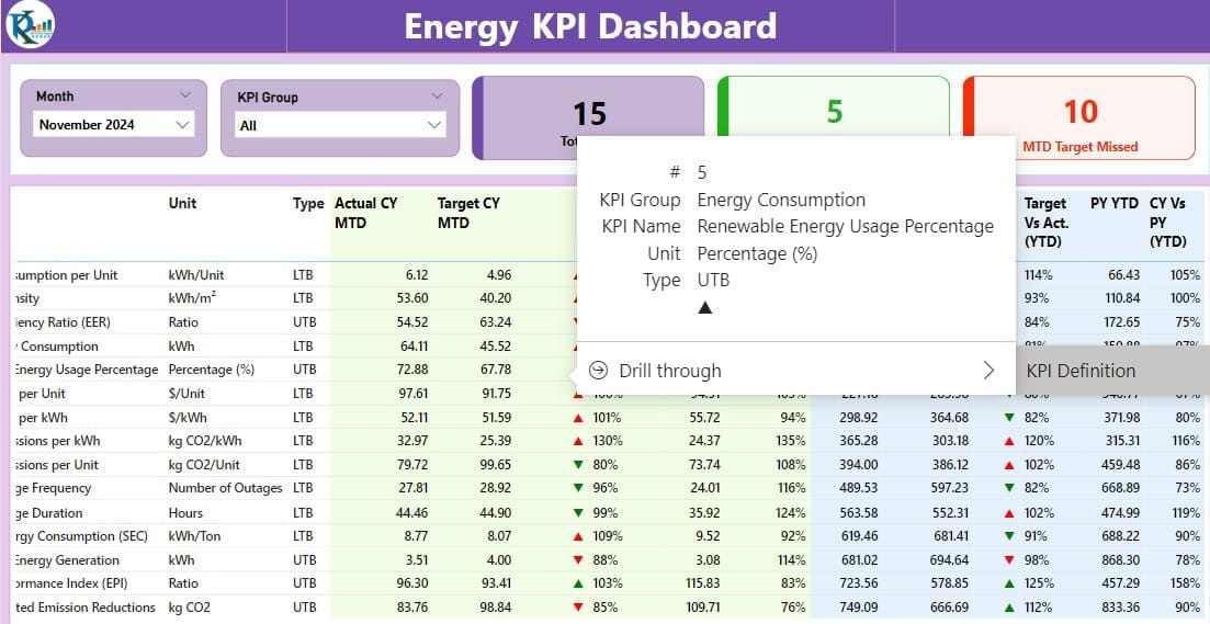
- The nerve center of the dashboard, this page offers interactive slicers for month and KPI group selection, with cards displaying total KPI counts, monthly target achievements, and misses. Below, a detailed table presents various critical data points like KPI number, name, group, unit, type, and performance against targets, using intuitive red and green icons to signify status.
Click to Energy KPI
KPI Trend Page:
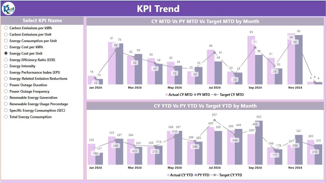
- This page visualizes the performance trends with dual combo charts comparing actual figures against targets and the previous year’s numbers for both MTD (Month-To-Date) and YTD (Year-To-Date) metrics. An interactive slicer allows for easy navigation and data filtering based on specific KPI names.
Click to Energy KPI
KPI Definition Page:
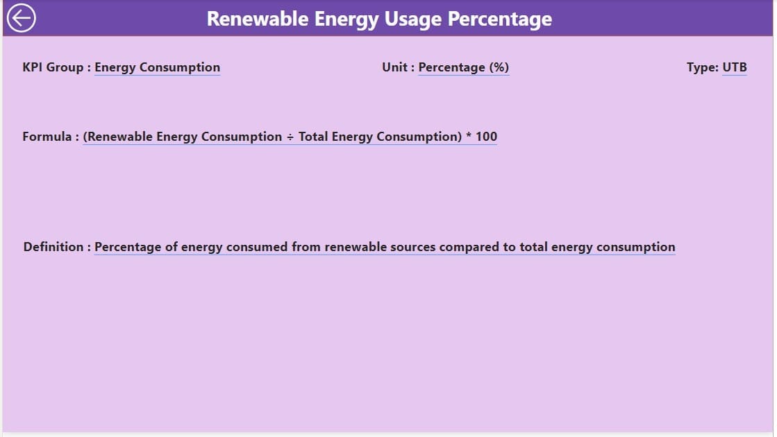
Essential for in-depth understanding, this hidden drill-through page contains definitions and formulas related to each KPI. Accessible from the Summary Page, it provides a detailed background for each metric.
Advantages of the Energy KPI Dashboard
- Real-Time Insights: Instantly visualize performance against energy targets.
- Enhanced Decision Making: Utilize detailed analytics to make informed energy management decisions.
- Customizable Views: Tailor views to meet specific monitoring needs with interactive slicers and hidden pages.
- Historical Data Comparison: Easily compare current performance against historical data to track improvements or identify areas needing attention.
Click to Energy KPI
Best Practices for Using the Energy KPI Dashboard
- Regular Data Updates: Ensure the Excel file is consistently updated to reflect the most current data for accurate dashboard performance.
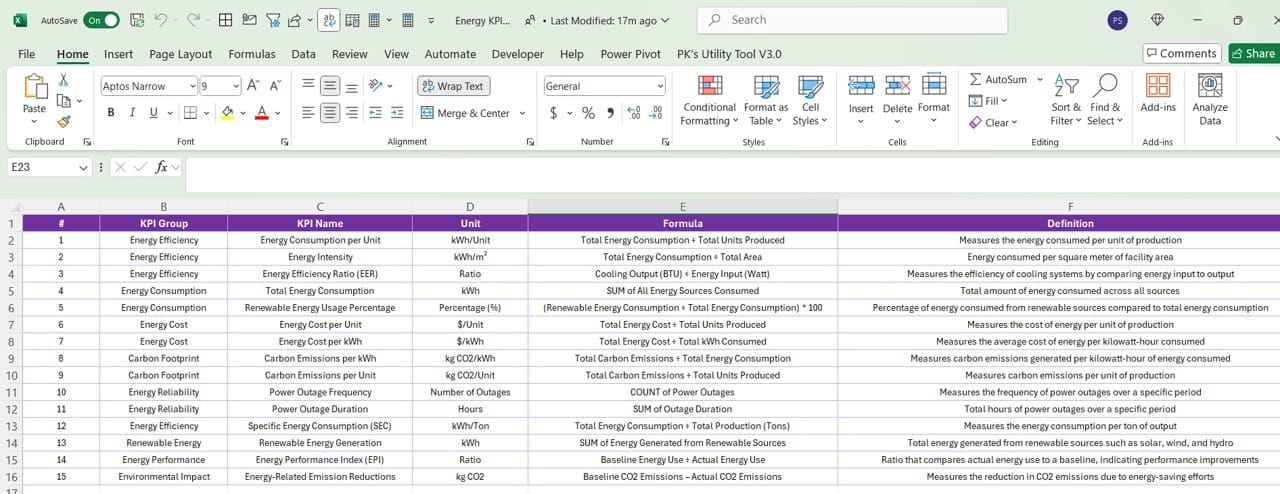
- Utilize Drill-Through Features: Make use of the hidden KPI Definition page for a deeper understanding of each metric.
- Engage with Visuals: Regularly interact with the trend charts for insights into performance fluctuations and patterns.
- Customize Slicers: Adjust slicers to refine data views and focus on specific areas of interest or concern.
Click to Energy KPI
Conclusion
The Energy KPI Dashboard in Power BI revolutionizes how energy metrics are monitored and analyzed. By integrating detailed data from Excel and utilizing Power BI’s dynamic visualization capabilities, organizations can achieve a clearer understanding of their energy usage, streamline their operations, and drive strategic energy initiatives.
Frequently Asked Questions
Q. How do I customize the Energy KPI Dashboard for my needs?
You can customize the dashboard by adjusting the slicers, adding new cards, or modifying the existing charts and tables to better fit your specific requirements.
Q. Can the dashboard update in real-time?
While the dashboard itself does not update in real-time, it can be refreshed as often as the Excel data source is updated to reflect the most recent information.
Q. Is there a way to share the dashboard with other team members?
Yes, the dashboard can be published to the Power BI service, allowing you to share it with colleagues and stakeholders who have the appropriate permissions.
Click to Energy KPI
Visit our YouTube channel to learn step-by-step video tutorials
View this post on Instagram

