In the fast-paced world of event management, staying on top of multiple KPIs (Key Performance Indicators) is crucial for success. The Event Management KPI Dashboard in Power BI offers event planners and organizers a powerful tool for tracking key metrics, ensuring the smooth execution of events, and making data-driven decisions. This dashboard integrates data from Excel into Power BI, providing a dynamic and interactive view of performance metrics. In this article, we will take a deep dive into how this dashboard works, its features, and how it can help optimize event management processes.
Table of Contents
ToggleWhat is an Event Management KPI Dashboard in Power BI?
An Event Management KPI Dashboard in Power BI is an interactive data visualization tool that helps event managers track and analyze various performance indicators. This dashboard pulls data from Excel, allowing users to visualize and monitor KPIs related to event performance, attendee satisfaction, budget management, and more. By utilizing Power BI’s advanced visualization features, the dashboard provides actionable insights that help event organizers make informed decisions, improve future events, and ensure the overall success of their operations.
Key Features of the Event Management KPI Dashboard in Power BI
The Event Management KPI Dashboard is designed to be user-friendly, flexible, and comprehensive. It is divided into three main pages, each offering a different view of the data. Let’s explore the key features of each page:
1. Summary Page
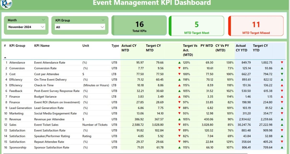
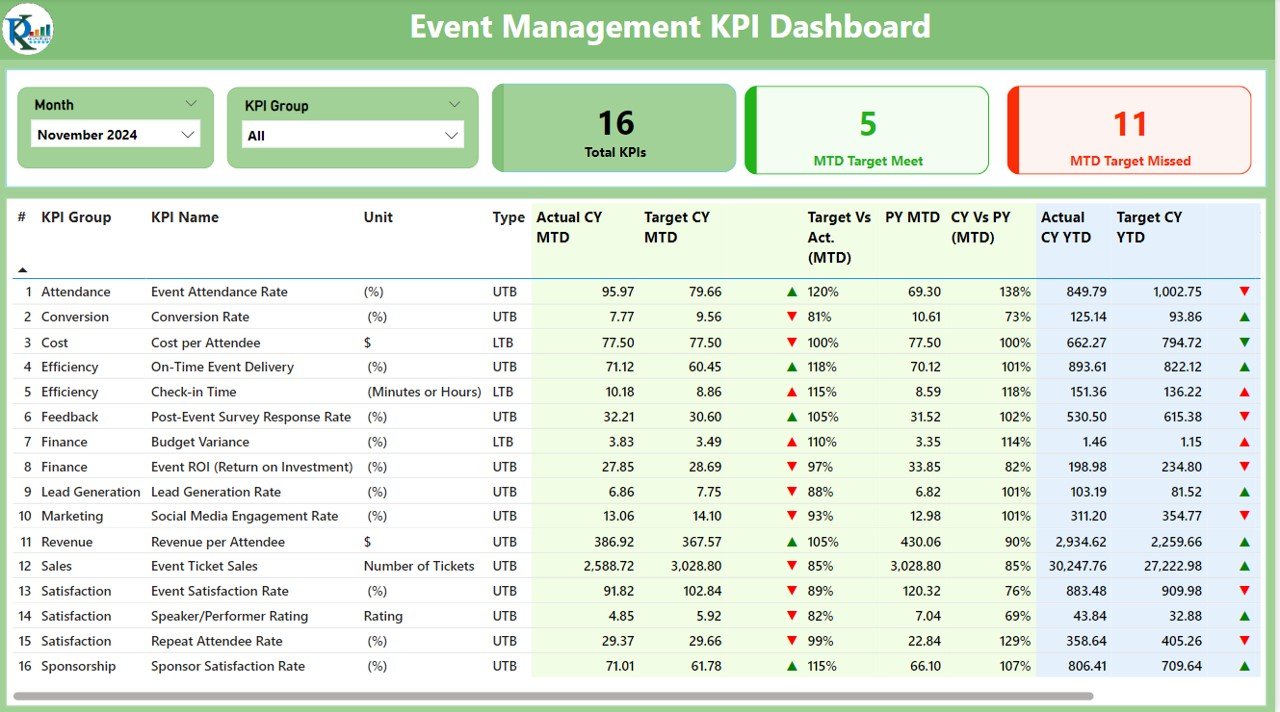
The Summary Page is the central hub of the dashboard. It gives users a quick overview of key metrics, enabling them to monitor event performance at a glance. The page includes the following features:
- Month and KPI Group Slicer: Allows users to filter the data based on specific months and KPI groups.
- Key Metrics Cards: Displays three important cards that show the total number of KPIs, MTD (Month-to-Date) Target Met count, and MTD Target Missed count. These cards provide a snapshot of how well the event is performing.
- Detailed KPI Table: This table includes various columns to track event performance. Here’s a breakdown of the information displayed:
- KPI Number: A unique identifier for each KPI.
- KPI Group: The category or group to which the KPI belongs.
- KPI Name: The name or description of the KPI.
- Unit: The unit of measurement for the KPI.
- Type: Indicates whether the KPI is LTB (Lower the Better) or UTB (Upper the Better).
- Actual CY MTD and Target CY MTD: These columns show the Actual and Target values for the current year MTD.
- MTD Icon: A color-coded icon (▼ for below target and ▲ for above target) visually indicates the KPI status against the target for MTD.
- Target vs Actual (MTD): A percentage value that compares the actual MTD number with the target MTD number.
- Previous Year MTD (PY MTD): MTD data from the previous year for comparison.
- CY vs PY (MTD): This percentage comparison highlights the performance difference between the current and previous year’s MTD values.
- Actual CY YTD and Target CY YTD: Shows the Actual and Target values for the current year YTD.
- YTD Icon: Color-coded icons indicating the status of YTD against the target.
- Target vs Actual (YTD): A percentage comparison of the actual YTD number versus the target YTD number.
- Previous Year YTD (PY YTD): Displays YTD values from the previous year for comparison.
- CY vs PY (YTD): A comparison between the current year’s YTD performance and that of the previous year.
Click to buy Event Management KPI Dashboard in Power BI
2. KPI Trend Page
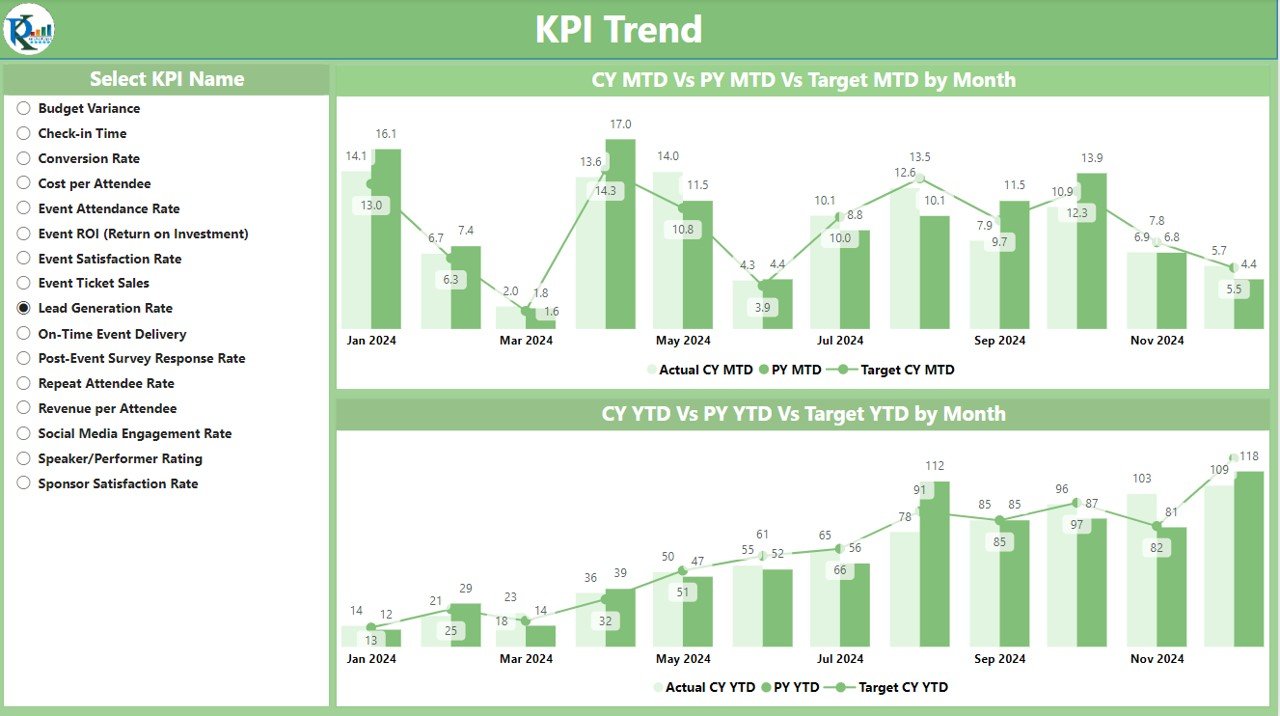
The KPI Trend Page offers a more in-depth view of event performance trends over time. The features on this page include:
- Combo Charts: Two combo charts are used to display Actual Numbers for the current year, previous year, and targets for both MTD and YTD. This helps users compare the performance of different periods at a glance.
- KPI Name Slicer: A slicer on the left allows users to filter the data based on specific KPIs, giving a more focused analysis for each event.
Click to buy Event Management KPI Dashboard in Power BI
3. KPI Definition Page
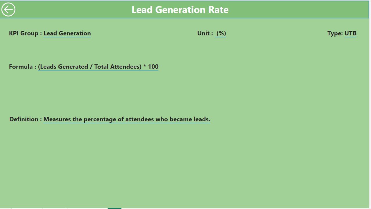
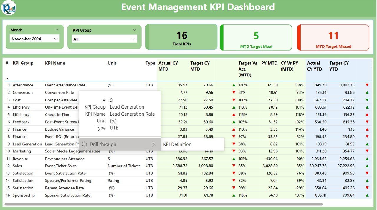
The KPI Definition Page provides detailed information about each KPI, including its formula and definition. This page is hidden by default but can be accessed by drilling through from the Summary Page. Here’s what you’ll find:
Click to buy Event Management KPI Dashboard in Power BI
- KPI Formula: A breakdown of how each KPI is calculated.
- KPI Definition: A clear explanation of what each KPI represents and its importance in event management.
Click to buy Event Management KPI Dashboard in Power BI
How the Excel Data Powers the Event Management KPI Dashboard
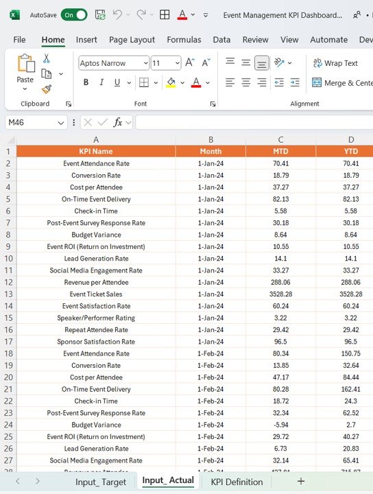
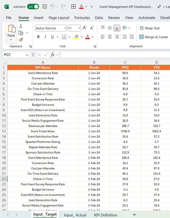
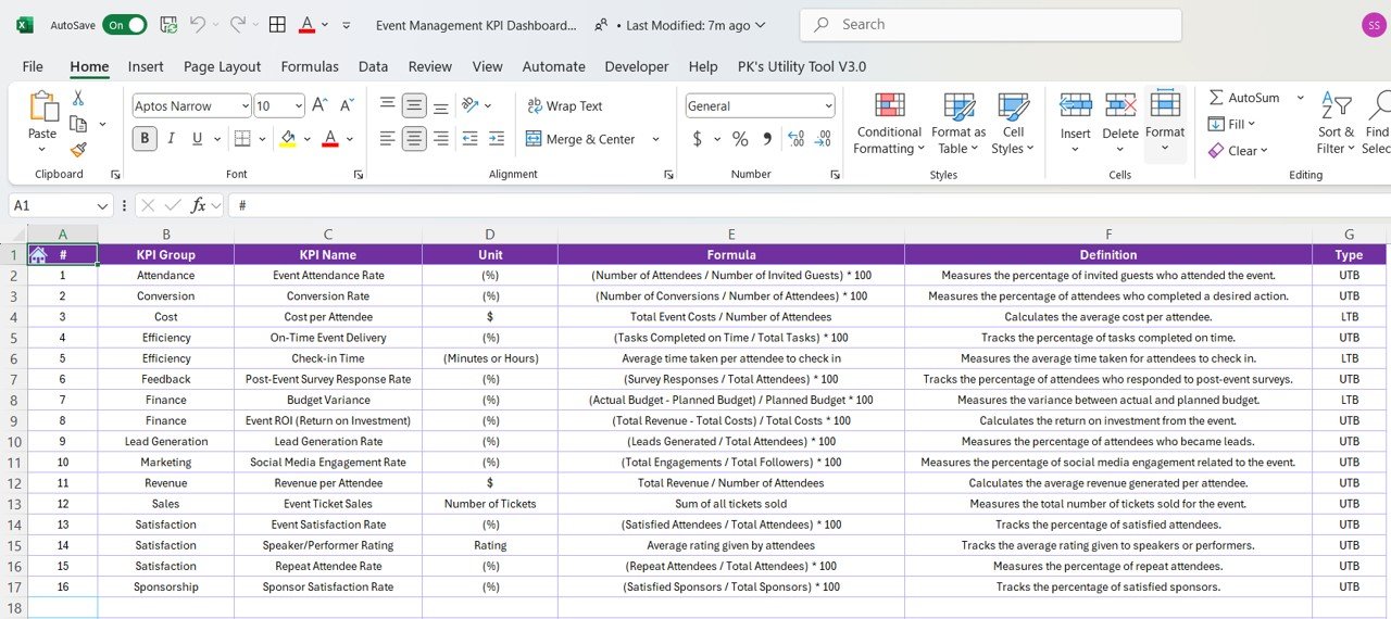
The Event Management KPI Dashboard in Power BI relies on data from an Excel file, making it easy to input and update the necessary information. The Excel file is organized into three sheets:
- Input_Actual Sheet Tab: Enter the Actual values for each KPI, including MTD and YTD numbers for the current year.
Click to buy Event Management KPI Dashboard in Power BI
- Input_Target Sheet Tab: This sheet is where the Target values for each KPI are entered, including MTD and YTD targets.
Click to buy Event Management KPI Dashboard in Power BI
- KPI Definition Sheet Tab: Here, enter details such as the KPI Number, KPI Group, KPI Name, Unit, Formula, Definition, and Type (LTB or UTB).
Click to buy Event Management KPI Dashboard in Power BI
Once the data is entered into the Excel file, it automatically updates the Power BI dashboard, providing real-time insights into event performance.
Advantages of Using the Event Management KPI Dashboard in Power BI
The Event Management KPI Dashboard in Power BI offers numerous benefits for event planners and organizers. Let’s explore some of the key advantages:
- Real-Time Data Updates: The dashboard provides real-time updates as soon as new data is entered into the Excel file, allowing event managers to track progress as the event unfolds.
- Interactive and Customizable: Power BI’s interactive features, such as slicers, combo charts, and drill-through pages, allow users to explore the data in detail. You can filter the data based on specific KPIs, months, or categories to get a tailored view.
- Easy Performance Monitoring: With the color-coded icons and percentage comparisons, it’s easy to understand how well KPIs are performing against targets. The dashboard visually highlights areas that need attention, helping event managers make timely adjustments.
- Comprehensive Data Visualization: The combo charts and detailed tables provide a clear and comprehensive visualization of event performance, making it easy to analyze trends, track goals, and identify areas for improvement.
- Improved Decision-Making: By centralizing all the key metrics in one dashboard, event planners can make faster, more informed decisions based on real-time data. This helps improve the effectiveness of event management strategies.
Opportunities for Improvement in the Event Management KPI Dashboard
While the Event Management KPI Dashboard in Power BI is a robust tool, there are always opportunities to enhance its effectiveness. Here are some potential areas for improvement:
- Automation of Data Entry: Currently, data entry into Excel is manual. Automating this process by integrating with other event management systems could save time and reduce human errors.
- Predictive Analytics: Integrating predictive analytics could help event planners forecast outcomes, such as attendance or budget variance, based on historical data.
- Integration with Other Platforms: Integrating the dashboard with other software platforms (e.g., CRM systems, ticketing software) could provide a more comprehensive view of event performance and audience engagement.
Conclusion
The Event Management KPI Dashboard in Power BI is a powerful tool that helps event organizers track, monitor, and optimize performance metrics. With its real-time updates, interactive features, and comprehensive data visualization, this dashboard makes it easier to manage events efficiently and ensure their success. By leveraging this dashboard, event planners can make data-driven decisions, improve event execution, and ultimately deliver better experiences for attendees.
Frequently Asked Questions (FAQs)
1. What are the key features of the Event Management KPI Dashboard in Power BI?
The dashboard includes three key pages: Summary Page, KPI Trend Page, and KPI Definition Page, offering different views of event performance data.
2. How does the dashboard pull data from Excel?
The dashboard is powered by an Excel file where users enter data into three sheets: Input_Actual, Input_Target, and KPI Definition. This data is automatically updated in Power BI.
3. Can the Event Management KPI Dashboard be customized?
Yes, Power BI allows extensive customization of the dashboard using slicers, charts, and tables to meet the specific needs of event planners.
4. What are the advantages of using this dashboard?
The dashboard offers real-time updates, interactive data visualization, easy performance monitoring, and improved decision-making.
5. How can I improve the Event Management KPI Dashboard?
Opportunities for improvement include automating data entry, integrating predictive analytics, and connecting the dashboard to other event management platforms.
6. Why is accurate data entry important?
Accurate data ensures that the dashboard provides reliable insights. Regular data audits should be conducted to maintain the quality of the information.
Visit our YouTube channel to learn step-by-step video tutorials
