Welcome to our step-by-step guide on how to seamlessly connect charts slicers in Excel. This tutorial is perfect for anyone looking to add a bit of magic to their data visualization skills. Whether you’re a seasoned Excel user or just starting out, you’ll find this guide incredibly easy to follow. Let’s dive in!
How to connect connect charts slicers in Excel
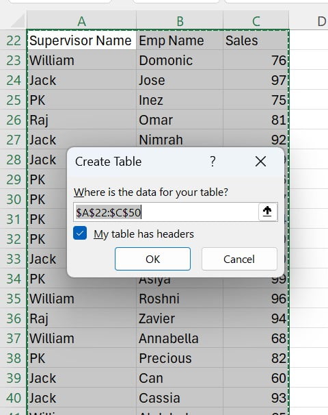
First things first, let’s get your data organized. In our example, we’re using sales data that includes Supervisor Names, Employee Names, and Sales figures. These are laid out in ranges A22:A50 for Supervisor Names, B22:B50 for Employee Names, and C22:C50 for Sales.
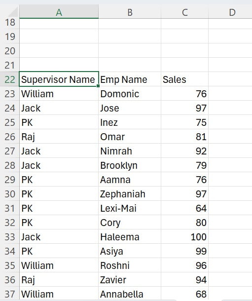
To begin, select your entire data range. Then, simply press Ctrl+T shortcut key. This quick action transforms your data into a neatly organized table. After pressing Ctrl+T, a prompt will appear. Click OK, and just like that, your selected range becomes a well-structured table.
Inserting Slicers for Interactive Data Filtering
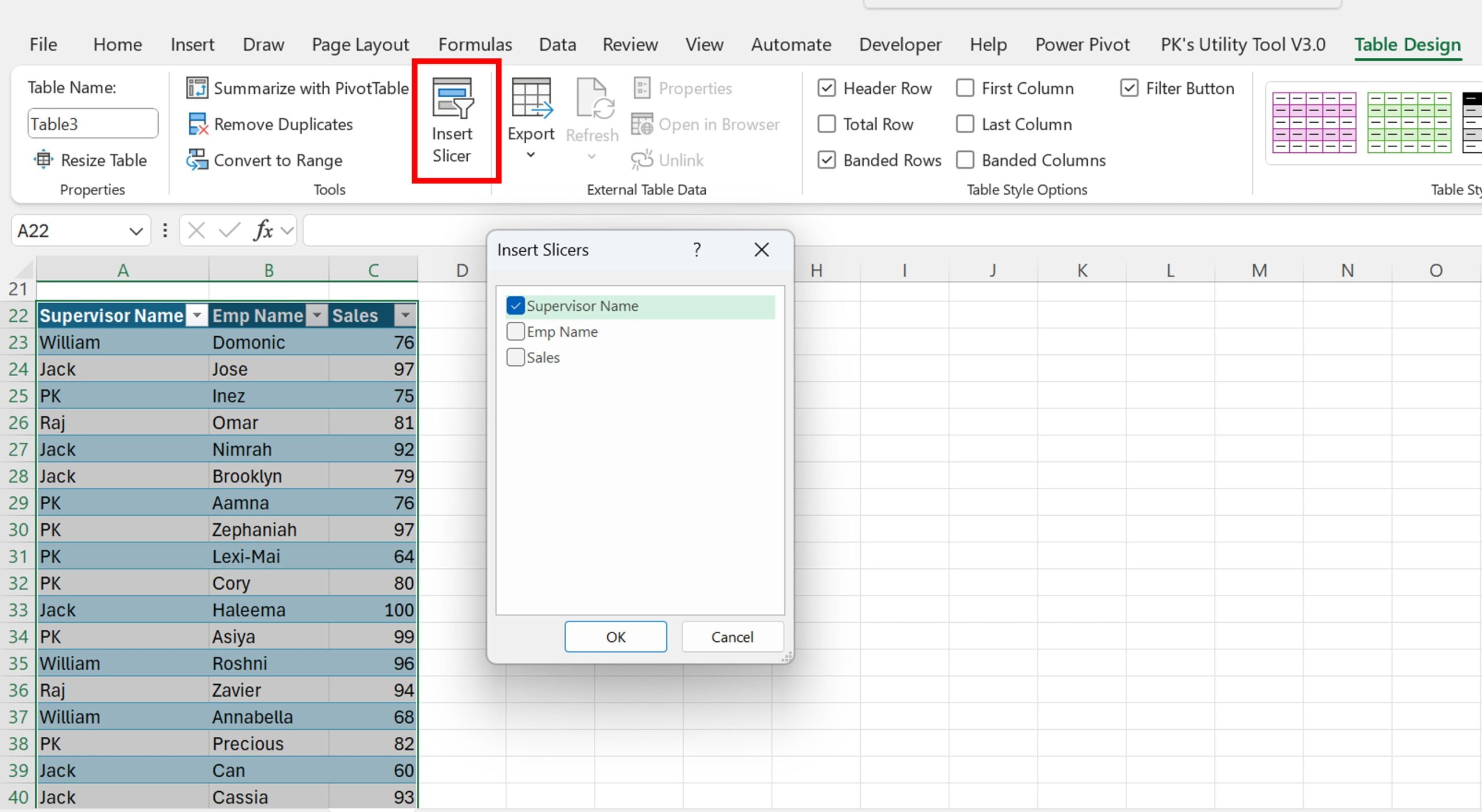
Now, click anywhere on your newly created table. You’ll notice the Table Design tab appearing on the Excel ribbon. Here’s where the fun begins. Click on Insert Slicer. In the popup window, check the box next to Supervisor Name. This action inserts a slicer specifically for the supervisor names, paving the way for interactive data filtering.
Customizing Your Slicer for Enhanced Usability
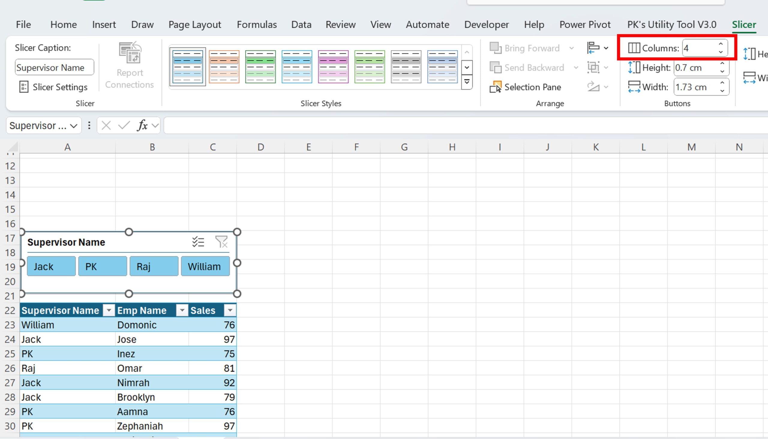
After selecting the slicer, the Slicer tab will appear. Here, you can make your slicer more user-friendly. Set the number of columns to 4 in this tab, making your slicer easier to navigate.
Bringing Your Data to Life with a Chart
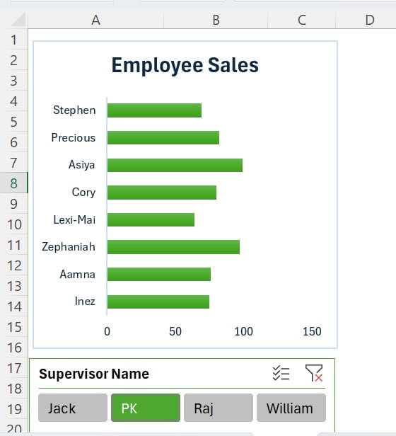
Next, it’s time to visualize your data. Select the range B23:C50. Then, head over to the Insert tab and choose to insert a 2D bar chart. This visual representation will make your data analysis much more intuitive.
Refining Your Chart for a Professional Look
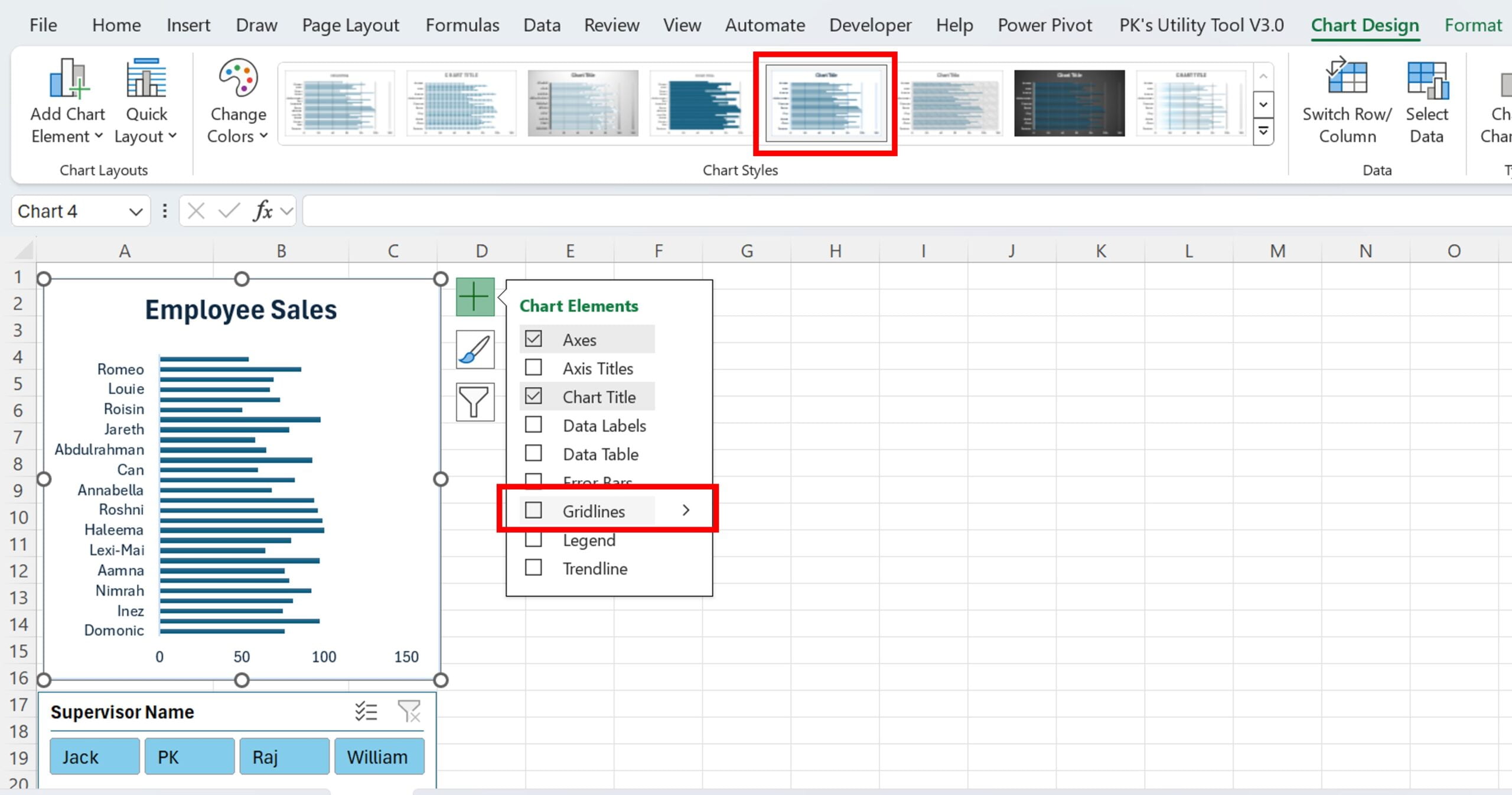
To enhance the readability of your chart, remove the gridlines using the Chart Element button. Then, add a touch of style. Go to the Chart Design tab in the Excel ribbon and select “Style 5” from the Chart Styles.
Change the chart color
For an additional flair, choose “Color Palette 4” from the Change Color options.
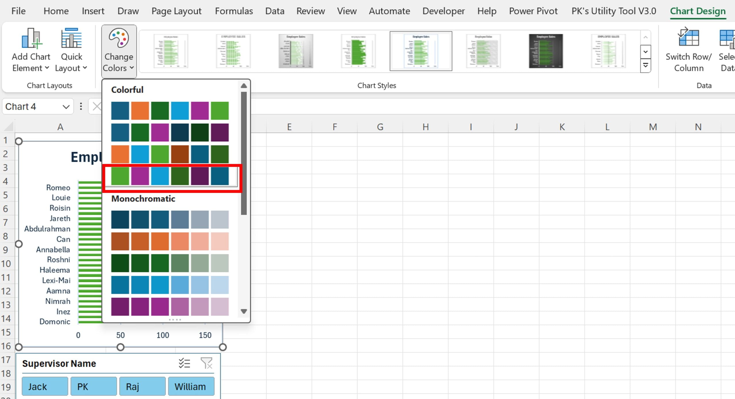
Change the Slicer color
Select your slicer again, go to the Slicer tab, and choose the last style from the Slicer Styles.
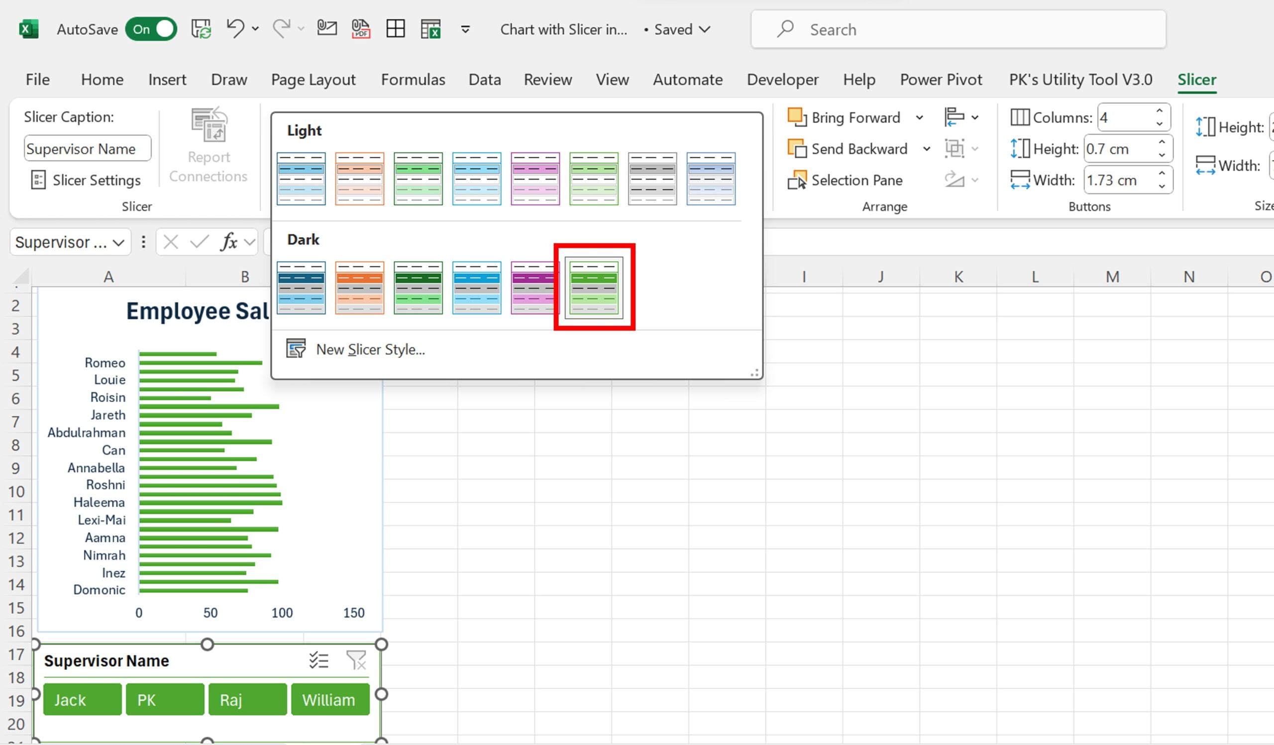
Click to buy Excel Magic: Connect Charts & Slicers in Seconds
Conclusion: Your Excel Dashboard, Elevated
There you have it! With these simple steps, you’ve successfully connected your Excel chart with slicers, turning your data into an interactive and dynamic dashboard. This skill not only enhances your Excel capabilities but also elevates the way you present and analyze data. Happy slicing and charting!
Remember, Excel is a powerful tool, and with these tricks up your sleeve, you’re well on your way to becoming an Excel wizard!
Visit our YouTube channel to learn step-by-step video tutorials
Watch the step-by-step video tutorial:
Click to buy Excel Magic: Connect Charts & Slicers in Seconds
