Managing cost efficiency in finance and accounting is essential for business success. However, tracking all the moving parts can be overwhelming without the right tools. That’s where the Finance and Accounting Cost Efficiency KPI Dashboard in Excel steps in. This powerful tool provides a centralized, easy-to-use system for monitoring, analyzing, and improving financial efficiency using key performance indicators (KPIs).
In this detailed article, we will explore everything you need to know about this dashboard. From its benefits and structure to best practices and FAQs, we’ll cover it all. Let’s dive in!
Click to Purchases Finance and Accounting Cost Efficiency KPI Dashboard in Excel
What is a Finance and Accounting Cost Efficiency KPI Dashboard?
A Finance and Accounting Cost Efficiency KPI Dashboard is an Excel-based reporting tool that helps organizations track and analyze the performance of their finance departments. It consolidates key metrics, identifies trends, and enables data-driven decision-making to reduce costs and improve financial efficiency.
This dashboard includes:
- Visualized KPI comparisons
- Monthly and yearly performance data
- Target vs Actual and Previous Year comparisons
- Easy data entry for actuals, targets, and historical numbers
It’s ideal for CFOs, accountants, finance teams, and analysts who want real-time insights without complex software.
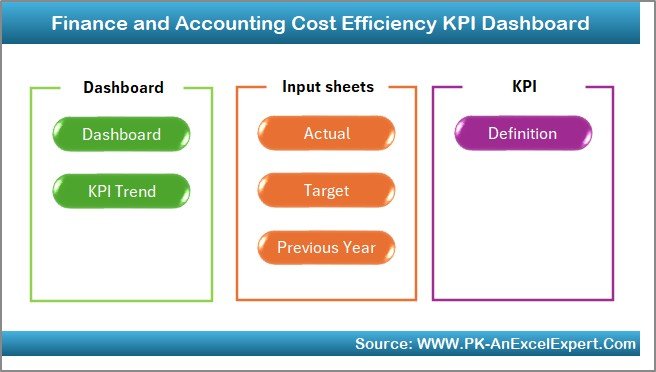
Key Features of the Excel KPI Dashboard Template
This ready-to-use Excel template includes seven worksheets designed to simplify cost tracking and efficiency analysis:
Home Sheet
- Acts as the index page
- Includes 6 navigation buttons for quick access
- Clean and intuitive layout for users
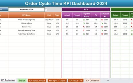
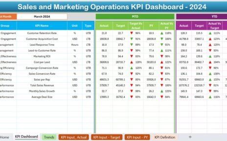
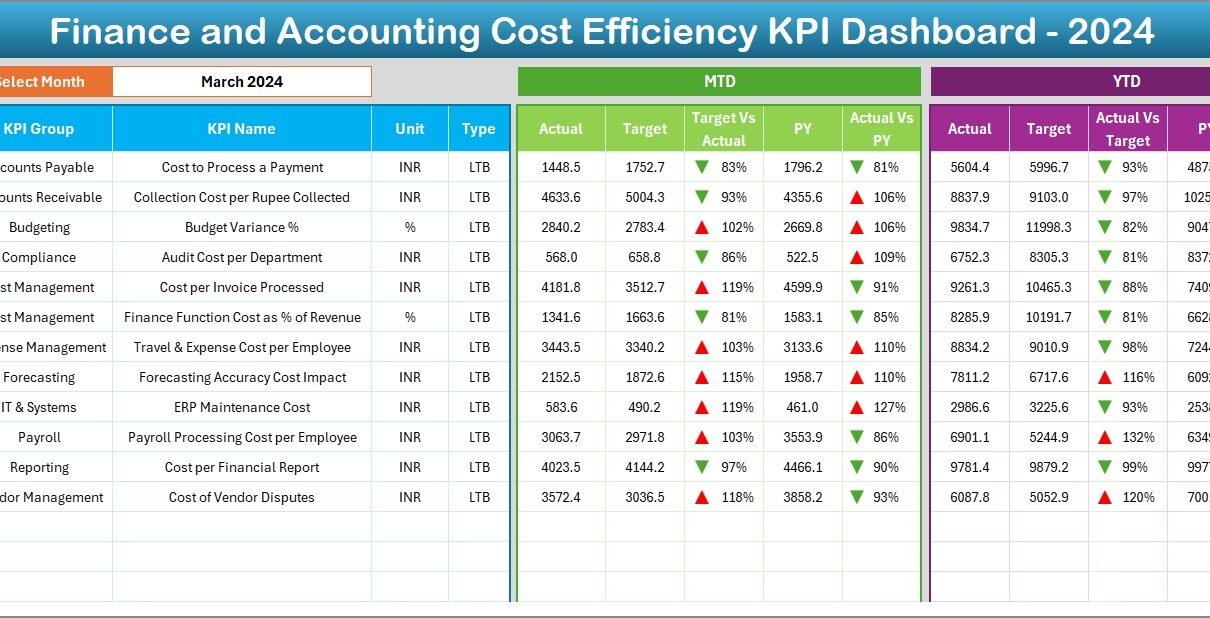
Dashboard Sheet Tab
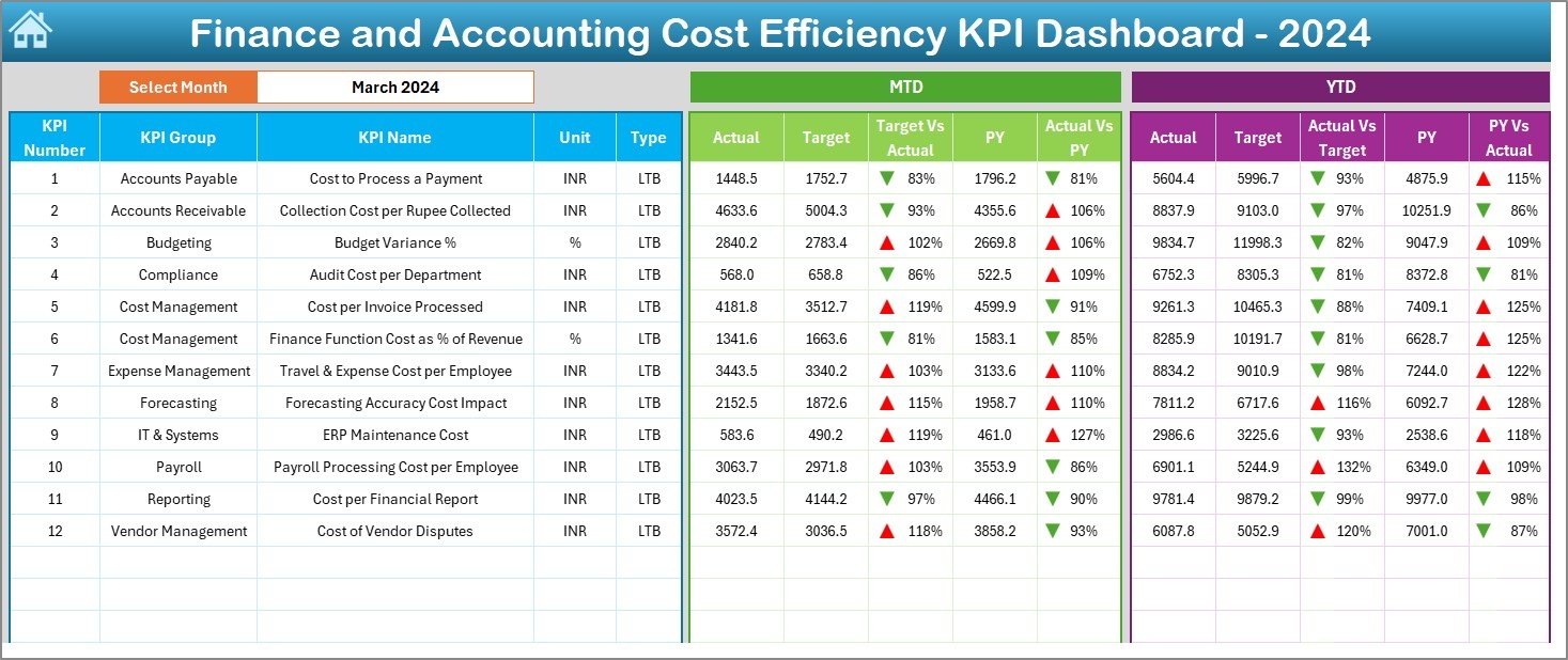
- Main data visualization hub
- Drop-down selector for monthly data (cell D3)
- Highlights:
- MTD (Month-to-Date) Actual vs Target
- YTD (Year-to-Date) Actual vs Target
- PY (Previous Year) comparisons
- Up/Down arrows using conditional formatting for trends
KPI Trend Sheet Tab
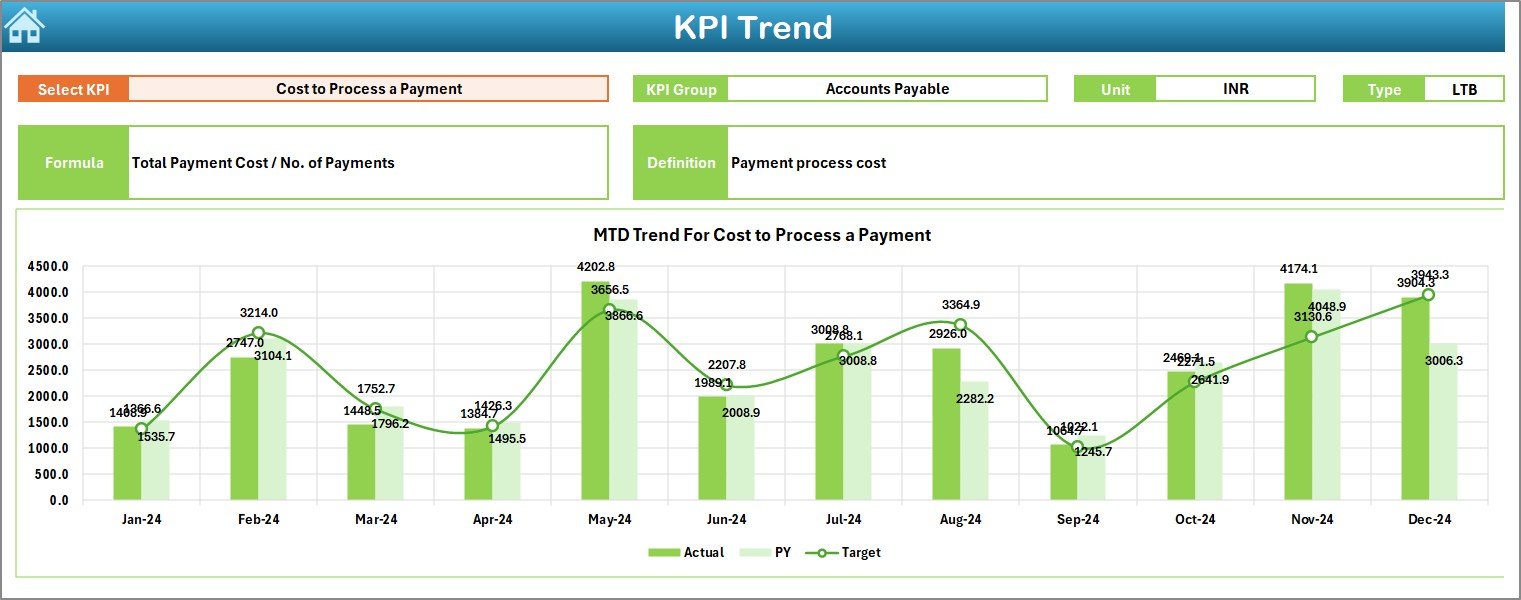
- Choose KPI from drop-down list (cell C3)
- View:
- KPI Group, Unit, Type (UTB or LTB), Formula, and Definition
- Dynamic MTD & YTD trend charts for Actual, Target, and PY values
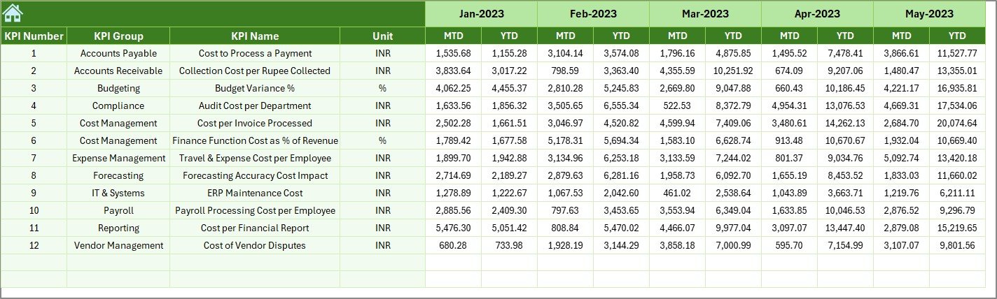
Actual Numbers Input Sheet
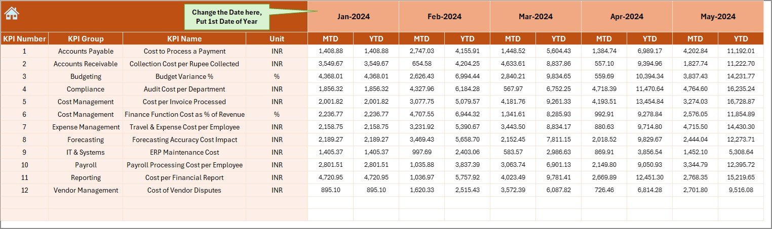
- Input MTD and YTD values for each KPI
- Select starting month from cell E1
- Keeps actual performance data organized
Target Sheet Tab
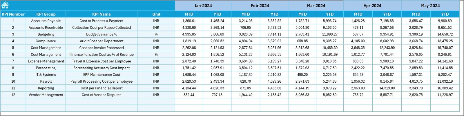
- Enter monthly target values for each KPI
- Includes both MTD and YTD targets
Previous Year Number Sheet Tab
- Input MTD and YTD data from the previous year
- Enables year-on-year comparisons
KPI Definition Sheet Tab
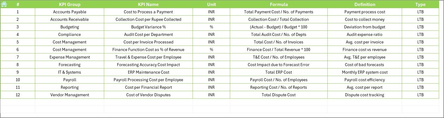
- Define each KPI clearly with:
- KPI Name
- Group
- Unit
- Formula
- Short and clear definition
Advantages of the Cost Efficiency KPI Dashboard
Implementing this Excel dashboard brings several practical benefits:
✅ Clear Financial Visibility
You get a full picture of how efficiently your finance team is managing costs.
✅ Quick Decision-Making
Since the data is visualized with comparisons and trends, it’s easier to take corrective action.
✅ Centralized Data Tracking
Having actuals, targets, and historical data in one place prevents confusion and speeds up reporting.
✅ No Complex Software Required
Excel is familiar to most finance professionals, so there’s no learning curve.
✅ Time-Saving Automation
Dropdowns, dynamic charts, and conditional formatting eliminate manual work.
Best Practices for Using the KPI Dashboard
Click to Purchases Finance and Accounting Cost Efficiency KPI Dashboard in Excel
To get the best out of your Finance and Accounting KPI Dashboard, follow these tips:
1. Define Your KPIs Clearly
Use the KPI Definition Sheet to add short, specific formulas and definitions. This helps every stakeholder understand what each metric measures.
2. Update Regularly
Keep your actual numbers, targets, and historical data updated monthly. Consistent data ensures accurate trend analysis.
3. Use Color Coding for Trends
Highlight increases and decreases using green and red arrows. This instantly shows if performance is improving or declining.
4. Analyze Both MTD and YTD
Don’t rely on monthly data alone. Year-to-date performance gives a broader view of progress.
5. Review Trends, Not Just Values
Trends offer more insight than isolated numbers. Use the KPI Trend Sheet to visualize patterns and make smarter decisions.
❓ What KPIs Should You Track for Cost Efficiency in Finance?
Not all KPIs are created equal. Here are some commonly used KPIs included in this dashboard:
- Cost per Invoice Processed: Measures the efficiency of accounts payable.
- Finance Function Cost as % of Revenue: Indicates how much of total revenue goes into finance operations.
- Budget Variance: Highlights the difference between budgeted and actual spending.
- Account Reconciliation Cycle Time: Tracks how long it takes to reconcile accounts.
- Days Payable Outstanding (DPO): Shows how long your company takes to pay its bills.
- Finance Errors per Month: Measures accuracy in financial reporting.
- Cost to Serve per Customer: Assesses support costs per client.
- Automation Rate of Financial Tasks: Tracks the share of tasks handled by automation.
- Time to Close Monthly Accounts: Shows the number of days taken to finalize monthly financials.
- Number of Late Payments: Counts delayed vendor payments.
These KPIs provide a balanced view of cost control, process efficiency, and accuracy.
📊 How to Customize the Dashboard for Your Organization
This Excel-based dashboard is fully editable. Here’s how to make it your own:
- ✏️ Add or Remove KPIs: Go to the KPI Definition Sheet and update the list.
- 🔄 Change Months or Years: Use the E1 cell in the Actual Numbers Input tab.
- ✉️ Insert Your Logo: Add your company logo to the Home or Dashboard sheet.
- 📊 Edit Charts: Adjust the chart data ranges to match your needs.
- 🌐 Localize Units or Currency: Modify units like USD, INR, EUR, etc.
Why Use Excel Instead of Expensive Tools?
Excel continues to be a preferred tool for finance teams around the globe. Here’s why:
- ⚡ It’s easily accessible and doesn’t require extra software.
- 💼 Your team is already comfortable using Excel.
- 📊 You can create custom dashboards and templates.
- 📅 It saves time and money on licenses and subscriptions.
- ✏️ You get full control over formulas and layout.
When Should You Use a Cost Efficiency Dashboard?
Use this dashboard:
- During monthly or quarterly financial reviews
- While preparing for audits or board meetings
- For tracking cost optimization initiatives
- To evaluate performance of finance departments
- For benchmarking year-on-year financial efficiency
Real-World Use Case Example
Let’s say your finance team wants to reduce the Time to Close Monthly Accounts from 8 days to 5 days. You set the target, track actuals each month, and use the dashboard to monitor the difference. If you notice the number hasn’t improved for 3 months, you can dig deeper and take action. This is how the dashboard helps you stay on top.
Conclusion
The Finance and Accounting Cost Efficiency KPI Dashboard in Excel is more than just a spreadsheet. It’s a smart, strategic tool that empowers your team to cut costs, improve efficiency, and make better financial decisions. With clear visuals, easy data input, and real-time insights, it transforms your finance function into a performance powerhouse.
Start using this dashboard today and experience the difference in your financial management approach.
Frequently Asked Questions (FAQs)
👉 What is the purpose of a Cost Efficiency KPI Dashboard in finance?
It helps finance teams monitor, evaluate, and optimize their cost-related performance using clear and actionable metrics.
👉 How do I update the dashboard every month?
Go to the Actual Numbers Input sheet, update the month in cell E1, and enter the new MTD and YTD values.
👉 Can I add more KPIs to this dashboard?
Yes! Just go to the KPI Definition Sheet and input your new KPIs, then update your input and chart data accordingly.
👉 Is this template beginner-friendly?
Absolutely. It’s designed for users with basic Excel knowledge and includes easy navigation and dropdown options.
👉 Can I use this dashboard for departments other than finance?
While it’s tailored for finance, you can customize it for any department that needs performance tracking through KPIs.
Click to Purchases Finance and Accounting Cost Efficiency KPI Dashboard in Excel
Visit our YouTube channel to learn step-by-step video tutorials
Watch the step-by-step video Demo: