Managing business finances can quickly become overwhelming when the data is spread across multiple sheets, reports, and departments. That’s where a Finance Summary Dashboard in Excel steps in to transform how you view and manage financial data. This article walks you through everything you need to know about creating and using a Finance Summary Dashboard in Excel—from its structure and benefits to best practices and frequently asked questions.
What is a Finance Summary Dashboard in Excel?
A Finance Summary Dashboard in Excel is a visual and interactive reporting tool that helps track your business’s key financial metrics in one place. Whether you’re a small business owner or a financial analyst, this dashboard allows you to monitor revenues, expenses, and profit/loss trends using charts, slicers, and pivot tables. Instead of juggling multiple reports, you get a clean and organized view of your financial health.
Structure of the Finance Summary Dashboard
Click to Finance Summary Dashboard
Our ready-to-use Finance Summary Dashboard includes four main analytical worksheets and two supporting sheets. Let’s break them down:
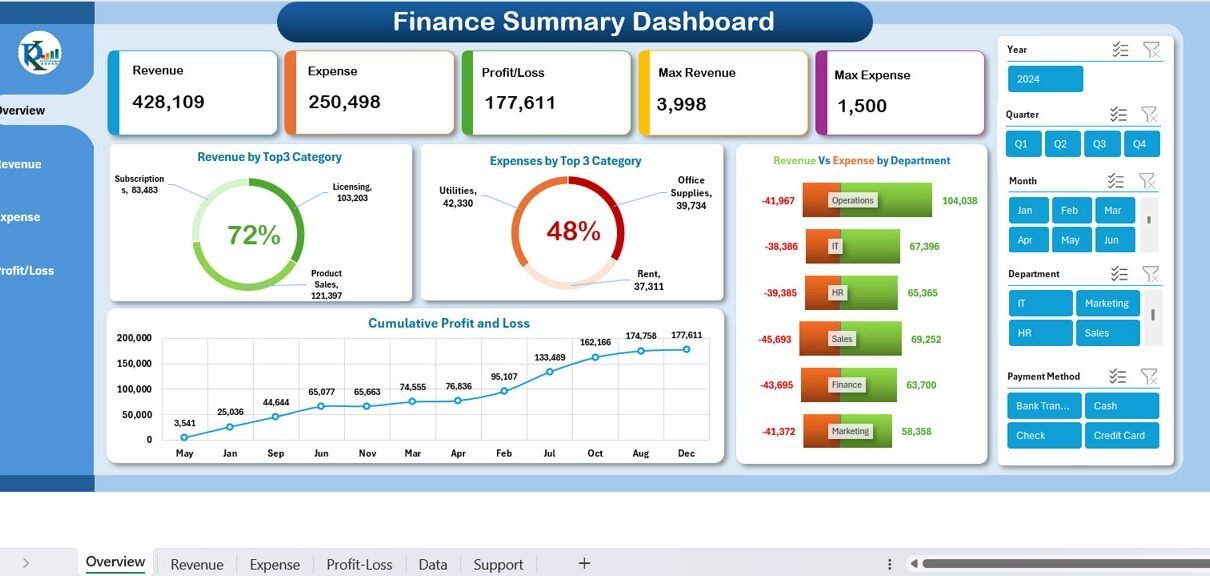
Overview Sheet
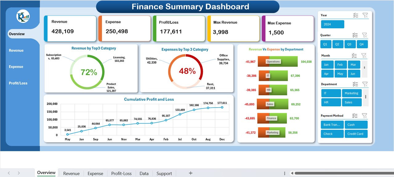
The Overview page is the main dashboard landing page. It provides a high-level summary of your financials using interactive cards and charts.
Key Components:
- Revenue, Expenses, Profit/Loss, Max Revenue, Max Expense Cards: At a glance, see how your business is performing.
- 5 Interactive Slicers: Filter data by Year, Quarter, Month, Department, and Payment Method.
- Charts Included:
- Revenue by Top 3 Categories
- Expenses by Top 3 Categories
- Revenue vs. Expenses by Department
- Cumulative Profit and Loss
This page helps top-level decision-makers get quick insights without diving into granular data.
Revenue Sheet
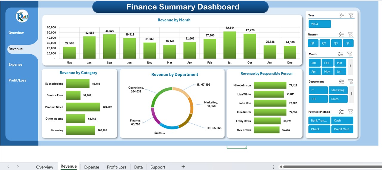
This worksheet gives you a detailed view of how and where your revenue is coming from.
Components:
- Slicers: Same 5 slicers as above for dynamic filtering.
Charts:
- Revenue by Month
- Revenue by Category
- Revenue by Department
- Revenue by Responsible Person
- You can easily compare performance across timeframes, teams, and products/services.
Expense Sheet
Just like revenue, it’s important to track your expenses to manage costs effectively. This sheet gives you a detailed view of where money is being spent.
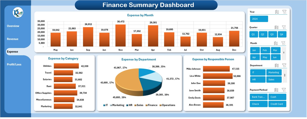
Components:
- Slicers: Year, Quarter, Month, Department, Payment Method
Charts:
- Expenses by Month
- Expenses by Category
- Expenses by Department
- Expenses by Person
- Tracking expenses this way ensures transparency and better cost control.
Profit-Loss Sheet
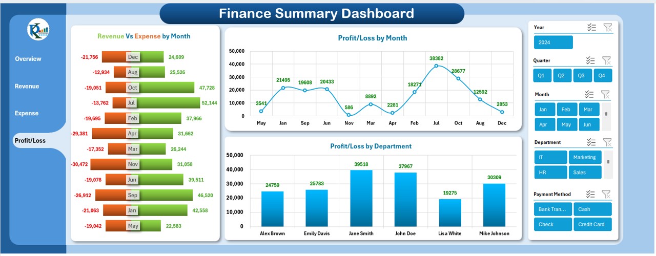
Click to Buy Finance Summary Dashboard
This is where revenue and expense data combine to show your profit and loss trends. It helps you determine whether your business is growing or losing money—and why.
Components:
- Slicers: Same 5 slicers to analyze the data from different angles.
Charts:
- Revenue vs. Expenses by Month
- Profit/Loss by Month
- Profit/Loss by Department
- This sheet is incredibly useful for tracking overall business health.
Data Sheet Tab
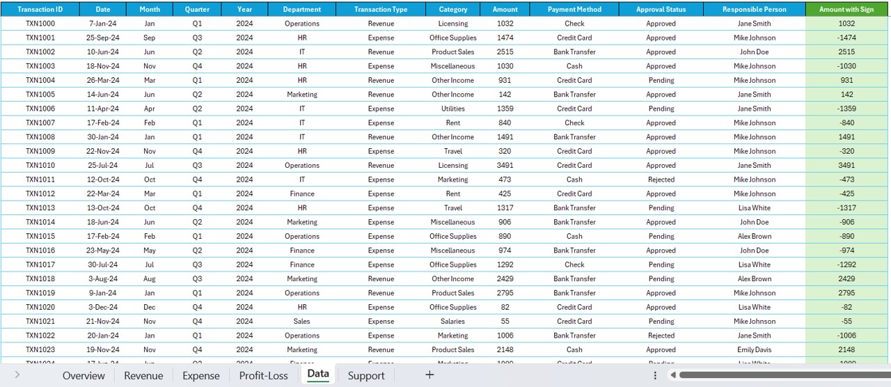
This sheet contains the raw transaction data and is the foundation for your dashboard.
- Columns Included:
- Transaction ID
- Date, Month, Quarter, Year
- Department, Category, Payment Method
- Transaction Type (Revenue/Expense)
- Amount, Responsible Person, Approval Status
- Amount with Sign (for profit/loss calculation)
This data is well-structured and ready to use—no need for additional formatting.
Support Sheet Tab
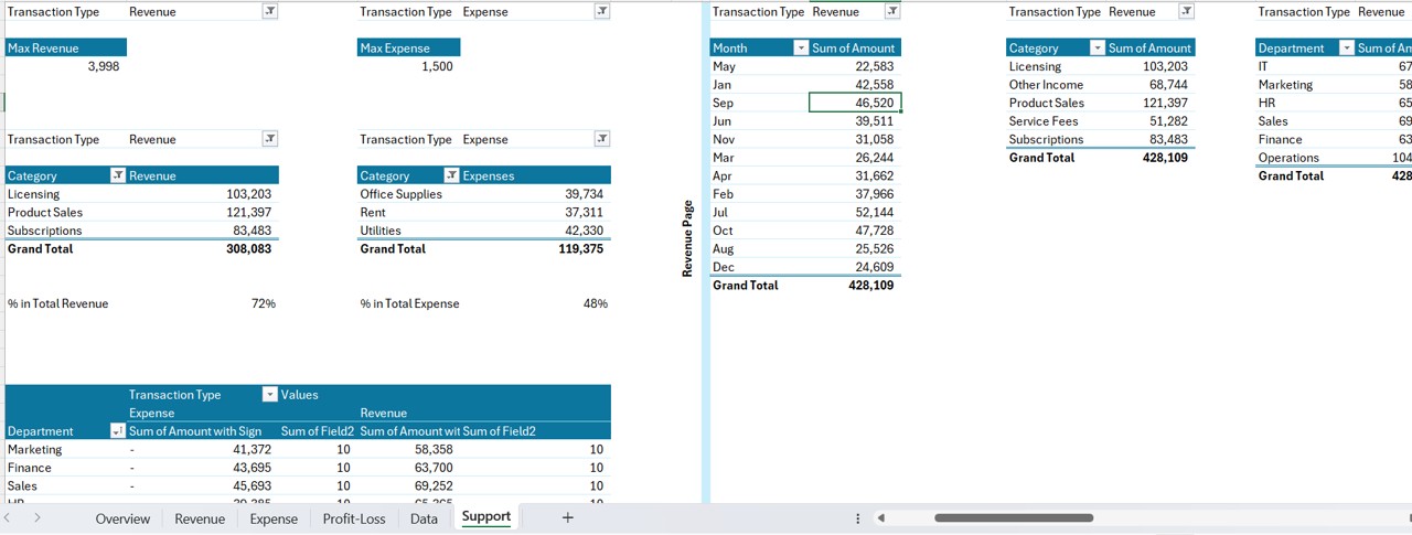
This hidden sheet contains Pivot Tables used to create charts on the dashboard. It supports the backend calculations and should not be modified. Feel free to hide it!
Advantages of Using a Finance Summary Dashboard in Excel
A dashboard like this offers several key benefits that make it a must-have for any business:
📊 1. Consolidated Financial View: Instead of jumping between multiple reports, you get everything you need in one place.
🕒 2. Saves Time and Effort: Automated calculations and visualizations reduce manual work and allow faster decision-making.
🎯 3. Customizable Filters: Slicers let you view specific data segments without changing the entire dataset.
📈 4. Easy to Understand: With well-designed charts and cards, even non-finance people can interpret the data quickly.
🔁 5. Real-Time Updates: Once you update the Data Sheet, all linked dashboards update automatically.
Click to Buy Finance Summary Dashboard
🚀 Best Practices for the Finance Summary Dashboard in Excel
To make the most of your dashboard, follow these tried-and-tested best practices:
🧹 1. Keep the Data Clean: Ensure your transaction data is accurate, complete, and consistently formatted.
📅 2. Use Standard Date Formats: This helps Excel slicers and charts work more efficiently.
📌 3. Don’t Modify the Support Sheet: Let it work in the background. It’s crucial for chart functionality.
🎨 4. Use Conditional Formatting: Add highlights to important metrics like negative profit or large expenses.
🔄 5. Refresh Pivot Tables Regularly: Make sure your charts reflect the most recent data after updates.
🔒 6. Protect the Dashboard Sheet: To prevent accidental edits, protect your final dashboard layout.
🤔 Why Should You Choose Excel for Your Finance Dashboard?
Excel remains one of the most versatile and accessible tools for creating dashboards. Here’s why:
- No coding required
- Customizable and scalable
- Widely used and supported
- Perfect for small to medium businesses
🔄 How to Update the Dashboard?
- Updating the dashboard is super simple:
- Go to the Data Sheet
- Add or replace new data entries
- Refresh all pivot tables (via Data → Refresh All)
- Your dashboard will automatically update!
- You can even add monthly or weekly automation with Power Query or VBA if needed.
💡 Pro Tips to Make Your Dashboard Stand Out
- Use icons or emojis in card titles to enhance visual appeal
- Add dynamic conditional formatting to highlight top/bottom performers
- Keep charts minimal and clean—don’t overcrowd
- Always label your axes and charts properly
- Use color themes that reflect your brand
🎯 Use Cases of the Finance Summary Dashboard
- Here are some real-life scenarios where this dashboard is incredibly helpful:
- Startups can monitor cash flow quickly
- Finance departments can present insights to leadership
- Project managers can track project-specific finances
- Non-profits can monitor fund usage and grant expenditures
- Freelancers can manage client payments and expenses
🧭 Conclusion
A well-designed Finance Summary Dashboard in Excel helps you make smarter decisions by offering a clear view of your business finances. With the ability to track revenue, expenses, and profit/loss using interactive charts and slicers, you eliminate guesswork and bring clarity to your data. The best part? You don’t need to be an Excel expert to use it.
If you’re ready to streamline your financial reporting and make data-driven decisions, this dashboard is the perfect starting point!
❓ Frequently Asked Questions (FAQs)
Can I customize this Finance Summary Dashboard?
Yes, you can easily customize chart colors, slicers, and data fields based on your specific needs.
Is Excel better than Google Sheets for dashboards?
Excel offers more advanced features like Pivot Tables and Slicers, making it ideal for detailed dashboards.
What if I don’t have advanced Excel skills?
No worries! This dashboard is ready-to-use and beginner-friendly. Just input your data and refresh the pivot tables.
How often should I update the data?
That depends on your business. Weekly or monthly updates work well for most users.
Can I link this dashboard to external data sources?
Yes, with Power Query or VBA, you can connect it to external databases, websites, or APIs.
Will the dashboard work on Mac?
Yes, but some features like Slicers may have limited functionality on older Excel versions for Mac.
Is it possible to add more slicers or charts?
Absolutely! You can insert additional charts or slicers based on new KPIs or dimensions you want to track.
Can this dashboard support multiple departments?
Yes! With slicers for Department and Responsible Person, you can filter and view department-specific data.
Click to Buy Finance Summary Dashboard
Visit our YouTube channel to learn step-by-step video tutorials