In the food delivery industry, tracking performance metrics is vital to ensure smooth operations, enhance customer satisfaction, and improve profitability. Key Performance Indicators (KPIs) serve as the benchmark for success, helping food delivery businesses evaluate their progress and identify areas for improvement. A Food Delivery KPI Dashboard in Power BI is an essential tool that simplifies the process of monitoring, analyzing, and optimizing these KPIs.
In this article, we will dive deep into the structure, features, and benefits of the Food Delivery KPI Dashboard in Power BI, along with how it can transform your business operations. Whether you’re new to Power BI or looking to improve your existing dashboard, this guide will help you understand its functionality and how it can empower your business with actionable insights.
What is a Food Delivery KPI Dashboard in Power BI?
A Food Delivery KPI Dashboard in Power BI is a data visualization tool that enables food delivery businesses to track, analyze, and display key metrics and performance indicators. By using Power BI, companies can create interactive and customizable dashboards that provide a clear overview of operational performance.
These KPIs typically cover various aspects of the business, including delivery times, customer satisfaction, order accuracy, and financial metrics. A well-designed dashboard helps businesses make data-driven decisions, streamline operations, and ultimately improve customer experience.
Key Features of the Food Delivery KPI Dashboard in Power BI
Our Food Delivery KPI Dashboard template in Power BI comes with an array of powerful features that make it easy to manage and interpret data. Here are the key components that make this dashboard an essential tool for food delivery businesses:
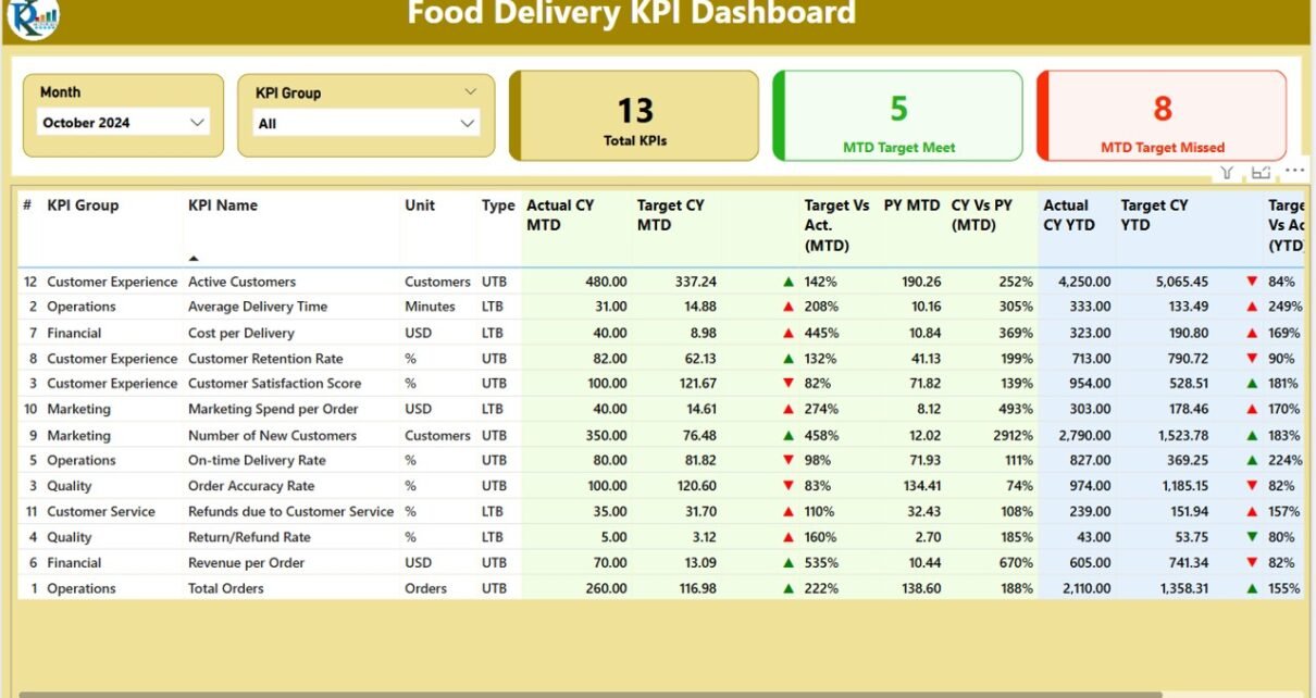
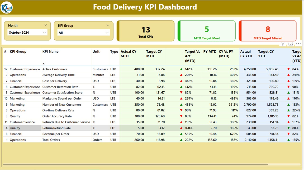
1. Summary Page
The Summary Page is the main hub of the dashboard. It displays an overview of all key performance metrics for the food delivery business, including the following:
KPI Group Slicer: Allows users to filter KPIs based on categories (e.g., Delivery Time, Customer Satisfaction, Financials).
Month Slicer: Enables users to filter the data for a specific month to compare performance across different periods.
KPI Cards: Displays three important KPIs – Total KPIs count, MTD (Month-to-Date) Target Meet count, and MTD Target Missed count.
Detailed Table: This table includes detailed information about each KPI, such as:
- KPI Number: The unique identifier for each KPI.
- KPI Group: The category to which the KPI belongs.
- KPI Name: The name of the KPI.
- Unit: The unit of measurement for the KPI.
- Type (LTB/UTB): Indicates whether the KPI is “Lower the Better” (LTB) or “Upper the Better” (UTB).
- Actual CY MTD: The actual value for the current year’s MTD.
- Target CY MTD: The target value for the current year’s MTD.
- MTD Icon: Visual indicators (▲ and ▼) show whether the KPI meets the target (green for up, red for down).
- Target vs Actual (MTD): The percentage comparison between the target and the actual MTD numbers.
- PY MTD: The MTD number from the previous year for comparison.
- CY vs PY (MTD): The percentage comparison between the current MTD and the previous year’s MTD.
Additionally, this page includes the YTD (Year-to-Date) metrics, with the same structure as MTD, offering a more comprehensive view of the business’s performance over time.
Click to buy Food Delivery KPI Dashboard in Power BI
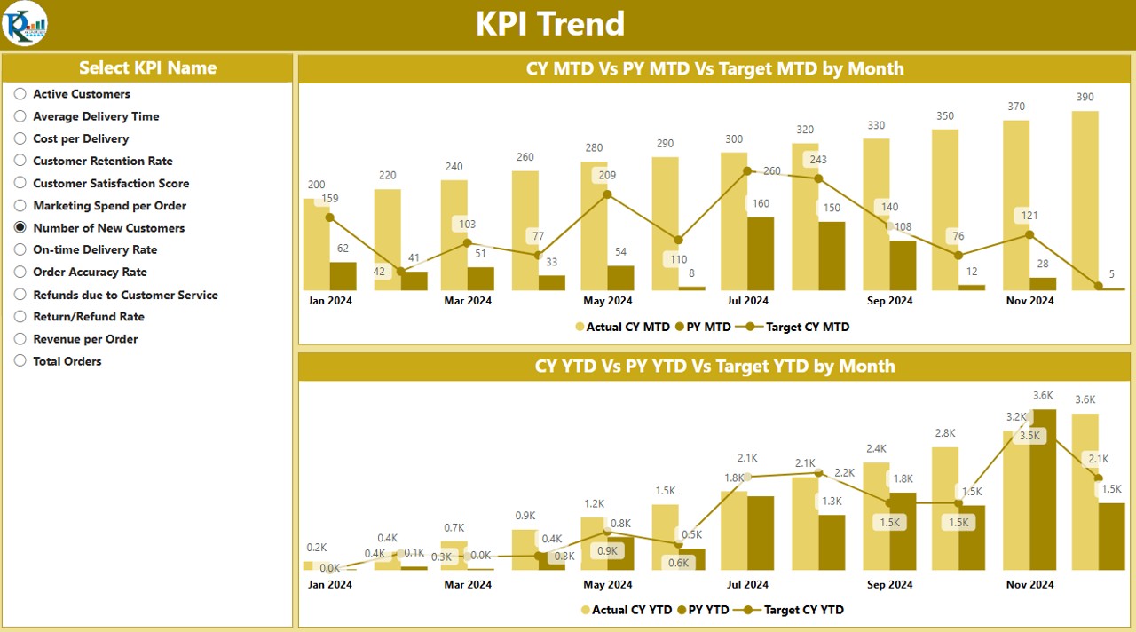
2. KPI Trend Page
The KPI Trend Page helps businesses track their KPIs over time by comparing actual numbers from the current year, previous year, and targets for both MTD and YTD. This page features:
- Combo Charts: These charts provide a clear visual representation of performance trends over time. They compare the current year’s actual numbers, the previous year’s figures, and the targets for both MTD and YTD.
- KPI Name Slicer: Allows users to select and filter specific KPIs to view their trends over time.
This page is perfect for managers who want to dive deep into the performance trends of specific KPIs, helping them identify patterns and areas that need attention.
Click to buy Food Delivery KPI Dashboard in Power BI
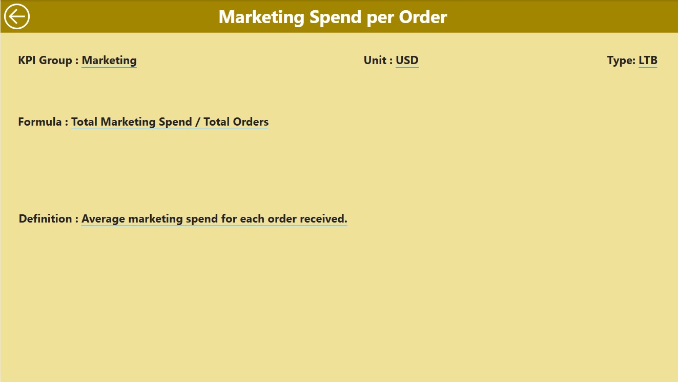
3. KPI Definition Page
The KPI Definition Page offers detailed explanations and formulas for each KPI. It is a drill-through page, meaning you can navigate from the Summary Page to the KPI Definition page by selecting any KPI. This page includes:
- KPI Formula: The formula used to calculate the KPI.
- KPI Definition: A brief description explaining the importance of the KPI and how it is measured.
- Back Button: To return to the main Summary Page.
This page is hidden by default but can be accessed via the drill-through feature, ensuring that users can easily access detailed information about each KPI without cluttering the main dashboard.
Click to buy Food Delivery KPI Dashboard in Power BI
Advantages of Using a Food Delivery KPI Dashboard in Power BI
Using a Food Delivery KPI Dashboard in Power BI offers numerous benefits to businesses. Below are some of the key advantages that make this dashboard a valuable tool:
- Centralized Data Management: The dashboard consolidates all essential KPIs in one location, making it easy to monitor and analyze data from multiple sources. Instead of relying on separate spreadsheets or reports, you can view all critical metrics in a single, unified interface.
- Real-time Insights: Power BI dashboards update automatically with real-time data, allowing businesses to track performance instantly. Whether you want to monitor daily delivery times or monthly revenue, the dashboard provides up-to-date insights at any given moment.
- Easy Customization: The Food Delivery KPI Dashboard is customizable to fit your specific business needs. You can add or remove KPIs, adjust colors and themes, and tailor the dashboard to highlight the metrics that matter most to your business.
- Improved Decision-making: By providing a clear and visually appealing view of key performance metrics, the dashboard helps decision-makers identify trends, spot issues early, and make informed decisions that improve business operations.
- Enhanced Efficiency: The dashboard allows you to easily track multiple KPIs at once, reducing the time spent manually gathering data. With everything in one place, you can focus more on analysis and strategy, improving overall productivity.
Opportunity for Improvement in the Food Delivery KPI Dashboard
While the Food Delivery KPI Dashboard in Power BI offers excellent functionality, there are always areas for improvement. Here are a few suggestions to enhance the dashboard further:
- Integration with Other Systems: Currently, the dashboard pulls data from an Excel file. To improve its functionality, consider integrating the dashboard with other business systems (e.g., CRM, point of sale, or delivery tracking software). This would allow for automated data updates and reduce manual data entry.
- Predictive Analytics: Adding predictive analytics features to the dashboard would allow businesses to forecast future trends. For instance, predicting future delivery times based on past performance or projecting sales for the upcoming months would provide additional insights for decision-making.
- Mobile Compatibility: Making the dashboard mobile-friendly would enable business owners and managers to access critical information on the go. This would be particularly useful for food delivery services that rely on quick decision-making and real-time data.
- Enhanced Data Drilldowns: Adding the ability to drill down further into each KPI would allow users to get even more granular insights. For example, drilling down into delivery times by driver or location could help identify specific operational bottlenecks.
Best Practices for Using the Food Delivery KPI Dashboard
To get the most out of your Food Delivery KPI Dashboard in Power BI, consider following these best practices:
- Regularly Update the Data: Ensure that the data fed into the dashboard is accurate and up-to-date. Set up automated data pulls from your systems to minimize human error and keep the information fresh.
- Focus on Key Metrics: While it’s tempting to track a wide range of KPIs, focus on the most relevant metrics that align with your business objectives. This ensures you’re not overwhelmed with unnecessary data and can prioritize what matters most.
- Use Conditional Formatting for Visual Cues: Leverage the conditional formatting features of Power BI to visually highlight KPIs that need attention. For example, use color-coding (green for meeting targets, red for missing them) to draw attention to performance gaps.
- Regular Review and Adjustments: Review the dashboard regularly to assess its effectiveness. If certain KPIs are no longer relevant or if new performance indicators need to be added, make the necessary adjustments to keep the dashboard aligned with your business goals.
Frequently Asked Questions (FAQs)
1. How do I add new KPIs to the Food Delivery KPI Dashboard?
To add new KPIs, simply go to the Excel file that serves as the data source. Add the necessary data for the new KPI and update the dashboard to include it.
2. Can I customize the dashboard’s appearance?
Yes, the Food Delivery KPI Dashboard in Power BI is highly customizable. You can adjust themes, colors, and layout to match your branding or personal preferences.
3. How can I track delivery times using the dashboard?
You can track delivery times by including specific KPIs related to delivery performance. These may include average delivery time, percentage of on-time deliveries, and other relevant metrics.
4. Can I integrate this dashboard with other software?
Yes, Power BI allows integration with various business systems, including CRM, POS, and delivery tracking software. This integration can automate data flow and ensure real-time updates.
5. Is the Food Delivery KPI Dashboard mobile-friendly?
Currently, the dashboard is designed for desktop use. However, you can access it on mobile devices through the Power BI mobile app, though some adjustments may be needed for smaller screens.
Conclusion
A Food Delivery KPI Dashboard in Power BI is an essential tool for food delivery businesses seeking to optimize their operations. With its comprehensive features, real-time insights, and customizable design, it helps businesses track and analyze key performance indicators effectively. By following best practices and exploring opportunities for improvement, the dashboard can serve as a powerful tool to enhance performance, increase efficiency, and drive success in the food delivery industry.
Visit our YouTube channel to learn step-by-step video tutorials
Click to buy Food Delivery KPI Dashboard in Power BI


