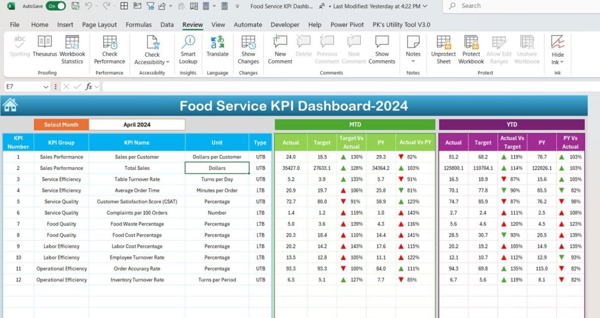
In the Food Service KPI Dashboard in Excel industry, keeping a close eye on performance is essential to stay competitive. With so many aspects of the business to monitor, from customer satisfaction to inventory management, tracking all the data can seem overwhelming. This is where a Food Service KPI Dashboard in Excel comes in handy. It simplifies the process by organizing important metrics in one place, allowing you to easily monitor key performance indicators (KPIs).
This guide will walk you through the features of a Food Service KPI Dashboard template, explain how it works, and provide useful insights on how to maximize its potential. We will also cover best practices, opportunities for improvement, and frequently asked questions to help you get the most out of this tool.
Click to buy Food Service KPI Dashboard in Excel
Key Features of the Food Service KPI Dashboard
The Food Service KPI Dashboard in Excel is built in Excel and comes with seven worksheets that help track and display important KPIs. Here’s an overview of each sheet and what it offers Food Service KPI Dashboard in Excel.
Home Sheet
Click to buy Food Service KPI Dashboard in Excel
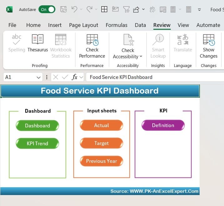
First and foremost, the Home Sheet acts as an index page for the entire dashboard. It’s designed to make navigation as easy as possible. With six buttons linking directly to the main sheets, you can quickly jump to the section you need, saving valuable time.
Dashboard Sheet Tab
Click to buy Food Service KPI Dashboard in Excel
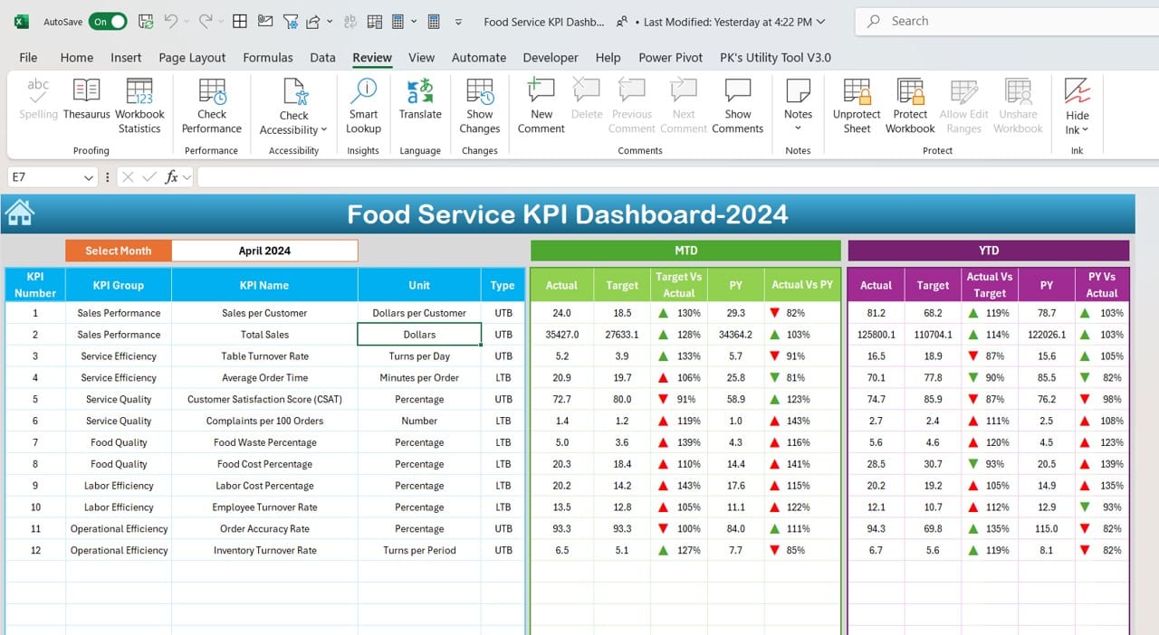
Now, moving on to the Dashboard Sheet Tab, this is the main part of the dashboard where the bulk of your performance data is displayed. Here’s how it works:
- Month Selection: In cell D3, you can choose the desired month from a dropdown list. The data for that specific month will automatically update across the dashboard, giving you a clear snapshot of performance.
- MTD and YTD Data: The sheet displays Month-to-Date (MTD) and Year-to-Date (YTD) data, showing actual performance, target values, and numbers from the previous year. Additionally, you’ll notice arrows highlighting trends, such as whether a KPI has improved or declined, thanks to built-in conditional formatting.
The ability to switch months and instantly view target comparisons with last year’s data makes it easy to monitor progress and adjust strategies accordingly.
KPI Trend Sheet Tab
Click to buy Food Service KPI Dashboard in Excel
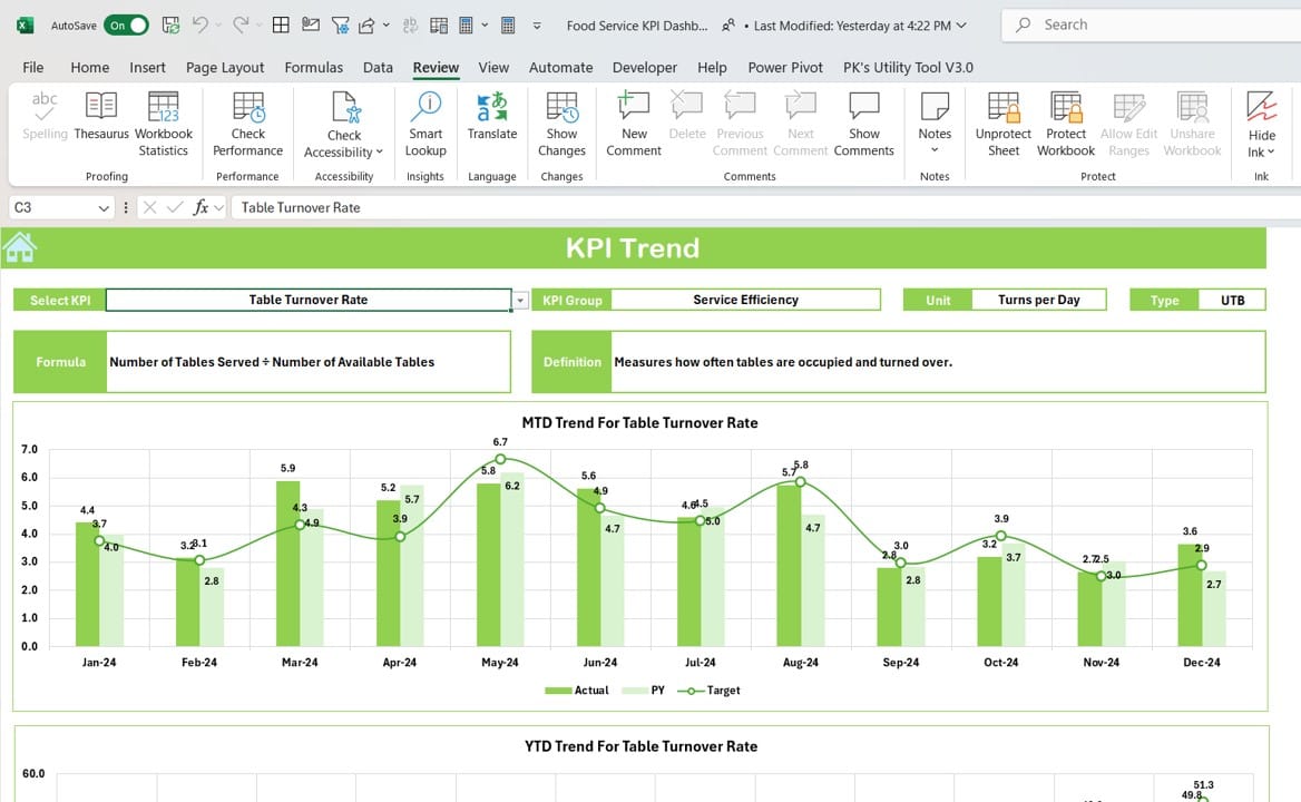
Next, the KPI Trend Sheet Tab provides more detailed insights into each KPI. To begin, select the KPI you want to focus on from a dropdown in cell C3. After selecting, the following information will appear:
- KPI Group: Helps categorize KPIs for better organization.
- Unit of Measurement: Displays how the KPI is measured (e.g., percentage, units, etc.).
- KPI Type: Indicates if the KPI is a “Lower is Better” or “Upper is Better” metric.
- Formula: Shows the formula used to calculate the KPI.
- Definition: Offers a brief explanation of what the KPI measures.
In addition to these details, the sheet also includes trend charts that compare MTD and YTD actual numbers with targets and previous year data, giving you a visual representation of progress.
Actual Numbers Input Sheet
Click to buy Food Service KPI Dashboard in Excel
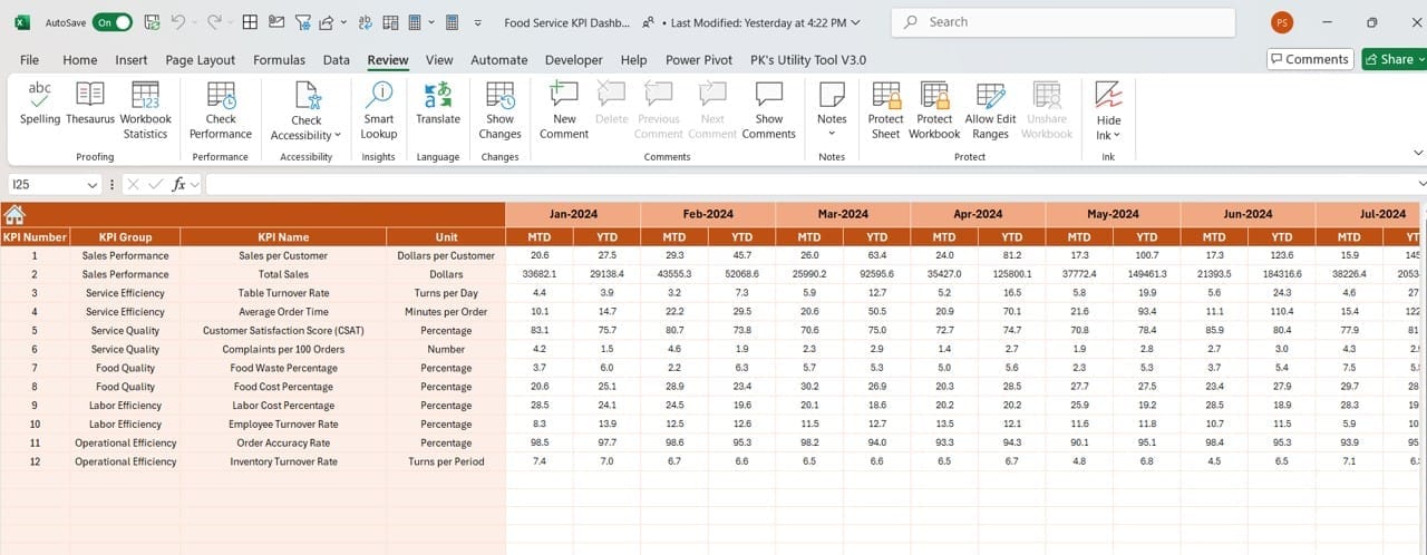
This Actual Numbers Input Sheet is where you enter the real performance data for each KPI. The sheet is quite straightforward:
- Enter the actual numbers for both MTD and YTD in the corresponding columns.
- Select the month by typing the first month of the year into cell E1.
By regularly updating this sheet, you ensure that the dashboard reflects the most current and accurate performance data.
Target Sheet Tab
Click to buy Food Service KPI Dashboard in Excel
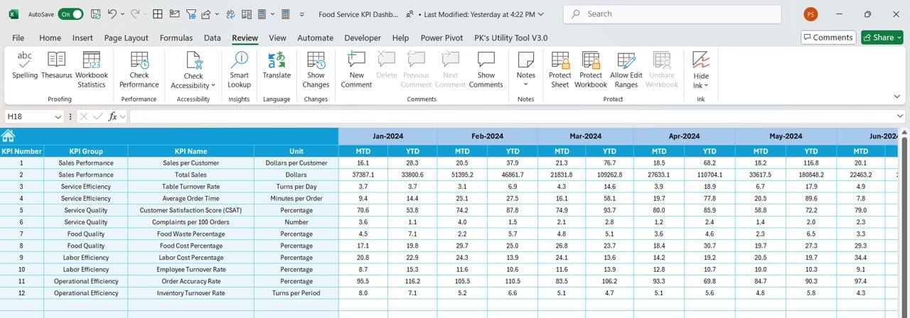
The Target Sheet Tab is equally important. This is where you input the performance goals or targets for each KPI:
- You can enter monthly (MTD) and yearly (YTD) targets for every KPI.
- These targets are then used to compare actual performance and give you a clear sense of whether your business is meeting its goals.
Previous Year Number Sheet Tab
Click to buy Food Service KPI Dashboard in Excel
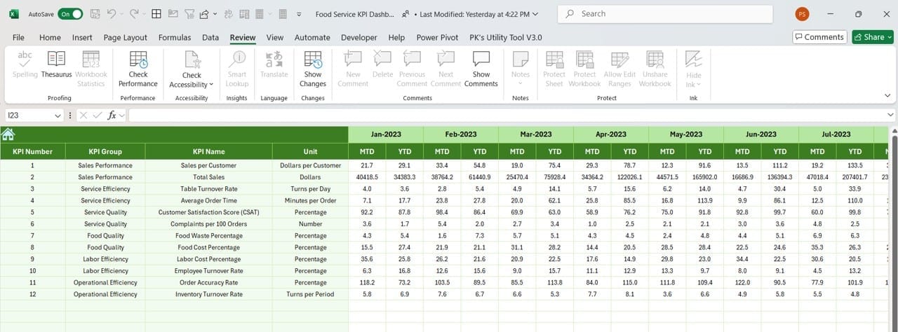
In the Previous Year Number Sheet Tab, you input the actual numbers from the previous year. This data is essential because it allows you to:
- Compare current performance with last year’s numbers, helping identify growth trends or areas of concern.
Entering this information ensures a side-by-side comparison of this year’s progress versus last year’s results, which is invaluable when it comes to long-term planning and forecasting.
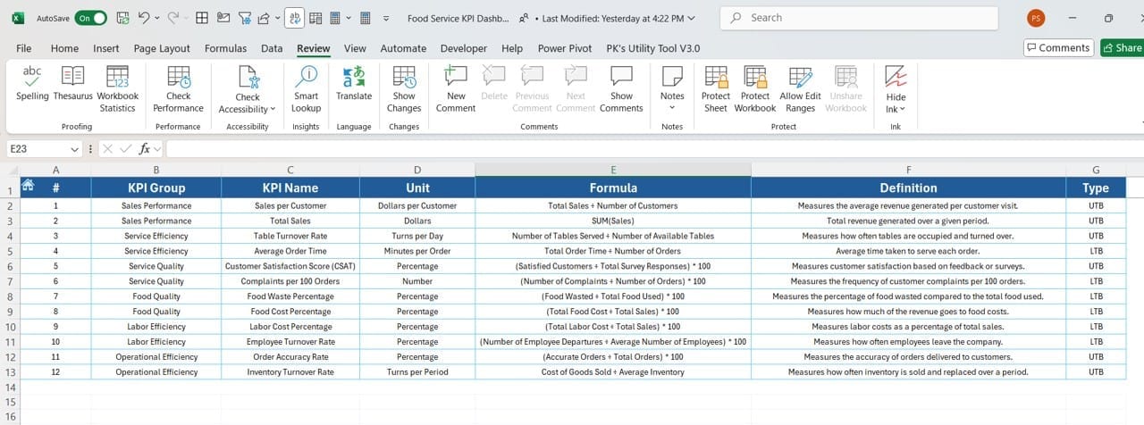
KPI Definition Sheet Tab
Click to buy Food Service KPI Dashboard in Excel
Finally, the KPI Definition Sheet Tab is a reference guide for all the KPIs in the dashboard. Here’s what you’ll need to enter:
- KPI Name
- KPI Group
- Unit of Measurement
- Formula used to calculate the KPI
- A clear definition of what the KPI measures
This sheet helps ensure consistency and clarity, so everyone in the organization understands the purpose of each metric and how it’s calculated.
Advantages of Using the Food Service KPI Dashboard
There are many benefits to using a KPI Dashboard in Excel, especially in the fast-paced food service industry. Here’s why this tool can be a game changer:
- Real-time Data Insights: One of the biggest advantages is that the dashboard updates in real-time. With the ability to input and analyze data on a monthly and yearly basis, you’ll always know exactly how your business is performing, allowing for quick decision-making.
- Improved Focus on Goals: By tracking KPIs that are directly tied to your business objectives, you can stay focused on what matters most. Whether it’s reducing food waste, improving customer satisfaction, or increasing sales, this dashboard helps you keep your eye on the prize.
- Better Trend Analysis: The ability to compare current performance with both target numbers and last year’s data gives you a deeper understanding of trends. This makes it easier to see what’s working and where improvements are needed.
- Customizable and Flexible: Since the dashboard is built in Excel, it’s highly customizable. You can easily add new KPIs or modify existing ones to meet the unique needs of your business. This flexibility is a huge advantage, especially for growing businesses.
Click to buy Food Service KPI Dashboard in Excel
Best Practices for Using the Food Service KPI Dashboard
While the dashboard is an excellent tool, there are several best practices you can follow to ensure you’re using it to its full potential:
- Update Data Regularly: Make sure to input actual performance data regularly, whether it’s daily, weekly, or monthly. Consistently updating the numbers ensures the dashboard provides an accurate reflection of your business’s performance.
- Set Achievable Targets: While it’s important to aim high, be sure that the targets you set in the Target Sheet Tab are realistic. Overly ambitious goals can be discouraging, while targets that are too easy won’t push your team to perform at their best.
- Utilize Conditional Formatting: The built-in conditional formatting, which highlights trends with arrows and colors, is a powerful feature. Use it to quickly identify areas where performance is lagging, so you can act right away.
- Review Trends Consistently: Don’t just look at KPIs in isolation. Use the KPI Trend Sheet Tab to analyze performance over time and across different metrics. This will help you spot long-term trends that may not be immediately obvious.
Opportunities for Improvement in the Food Service KPI Dashboard
Click to buy Food Service KPI Dashboard in Excel
While this dashboard is highly effective, there’s always room for improvement. Here are a few opportunities to consider:
- Automate Data Entry: Currently, data needs to be entered manually. However, adding automation features, such as linking the dashboard to a POS system or inventory management software, could save time and reduce errors.
- Enhanced Visualizations: Although the dashboard includes basic charts and graphs, integrating more advanced visualization tools, such as Power BI, could improve the user experience by making the data even more interactive.
- Mobile Accessibility: Managers are often on the go, especially in the food service industry. Developing a mobile-friendly version of the dashboard would allow users to access it from any device, making it easier to stay informed even when they’re not at a desk.
Click to buy Food Service KPI Dashboard in Excel
Conclusion
In conclusion, the Food Service KPI Dashboard in Excel is an invaluable tool for anyone looking to monitor and improve the performance of their food service business. With seven dedicated sheets covering everything from real-time data tracking to trend analysis, this dashboard helps you stay organized, focused, and informed.
By regularly updating the data, setting realistic targets, and reviewing trends, you can use this dashboard to make informed decisions that drive business growth. Moreover, with the flexibility that Excel offers, you can easily tailor the dashboard to fit your specific needs.
Frequently Asked Questions (FAQs)
Q. What is a KPI Dashboard in Excel?
A KPI dashboard in Excel is a tool used to visualize key performance indicators (KPIs) and monitor business performance. It provides a clear and concise way to track important metrics in real time.
Q. Why should I use a Food Service KPI Dashboard?
Using a Food Service KPI Dashboard allows you to track essential business metrics, identify trends, and make data-driven decisions. It helps ensure you’re meeting your goals and staying competitive in the market.
Q. How can I customize the dashboard for my business?
The dashboard is built in Excel, which makes it highly customizable. You can add new KPIs, adjust formulas, or modify the layout to suit your business’s specific needs.
Q. How often should I update the data?
To get the most accurate insights, it’s recommended to update the data regularly—whether that’s daily, weekly, or monthly—depending on how closely you need to track performance.
Q. Can I use this dashboard for tracking non-food service KPIs?
Absolutely!
Visit our YouTube channel to learn step-by-step video tutorials
Click to buy Food Service KPI Dashboard in Excel
