In the dynamic field of food supply chain management, leveraging Key Performance Indicators (KPIs) through an Excel dashboard can significantly enhance decision-making and operational efficiency. This article introduces a meticulously designed Food Supply Chain KPI Dashboard, a powerful tool ready to deploy for managing and improving performance.
Click to Purchase Food Supply Chain KPI Dashboard in Excel
Understanding the Food Supply Chain KPI Dashboard
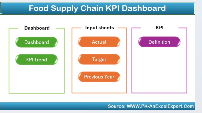
The Food Supply Chain KPI Dashboard in Excel is an essential tool for professionals in the food industry aiming to track and improve their operations. It consists of a series of interconnected worksheets each serving a specific function, providing a holistic view of performance metrics.
Key Features of the Food Supply Chain KPI Dashboard
Home Sheet: The Gateway to Your Data

The Home sheet functions as the index of the dashboard. It features six buttons that provide immediate access to the respective sheets, simplifying navigation and enhancing user experience.
Dashboard Sheet Tab: The Heart of the Dashboard

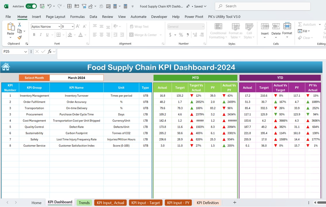
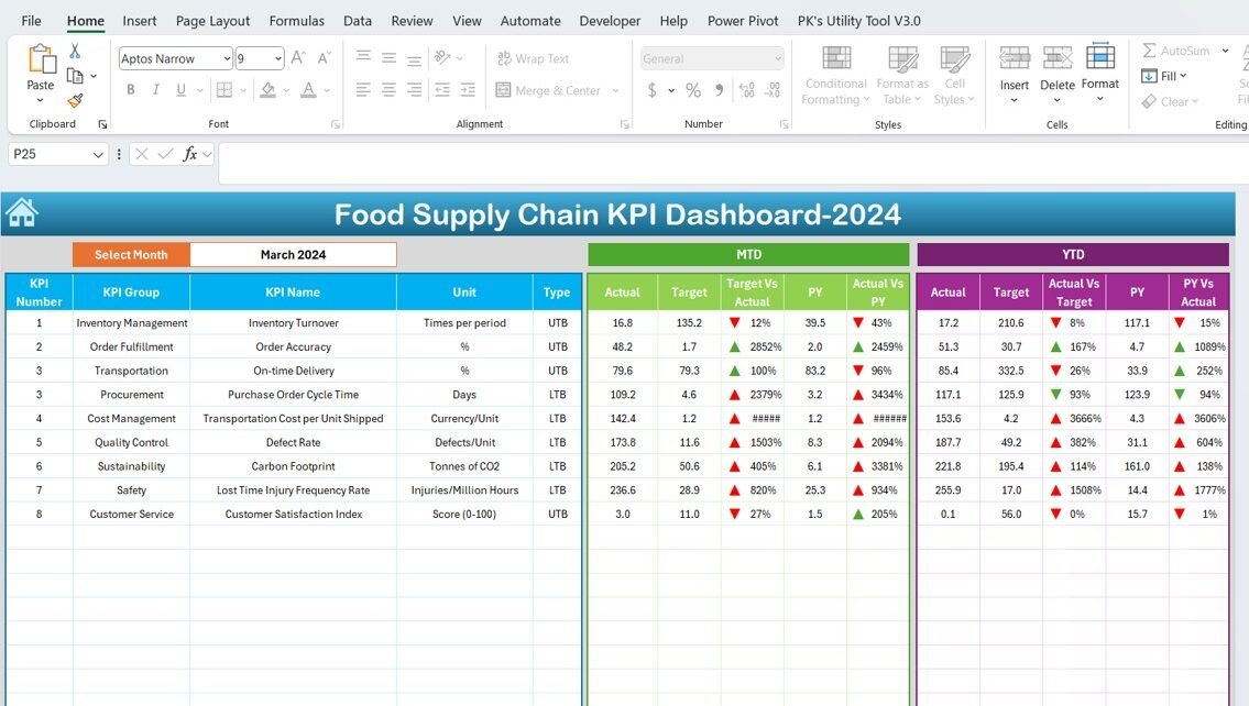
- The main tab displays comprehensive KPI data. Users can select a month from a drop-down on range D3, updating the dashboard to reflect the chosen period.
- It presents data such as Month-To-Date (MTD) Actual, Target, Previous Year data, Year-To-Date (YTD) Actual, and more.
- Visual aids like conditional formatting arrows indicate performance compared to targets and previous year figures, making it easy to digest complex data at a glance.
KPI Trend Sheet Tab: Visualizing Progress

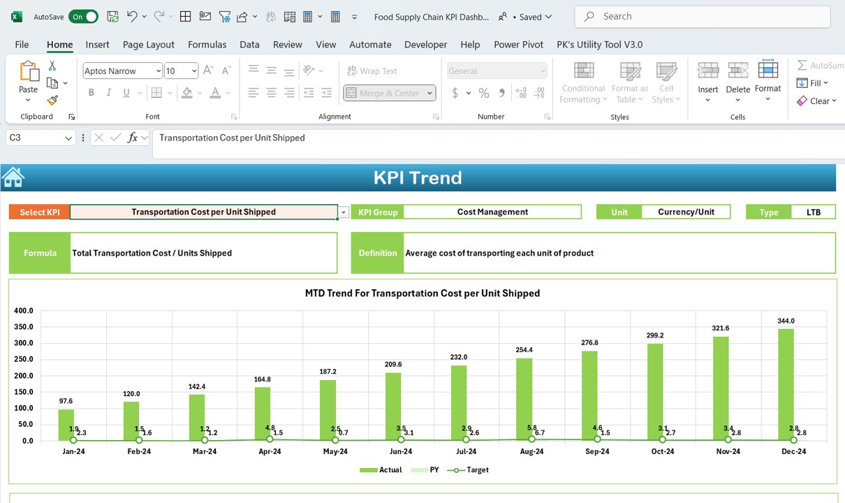
- Here, you can select a KPI from the dropdown at C3, which shows detailed information such as the KPI Group, Unit, Type (whether ‘Lower is Better’ or ‘Upper is Better’), and its formula and definition.
- The tab also features MTD and YTD trend charts for Actual, Target, and Previous Year numbers, providing a visual representation of performance over time.
Actual Numbers Input Sheet: Data Entry Made Easy

This sheet is designated for entering actual MTD and YTD numbers for specific months. You can adjust the month by changing the range at E1.
Target Sheet Tab: Setting Benchmarks

Essential for planning, this tab allows for the entry of Target numbers for each KPI for MTD and YTD.
Click to Purchase Food Supply Chain KPI Dashboard in Excel
Previous Year Number Sheet Tab: Historical Context

This tab facilitates the entry of data from the previous year, enabling year-over-year performance comparisons.
KPI Definition Sheet Tab: Everything You Need to Know About Your KPIs

It is crucial for maintaining clarity about the KPIs used. This tab allows for the entry of KPI names, groups, units, formulas, and definitions.
Advantages of Using a Food Supply Chain KPI Dashboard in Excel
- Enhanced Visibility: Instantly see key metrics and trends that impact the food supply chain.
- Improved Decision Making: With accurate and up-to-date information, make informed decisions that can lead to significant operational improvements.
- Increased Efficiency: Automate the tracking of performance against key metrics, reducing manual labor and the potential for errors.
- Strategic Planning: Use historical data and trend analysis to forecast future needs and set realistic performance goals.
Best Practices for Implementing the Food Supply Chain KPI Dashboard
- Regular Updates: Ensure that the data entered in the dashboard is current to maintain its accuracy and relevance.
- Comprehensive Training: Provide thorough training for all users of the dashboard to maximize its effectiveness.
- Data Verification: Regularly check the data for errors, which could significantly impact decision-making.
- Customization: Adapt the dashboard to better fit the specific needs of your organization or specific areas within your supply chain.
Conclusion
Implementing the Food Supply Chain KPI Dashboard in Excel within your organization can lead to more informed decision-making and enhanced operational efficiency. By leveraging the full capabilities of this tool, you can gain a competitive edge in the fast-paced food industry.
Frequently Asked Questions with Answers
Q1: How often should I update the data in the dashboard?
A1: Data should be updated as frequently as new information becomes available, or at least monthly, to maintain accuracy.
Q2: Can I customize the dashboard to fit more specific needs?
A2: Yes, the dashboard is fully customizable. You can modify it to better suit your specific operational needs or to focus on particular areas of interest.
Q3: What should I do if the trends are not showing as expected?
A3: Verify the data for accuracy, check the formulas, and ensure that the correct month is selected in the dashboard. If issues persist, consider revisiting the KPI definitions and calculations.
Visit our YouTube channel to learn step-by-step video tutorials
View this post on Instagram


