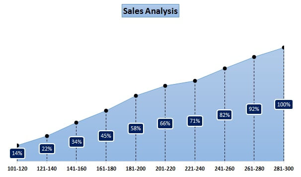
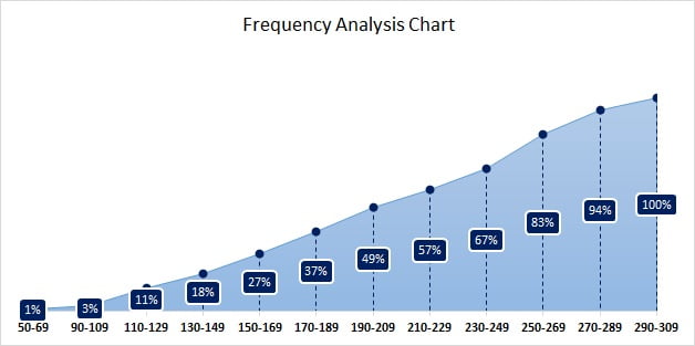
In this article you will learn how to create a Frequency Analysis chart in Excel. We will create this chart show the headcount % for different sales range. You will also learn how to create the number group and how to show the % Running Total in the pivot table. This chart is useful to understand that maximum employee are making how many sales (or any other metric).
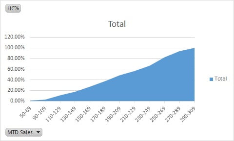
For example:- In this chart 58% of employee are making only 200 or less than 200 sales.
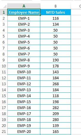
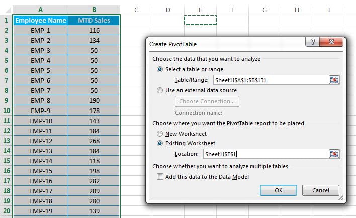
We have below given employee wise MTD Sales data.
Frequency Analysis Chart in Excel
- First of all we will create the Pivot Table on this data.
- Select the data and go to Insert tab and insert the Pivot Table.
- In Create Pivot Table window select the Existing Worksheet and give the location of same sheet.
- Frequency Analysis Chart in Excel
- Drag the MTD Sales field in ROWS and VALUES.
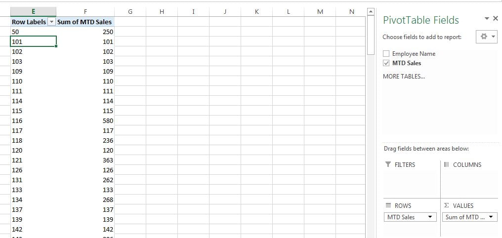
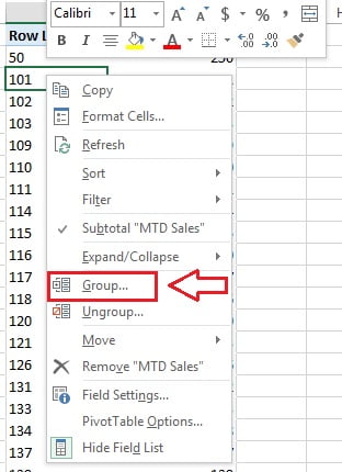
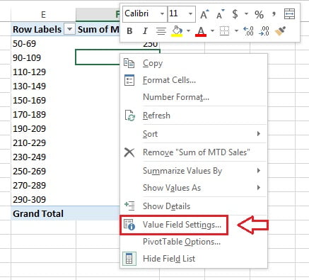
- Right Click on any value of Row Labels and click on Group.
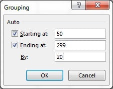
- Grouping window will be opened.
- Put 20 in “By” text box (Please take this number as per your data, here we are taking 20)
- Now right click on any number of “Sum of MTD Sales” column in the pivot table and click on Value Field Settings.
- Or you can double click on header of “Sum of MTD Sales” column.
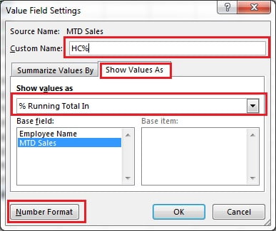
In the Value Field Settings window:
- Give the Custom Name as HC% (Head Count%)
- Select the Show Value As tab.
- Select “% Running Total In” in the Show Value As drop down.
- Change the Number format as percentage with 0 decimal place.
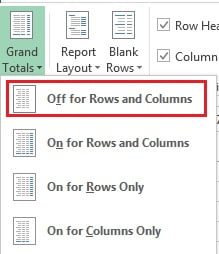
- Now remove the Grand Total from the pivot table.
- Select the pivot table and go to Design Tab>>Grand Totals>>Off for Rows and Columns.
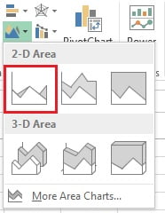
- Now select the pivot table and go to Insert tab and insert a 2D Area Chart.
- Our Pivot Chart will look like below image.
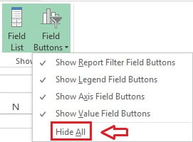
- We can remove the Pivot chart element like HC% and MTD Sales Filter.
- Select the chart and go to Analyze Tab>>Field Buttons>>click on Hide All.
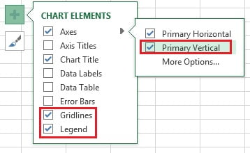
- Remove the Gridlines, Legend and Primary Vertical Axis from the chart.
- Click on ‘+‘ button (Chart Elements button) and uncheck the Gridlines, Legend and Primary Vertical Axis
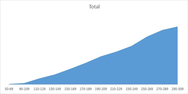
- After doing above given settings, our chart will look like below image.
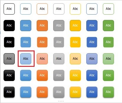
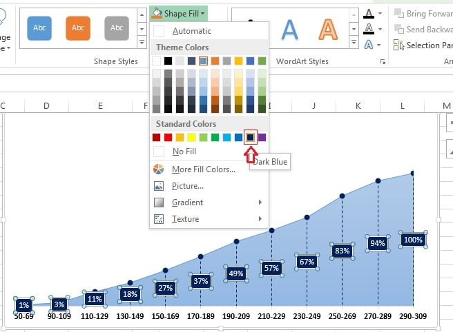
- Now select the Area (Click on blue color)
- Go to Format tab>>Shap Styles>>Choose a shape style
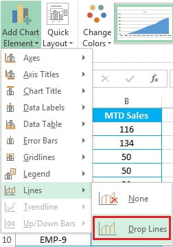
- Now select the chart and Design Tab>>Add Chart Elements>>Lines>>Drop Lines
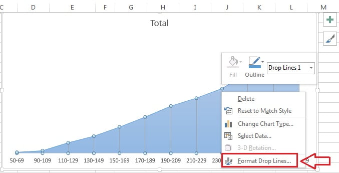
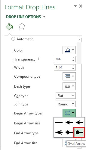
- Right click on the drop lines available on the chart and click on Format Drop Lines.
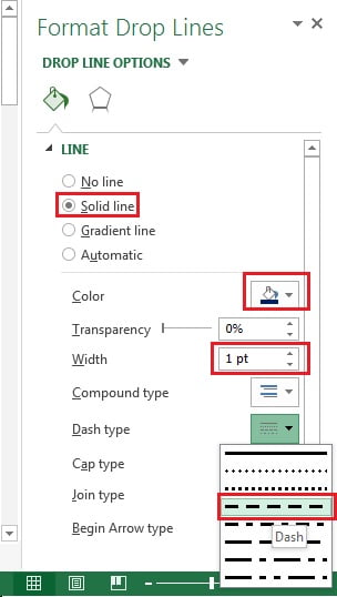
In Format Drop Lines Window
- Go to the File and Line option
- Take the Solid color as Dark Blue
- Width as 1pt.
- Dash Type as Dash (Third one)
- Take the Begin Arrow Type as Oval Arrow.
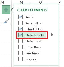
- Add the data labels from the Chart Elements.
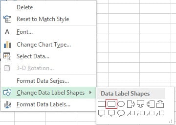
- Right Click on the data labels and go to the Change Data Label Shapes and choose Rounded Rectangle shape.
- Select the Data Labels and change the shape style from the Format tab.
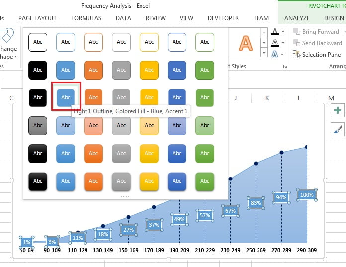
- Take the dark blue color for data label’s shapes.
Our Frequency Analysis Chart is ready and It will look like below image.
Click here to download this Excel file
Watch the video tutorial of Frequency Analysis Chart
Visit our YouTube channel to learn step-by-step video tutorials