Managing key performance indicators (KPIs) is crucial for tracking organizational performance and aligning it with strategic goals. Power BI is one of the best tools for creating dynamic dashboards that provide actionable insights. The General Management KPI Dashboard in Power BI simplifies monitoring by offering a ready-to-use template that uses Excel as its data source. This article explores the features, advantages, and best practices for creating and using this dashboard effectively.
Click to General Management KPI
Key Features of the General Management KPI Dashboard
This Power BI dashboard consists of three main pages, each designed to provide detailed insights into various KPIs. Below is a comprehensive breakdown:
Summary Page
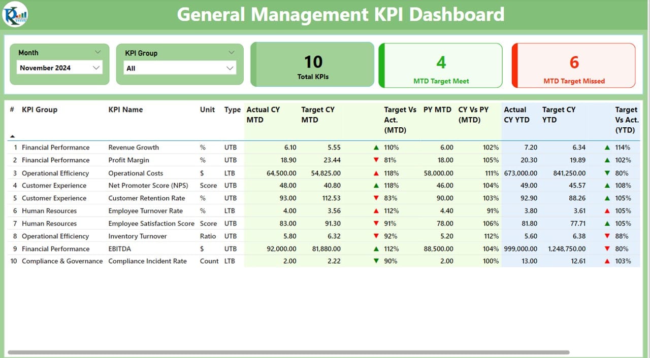
The Summary Page is the primary interface of the dashboard, offering an overview of key metrics and performance indicators.
Click to General Management KPI
- Top Features of the Summary Page:
- Interactive Slicers:
- Includes a Month slicer and a KPI Group slicer to filter data.
- Performance Cards:
- Displays three important metrics:
- Total KPIs Count
- Month-to-Date (MTD) Target Met Count
- MTD Target Missed Count
- Detailed Table View:
Provides an in-depth analysis of each KPI, covering the following details:
- KPI Number: The sequential number of the KPI.
- KPI Group: The category or group to which the KPI belongs.
- KPI Name: The name of the KPI.
- Unit: The measurement unit (e.g., percentage, currency, etc.).
- Type: Indicates whether the KPI is LTB (Lower the Better) or UTB (Upper the Better).
- MTD and YTD Values: Includes both current and previous year data for comparison.
- Status Icons: Displays visual indicators (▲/▼ in green/red) for MTD and YTD performance.
Click to General Management KPI
KPI Trend Page
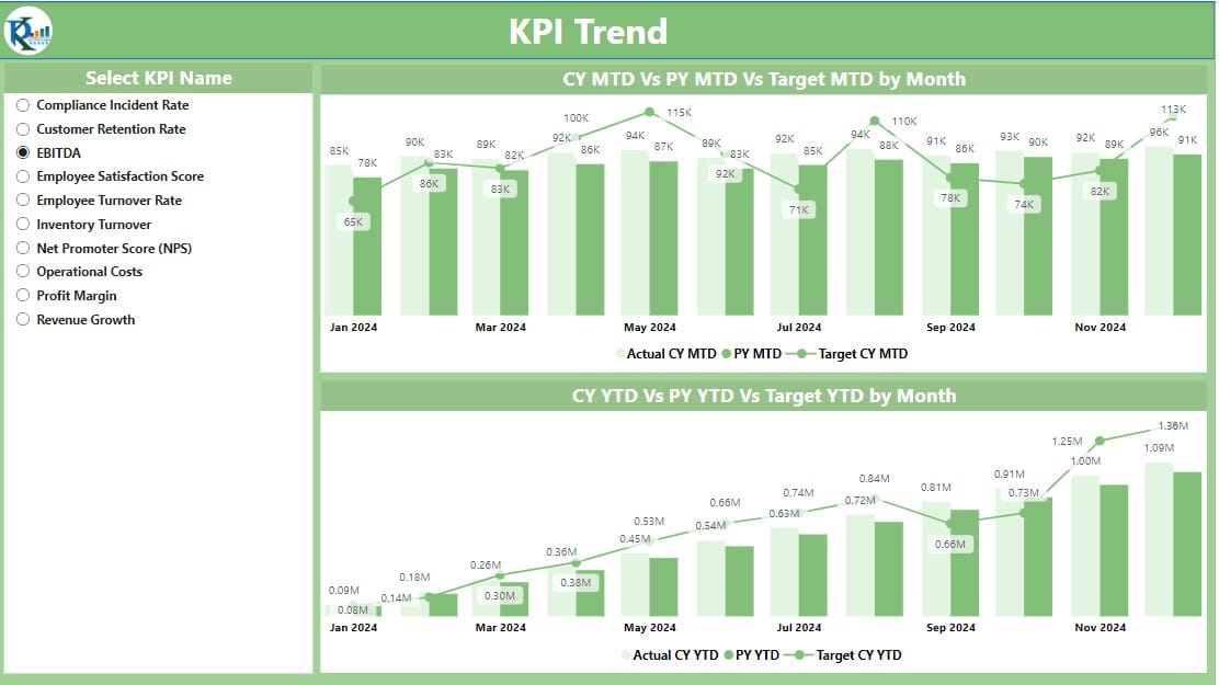
The KPI Trend Page provides a visual representation of trends, helping you analyze how performance evolves over time.
- Features of the KPI Trend Page:
- Combo Charts:
- Two charts display trends for MTD and YTD values, comparing actuals, targets, and previous year data.
- KPI Name Slicer:
- Users can select specific KPIs to focus on individual trends.
- These visualizations enable users to identify patterns, seasonality, or anomalies in their performance metrics.
KPI Definition Page
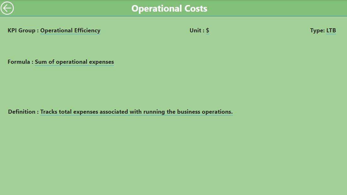
This page serves as a reference for understanding KPI calculations and definitions.
- Features of the KPI Definition Page:
Drill-Through Functionality:
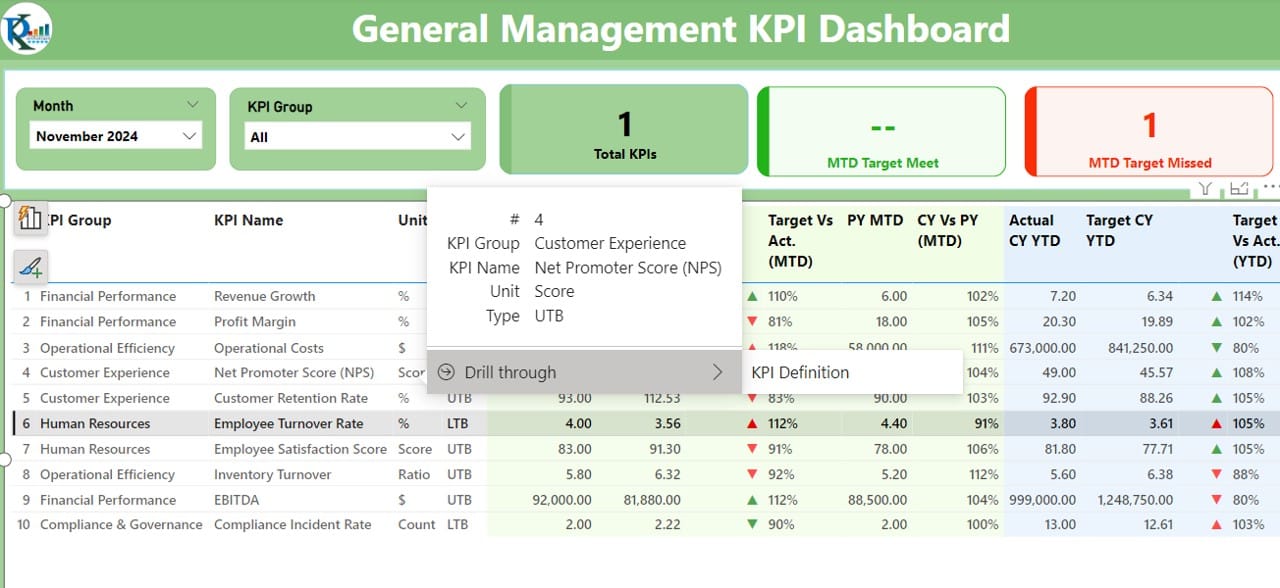
- Access this page from the Summary Page for details on formulas and definitions.
Back Navigation:
Click to General Management KPI
- Use the back button in the top-left corner to return to the Summary Page seamlessly.
- This hidden page ensures clarity and transparency in KPI tracking, reducing ambiguity.
Excel Data Integration
The dashboard relies on Excel for its data input, ensuring simplicity and flexibility. Data is distributed across three sheets:
Input Actual Sheet
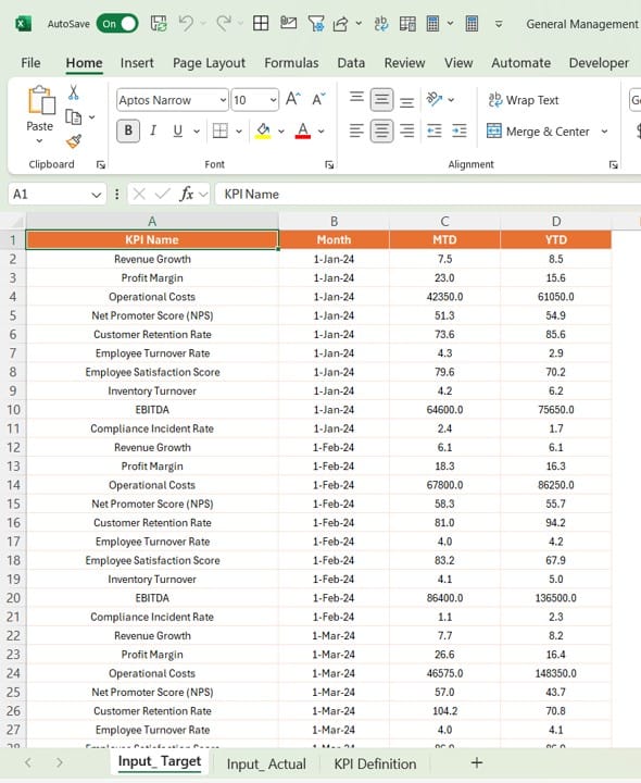
- Populate the Actual values for each KPI, including:
- KPI Name
- Month (use the first date of the month)
- MTD and YTD numbers.
Input Target Sheet
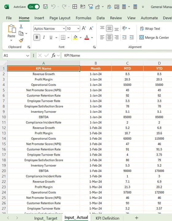
- Input Target values for each KPI with similar fields:
- KPI Name
- Month (use the first date of the month)
- MTD and YTD numbers.
KPI Definition Sheet
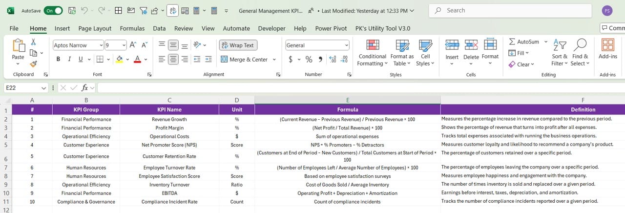
Define key details about each KPI, such as:
- KPI Number
- KPI Group
- KPI Name
- Unit
- Formula
- Definition
- Type (LTB or UTB).
Click to General Management KPI
Advantages of the General Management KPI Dashboard
- Real-Time Insights: The dashboard updates dynamically, ensuring users have access to the latest performance data.
- Actionable Visualizations: Use interactive charts, slicers, and status icons for better decision-making.
- User-Friendly: Predefined Excel templates simplify data input and ensure compatibility with Power BI.
- Customizable: Easily modify slicers, visuals, and metrics to suit organizational needs.
- Enhanced Performance Tracking: Offers a granular view of MTD and YTD values, helping identify trends and anomalies.
Best Practices for Using the General Management KPI Dashboard
To maximize the effectiveness of the KPI Dashboard, follow these best practices:
- Standardize KPI Definitions: Ensure consistency in KPI naming, units, and formulas across teams.
- Regularly Update Data: Maintain up-to-date Excel data files to avoid discrepancies in analysis.
- Leverage Drill-Through Pages: Use the hidden KPI Definition Page to educate stakeholders on KPI methodologies.
- Use Data Filters Effectively: Utilize slicers to focus on specific KPIs, months, or categories for targeted analysis.
- Analyze Trends: Regularly review trend charts to identify seasonal patterns or emerging issues.
- Train Your Team: Ensure users understand how to interact with the dashboard and interpret the data.
Conclusion
The General Management KPI Dashboard in Power BI is a powerful tool for organizations to monitor and optimize their performance metrics. Its combination of dynamic visualizations, Excel integration, and user-friendly design makes it an essential asset for decision-makers.
Frequently Asked Questions (FAQs)
Q. What is the General Management KPI Dashboard used for?
This dashboard helps organizations track and analyze their key performance indicators (KPIs) using dynamic visualizations and interactive tools.
Q. How is data updated in the dashboard?
Data is updated by modifying the linked Excel file. The Power BI dashboard refreshes automatically to reflect changes.
Q. Can the dashboard be customized for specific industries?
Yes, you can adapt the dashboard by adding or modifying KPIs, slicers, and visuals to suit industry-specific needs.
Q. How do I access the KPI Definition Page?
Use the drill-through feature from the Summary Page to navigate to the KPI Definition Page for detailed explanations.
Q. What software is required to use this dashboard?
You need Power BI Desktop and Excel to fully utilize the dashboard’s capabilities.
By following these guidelines and insights, you can effectively utilize the General Management KPI Dashboard to drive performance and achieve strategic goals.
Click to General Management KPI
Visit our YouTube channel to learn step-by-step video tutorials
View this post on Instagram


