In today’s competitive landscape, grant management plays a crucial role in ensuring that resources are allocated effectively and efficiently. With numerous stakeholders and complex data sets involved, managing grants requires the ability to monitor key metrics and performance indicators. The most efficient way to do this is through a Grant Management KPI Dashboard in Excel. This article provides a detailed overview of how you can create, manage, and optimize a Grant Management KPI Dashboard to streamline your workflow and make data-driven decisions.
Table of Contents
ToggleWhat is a Grant Management KPI Dashboard?
A Grant Management KPI Dashboard is a tool used to track the key performance indicators (KPIs) of a grant management system. It allows organizations to monitor the progress of grants, from submission to approval, and ensures that funds are spent according to predetermined guidelines. With Excel, you can create a dashboard that offers real-time tracking, visualizations, and detailed reports to help you manage your grants more effectively.
In this guide, we will walk through the key features of a Grant Management KPI Dashboard, the KPIs to track, and best practices for optimizing the dashboard’s use. Whether you’re managing a small grant program or overseeing multiple large-scale grants, this dashboard is your go-to tool for success.
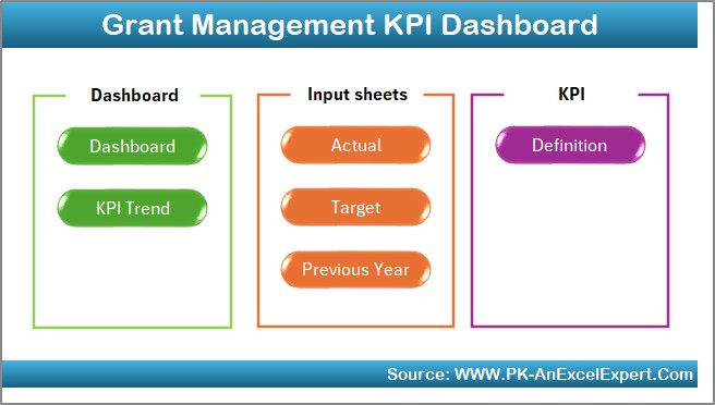
Key Features of the Grant Management KPI Dashboard in Excel
The Grant Management KPI Dashboard in Excel is a ready-to-use template designed to give you a quick and intuitive way to track, analyze, and report on your grant management KPIs. Here are the key features of this Excel dashboard:
1. Home Sheet Tab
The Home Sheet Tab is the main navigation page of your dashboard. It acts as a hub from which users can easily jump to the other sections of the dashboard. This design keeps the dashboard organized and user-friendly, allowing you to quickly access any data you need.
Click to buy Grant Management KPI Dashboard in Excel
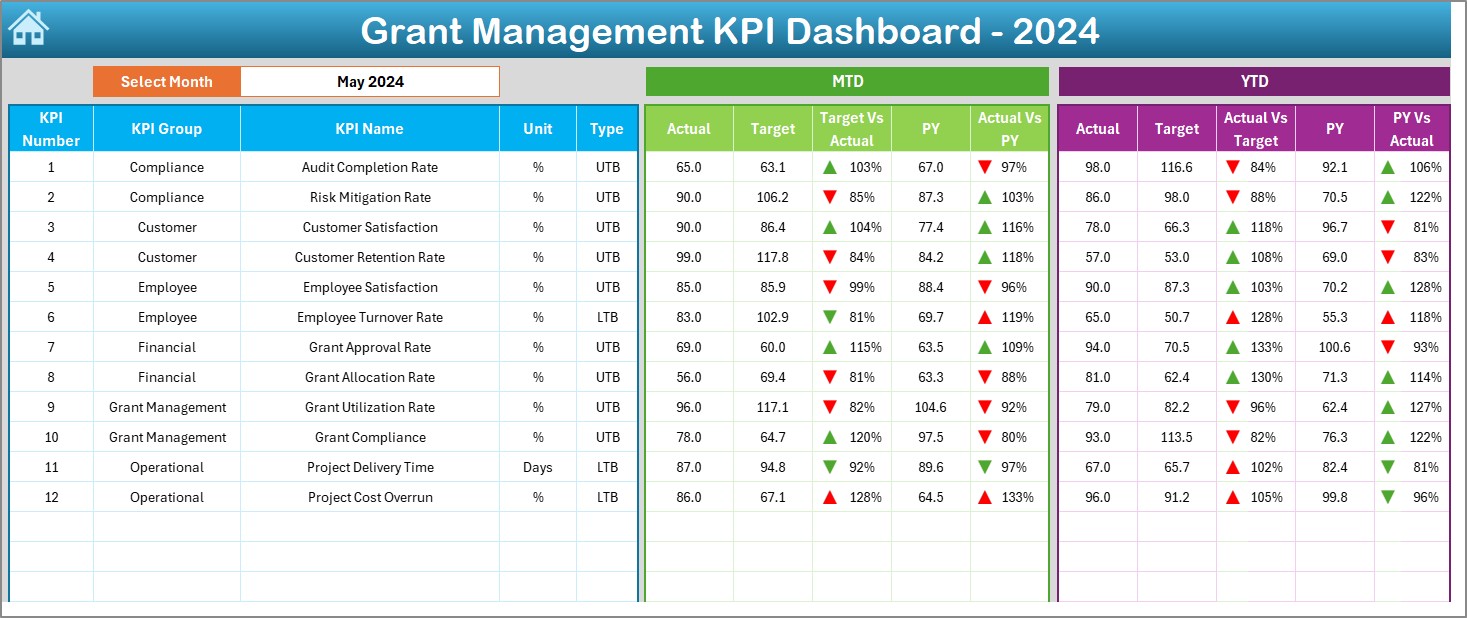
2. Dashboard Sheet Tab
The Dashboard Sheet Tab is the core of the KPI dashboard. In this tab, you’ll see all your KPIs displayed in one place. Users can select the month they wish to analyze from the drop-down menu (range D3), and the entire dashboard will automatically update to reflect data for that specific month. The following metrics are displayed here:
-
MTD Actual (Month-to-Date)
-
Target
-
Previous Year Data
-
Target vs. Actual Comparison
-
PY (Previous Year) vs. Actual Comparison
The conditional formatting applied to the dashboard helps you quickly identify the performance trends, using up or down arrows to represent whether a KPI is trending positively or negatively.
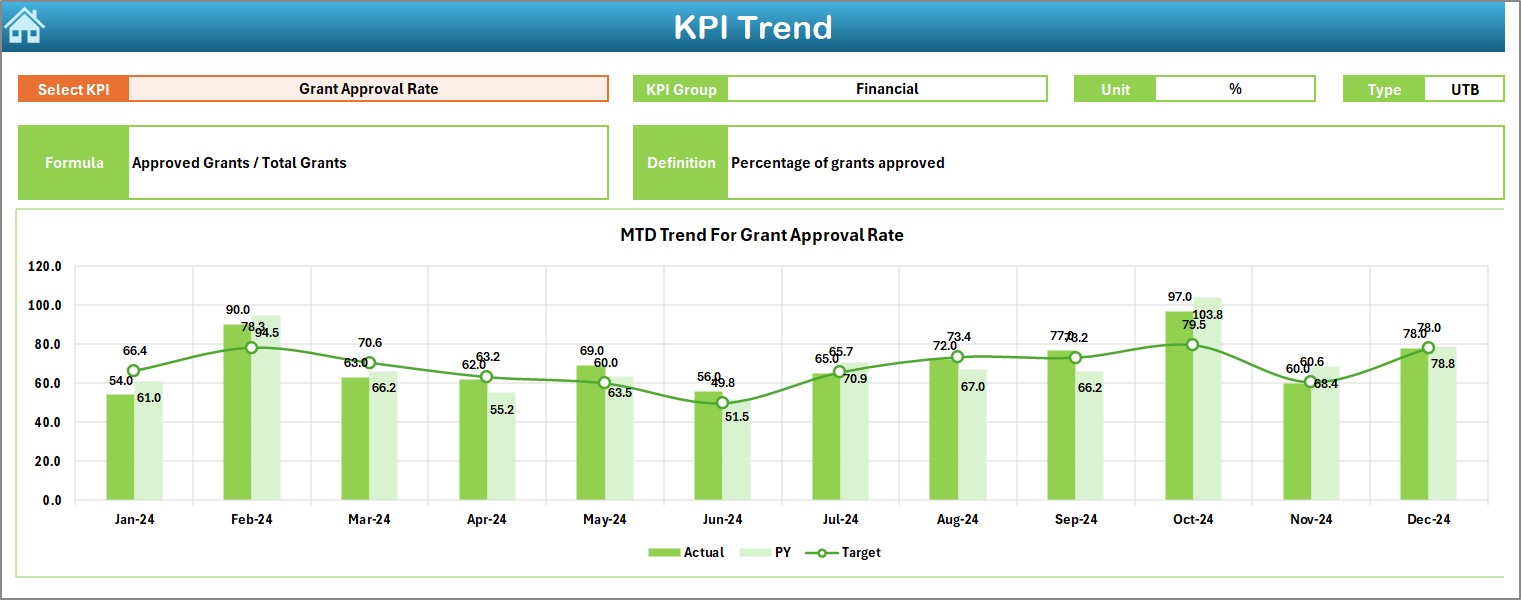
3. KPI Trend Sheet Tab
The KPI Trend Sheet Tab lets users track the historical performance of each KPI over time. You can select a specific KPI from a drop-down list (range C3), and the dashboard will display the corresponding KPI group, unit, formula, definition, and whether the KPI is “Lower the Better” or “Upper the Better.”
Click to buy Grant Management KPI Dashboard in Excel
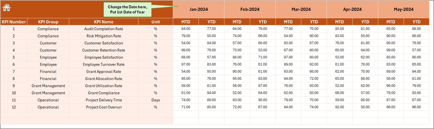
4. Actual Numbers Sheet Tab
The Actual Numbers Sheet Tab is where you input real-time data for the KPIs. You’ll enter the MTD and YTD (Year-to-Date) actual values for each KPI. The month can be easily changed in range E1 by entering the first month of the year, and the rest of the data will automatically adjust for subsequent months.
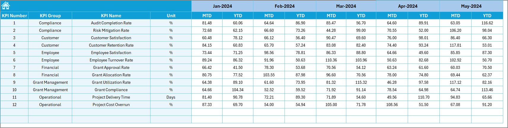
5. Target Sheet Tab
The Target Sheet Tab allows you to input the target values for each KPI on a monthly basis. Both MTD and YTD targets must be entered, and this data will be compared against the actual performance values for analysis.
Click to buy Grant Management KPI Dashboard in Excel
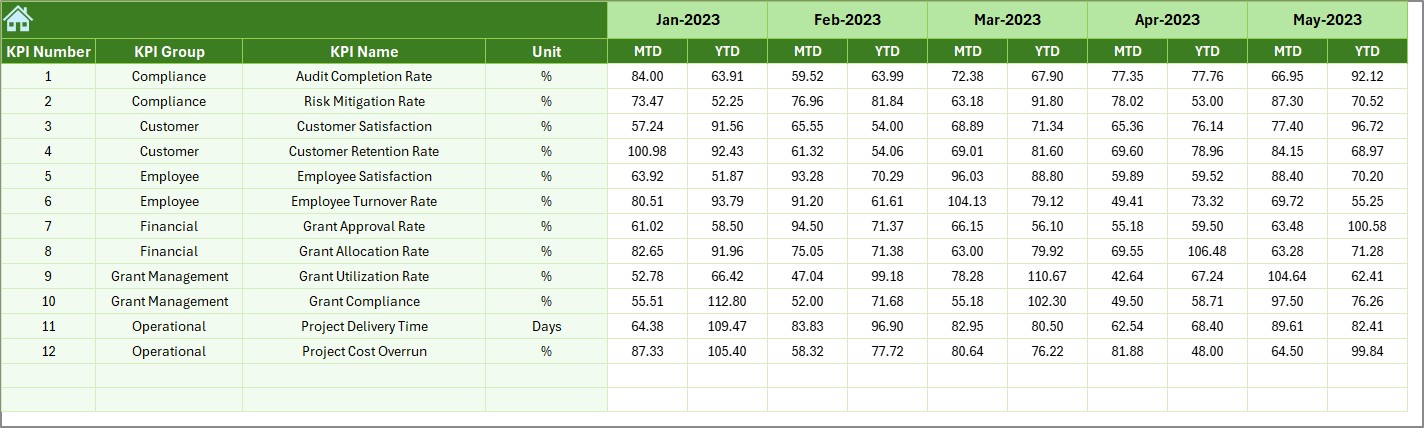
6. Previous Year Numbers Sheet Tab
In the Previous Year Numbers Sheet Tab, you’ll enter the previous year’s numbers for comparison. This is crucial for trend analysis and for comparing how current performance stacks up against the previous year.
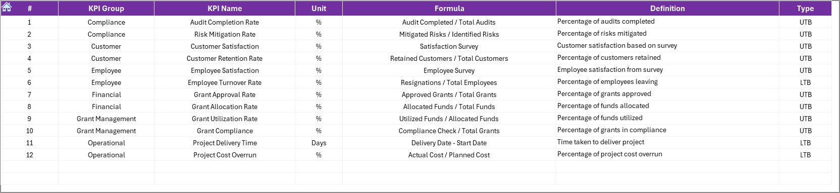
7. KPI Definition Sheet Tab
The KPI Definition Sheet Tab is where you define each KPI in detail. You’ll enter the KPI name, KPI group, unit of measurement, formula for aggregation, and a short definition. This tab ensures that all stakeholders understand the data they are viewing and how each KPI is calculated.
Advantages of Using a Grant Management KPI Dashboard in Excel
Click to buy Grant Management KPI Dashboard in Excel
A Grant Management KPI Dashboard provides numerous advantages that can significantly improve how you manage and oversee grants. Here are the primary benefits:
- Real-Time Data Monitoring: The dashboard provides real-time tracking of grants, enabling you to make timely and informed decisions. With the ability to update data for any given month, you can immediately assess the current status of grants and make adjustments when necessary.
- Data-Driven Insights: By comparing actual performance to targets and previous year data, the dashboard offers valuable insights into how well your grants are performing. This helps you spot any discrepancies early and make adjustments to meet goals.
- Visual Comparison: The conditional formatting used to compare Target vs. Actual and Previous Year vs. Actual data provides a clear, easy-to-understand visual representation of performance. This enables quick decision-making and allows stakeholders to quickly grasp the overall performance.
- Customizable and Scalable: Excel dashboards are highly customizable. You can easily adjust the dashboard to track additional KPIs, change the layout, or modify the data sources. As your grant program grows or changes, the dashboard can be modified to suit new requirements.
- Simplified Reporting: Instead of manually pulling data from different sources and creating reports, the dashboard automatically generates visual summaries that can be used for presentations, funding requests, or internal reviews.
Opportunities for Improvement in Grant Management KPI Dashboard
While the Grant Management KPI Dashboard offers numerous benefits, there are always opportunities to improve its functionality and user experience. Here are some areas to focus on:
- Automation of Data Entry: Currently, data entry is manual. By automating the process, you could integrate the dashboard with other software systems to pull data directly from a centralized database. This would save time and reduce the risk of errors.
- Advanced Analytics and Predictive Modeling: To improve decision-making, consider adding advanced analytics features, such as trend forecasting and predictive modeling. This can help you anticipate future outcomes and take proactive measures to ensure your grant program’s success.
- Enhanced Visualization: Adding advanced visualizations, such as heatmaps, bar charts, or sparklines, could enhance the effectiveness of the dashboard. This will make it easier for users to identify patterns and trends at a glance.
- Greater Interactivity: Consider adding slicers, filters, and dynamic charts to the dashboard. These features would allow users to drill down into specific data points, such as regions or grant types, for more granular insights.
Best Practices for Creating and Using a Grant Management KPI Dashboard in Excel
Click to buy Grant Management KPI Dashboard in Excel
To make the most of your Grant Management KPI Dashboard, it’s essential to follow best practices that ensure its effectiveness and ease of use:
- Focus on Key KPIs: While it’s tempting to track every metric, it’s important to focus on the most relevant KPIs for your grant management process. Too many KPIs can overwhelm users and make the dashboard difficult to navigate.
- Regularly Update Data: To maintain the dashboard’s relevance, update the data regularly—preferably once a month. Ensure that all target, actual, and historical data is accurate and up to date.
- Keep the Design Simple: Simplicity is key when designing a dashboard. Avoid clutter by using a clean, minimalistic layout. This ensures that users can quickly interpret the data without being distracted by unnecessary information.
- Ensure Data Accuracy: Since the effectiveness of your dashboard relies on accurate data, double-check all inputs. This includes target numbers, actual performance, and historical data.
- Provide Context for KPIs: Ensure that each KPI is clearly defined and that users understand its relevance. The KPI Definition Sheet Tab should be comprehensive, offering clear descriptions and formulas for aggregation.
Conclusion
The Grant Management KPI Dashboard in Excel is an invaluable tool for tracking and managing your grant program. With its user-friendly interface, real-time data tracking, and powerful visualizations, this dashboard can help you make informed decisions and improve the efficiency of your grant management process. By following best practices and continuously improving your dashboard, you can ensure that your grants are managed effectively and achieve the desired outcomes.
Frequently Asked Questions (FAQs)
What is a Grant Management KPI Dashboard?
A Grant Management KPI Dashboard is a tool used to track key performance indicators related to a grant management program. It helps you monitor the progress of grants, compare actual performance to targets, and make data-driven decisions.
How do I update the Grant Management KPI Dashboard in Excel?
To update the dashboard, simply enter the most recent actual and target data for each KPI. The dashboard will automatically update to reflect the new information.
Can I customize the Grant Management KPI Dashboard?
Yes, the dashboard is highly customizable. You can add new KPIs, adjust the layout, or modify the formulas to fit your specific grant program needs.
Is the Grant Management KPI Dashboard easy to use?
Yes, the dashboard is designed to be user-friendly, with intuitive navigation and clear visuals that help users understand the data quickly.
How often should I update the data in the Grant Management KPI Dashboard?
It is recommended to update the data at least once a month to ensure that the dashboard remains relevant and accurate.