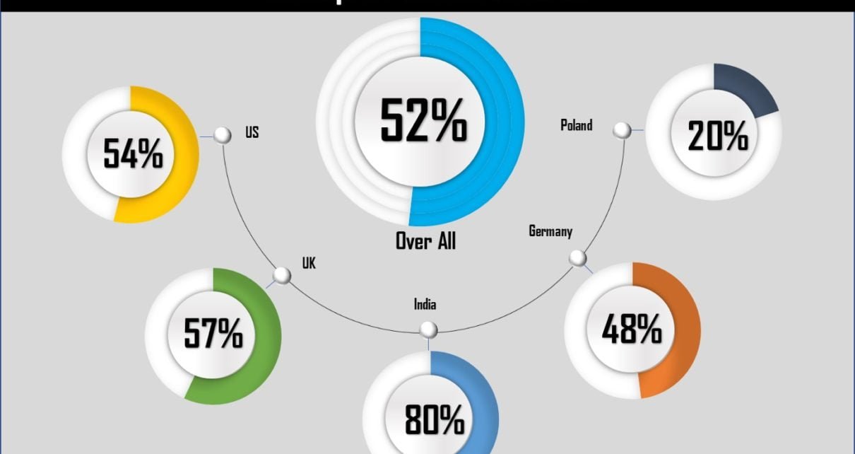
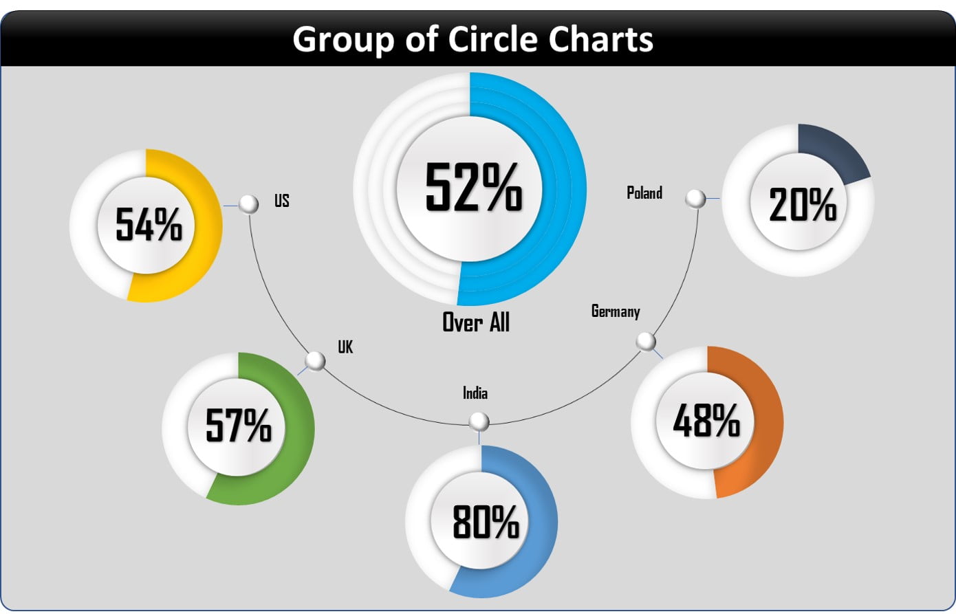
Using the multiple Doughnut charts, we have created a beautiful Group of circle charts. In this chart, we have displayed Market level and Over all service level. You can use it in your business dashboard or presentation. This is a ready to use template.
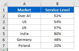
Data Points:
Below are the data points to create this chart. You can change this data with your own data.
Group of Circle Charts
Below is the snapshot of Group of Circle Chart. This is useful when you want to show the data for multiple KPI or multiple location etc.
Click to buy Group of Circle Charts in Excel
Visit our YouTube channel to learn step-by-step video tutorials
Watch the step by step video tutorial:
Click to buy Group of Circle Charts in Excel