Tracking key performance indicators (KPIs) is critical for the success of any healthcare insurance operation. A Healthcare Insurance KPI Dashboard offers a structured and visually engaging way to monitor these essential metrics. It helps organizations evaluate their performance, identify areas for improvement, and make data-driven decisions.
In this article, we’ll explore everything you need to know about creating and using a Healthcare Insurance KPI Dashboard, including its features, KPIs, advantages, best practices, and opportunities for improvement.
What is a Healthcare Insurance KPI Dashboard?
A Healthcare Insurance KPI Dashboard is a centralized tool that consolidates and tracks performance data for key metrics in the healthcare insurance sector. It ensures transparency, helps assess progress toward goals, and identifies trends and anomalies. By presenting data in a structured format, this dashboard simplifies decision-making and enhances overall efficiency.
Key Features of the Healthcare Insurance KPI Dashboard
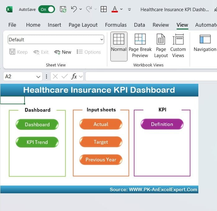
This dashboard template is ready-to-use and includes seven structured worksheets, each serving a specific purpose.
Home Sheet
Acts as the index of the dashboard.
Contains six navigation buttons for quick access to other sheets.
Provides a clean, intuitive starting point.
Click to Healthcare Insurance KPI
Dashboard Sheet Tab
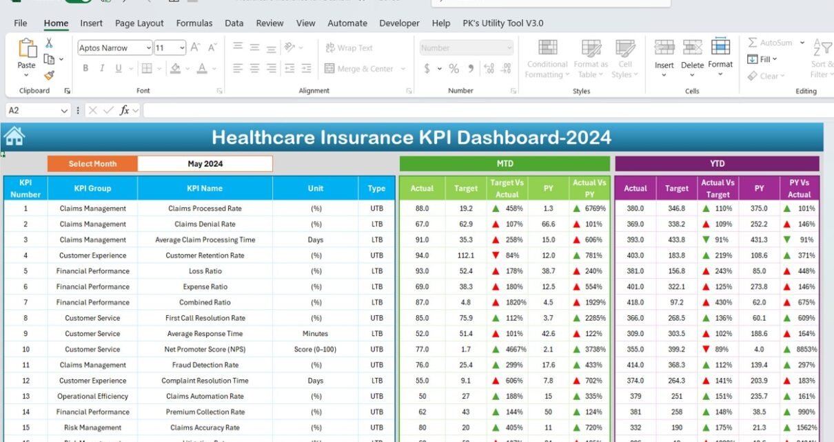
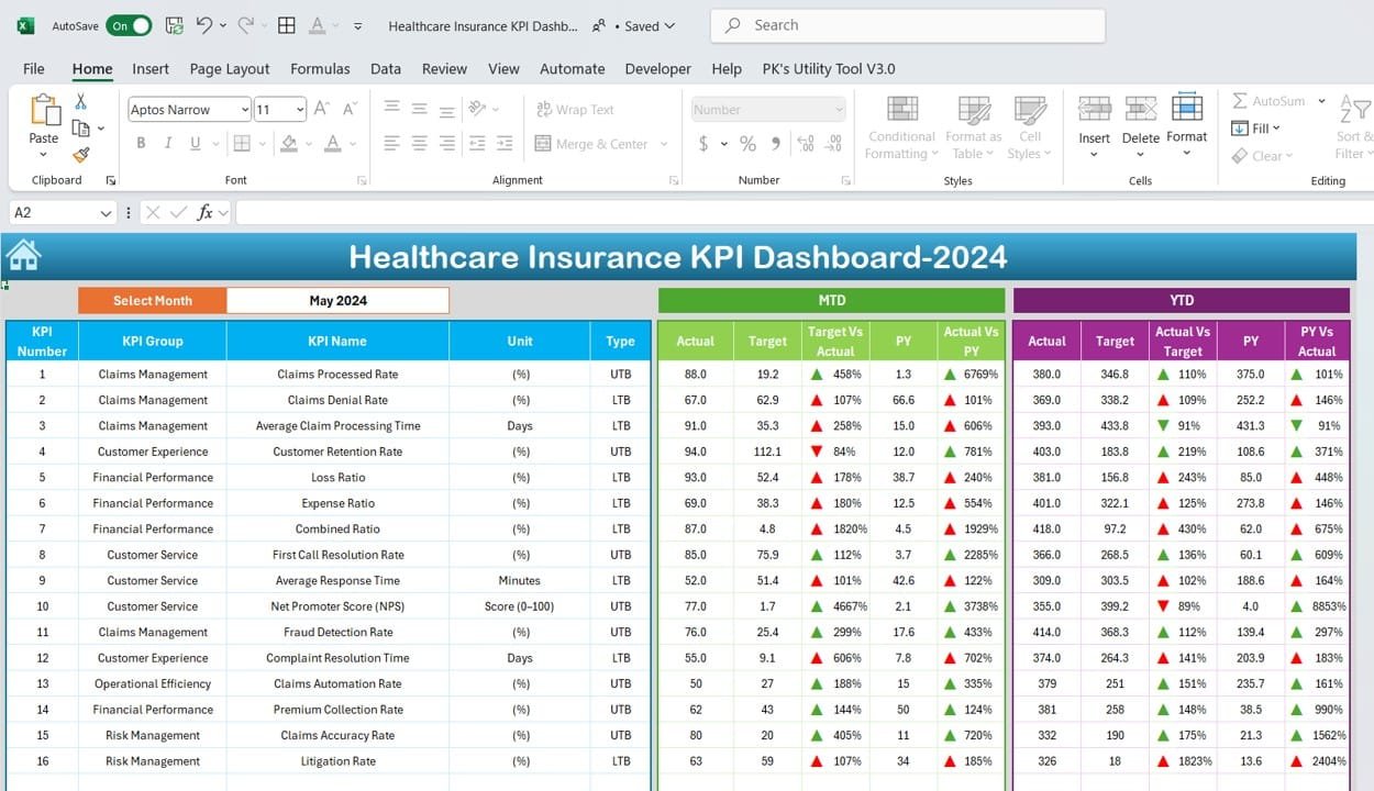
Serves as the primary data visualization hub.
Includes dropdown in Range D3 for month selection, dynamically updating the entire dashboard.
Displays:
MTD (Month-to-Date): Actual, Target, and Previous Year (PY) data.
YTD (Year-to-Date): Actual, Target, and PY data.
Conditional formatting with up/down arrows for performance trends.
Click to Healthcare Insurance KPI
KPI Trend Sheet Tab
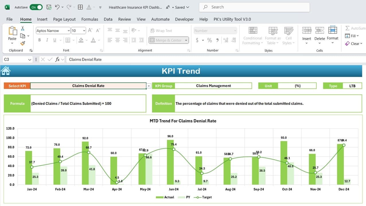
Allows users to select a KPI from a dropdown in Range C3.
Displays detailed information, including:
KPI Group
Unit
Performance Type: Lower is better or Upper is better.
Formula
Definition
Click to Healthcare Insurance KPI
Actual Numbers Sheet Tab
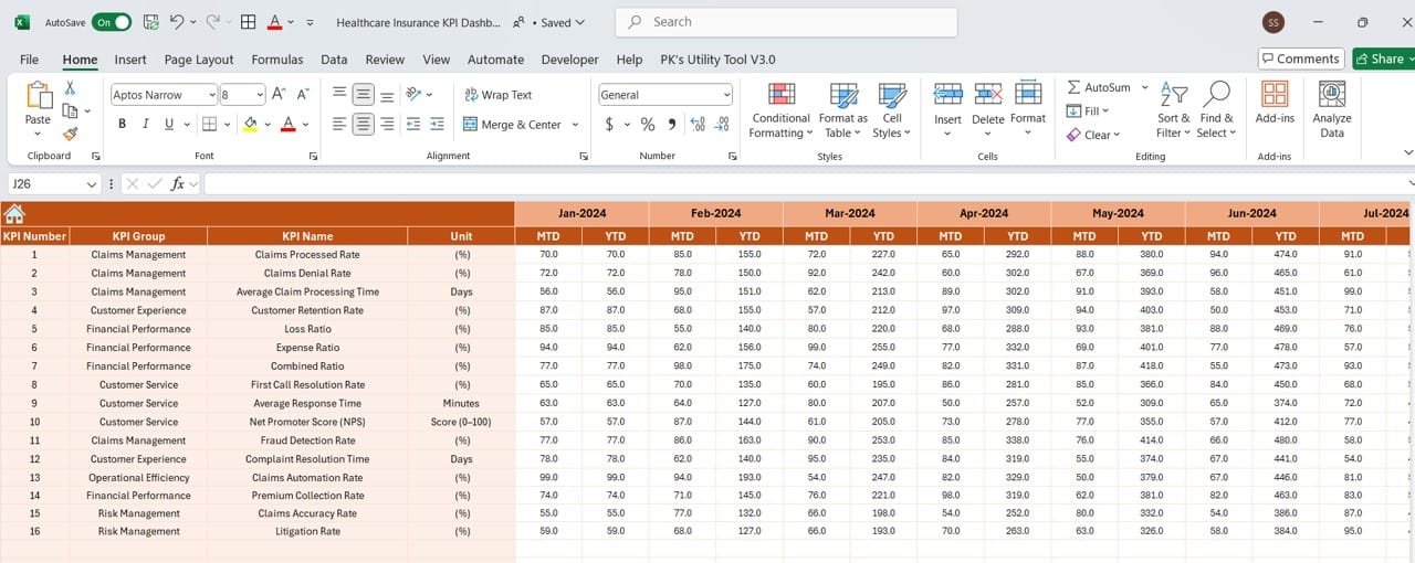
Enter actual data for MTD and YTD for each KPI.
Month selection in Range E1 adjusts entries automatically for seamless data management.
Click to Healthcare Insurance KPI
Target Sheet Tab
Input target values for each KPI for both MTD and YTD metrics.
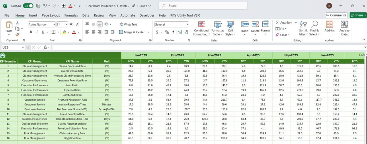
Previous Year Numbers Sheet Tab
Stores historical data for year-over-year comparisons.
Click to Healthcare Insurance KPI
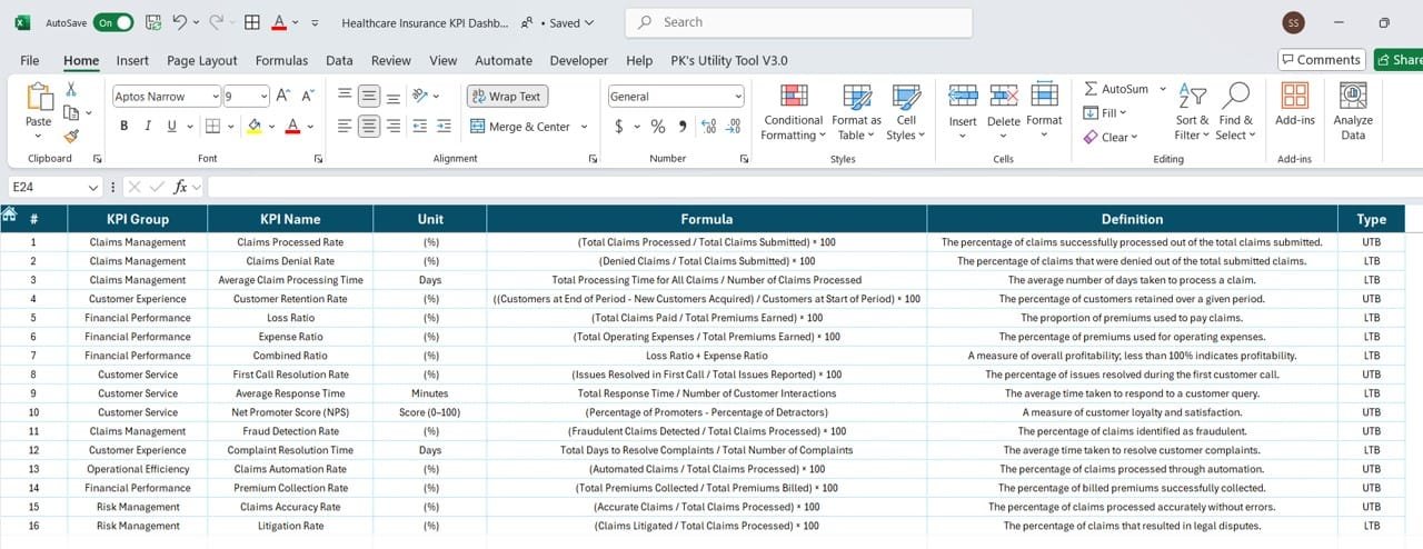
KPI Definition Sheet Tab
Comprehensive repository for:
KPI names
KPI groups
Units
Formulas
Definitions
Click to Healthcare Insurance KPI
Advantages of a Healthcare Insurance KPI Dashboard
Implementing this dashboard comes with numerous benefits:
- Enhanced Decision-Making: Provides a clear overview of performance metrics to support informed decisions.
- Better Resource Allocation: Helps identify areas where resources are over or under-utilized.
- Improved Customer Satisfaction: Tracks metrics like NPS and claims settlement ratio to improve customer experience.
- Cost Control: Monitors cost-related KPIs, ensuring financial discipline.
- Transparency: Facilitates data-driven discussions with stakeholders.
Best Practices for Using the Healthcare Insurance KPI Dashboard
Follow these tips to maximize the potential of your KPI dashboard:
- Define Clear Objectives: Ensure your KPIs align with business goals and customer expectations.
- Update Data Regularly: Keep the dashboard accurate by inputting data daily or weekly.
- Customize to Fit Needs: Tailor the dashboard to reflect your unique organizational structure and priorities.
- Engage Stakeholders: Share insights from the dashboard with relevant teams to foster collaboration.
- Leverage Visualizations: Use conditional formatting, graphs, and charts for easy interpretation of data.
Opportunities for Improvement in the Dashboard
Even the best dashboards can evolve. Here are ways to enhance functionality:
- Automated Data Input: Integrate with systems like CRM or ERP for real-time data updates.
- Mobile Optimization: Make the dashboard accessible on smartphones and tablets.
- External Integrations: Connect with analytics tools for deeper insights and predictive analysis.
- Advanced Visuals: Add interactive features like drill-down charts and slicers for in-depth analysis.
- Custom Alerts: Use notifications to highlight KPIs that need immediate attention.
How to Create Your Healthcare Insurance KPI Dashboard
Building this dashboard doesn’t have to be overwhelming. Here’s a step-by-step guide:
Step 1: Plan Your KPIs
Identify the KPIs that are most relevant to your organization. Include metrics that cover financial performance, customer satisfaction, and operational efficiency.
Step 2: Organize the Sheets
Structure your Google Sheet or Excel workbook with seven tabs: Home, Dashboard, KPI Trend, Actual Numbers, Target, Previous Year Numbers, and KPI Definition.
Step 3: Input Sample Data
Add sample data to test the functionality of your dashboard. Populate fields like actual numbers, targets, and previous year values.
Step 4: Build Visualizations
Use charts and graphs to visualize trends. Conditional formatting can help highlight key trends, such as deviations from targets.
Step 5: Enable Interactivity
Add dropdown menus for month and KPI selection. These features make the dashboard dynamic and user-friendly.
Step 6: Share and Collaborate
Share the dashboard with your team and set permissions based on roles, ensuring collaborative decision-making.
Conclusion
A Healthcare Insurance KPI Dashboard is an invaluable tool for managing and monitoring the performance of your organization. With its ability to consolidate critical data into actionable insights, it streamlines decision-making, optimizes resources, and boosts overall efficiency. Whether you’re tracking claims settlement ratios or customer satisfaction scores, this dashboard ensures you stay ahead in the competitive healthcare insurance landscape.
Frequently Asked Questions (FAQs)
- What KPIs should be included in a Healthcare Insurance KPI Dashboard?
Include KPIs such as Claims Settlement Ratio, Policy Lapse Rate, Customer Retention Rate, and Cost Per Claim for a well-rounded view.
- How often should the dashboard be updated?
Update the dashboard daily or weekly for the most accurate insights.
- Can this dashboard be used for non-healthcare insurance organizations?
Yes, the template can be adapted for other industries by modifying the KPIs and structure.
- How do I handle data input for multiple months?
Use dropdown menus and dynamic formulas to switch between months seamlessly.
- Can the dashboard integrate with other tools?
Yes, you can integrate it with analytics tools, CRMs, or ERPs for automated updates and deeper insights.
Visit our YouTube channel to learn step-by-step video tutorials
