In today’s fast-paced healthcare world, keeping track of performance is essential. Healthcare organizations must be able to measure their success, ensure optimal resource use, and, most importantly, provide quality patient care. That’s where the Healthcare KPI Dashboard comes in—it’s a tool that every healthcare provider should have. With it, you can monitor key performance indicators (KPIs), track progress, and make informed decisions. In this guide, we’ll dive into the best practices, opportunities for improvement, and the benefits of using a Healthcare KPI Dashboard.
What is a Healthcare KPI Dashboard?
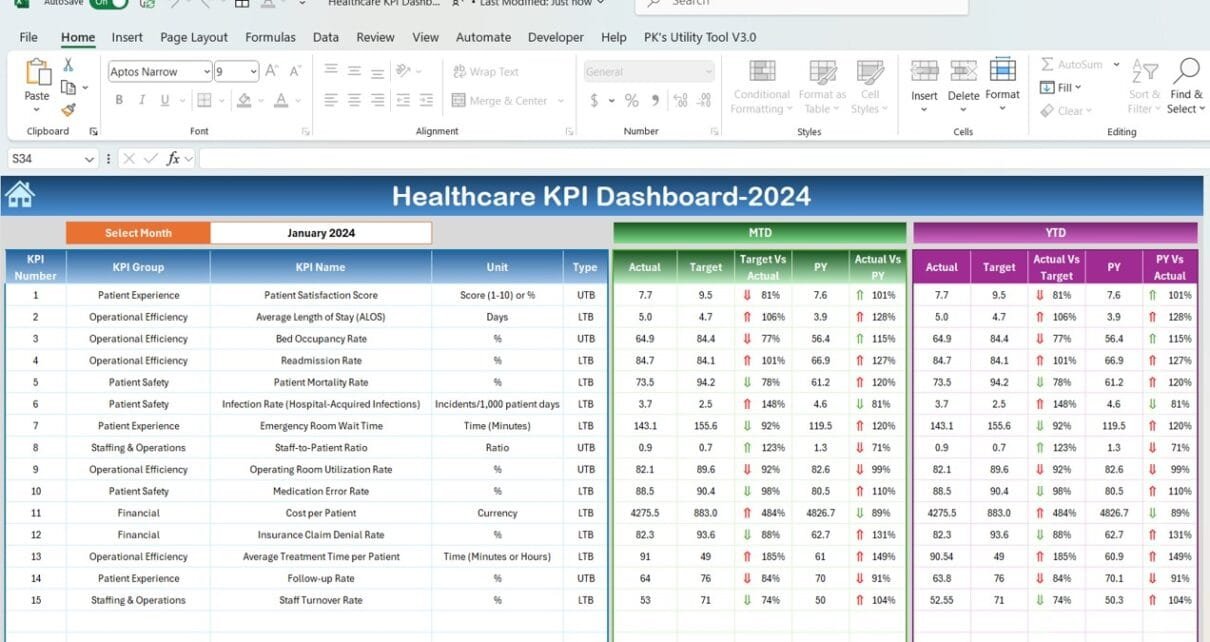
So, what exactly is a Healthcare KPI Dashboard? Simply put, it’s a visual tool that shows an overview of your organization’s performance. It pulls together critical metrics—like patient satisfaction, hospital readmission rates, bed occupancy, and staff performance—into one easy-to-use interface. You can monitor trends, identify areas that need improvement, and, ultimately, provide better patient outcomes with just a glance.
Key Features of a Healthcare KPI Dashboard
To help you understand how it works, let’s walk through some of the main features of a typical Healthcare KPI Dashboard.
-
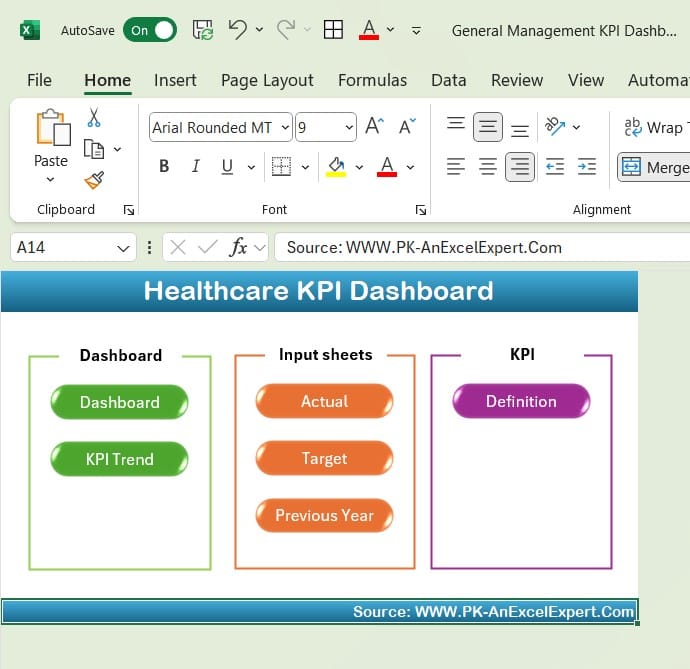
Home Sheet:
Think of the Home Sheet as the hub or index of your dashboard. It includes six buttons that let you jump between different sections of the dashboard with ease. Whether you’re checking patient satisfaction or staff performance, this feature makes navigation a breeze, ensuring you don’t get lost in a sea of tabs.
Click to buy Healthcare KPI Dashboard In Excel
-
Dashboard Sheet Tab
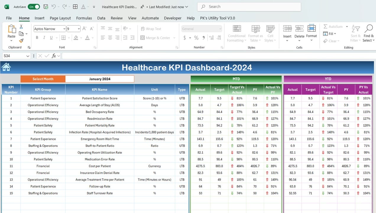
This is where the real action happens! The Dashboard Sheet is the heart of your dashboard. It displays all your KPIs, so you can get a quick snapshot of how things are going. You can select the month you want to view using a drop-down menu, and the dashboard will instantly update with data for that month.
Here’s what you’ll see:
Month-to-Date (MTD) Actuals, Targets, and Previous Year Data
With this feature, you can compare your current month’s performance to your targets and last year’s performance. Visual indicators like arrows make it easy to see whether you’re on track.
Year-to-Date (YTD) Actuals, Targets, and Previous Year Data
Just like the MTD metrics, this shows you cumulative performance for the year, so you can track overall progress. Again, visual aids help you quickly spot areas where you’re excelling or lagging behind.
Click to buy Healthcare KPI Dashboard In Excel
-
KPI Trend Sheet Tab
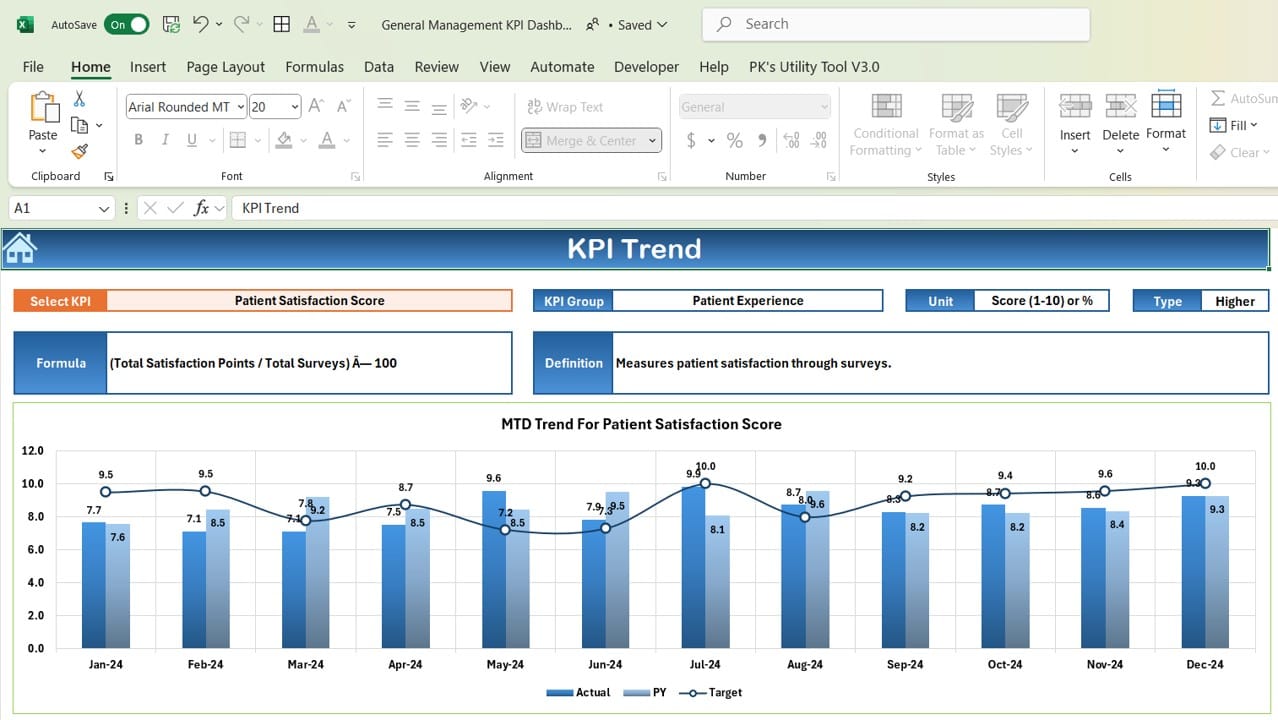
Need a closer look at a specific KPI? The KPI Trend Sheet is where you can do that. Just select a KPI from the drop-down menu, and you’ll see all the important details—like its group, measurement unit, and whether it’s a “higher is better” or “lower is better” metric. It also shows the formula and a clear definition of each KPI, which is super helpful for anyone who’s not familiar with the jargon.
Click to buy Healthcare KPI Dashboard In Excel
-
Actual Numbers Sheet Tab
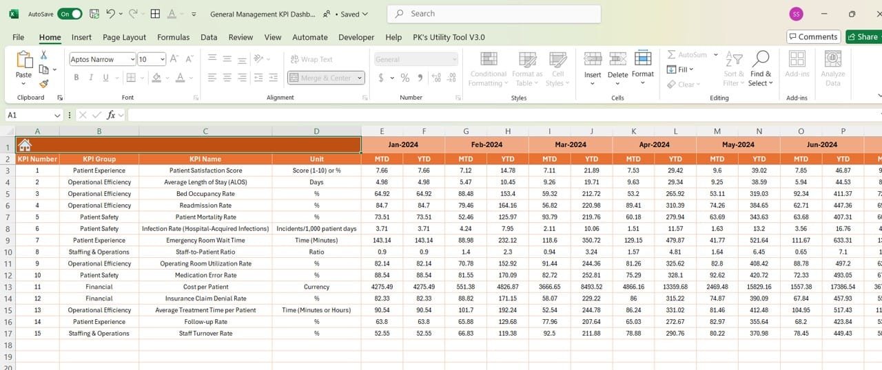
This is the spot where you’ll input your actual numbers for both MTD and YTD. It’s as simple as changing the month in range E1, and the dashboard will adjust automatically. This feature makes sure that your data entry is quick and easy, reducing the risk of errors.
Click to buy Healthcare KPI Dashboard In Excel
-
Target Sheet Tab
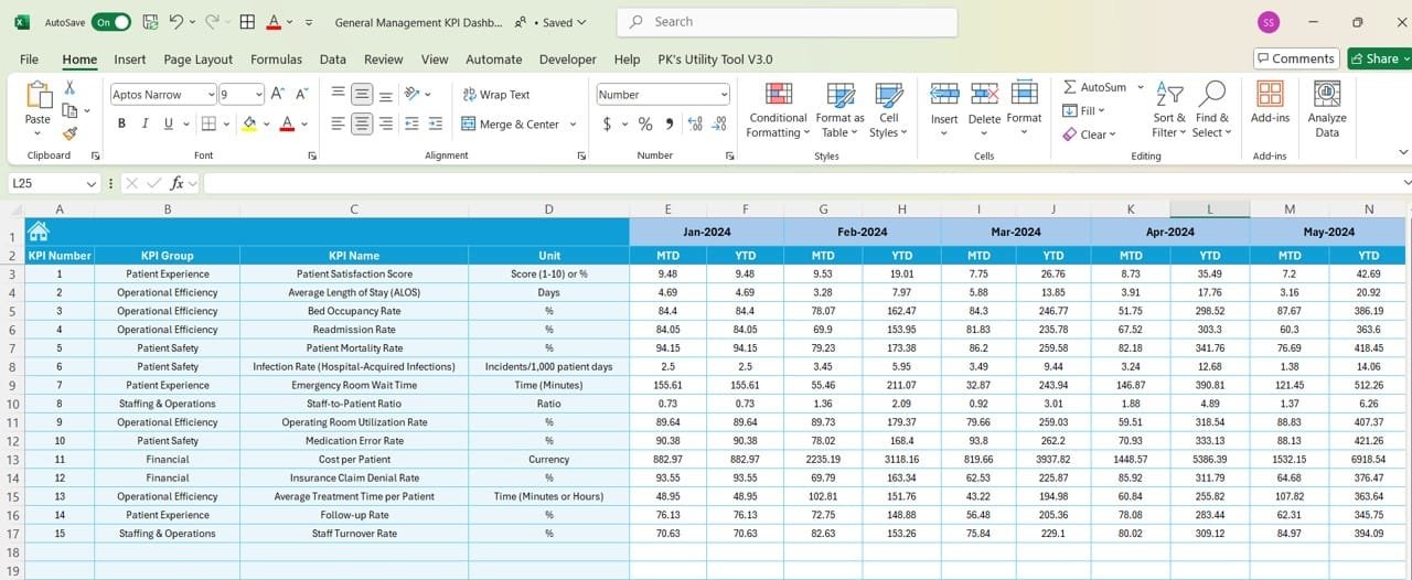
In the Target Sheet, you enter your goals for each KPI—both for the month and the year. By keeping this updated, your dashboard will give you real-time feedback on how close you are to hitting those targets.
Click to buy Healthcare KPI Dashboard In Excel
-
Previous Year Numbers Sheet Tab
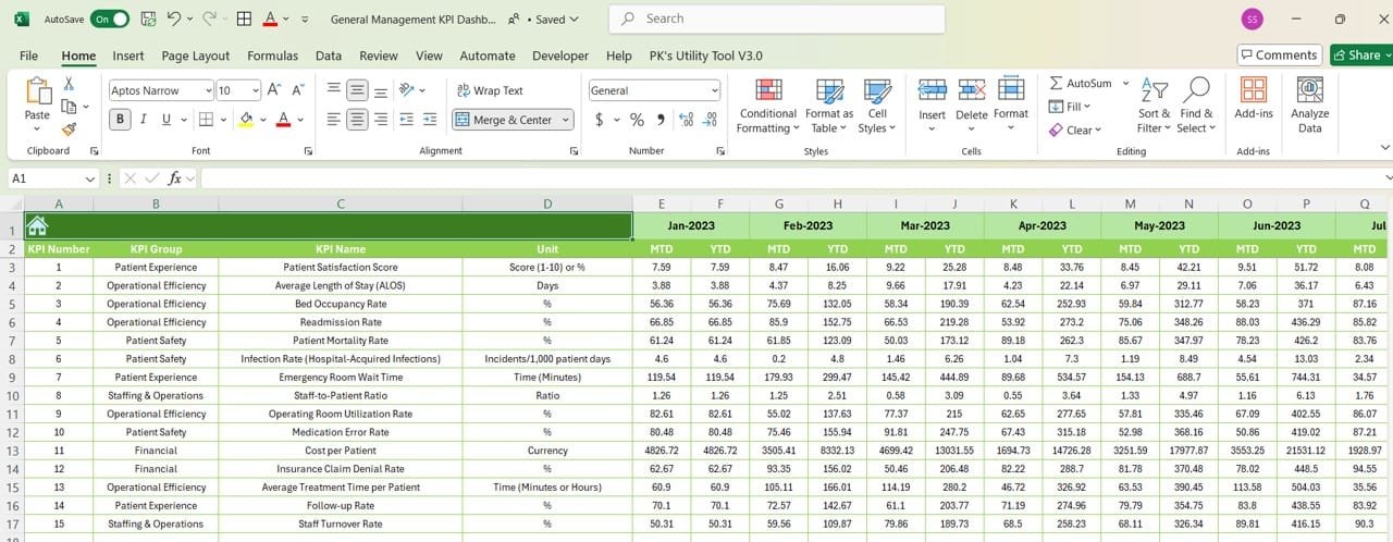
For year-over-year comparisons, the Previous Year Numbers Sheet is where you’ll input last year’s data. This is crucial for seeing how your performance has changed over time and whether you’re making progress.
Click to buy Healthcare KPI Dashboard In Excel
-
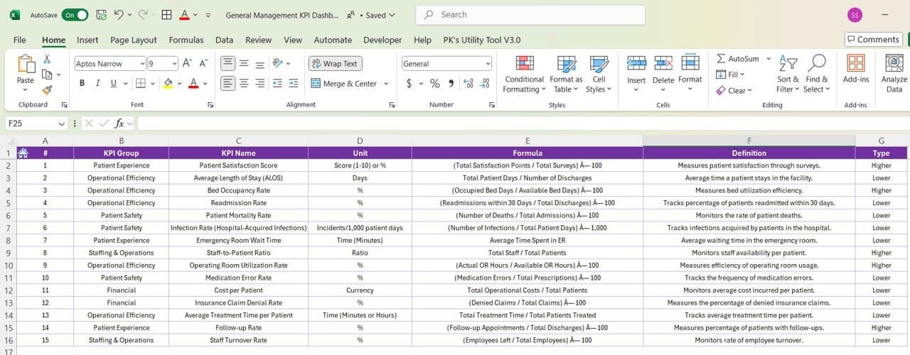
KPI Definition Sheet Tab
Finally, the KPI Definition Sheet is where you define each KPI. This includes the KPI name, group, unit, formula, and definition. It ensures that everyone in the organization understands what each KPI measures and why it matters.
Click to buy Healthcare KPI Dashboard In Excel
Advantages of Using a Healthcare KPI Dashboard
Now that you know how a Healthcare KPI Dashboard works, let’s talk about why it’s so beneficial for healthcare organizations. Here are a few key advantages:
- Real-time Data Tracking: With a KPI dashboard, you get real-time data at your fingertips. This means you can make decisions based on the most up-to-date information. Whether it’s resource management or patient care, real-time insights lead to faster, smarter decisions.
- Better Resource Management: Managing hospital resources is no small feat. But with a KPI dashboard, it becomes a whole lot easier. You can track everything from bed occupancy to staff schedules, helping you allocate resources more effectively and avoid bottlenecks.
- Improved Patient Outcomes: By tracking KPIs like readmission rates and patient satisfaction, you can identify areas that need attention and make adjustments that directly improve patient care. The result? Happier, healthier patients.
- Increased Transparency and Accountability: Dashboards provide a clear picture of performance, which fosters transparency across the organization. This makes it easier for department heads to track their teams’ progress and stay accountable to their goals.
Best Practices for Building a Healthcare KPI Dashboard
To get the most out of your Healthcare KPI Dashboard, here are some best practices to keep in mind:
- Focus on Relevant KPIs: Only track KPIs that matter to your organization’s goals. If patient satisfaction is your top priority, focus on metrics like discharge times and patient feedback rather than financial data.
- Ensure Data Accuracy:Your dashboard is only as good as the data you put in it. Make sure data entry is consistent and correct. It’s also a good idea to audit the data periodically to catch any mistakes.
- Use Visual Indicators: Simple visual cues—like arrows, color coding, and trend lines—make it easy to spot trends. This helps everyone, from data analysts to managers, quickly understand what the numbers mean.
- Set Clear Targets: Every KPI needs a target. Make sure these goals are realistic yet challenging enough to encourage improvement. And don’t forget to communicate these targets clearly to the entire team.
- Regularly Update and Review: A dashboard isn’t a “set it and forget it” tool. You need to update it regularly and review the data to ensure everything’s on track. Schedule regular check-ins—whether monthly or quarterly—to see if adjustments are needed.
Opportunities for Improvement in Healthcare KPI Dashboards
While Healthcare KPI Dashboards are great, there’s always room for improvement. Here are a few areas where you can enhance your dashboard:
- Expand KPI Coverage: Many dashboards only track operational and financial KPIs. Expanding your dashboard to include clinical outcomes, patient satisfaction, and staff performance can give a more complete picture of your organization’s health.
- Incorporate Predictive Analytics: Instead of just looking at past performance, why not try predicting the future? By adding predictive analytics, you can forecast trends, such as patient admissions, and prepare accordingly.
- Improve User Experience: Your dashboard should be easy for everyone to use, not just data experts. Adding hover-over explanations and tooltips can make it more accessible for all users.
- Automate Data Entry: Manual data entry can be tedious and error-prone. By integrating your dashboard with electronic health record (EHR) systems, you can automate data entry and ensure that your dashboard always has up-to-date information.
Conclusion
In conclusion, a Healthcare KPI Dashboard is an invaluable tool for any healthcare organization. It provides real-time insights into critical performance metrics, helping administrators make informed decisions that lead to better patient care, improved resource management, and overall higher organizational performance. With the right setup, best practices, and a focus on continuous improvement, a KPI dashboard can take your healthcare operations to the next level.
Frequently Asked Questions (FAQs)
Q. What is the purpose of a Healthcare KPI Dashboard?
A Healthcare KPI Dashboard helps healthcare organizations track and improve performance across various areas, including patient care, resource management, and financial health.
Q. Which KPIs should be tracked in a Healthcare KPI Dashboard?
Common KPIs include patient satisfaction, hospital readmission rates, bed occupancy, staff performance, and resource utilization.
Q . Healthcare KPI Dashboard improve patient care?
By tracking metrics like readmission rates and patient satisfaction, healthcare providers can make timely adjustments that lead to better patient outcomes.
Q. What are some best practices for creating a Healthcare KPI Dashboard?
Focus on relevant KPIs, ensure data accuracy, use visual aids, set clear targets, and update the dashboard regularly to stay on top of performance.
Q. Can predictive analytics be integrated into a Healthcare KPI Dashboard?
Yes! Adding predictive analytics can help healthcare providers anticipate trends like patient admission rates and plan accordingly.
Visit our YouTube channel to learn step-by-step video tutorials
Click to buy Healthcare KPI Dashboard In Excel
