Have you ever wondered how you can visualize data using simple, powerful formulas in Excel? Well, the REPT Function in Excel is one of those hidden gems that can help you do just that. In this blog post, we will take a closer look at the REPT function and how you can use it to create a visually engaging bar chart right inside your Excel sheet. By the end of this post, you will have a clear understanding of how the REPT function works and how you can apply it to your data.
What is the REPT Function in Excel?
The REPT function in Excel allows you to repeat a character or string multiple times based on a specified number. Essentially, you can use it to create patterns or symbols that visually represent numbers. This makes it perfect for creating simple bar charts or visual representations without having to rely on Excel’s built-in chart tools.

Syntax:
=REPT (text, number times)
- text: This is the character or string that you want to repeat.
- number times: This is the number of times you want to repeat the text.
Practical Example: Visualizing Student Marks with REPT
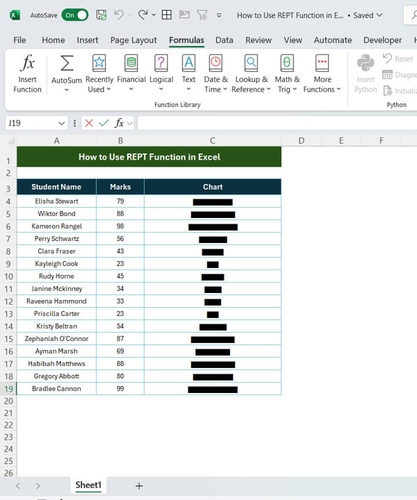
Let’s dive into an example where we use the REPT function to create a simple bar chart based on student marks. Below is a set of data that includes student names and their corresponding marks. We’ll use the REPT function to visualize the marks as bars.
Step-by-Step: Using REPT Function to Create the Chart
In this example, we are going to use the REPT Function in Excel to generate the “Chart” column. Here’s how you can do it:
Start with Your Data: Make sure your data is organized properly. In this case, we have three columns: Student Name, Marks, and Chart. The marks will be used to generate the bar chart using the REPT function.
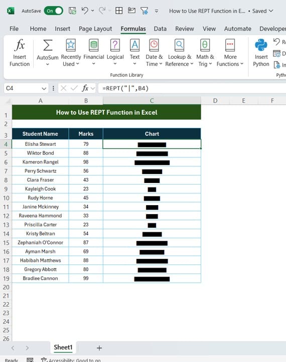
- Apply the REPT Function: Use the formula =REPT (“|”, B4) where B4 is the cell containing the marks for the first student (Elisha Stewart). This formula repeats the “|” symbol based on the number of marks.
- Copy the Formula: After applying the formula to the first student, you can simply drag the formula down to apply it to all other students in the list.
For example:
- Elisha Stewart has 79 marks, so the formula generates 79 “|” symbols.
- Wictor Bond has 88 marks, which produces 88 “|” symbols.
- This creates a neat, visual representation of each student’s marks in the form of a bar.
Why Use the REPT Function?

The REPT function is incredibly versatile and can be used in many scenarios where you want to visualize numbers quickly. Here are some key benefits of using it:
- Simple and Easy: You don’t need to create a complex chart to represent your data. The REPT function allows you to visually display information in a straightforward manner.
- Customizable: You can repeat any character, not just the “|” symbol. For example, you could use “*”, “#”, or even custom text.
- No Additional Tools Needed: Unlike using a chart, the REPT function doesn’t require additional formatting or settings. It’s all done with a simple formula.
Conclusion: Visualize Data Like A Pro
Using the REPT function in Excel is a powerful yet simple way to visually represent your data. Whether you’re creating quick bar charts or experimenting with other symbols, the REPT Function in Excel makes it easy to turn numbers into something visual and engaging.
So next time you need to create a visual representation in Excel, give the REPT function a try! You’ll be surprised how easy and effective it can be.
Visit our YouTube channel to learn step-by-step video tutorials
View this post on Instagram
Click hare to download the practice file


