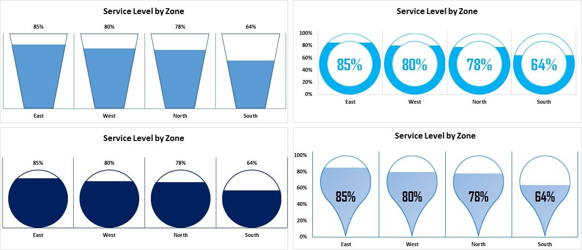
In this article you will learn how we can use info-graphics in the column chart for KPI metrics. We have created 4 different charts for Service Level. These charts can be used in business dashboard, reports and presentations. You can use any other metric in place of Service Level.
Info-graphics with Column chart
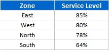
Below is the data points for which we have created Info-graphics chart-
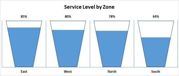
Service Level by Zone chart with Filling Bucket Info-graphics-
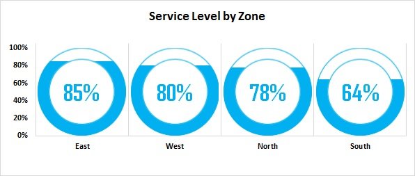
Service Level by Zone chart with Filling Doughnut Info-graphics-
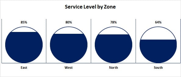
Service Level by Zone chart with Filling Circle Info-graphics-
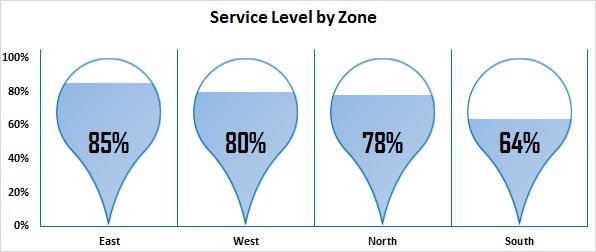
Service Level by Zone chart with Filling Tear drop (rotated on 135°) Info-graphics-
Visit our YouTube channel to learn step-by-step video tutorials
Click to buy Info-graphics with Column chart (Part-2)
Watch the step by step video tutorial to learn these charts:
Click to buy Info-graphics with Column chart (Part-2)