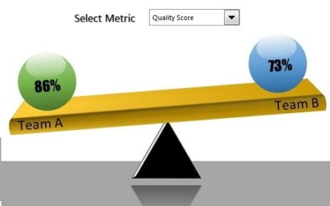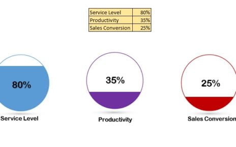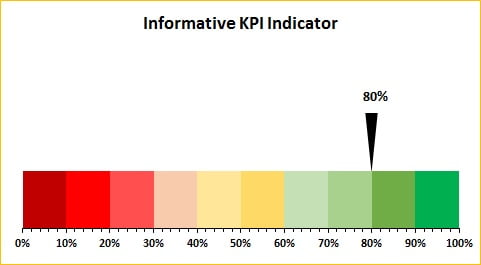
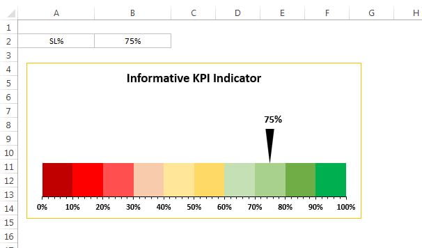
I am back with one more stunning and Informative KPI Indicator Chart. In this chart I have used a RAG color pallet in 10 slices (10% each). Here I have taken Service Level metrics, you can take your own metrics. As soon as you will change the Service Level%, Indicator will be moved accordingly.
Informative KPI Indicator Chart (Version-1)
This chart is very useful to use in business dashboard or business presentations.
Click to buy Informative KPI Indicator Chart (Version-1)
Click to buy Informative KPI Indicator Chart (Version-1)
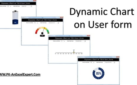
Visit our YouTube channel to learn step-by-step video tutorials
Watch the step by step tutorial:
Click to buy Informative KPI Indicator Chart (Version-1)