An insurance dashboard in Excel is a powerful tool designed to help insurance professionals, analysts, and agents track, visualize, and analyze important metrics related to policies, premiums, claims, and agent performance. By using charts, slicers, and various data views, an insurance dashboard can provide a clear, concise summary of your business’s insurance data, enabling quick decision-making and performance monitoring.
In this article, we will explain how to create an effective Insurance Dashboard in Excel, which can help you manage data across multiple parameters such as policy types, claim amounts, regions, and agent performance. We’ll walk you through the essential components of the dashboard and explain each section in detail.
Key Features of the Insurance Dashboard
Click to buy Insurance Dashboard in Excel
This Insurance Dashboard in Excel consists of several essential sheets that work together to give a comprehensive view of key metrics. Below, we’ll break down the components and how each one contributes to the dashboard’s functionality.
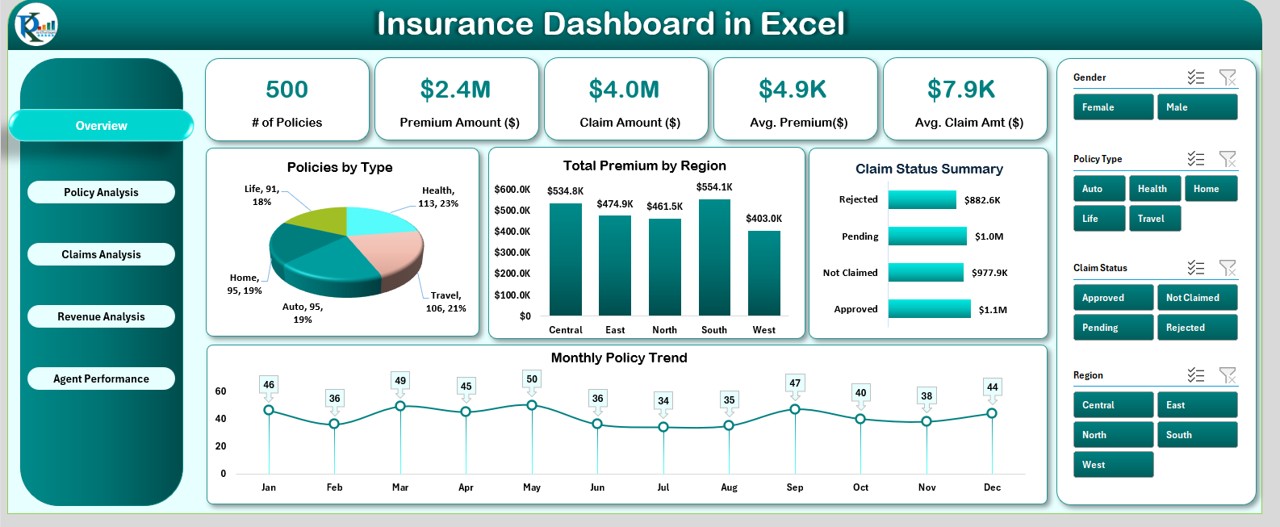
Overview Sheet Tab
This is the primary summary sheet of the dashboard. It provides key metrics, charts, and slicers that allow users to get an immediate overview of the data.
Key Elements:
Cards:
These are small summary indicators that show important statistics such as:
- Number of Policies
- Premium Amount ($)
- Claim Amount ($)
- Average Premium ($)
- Average Claim Amount ($)
Charts:
The dashboard includes several charts for better visualization:
- Policies by Type: Pie chart showing the distribution of policies by their type.
- Total Premium by Region: Column chart that breaks down the total premium amount by region.
- Claim Status Summary: Bar chart displaying claim statuses across policies.
- Monthly Policy Trend: Line chart to show the trend of policies over time.
Slicers:
These are interactive filters allowing users to drill down and segment data by:
- Gender
- Policy Type
- Claim Status
- Region
Click to buy Insurance Dashboard in Excel
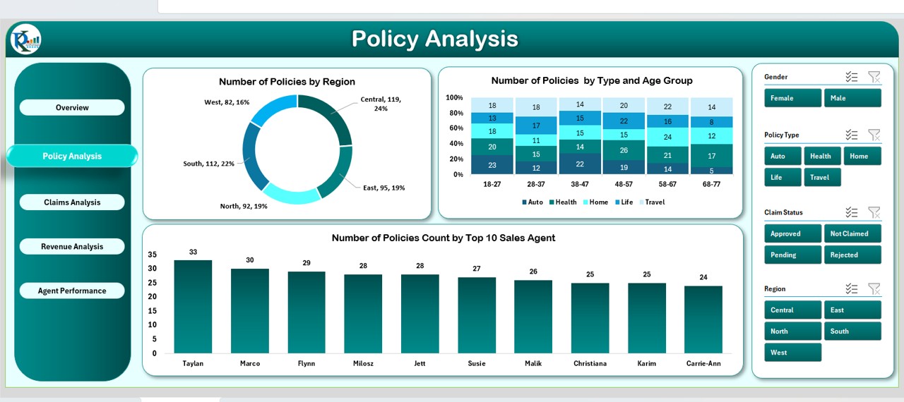
Policy Analysis Sheet Tab
This sheet is dedicated to analyzing the policies in more detail. It includes charts and slicers that help assess the distribution and trends related to policies.
Click to buy Insurance Dashboard in Excel
Key Elements:
- Policies by Region: Donut chart displaying the number of policies by different regions.
- Policies by Type and Age Group: A 100% stacked column chart showing the percentage of policies distributed by type and age group.
- Policies by Top 10 Sales Agents: Column chart to display the top 10 sales agents by the number of policies sold.
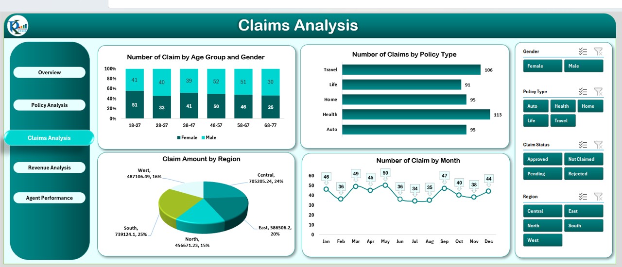
Claims Analysis Sheet Tab
This tab focuses on claims data, giving insights into claims by type, age group, gender, and region.
Key Elements:
- Claims by Age Group and Gender: Stacked column chart showing claims categorized by age group and gender.
- Claims by Policy Type: Bar chart to visualize the number of claims by policy type.
- Claim Amount by Region: Pie chart displaying the claim amounts distributed by region.
- Claims by Month: Line chart showing the number of claims each month.
Revenue Analysis Sheet Tab
The Revenue Analysis tab breaks down premium and claim amounts, providing insights into the financial performance of the insurance company.
Key Elements:
- Premium Amount by Policy Type: Bar chart showing premium amounts categorized by policy type.
- Premium vs Claims by Region: Column chart comparing the premium amounts to claims across different regions.
- Monthly Premium Trends: Line chart that shows the monthly trends in premium amounts.
- Top 5 Agents by Premium: Bar chart showing the performance of top agents based on premium amounts.
Click to buy Insurance Dashboard in Excel
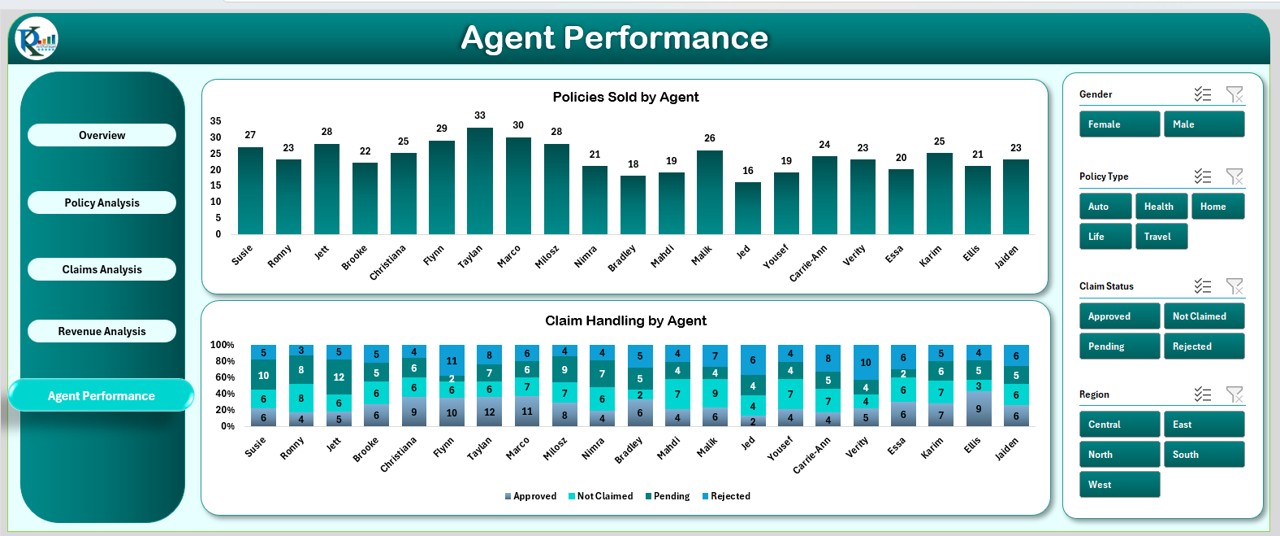
Agent Performance Sheet Tab
This sheet tracks agent performance by showing the number of policies sold and claim handling performance.
Key Elements:
- Policies Sold by Agent: Column chart showing the performance of agents based on the number of policies sold.
- Claim Handling by Agent: Column chart tracking agents’ performance in handling claims.
The Insurance Dashboard in Excel is equipped with multiple interactive features to ensure users can efficiently track and analyze various aspects of insurance operations.
Click to buy Insurance Dashboard in Excel
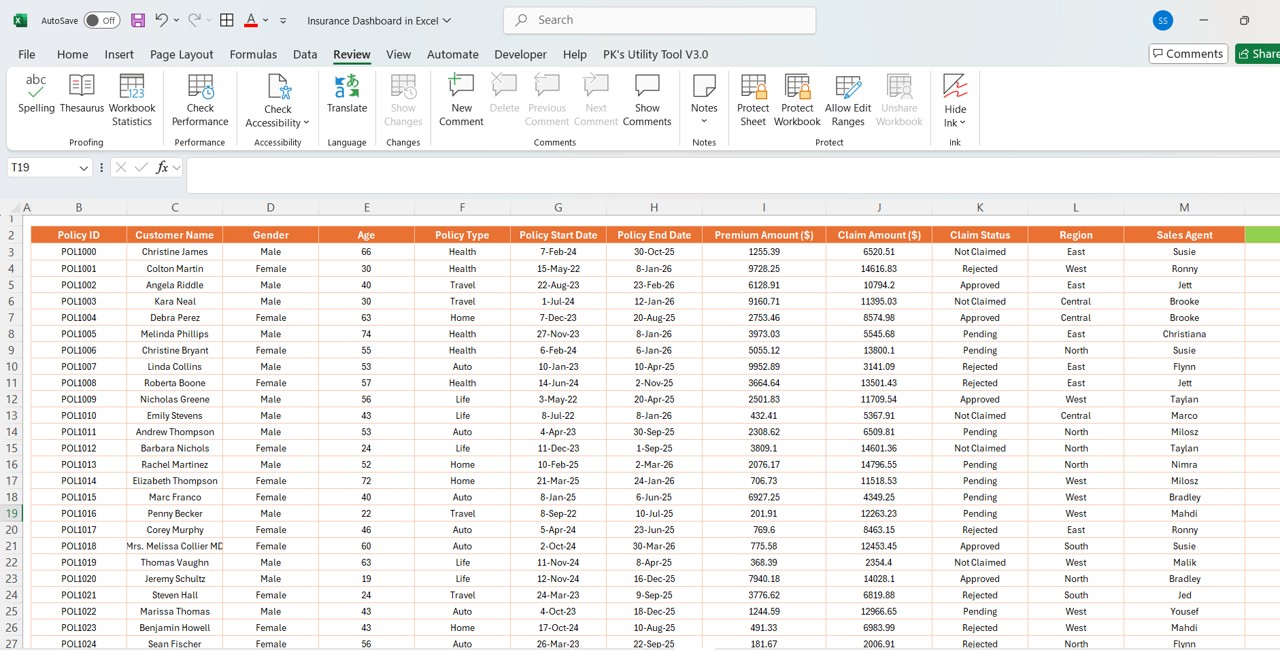
Data Input (Policy Data Sheet Tab)
-
The “Data Policy ID” sheet serves as the input sheet where all data regarding policies, claims, agents, and customers are stored.
-
The data includes fields such as Customer Name, Gender, Age, Policy Type, Policy Start Date, Policy End Date, Premium Amount, Claim Amount, Claim Status, Region, Sales Agent, Month, and Year.
-
The data here drives all the charts, slicers, and KPIs, allowing users to update the dashboard with new data on a regular basis.
Support Sheet Tab
-
The Support Sheet is designed to provide additional support to users, offering instructions, troubleshooting guides, and FAQs. It can help new users understand how to update data, use slicers, and interpret the dashboard’s metrics.
Advantages of Using an Insurance Dashboard in Excel
An Insurance Dashboard built in Excel can offer several key benefits for insurance companies and agents:
-
Quick Decision Making: With clear, real-time visualizations, insurance professionals can make informed decisions quickly by understanding trends, identifying areas for improvement, and tracking performance.
-
Enhanced Data Analysis: The dashboard allows users to analyze data across multiple parameters, such as claim amounts, policy types, regions, and agents. This helps identify patterns, uncover insights, and spot inefficiencies.
-
Improved Reporting: Generating reports becomes simpler with an insurance dashboard. The various charts and tables can easily be exported to create monthly, quarterly, or annual reports for management.
-
Data Consolidation: By consolidating policy, claims, and agent data in one place, the dashboard provides a single source of truth, eliminating the need to reference multiple spreadsheets or databases.
-
Customizability: Users can adapt the dashboard to meet their specific needs. Whether it’s adjusting the slicers, adding more charts, or changing the data format, the dashboard is flexible and customizable.
Opportunities for Improvement in an Insurance Dashboard
Click to buy Insurance Dashboard in Excel
While an Insurance Dashboard in Excel can significantly streamline operations, there are still opportunities for improvement:
-
Automation of Data Updates: Automating data import from other sources (such as claims management systems or customer databases) can save time and reduce the risk of errors.
-
Advanced Analytics Integration: Incorporating predictive analytics tools and integrating machine learning algorithms could provide deeper insights into policyholder behaviors, claim trends, and agent performance.
-
Interactive Dashboard Enhancements: Enhancing the interactivity of the dashboard by integrating it with Power BI or using VBA macros can provide more dynamic and real-time updates based on user inputs.
-
Mobile Compatibility: With more insurance professionals working remotely or on-the-go, creating a mobile-friendly version of the dashboard or integrating it with cloud-based platforms would improve accessibility.
Best Practices for Using the Insurance Dashboard
To maximize the effectiveness of your Insurance Dashboard in Excel, follow these best practices:
-
Keep Data Consistent and Clean: Ensure that your data is accurate and up-to-date. Regularly check for errors or discrepancies in the input data to maintain the integrity of the dashboard.
-
Use Slicers Effectively: Slicers are powerful tools for segmenting data. Use them wisely to drill down into specific metrics (such as policies by region or claims by agent), making your analysis more targeted.
-
Update the Dashboard Regularly: Periodically refresh the data and charts to ensure that the dashboard provides the most up-to-date insights. This is particularly important for metrics that track trends over time, like policy growth and claims analysis.
-
Optimize for User Experience: Keep the dashboard user-friendly. Avoid overcrowding the interface with too many charts or complicated metrics. Make sure users can easily navigate between different sheets and view the most important data at a glance.
Frequently Asked Questions (FAQs)
Click to buy Insurance Dashboard in Excel
1. How do I update the data in the Insurance Dashboard?
Simply update the “Data Policy ID” sheet with new policy and claims data, and the dashboard will automatically update based on the new entries.
2. Can I customize the charts in the dashboard?
Yes, Excel allows you to modify the charts, add new ones, or change the chart types. You can also adjust colors and formats to fit your preferences.
3. Is it possible to add more slicers for additional data points?
Absolutely! You can add more slicers by going to the Insert tab in Excel and selecting the Slicer option. Then, select the data you want to filter by.
4. Can the dashboard handle large datasets?
Yes, the dashboard can handle large datasets. However, performance may slow down if the data exceeds Excel’s row and column limits. It’s best to periodically clean the data to improve performance.
Conclusion
Creating an Insurance Dashboard in Excel is a valuable asset for insurance professionals who want to track, analyze, and report on key metrics. By utilizing cards, charts, and slicers, this tool provides a clear view of policies, claims, and agent performance, facilitating better decision-making and operational efficiency.
Visit our YouTube channel to learn step-by-step video tutorials
Click to buy Insurance Dashboard in Excel