Managing investments effectively requires detailed insights into performance metrics, historical comparisons, and future targets. For investment managers, tracking these details across multiple KPIs can be a daunting task. This is where an Investment Management KPI Dashboard in Excel becomes essential. It brings together key performance indicators (KPIs), historical data, trends, and targets in a simple, easy-to-navigate format. Whether you are managing a large portfolio or looking to keep track of a few investments, this dashboard provides all the tools needed to monitor progress and make informed decisions.
Click to buy Investment Management KPI Dashboard in Excel
In this article, we’ll dive into the structure of an Investment Management KPI Dashboard and explore its features, best practices, opportunities for improvement, and frequently asked questions. By the end, you’ll have a comprehensive understanding of how to implement and use this dashboard for maximum efficiency.
Key Features of the Investment Management KPI Dashboard
The Investment Management KPI Dashboard is built around seven core worksheets, each serving a unique purpose in tracking and analyzing KPIs. Below is an overview of these sheets:
Home Sheet
Click to buy Investment Management KPI Dashboard in Excel
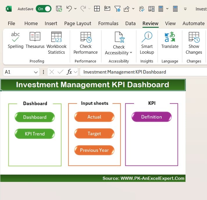
The Home sheet serves as the index for the entire dashboard. It’s designed with six buttons that allow users to navigate to different worksheets quickly and easily. This user-friendly interface ensures that even those unfamiliar with Excel can use the dashboard with minimal guidance.
Dashboard Sheet Tab
Dashboard Sheet
Click to buy Investment Management KPI Dashboard in Excel
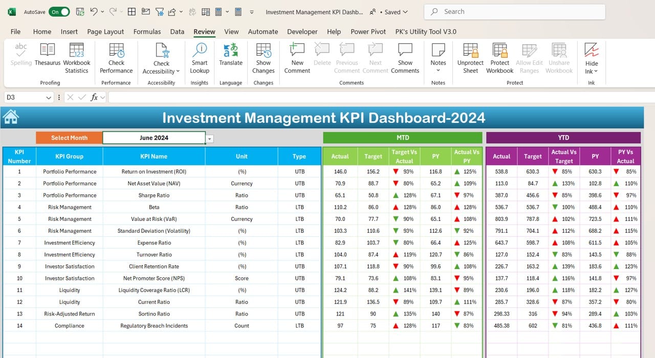
The Dashboard sheet is the heart of the system, displaying all critical KPIs in one central location. You can select a specific month from the drop-down menu in range D3, and the data for that month will instantly update across the dashboard.
This sheet includes:
- MTD (Month-to-Date) Actual, Target, and Previous Year (PY) data.
- Target vs. Actual and PY vs. Actual comparisons with conditional formatting, including up and down arrows.
- YTD (Year-to-Date) Actual, Target, and PY data with the same conditional formatting to visually indicate trends.
The ability to visualize monthly and yearly performance in one place enables quick, data-driven decision-making.
KPI Trend Sheet Tab
Click to buy Investment Management KPI Dashboard in Excel
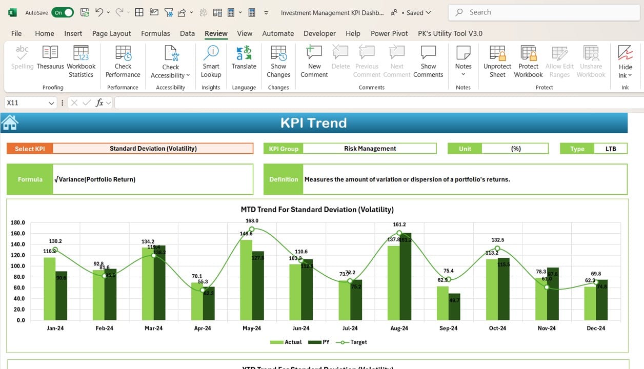
The KPI Trend sheet is where users can deep dive into specific KPIs. In range C3, users can select a KPI from the drop-down list, and the following details are displayed:
- KPI Group
- Unit of KPI (e.g., percentage, currency, etc.)
- KPI Type (indicating whether “Lower is Better” or “Upper is Better”)
- Formula of the KPI
- Definition of the KPI
Additionally, the sheet shows MTD and YTD trend charts for Actual, Target, and PY data, giving users a clear visualization of the KPI’s performance over time.
Actual Numbers Input Sheet
Click to buy Investment Management KPI Dashboard in Excel
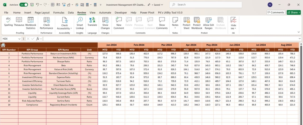
In the Actual Numbers Input sheet, users can enter the actual figures for MTD and YTD for each month. By changing the month in range E1, users can input data for any given period. This sheet ensures that your dashboard remains updated and accurate as new data is entered.
Target Sheet Tab
Click to buy Investment Management KPI Dashboard in Excel
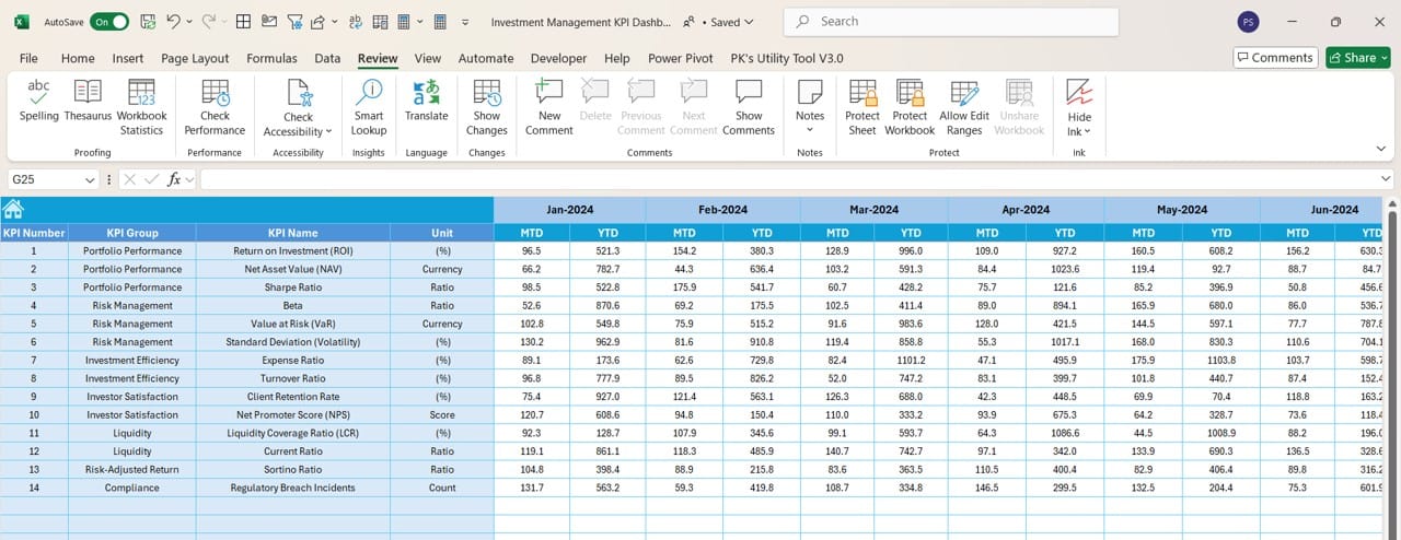
The Target sheet is designed for inputting target numbers for both MTD and YTD KPIs. By keeping targets and actual numbers in the same dashboard, users can easily track performance against set goals, ensuring that targets are not just set but actively monitored.
Previous Year Number Sheet Tab
Click to buy Investment Management KPI Dashboard in Excel
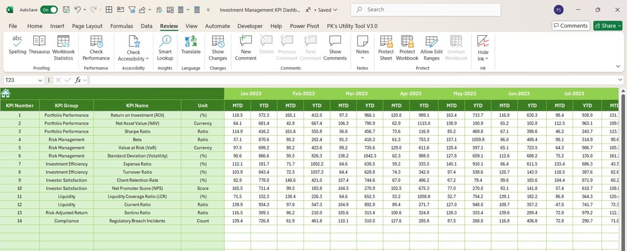
This sheet is used to input data from the previous year, similar to the actual numbers sheet. By having a direct comparison to last year’s performance, investment managers can better understand trends, variances, and areas for improvement.
KPI Definition Sheet Tab
Click to buy Investment Management KPI Dashboard in Excel
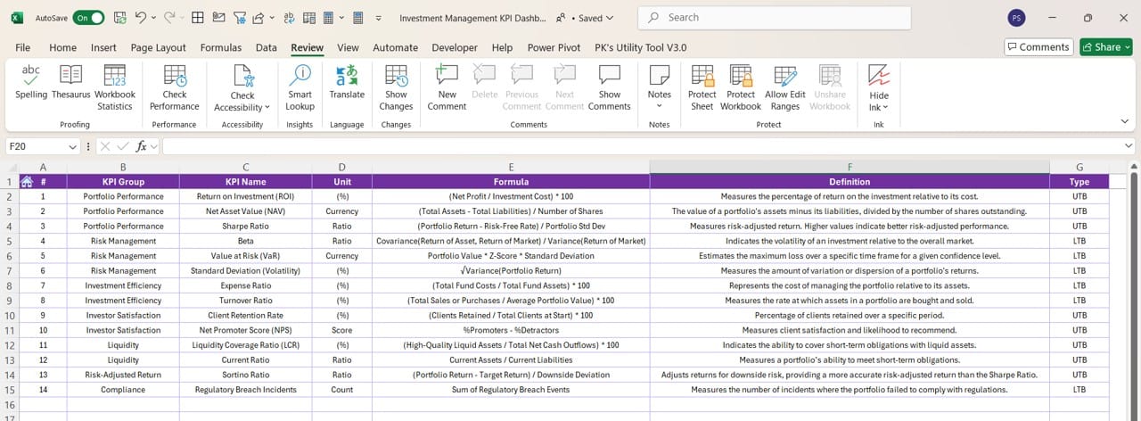
The KPI Definition sheet provides a structured format for defining KPIs. Here, users can enter the KPI Name, Group, Unit, Formula, and Definition. This ensures clarity around how each KPI is calculated and why it’s important.
Advantages of an Investment Management KPI Dashboard
Implementing an Investment Management KPI Dashboard in Excel offers several distinct advantages:
- Improved Decision-Making: With all KPIs available at a glance, managers can quickly assess how investments are performing against targets. This allows for proactive adjustments, reducing the risk of poor performance going unnoticed.
- Comprehensive KPI Tracking: By consolidating MTD, YTD, and PY data, the dashboard provides a holistic view of investment performance. This helps identify trends, make comparisons, and forecast future performance.
- Customizable and Scalable: The dashboard can be easily customized to track additional KPIs, investment categories, or portfolios. It grows with your needs, making it ideal for both small and large-scale operations.
- Increased Accountability: By clearly defining KPIs and their targets, it’s easier to assign accountability to team members or departments responsible for meeting these goals. This leads to a performance-driven culture.
Click to buy Investment Management KPI Dashboard in Excel
Best Practices for Using an Investment Management KPI Dashboard
Maximizing the potential of your Investment Management KPI Dashboard requires adhering to a few best practices:
- Keep the Data Updated: Regularly input actual numbers and targets to ensure that the dashboard reflects the most current investment performance. Set up reminders or automate data entry where possible to avoid gaps in information.
- Review Trends Monthly: While day-to-day fluctuations are expected, monthly trend analysis offers deeper insights into performance. Use the KPI trend sheet to track which KPIs consistently outperform or underperform.
- Set Realistic Targets: The value of the dashboard lies in its ability to compare actual performance against targets. Make sure that your targets are based on realistic assumptions and historical data.
- Collaborate with Team Members: Ensure that all relevant stakeholders, from portfolio managers to analysts, have access to the dashboard. By collaborating and sharing insights, the team can make more informed decisions.
Opportunity for Improvement in Investment Management KPI Dashboard
Like any tool, the Investment Management KPI Dashboard can always be refined to provide even better insights. Here are some opportunities for improvement:
- Automated Data Entry: While Excel provides a flexible platform, manual data entry can be time-consuming and prone to error. Integrating the dashboard with data sources through APIs or automation tools like Power Query can reduce this burden.
- Additional KPIs: The more comprehensive your KPI tracking, the better your decision-making will be. Consider adding more specific investment-related KPIs, such as risk-adjusted return metrics, drawdowns, or sector performance.
- Advanced Visualizations: Although the dashboard already features useful charts, incorporating advanced visualizations such as heat maps or sparklines can offer even more granular insights into investment performance.
Conclusion
Click to buy Investment Management KPI Dashboard in Excel
An Investment Management KPI Dashboard in Excel is an invaluable tool for any investment manager. By providing real-time insights into key metrics, it allows for more informed decision-making, trend analysis, and performance tracking. With a focus on MTD, YTD, and PY data, this dashboard simplifies the complex task of monitoring investment performance across multiple KPIs.
However, as with any tool, there are always opportunities for improvement. By automating data entry, adding more advanced KPIs, and incorporating more sophisticated visualizations, you can take this dashboard to the next level. For now, it provides a solid foundation for tracking and managing investments with ease.
Frequently Asked Questions (FAQs)
Q. What KPIs should I include in an investment management dashboard?
It depends on your specific investment goals, but common KPIs include Return on Investment (ROI), Net Present Value (NPV), Internal Rate of Return (IRR), and Expense Ratios. You should also track metrics like drawdown risk, asset allocation, and portfolio growth.
Q. How often should I update the dashboard?
The frequency of updates depends on your investment strategy. For active management, updating the dashboard daily or weekly is ideal. For long-term investments, monthly updates may suffice.
Q. Can I customize this dashboard for different types of investments?
Absolutely! The flexibility of Excel allows you to customize the dashboard by adding new KPIs, adjusting the formulae, or even integrating data from different asset classes such as stocks, bonds, or real estate.
Q. What’s the best way to visualize performance trends?
Excel offers various visualization tools, but line charts, bar charts, and sparklines work best for tracking trends over time. Conditional formatting with color codes can also be a great addition for visual impact.
Q. Can I share this dashboard with my team?
Yes! You can share the Excel file via cloud services like OneDrive or Google Drive to allow team collaboration. Make sure to manage access permissions to avoid accidental data manipulation.
By using an Investment Management KPI Dashboard in Excel, you streamline your investment management process, keep track of crucial metrics, and ultimately make better decisions to optimize your portfolio performance.
Visit our YouTube channel to learn step-by-step video tutorials
Click to buy Investment Management KPI Dashboard in Excel


