Tracking Key Performance Indicators (KPIs) is essential for any IT team aiming to achieve its goals efficiently. Using Power BI, you can create an IT KPI Dashboard that helps monitor performance, identify trends, and make informed decisions. This article will guide you through what an IT KPI Dashboard is, its features, how to set it up, and the best practices for using it effectively.
Click to IT KPI Dashboard
What Is an IT KPI Dashboard in Power BI?
An IT KPI Dashboard in Power BI is a tool that visualizes and tracks your organization’s IT metrics. It uses data from an Excel file, making it easy to input and manage performance data. With the interactive features of Power BI, this dashboard provides clear insights into how your IT department is performing, helping you to take timely actions and meet your objectives.
Key Features of the IT KPI Dashboard in Power BI
- This dashboard is designed with simplicity and efficiency in mind. It includes three pages that serve different purposes:
Summary Page
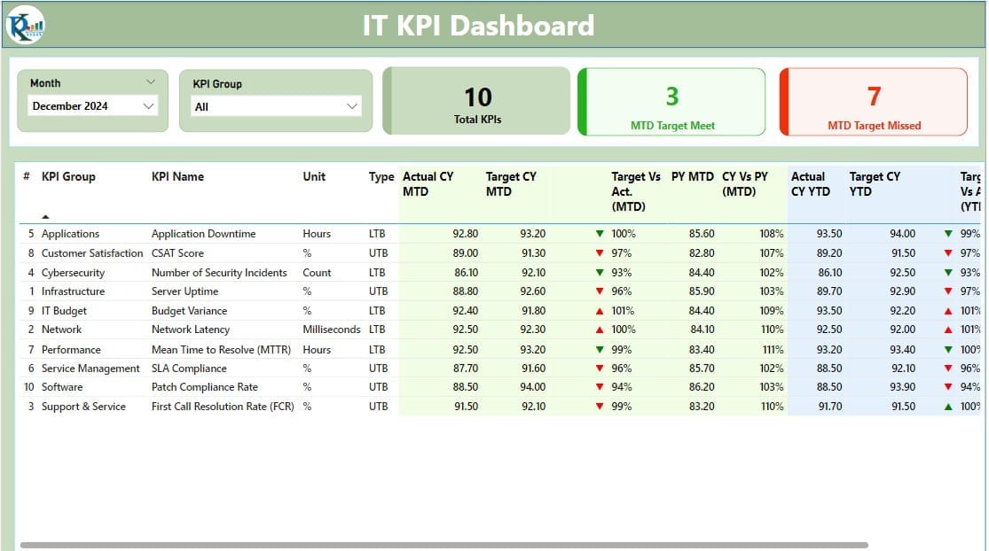
The Summary Page is the core of the dashboard. It provides an at-a-glance view of all key metrics. Here’s what you’ll find on this page:
- Slicers: Filters to narrow down the data by Month or KPI Group.
- KPI Cards:
- Total KPIs Count: Displays the total number of KPIs being tracked.
- MTD Target Meet Count: Shows how many KPIs met their Month-to-Date (MTD) targets.
- MTD Target Missed Count: Displays how many KPIs missed their MTD targets.
- Detailed Table: This table includes:
- KPI Number, Group, and Name: Helps you identify the metrics being tracked.
- Unit and Type: Shows the unit of measurement and whether the KPI is “Lower the Better” (LTB) or “Upper the Better” (UTB).
- Current Year MTD and YTD Actuals and Targets: Shows actual values compared to targets for Month-to-Date (MTD) and Year-to-Date (YTD).
- Performance Icons: Displays green arrows (▲) for meeting targets and red arrows (▼) for missing targets.
- Comparative Metrics: Highlights trends by comparing Current Year (CY) data with Previous Year (PY) data.
Click to IT KPI Dashboard
KPI Trend Page
Click to IT KPI Dashboard
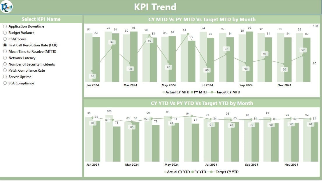
This page is for analyzing trends over time. It includes:
- Combo Charts: Visual representations of actual and target numbers for MTD and YTD values.
- Slicer: Allows users to select a specific KPI for focused analysis.
KPI Definition Page
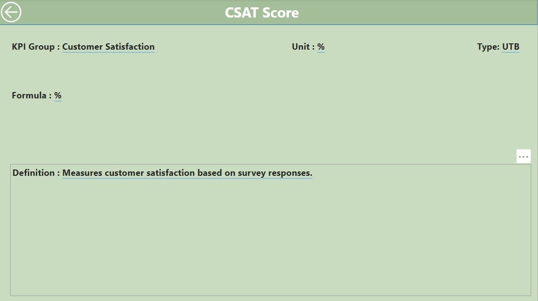
The KPI Definition Page offers detailed explanations about each KPI. It includes:
- Definitions and Formulas: Explains the logic behind each KPI.
- Navigation: A back button in the top-left corner helps users return to the Summary Page.
How to Set Up the IT KPI Dashboard
The IT KPI Dashboard uses data from an Excel file that is divided into three worksheets. Let’s explore what each sheet does:
Input Actual Sheet
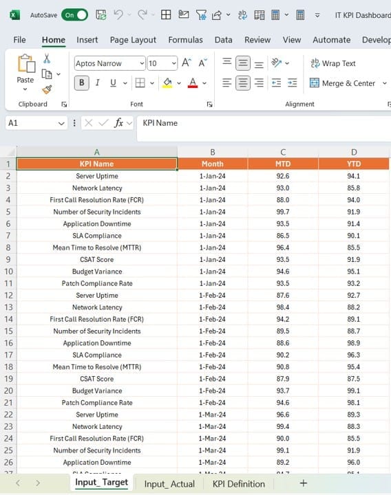
- Fill in actual numbers for each KPI, including the KPI Name, Month (use the first date of the month), MTD values, and YTD values.
Click to IT KPI Dashboard
Input Target Sheet
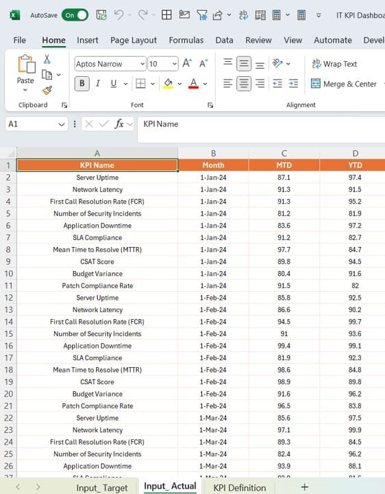
- Enter target numbers for each KPI, including the same fields as the Input Actual sheet.
KPI Definition Sheet
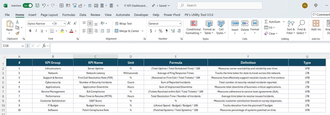
- Provide details about each KPI, including:
- KPI Number, Group, and Name
- Unit of Measurement
- Formula and Definition
- Type (LTB or UTB)
Once the data is entered, Power BI automatically updates the dashboard with the latest insights.
Why Use an IT KPI Dashboard in Power BI?
There are several reasons why an IT KPI Dashboard can be a game-changer for your organization. Here are a few key benefits:
- Real-Time Monitoring: The dashboard gives you real-time updates, allowing you to spot and address issues as they arise.
- Better Decision-Making: With clear visuals and data comparisons, you can make decisions based on facts rather than guesswork.
- Improved Accountability: By displaying performance metrics clearly, the dashboard encourages teams to stay accountable and aligned with organizational goals.
- Easier Trend Analysis: The combination of MTD and YTD comparisons makes it easy to analyze trends over time.
Click to IT KPI Dashboard
Best Practices for Using an IT KPI Dashboard
To ensure you get the most out of your IT KPI Dashboard, it’s essential to follow these best practices:
- Focus on Relevant KPIs: Make sure the KPIs you track align with your organization’s goals. Avoid cluttering the dashboard with unnecessary metrics.
- Keep the Design Simple: Simplicity is key. Use clear labels, meaningful visuals, and user-friendly navigation.
- Update Data Regularly: Ensure the Excel file is updated frequently to maintain the dashboard’s accuracy.
Use Drill-Through Features:
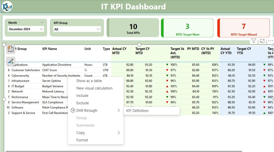
- Enable users to drill down into detailed data when needed. This keeps the main dashboard clean while offering deeper insights.
- Train Users: Provide basic training or documentation to help users understand the dashboard and interpret the data correctly.
Common Challenges and Solutions
- Data Quality Issues: Ensure your Excel sheets are free from errors or inconsistencies. Double-check formulas and validate data before uploading.
- Overwhelming Visuals: Avoid overcrowding the dashboard with too many visuals or data points. Focus on what matters most.
- Slow Performance: Optimize your Power BI file by limiting data volume and using efficient visualizations.
Conclusion
Click to IT KPI Dashboard
The IT KPI Dashboard in Power BI is a powerful tool for tracking IT metrics and achieving performance targets. With its easy-to-use interface, real-time updates, and customizable features, it enables organizations to stay on top of their game. By following the best practices outlined above, you can maximize the value of your dashboard and drive better outcomes.
Frequently Asked Questions (FAQs)
Q. What is an IT KPI Dashboard?
An IT KPI Dashboard is a visual tool that helps organizations monitor and analyze IT performance metrics in real time.
Q. What are LTB and UTB metrics?
LTB (Lower the Better): Lower values indicate better performance (e.g., server downtime).
UTB (Upper the Better): Higher values indicate better performance (e.g., system uptime).
Q. How do I update the dashboard data?
Simply update the Excel file with new Actual and Target values. The dashboard will refresh automatically when connected to Power BI.
Q. Can I customize the KPIs?
Yes, you can customize the KPIs by editing the KPI Definition Sheet in the Excel file. Add or modify formulas, units, and types as needed.
Q. How often should I update the dashboard?
The frequency depends on your organization’s needs. For most teams, updating monthly works well.
Q. Why should I use Power BI for KPIs?
Power BI offers robust visualization tools, easy integration with Excel, and customizable features, making it ideal for tracking and managing KPIs.
Click to IT KPI Dashboard
Visit our YouTube channel to learn step-by-step video tutorials
View this post on Instagram


