The luxury goods industry is characterized by high-end products, affluent customers, and a competitive market. To remain competitive, brands in this space need to continuously monitor their performance, track key metrics, and make data-driven decisions. One powerful tool that helps brands achieve this is the Luxury Goods KPI Dashboard in Power BI. This interactive and insightful tool enables businesses to efficiently track the key performance indicators (KPIs) that drive their success. Let’s explore the features, benefits, and best practices for using this tool to optimize your luxury goods business.
Table of Contents
ToggleWhat is the Luxury Goods KPI Dashboard in Power BI?
The Luxury Goods KPI Dashboard in Power BI is a data visualization tool designed to consolidate and track the key metrics that matter most for businesses in the luxury goods sector. By utilizing Power BI, a business analytics tool from Microsoft, this dashboard helps organizations collect, monitor, and visualize critical performance data in a single interface. Whether it’s sales performance, inventory levels, or customer satisfaction, the dashboard offers an easy-to-understand layout that allows decision-makers to take immediate action based on real-time data.
This dashboard is an essential tool for tracking the success of various metrics, including month-to-date (MTD) and year-to-date (YTD) performance, comparing actuals against targets, and evaluating trends over time. In addition, it enables brands to assess how they are performing in relation to their competitors and previous years’ data.
Key Features of the Luxury Goods KPI Dashboard in Power BI
A well-designed KPI dashboard for the luxury goods sector needs to offer comprehensive features that cover all aspects of business performance. The Luxury Goods KPI Dashboard in Power BI does just that. Below are the key features:
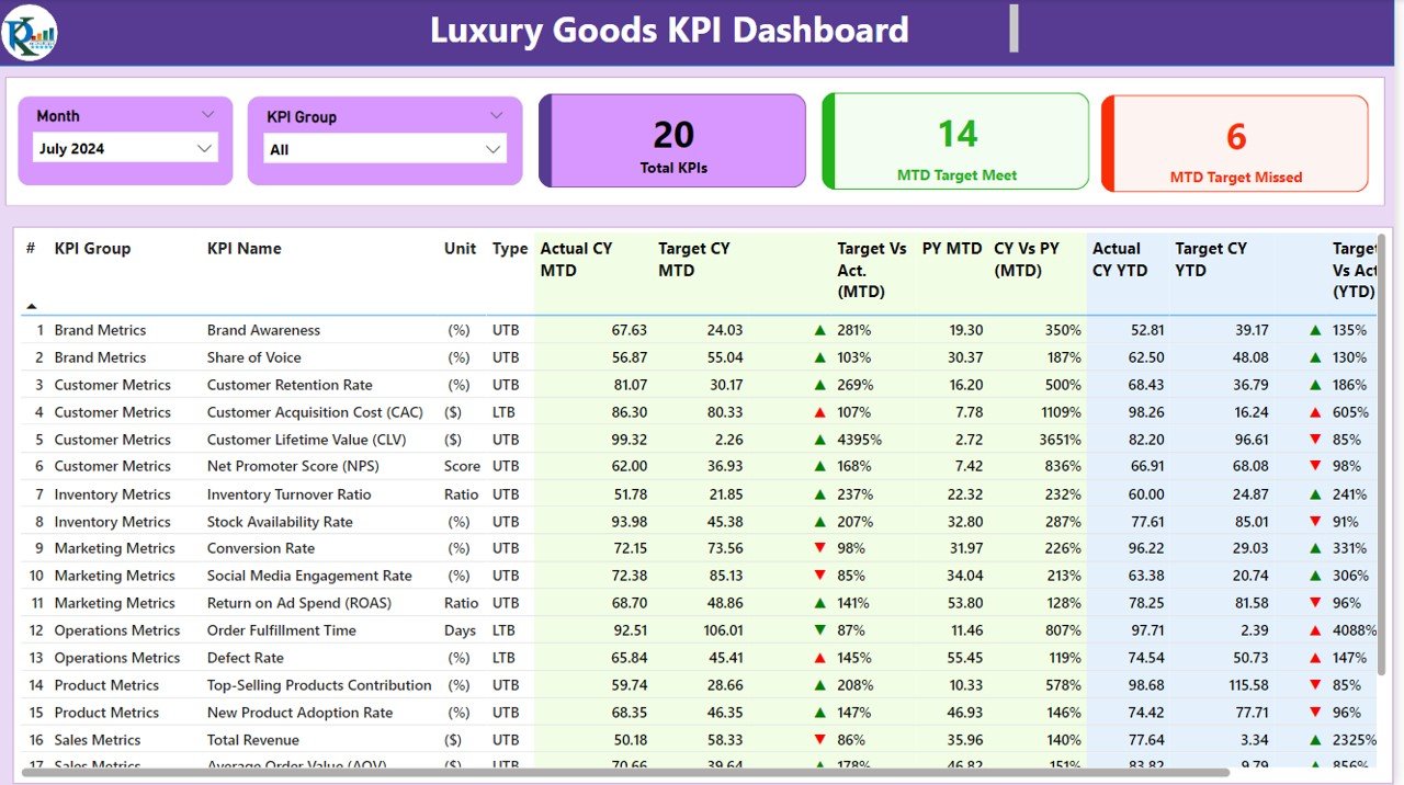
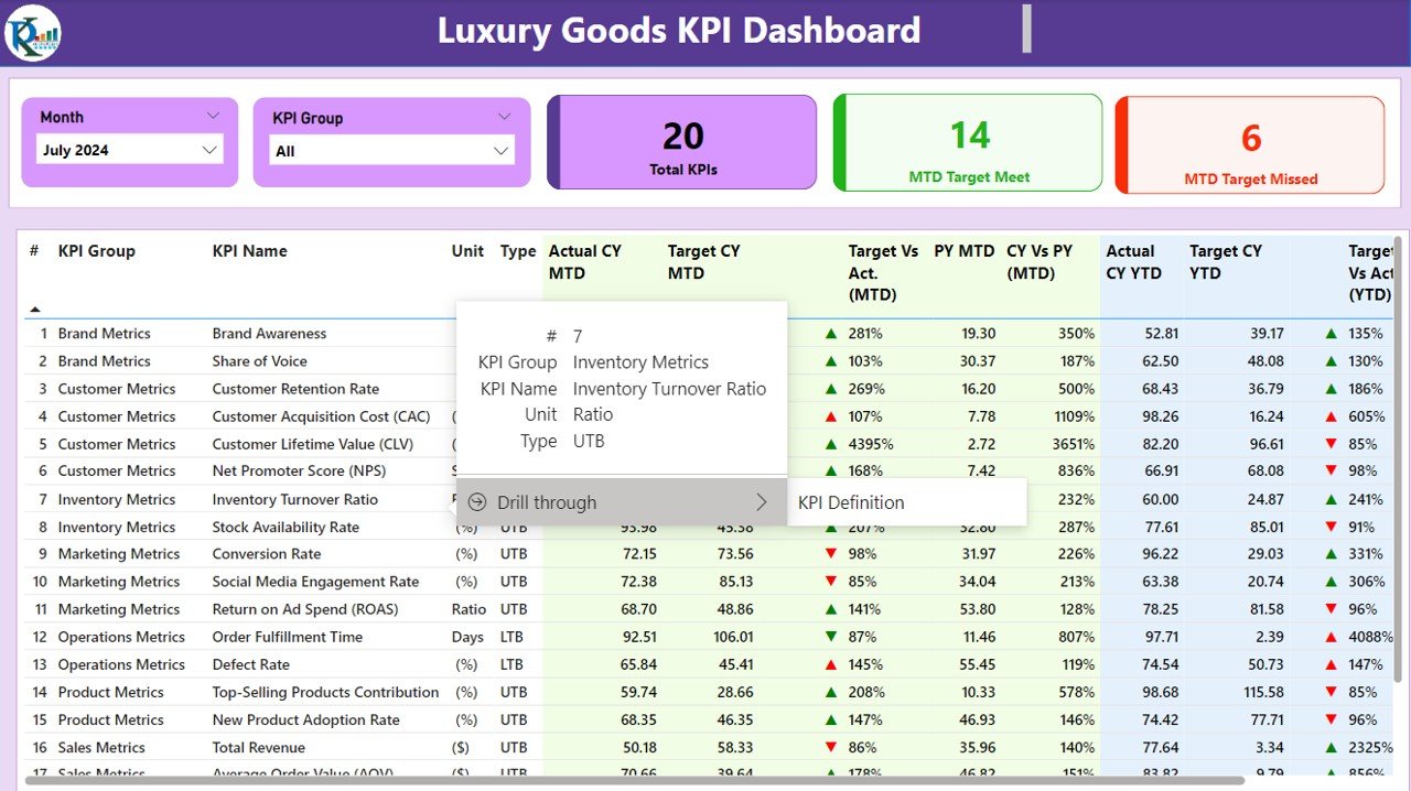
1. Summary Page: The Heart of the Dashboard
The Summary Page serves as the main hub of the dashboard. It offers an overview of the key performance indicators and allows users to assess how their business is performing at a glance. The page includes several critical features:
KPI Slicers: Allows users to filter data by month or KPI group for more granular insights.
Cards for KPI Overview: Displays the total number of KPIs, the number of KPIs that met the target (MTD), and the number of KPIs that missed the target (MTD).
Detailed KPI Table: Shows key data, including KPI names, units of measurement, target values, actual numbers, and percentage comparisons for both MTD and YTD metrics.
- KPI Number: Sequence number for each KPI.
- KPI Group: Categorizes the KPI, e.g., sales, customer satisfaction.
- KPI Name: The specific name of the KPI.
- MTD and YTD Comparison: Provides insights into month-to-date (MTD) and year-to-date (YTD) performance with visual indicators (green and red arrows) showing whether targets have been met or missed.
Click to buy Luxury Goods KPI Dashboard in Power BI
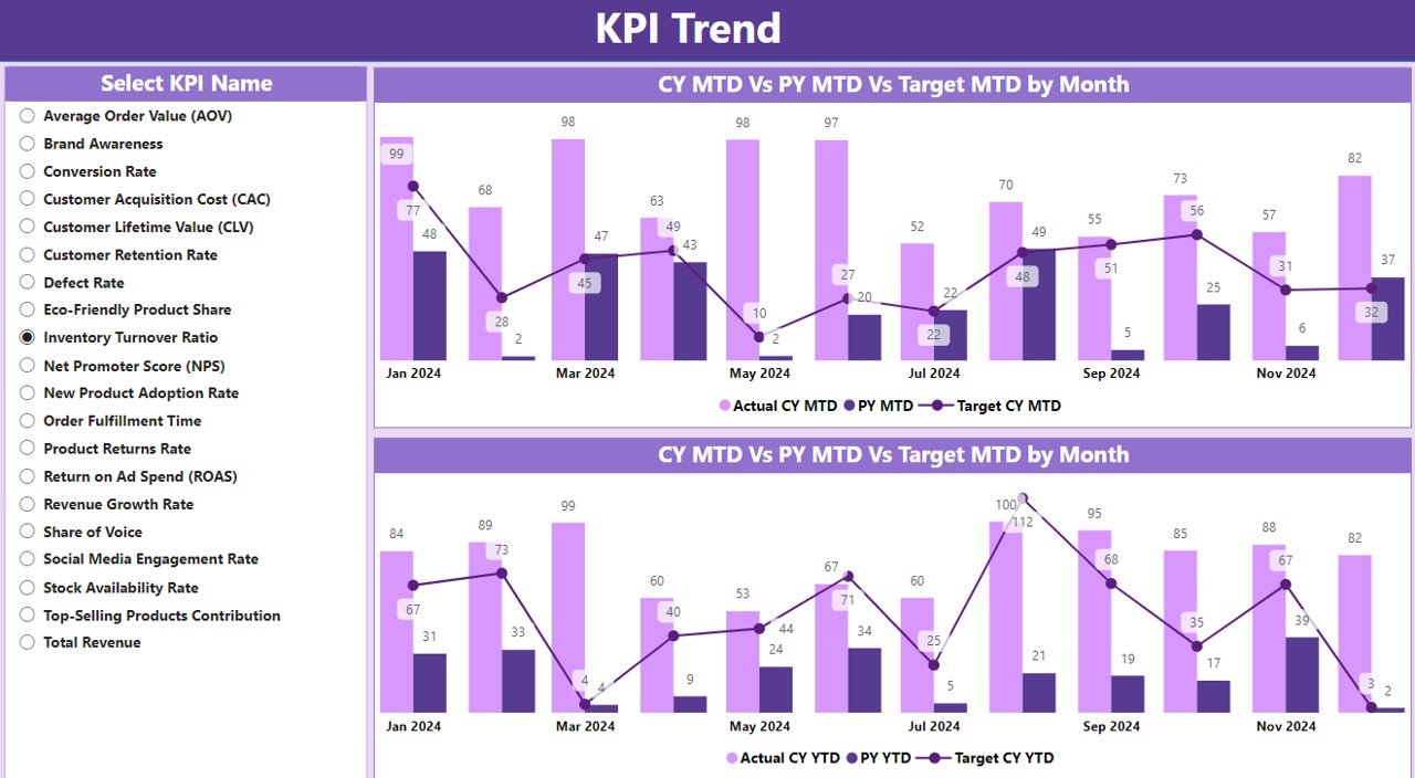
2. KPI Trend Page: Visualizing Performance Over Time
The KPI Trend Page helps businesses track the performance of their KPIs over time. It features:
- Combo Charts: These charts display the actual numbers for the current year, previous year, and targets for both MTD and YTD. This allows businesses to assess year-over-year trends and understand if they are on track to meet their goals.
- KPI Selection Slicer: Users can choose a specific KPI from the slicer on the left to delve deeper into individual trends and performance metrics.
Click to buy Luxury Goods KPI Dashboard in Power BI
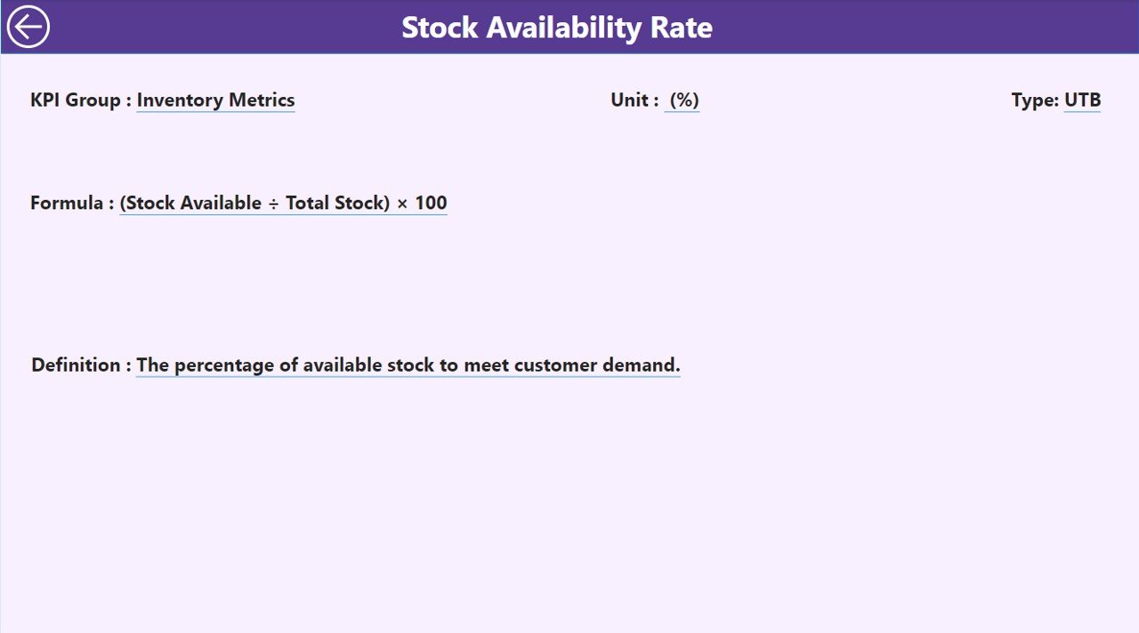
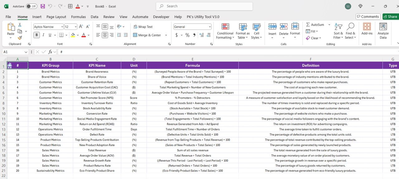
3. KPI Definition Page: In-Depth KPI Insights
The KPI Definition Page offers detailed information on each KPI. This page is hidden but accessible via drill-through from the summary page. It provides:
Click to buy Luxury Goods KPI Dashboard in Power BI
- Detailed Formula: Understanding the calculation behind each KPI.
- Definition: A clear explanation of each KPI, ensuring everyone in the organization understands its importance and purpose.
- Types of KPIs: Identifies whether the KPI is Lower the Better (LTB) or Upper the Better (UTB), helping users interpret the data correctly.
Click to buy Luxury Goods KPI Dashboard in Power BI
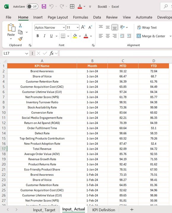
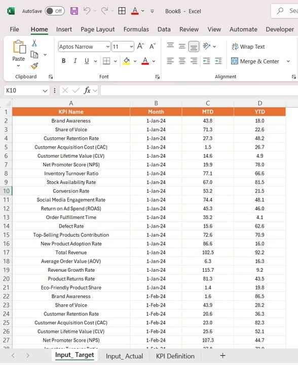
4. Excel Data Integration: Easy Data Input
The dashboard integrates seamlessly with Excel, making it user-friendly for those familiar with the platform. There are three primary Excel worksheets used for input:
- Input_Actual Sheet: Enter actual data for KPIs, such as sales numbers, inventory levels, etc., for MTD and YTD.
Click to buy Luxury Goods KPI Dashboard in Power BI
- Input_Target Sheet: Input target values for KPIs to compare with actual performance.
Click to buy Luxury Goods KPI Dashboard in Power BI
- KPI_Definition Sheet: Fill out details about each KPI, such as name, unit of measurement, formula, and type.
By linking Power BI with Excel, the dashboard provides an easy way to manage and update data without requiring advanced technical skills.
Advantages of Using the Luxury Goods KPI Dashboard in Power BI
Using the Luxury Goods KPI Dashboard in Power BI offers numerous advantages to businesses in the luxury goods sector. Below are some key benefits:
- Data-Driven Decision Making: The dashboard provides real-time insights into the business’s key metrics, enabling leaders to make informed decisions. By comparing actual performance against targets, organizations can quickly identify trends and adjust their strategies accordingly. For example, if a certain product category is underperforming, the dashboard helps identify which area needs attention, such as marketing or supply chain.
- Improved Performance Monitoring: With the Luxury Goods KPI Dashboard, businesses can monitor performance across multiple KPIs simultaneously. Whether it’s tracking sales performance, customer satisfaction, or inventory turnover, the dashboard consolidates all the essential metrics in one place. This eliminates the need for manual tracking and offers an easily accessible view of how the business is performing.
- Clear Goal Alignment: The dashboard aligns the team’s efforts with clear, measurable KPIs. Whether it’s setting sales targets or tracking customer retention rates, everyone in the organization understands their role in reaching the company’s goals. The visual indicators help motivate the team by providing a real-time view of progress, and the percentage comparisons make it easy to see if targets are being met.
- Increased Transparency: By using clear visualizations and real-time data, the dashboard ensures that key stakeholders, including executives, board members, and even customers, have full visibility into the organization’s performance. This transparency helps build trust and encourages collaboration across teams, ultimately improving decision-making and organizational outcomes.
Opportunity for Improvement in the Luxury Goods KPI Dashboard
While the Luxury Goods KPI Dashboard in Power BI is already an essential tool for performance tracking and optimization, there are always opportunities for improvement. Here are a few ways the dashboard can be enhanced:
- Mobile Compatibility: Currently, the dashboard is best used on desktop systems. However, making it mobile-friendly would allow team members to access critical data and KPIs on the go. This flexibility is especially beneficial for sales teams or executives who need to make quick decisions while traveling or attending meetings.
- Integration with Other Systems: Integrating the dashboard with other systems such as CRM platforms, social media analytics, or customer feedback tools could provide a more comprehensive view of performance. For example, linking the dashboard with a social media analytics tool could allow businesses to track customer sentiment in real time, while CRM data could help track lead generation and customer acquisition.
- Predictive Analytics: Incorporating predictive analytics into the dashboard could help businesses forecast future trends. By leveraging historical data and machine learning algorithms, the dashboard could predict sales trends, customer behavior, and inventory needs, enabling organizations to prepare more effectively for future challenges.
- Customization Options: Offering more customization options would allow users to tailor the dashboard to their specific needs. For example, users could create custom KPIs or adjust the layout of the dashboard to match the branding of their organization. This level of personalization would make the dashboard even more valuable and adaptable.
Best Practices for the Luxury Goods KPI Dashboard
To make the most of the Luxury Goods KPI Dashboard, businesses should follow these best practices:
- Regular Data Updates: Keep the data in the dashboard up to date to ensure accuracy. Monthly or quarterly updates are recommended, but more frequent updates may be necessary for businesses with rapidly changing data, such as sales or inventory levels.
- Set Clear KPIs: Establish clear and measurable KPIs for your team to track. These KPIs should align with your business objectives and provide actionable insights. Without clear KPIs, the dashboard will not deliver meaningful data.
- Train Your Team: Ensure that everyone in the organization is trained on how to use the dashboard. Proper training will help team members understand the data, interpret the KPIs, and take action based on the insights provided.
- Monitor Multiple Metrics: Track a variety of KPIs to get a comprehensive view of your business. For example, in addition to sales performance, monitor customer satisfaction, inventory levels, and marketing ROI. This holistic approach will help you identify which areas need attention and where your business is excelling.
- Use Insights for Strategic Planning: The insights from the dashboard should be used not only to monitor performance but also to inform strategic planning. Use the data to make decisions about new product launches, marketing campaigns, and customer engagement strategies.
Frequently Asked Questions (FAQ)
1. What is a Luxury Goods KPI Dashboard in Power BI?
A Luxury Goods KPI Dashboard in Power BI is a tool that helps businesses in the luxury goods sector track and analyze key performance indicators such as sales, customer satisfaction, and inventory management. It consolidates data into an easy-to-use dashboard that provides real-time insights and enables data-driven decision-making.
2. How can the dashboard improve my luxury goods business?
By providing real-time insights, the dashboard allows businesses to monitor performance across multiple KPIs. It helps identify trends, optimize marketing efforts, and ensure that the business is on track to meet its goals. It also fosters accountability and transparency across teams.
3. Can I customize the Luxury Goods KPI Dashboard?
Yes, the dashboard can be customized to reflect your unique KPIs, such as sales targets, customer engagement metrics, or inventory turnover rates. Customization allows you to tailor the dashboard to your specific business needs.
4. How do I input data into the Luxury Goods KPI Dashboard?
Data is inputted through an Excel file that integrates with the dashboard. You simply need to fill out the necessary information, such as actual and target numbers for KPIs, into the provided Excel sheets.
5. Can I use the dashboard on mobile devices?
Currently, the dashboard is optimized for desktop use. However, making it mobile-friendly is a potential area for improvement that could allow users to access KPIs on the go.
Conclusion
The Luxury Goods KPI Dashboard in Power BI is a powerful tool for tracking and optimizing the performance of businesses in the luxury goods sector. With its easy-to-understand visualizations, real-time data insights, and the ability to track multiple KPIs, this dashboard helps businesses make informed decisions, enhance transparency, and achieve their strategic goals. By following best practices, regularly updating data, and using insights for strategic planning, businesses can maximize the value of the dashboard and drive success in their luxury goods operations.
Visit our YouTube channel to learn step-by-step video tutorials