In today’s fast-paced manufacturing world, risk management is not just a requirement—it’s a competitive edge. However, tracking those risks, measuring their impact, and ensuring continuous improvement is no easy task. This is where a Manufacturing Risk Management KPI Dashboard in Excel becomes incredibly useful.
In this comprehensive guide, you’ll discover what this dashboard is, how it works, its advantages, best practices, and much more. Whether you’re a production manager, quality analyst, or operations head, this article will show you how to take control of manufacturing risks using simple Excel tools.
Click to Purchase Manufacturing Risk Management KPI Dashboard in Excel
What is a Manufacturing Risk Management KPI Dashboard?
A Manufacturing Risk Management KPI Dashboard is an interactive Excel-based tool that helps track key performance indicators (KPIs) related to risk in manufacturing processes. It provides a clear visual summary of performance trends, risk metrics, targets, and deviations—making it easier to monitor, evaluate, and act.
The dashboard empowers manufacturers to:
- Identify potential threats early.
- Analyze trends in quality, safety, and compliance.
- Compare actual performance with targets and historical data.
- Take data-driven decisions for process improvement.
What’s Inside the Manufacturing Risk Management KPI Dashboard?
This Excel template comes with seven pre-designed worksheets to simplify your work and enhance visibility into your risk KPIs.
Home Sheet: The Central Hub
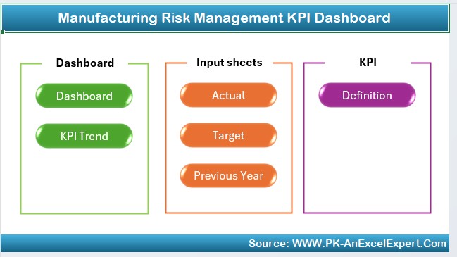
This is the main landing page of the dashboard. It contains clickable buttons for quick navigation to other sections, making the file user-friendly and efficient.
🔹 Includes 6 navigation buttons
🔹 Easy access to Dashboard, KPI Trend, Input Sheets, and Definitions
🔹 Helps you move between sheets without scrolling endlessly
Dashboard Sheet Tab: The Main Analytics View
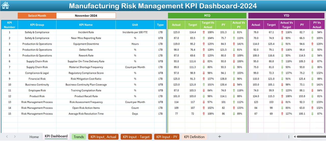
This is where the magic happens! The Dashboard tab shows a complete picture of your manufacturing risk performance.
You can select a specific month from the drop-down in cell D3. Instantly, the entire dashboard updates to reflect the KPIs for that month.
What it shows:
- MTD (Month-to-Date): Actual, Target, and Previous Year numbers
- YTD (Year-to-Date): Actual, Target, and Previous Year
- Target vs Actual and PY vs Actual: Conditional formatting with up/down arrows to show progress or decline
This visual approach makes it incredibly easy to spot risk areas and respond proactively.
KPI Trend Sheet Tab: Drill into Specific KPIs
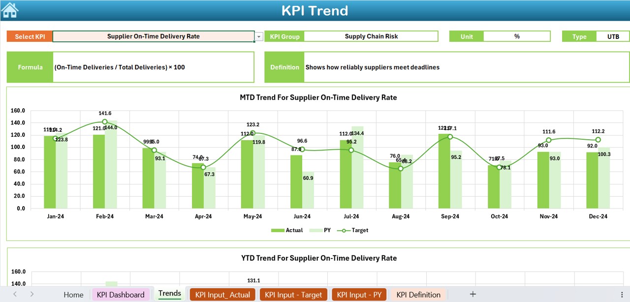
Want to explore the trend of a particular KPI? Use this sheet.
🔹 Select a KPI from the dropdown in cell C3
🔹 Automatically shows its Group, Unit, Type (Lower or Upper is better), and Formula
🔹 Displays both MTD and YTD trend charts for Actual, Target, and Previous Year
This tab helps you identify patterns and spikes in specific risk indicators over time.
Actual Numbers Input Sheet: Feed the Real Data
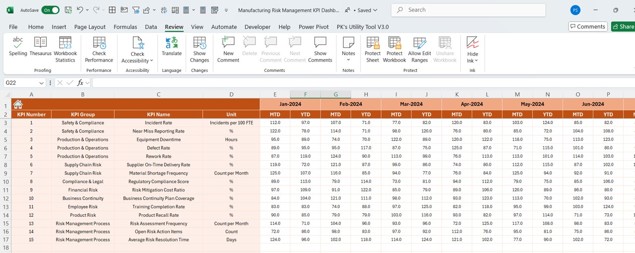
This is your data entry sheet for recording actual monthly figures.
👉 Enter the first month of the year in cell E1
👉 Then enter MTD and YTD numbers for each KPI
This sheet keeps your dashboard dynamic and up to date.
Click to Purchase Manufacturing Risk Management KPI Dashboard in Excel
Target Sheet Tab: Define Your Benchmarks
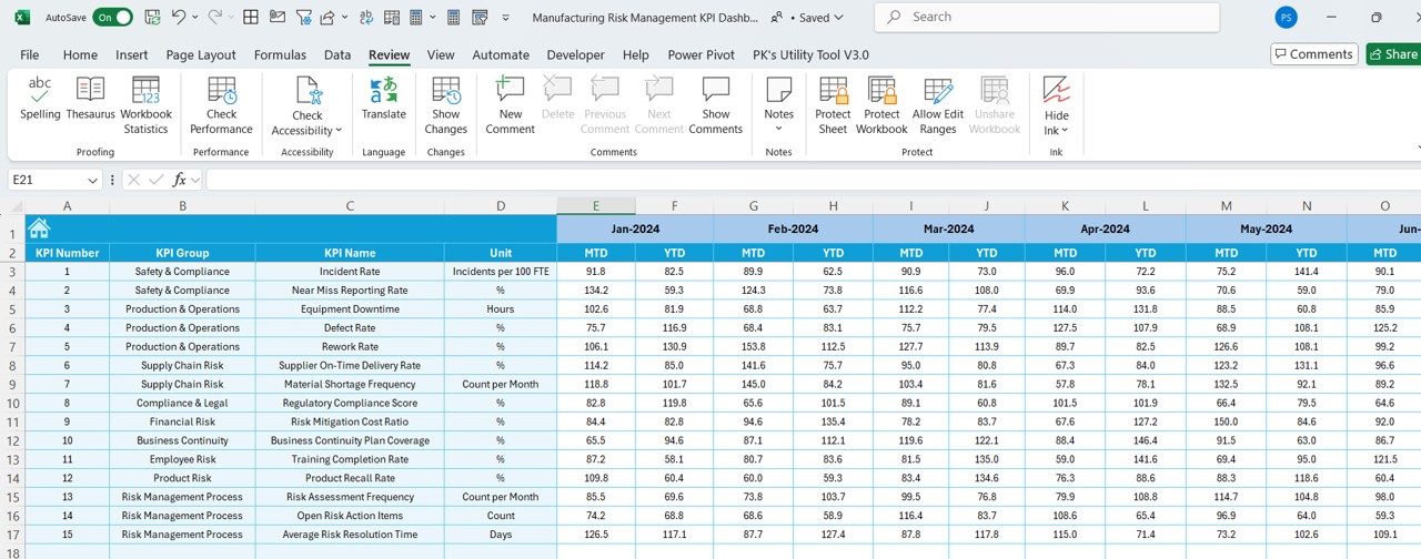
This is where you enter target values for each KPI.
✔️ Includes both MTD and YTD targets
✔️ Helps you compare actual vs planned performance
With clearly set targets, your dashboard becomes a benchmarking tool that ensures you stay on track.
Previous Year Number Sheet Tab: Historical Data Entry
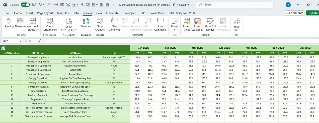
Comparing the current performance with the previous year’s performance helps assess progress.
📌 Just enter the actual numbers from the same period last year
📌 Dashboard automatically compares and shows improvement or decline using visual indicators
KPI Definition Sheet Tab: Understand the Metrics
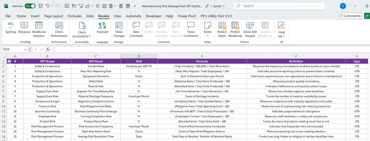
No more confusion about what each KPI means! This sheet documents:
- KPI Name
- KPI Group (e.g., Quality, Safety, Compliance)
- Unit of Measurement
- Whether “Lower is Better” or “Upper is Better”
- Formula to calculate the KPI
- A short and clear definition
This helps your team speak the same language when discussing performance.
Advantages of the Manufacturing Risk Management KPI Dashboard
- Instant Visualization of Risk Metrics: No need to scroll through long spreadsheets. You get everything in one glance—from KPI trends to deviation arrows.
- Focused and Actionable Insights: You can instantly spot where you’re falling short and take steps to fix issues before they escalate.
- Saves Time and Boosts Productivity: Predefined formulas and dropdowns mean no need to build from scratch. Just plug in your data and go.
- Tracks Both Short-Term and Long-Term Performance: With MTD and YTD views, you can easily track daily progress while keeping long-term goals in check.
- Customizable for Any Manufacturing Unit: You can edit KPIs, units, formulas, and targets as per your own process—making it extremely flexible and adaptable.
Best Practices for Using This Excel Dashboard
To make the most out of your Manufacturing Risk Management KPI Dashboard, follow these best practices:
- Keep Your Data Updated Regularly: Update the Actual and Target sheets monthly to maintain accuracy.
- Define KPIs Clearly: Use the KPI Definition tab to keep everyone aligned on what each metric means.
- Use Conditional Formatting Wisely: Don’t go overboard with colors—stick with up/down arrows for clean and easy tracking.
- Always Compare with Past Performance: Leverage the Previous Year tab to analyze trends, not just numbers.
- Limit Manual Entries: Use drop-downs, formulas, and data validation to reduce entry errors.
Conclusion
Managing manufacturing risks doesn’t have to be a complex or time-consuming task. With the Manufacturing Risk Management KPI Dashboard in Excel, you get a powerful tool that turns raw data into meaningful insights. From tracking targets to identifying risk trends and comparing yearly progress, this dashboard simplifies every step.
Whether you’re running a small workshop or a large-scale factory, this dashboard will help you stay on top of your KPIs and make informed decisions faster.
❓Frequently Asked Questions (FAQs)
What KPIs should be included in a Manufacturing Risk Dashboard?
Common KPIs include Defect Rate, Safety Incidents, Downtime Hours, Quality Compliance, Equipment Failure Rate, and Risk Severity Index.
Can I customize this Excel Dashboard for my factory?
Absolutely! You can modify KPIs, units, targets, and formulas to suit your specific manufacturing process.
Is Excel enough for managing risk in large manufacturing units?
Excel works well for small to mid-sized units. For larger enterprises, it can act as a foundation before moving to full-fledged BI tools like Power BI or Tableau.
How often should I update the dashboard?
It’s best to update it monthly, but some KPIs (like safety incidents) may require weekly tracking depending on your operations.
What does “Lower is Better” or “Upper is Better” mean?
It defines whether a lower or higher value of a KPI indicates good performance. For example, Defect Rate – Lower is Better; Production Yield – Upper is Better.
Do I need to know VBA or Macros to use this dashboard?
Not at all! This dashboard is built using basic Excel features, so anyone with fundamental Excel knowledge can use it.
Click to Purchase Manufacturing Risk Management KPI Dashboard in Excel
Visit our YouTube channel to learn step-by-step video tutorials