In today’s competitive maritime industry, managing and tracking Key Performance Indicators (KPIs) effectively is critical for improving operational efficiency, minimizing risks, and maximizing profitability. A well-structured Maritime KPI Dashboard offers maritime companies a consolidated view of essential metrics, allowing leaders to make data-driven decisions with ease. Here, we explore the features and functionality of a pre-built Maritime KPI Dashboard in Excel. This ready-to-use template is designed specifically to help users track KPIs, from monthly targets to year-to-date (YTD) trends, using an intuitive Excel interface.
Click to buy Maritime KPI Dashboard in Excel
Introduction to Maritime KPIs
Maritime KPIs measure a range of critical aspects in the shipping and logistics sectors, including safety, fuel efficiency, fleet performance, and crew operations. By monitoring these indicators, companies can identify strengths and pinpoint areas needing improvement, allowing them to optimize their resources and boost overall performance.
Key Features of the Maritime KPI Dashboard
Click to buy Maritime KPI Dashboard in Excel
Our Maritime KPI Dashboard is a user-friendly, Excel-based template that offers comprehensive insights into key metrics. Here are the standout features:
- Interactive Navigation: Users can move quickly across seven well-defined sheets, making data input and analysis hassle-free.
- Real-Time KPI Tracking: This dashboard provides Monthly-To-Date (MTD) and Year-To-Date (YTD) figures for each KPI, along with comparison visuals to last year’s data and targets.
- Customizable KPI Definitions and Formulas: The KPI Definition sheet lets users define KPIs with unique formulas, goals, and units, offering flexibility for various maritime functions.
- Visual Trends and Comparisons: Trend charts and conditional formatting give a clear view of each KPI’s performance against goals, making it easier to spot growth or areas of concern.
Detailed Breakdown of Each Sheet
Each sheet in this Maritime KPI Dashboard serves a specific function, contributing to the overall functionality and ease of navigation.
Home Sheet
Click to buy Maritime KPI Dashboard in Excel
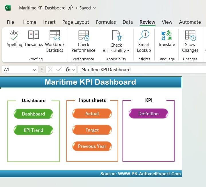
The Home sheet acts as a control center for the dashboard. It contains six clickable buttons, each redirecting to different sheets in the dashboard, allowing quick access without needing to scroll through tabs manually.
Dashboard Sheet Tab
Click to buy Maritime KPI Dashboard in Excel
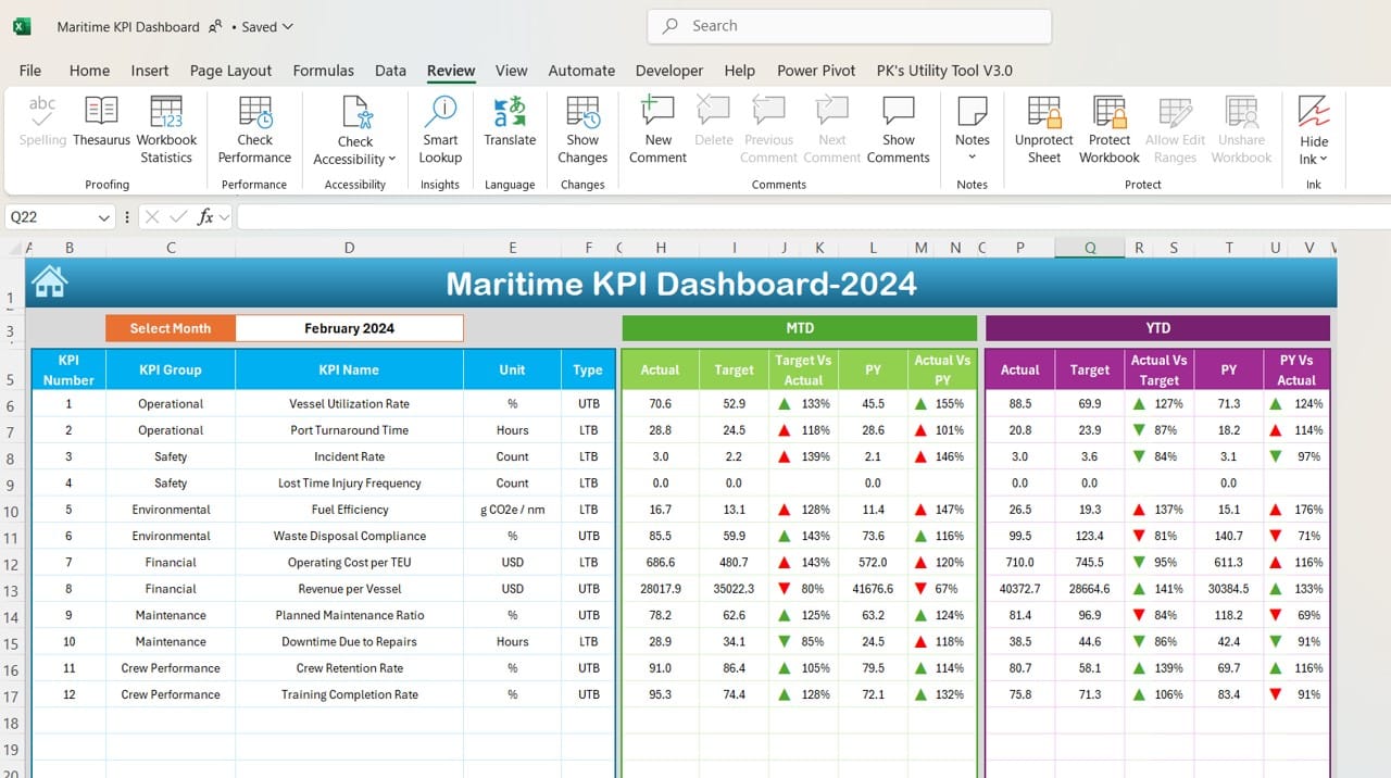
The main Dashboard tab is where all critical data is consolidated and visualized. Key components of this sheet include:
- Monthly Selection: A drop-down in cell D3 allows users to choose a specific month, updating the dashboard instantly to reflect the chosen period.
- MTD and YTD KPIs: The dashboard displays MTD Actual, Target, and Previous Year (PY) values for each KPI, along with comparisons using conditional formatting arrows to indicate progress or decline.
- Conditional Formatting: Up and down arrows provide quick visual cues for trends, showing whether KPIs are above or below target.
KPI Trend Sheet Tab
Click to buy Maritime KPI Dashboard in Excel
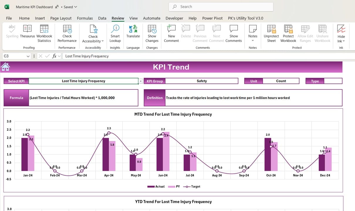
This sheet offers a more in-depth view of KPI performance by tracking the MTD and YTD trends. Features include:
- KPI Selection: The dropdown in cell C3 lets users select specific KPIs to examine.
- KPI Metadata: Each KPI includes additional details such as unit, group, and whether “Lower is Better” or “Upper is Better.”
- Trend Charting: A visual trend line shows changes over time, comparing Actual, Target, and Previous Year metrics.
Actual Numbers Input Sheet
Click to buy Maritime KPI Dashboard in Excel
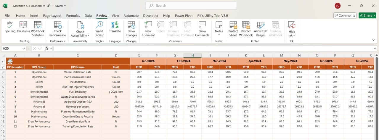
Here, users can enter actual performance numbers on a monthly and yearly basis. It’s vital to ensure accuracy in this sheet since it influences all KPI calculations.
- Monthly Update: Input the starting month in cell E1, and this will update the input range for MTD and YTD metrics across the dashboard.
Target Sheet Tab
Click to buy Maritime KPI Dashboard in Excel
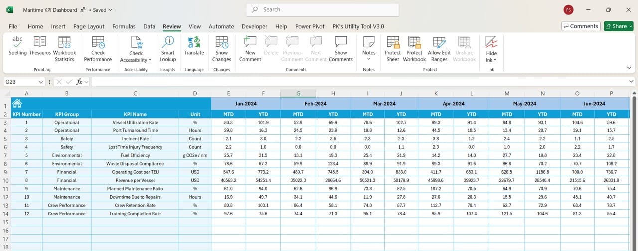
This tab allows users to set monthly and yearly targets for each KPI, which then populates the Dashboard tab and helps in benchmarking current performance against desired outcomes.
Previous Year Number Sheet Tab
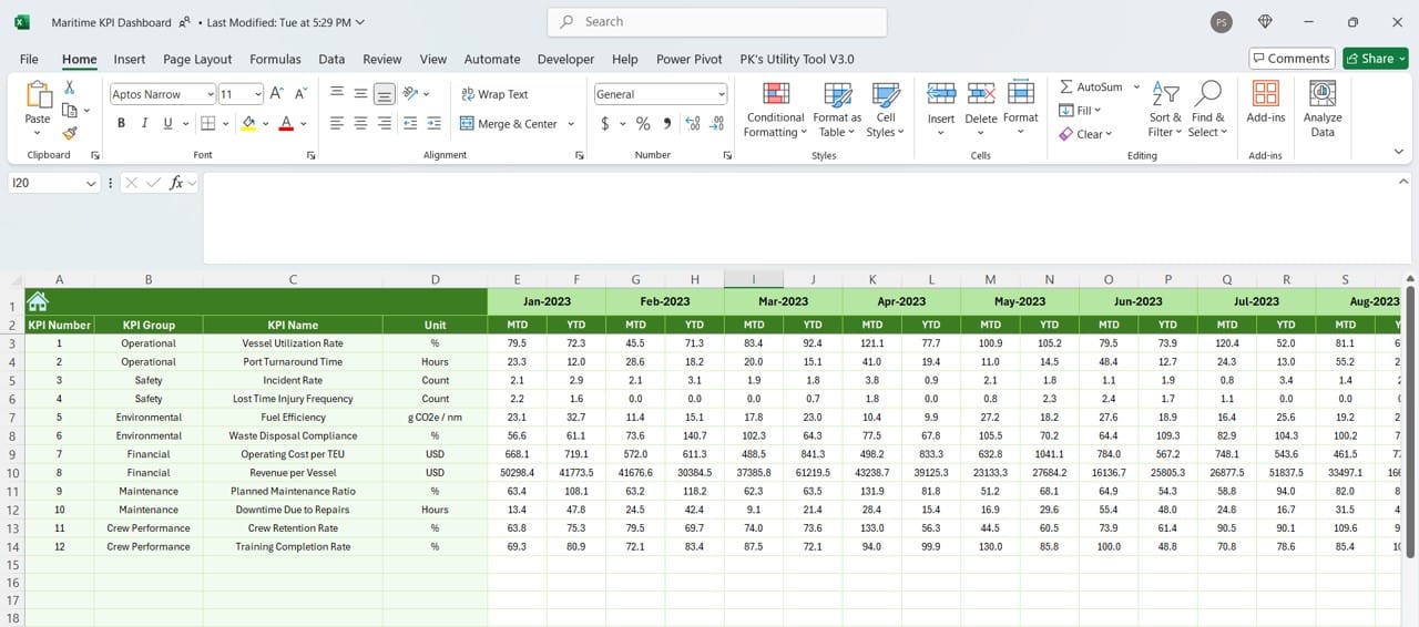
Previous Year Number Sheet
Click to buy Maritime KPI Dashboard in Excel
The Previous Year sheet holds last year’s data, which serves as a comparative baseline. This helps in identifying trends and assessing growth or decline over time.
KPI Definition Sheet Tab
Click to buy Maritime KPI Dashboard in Excel
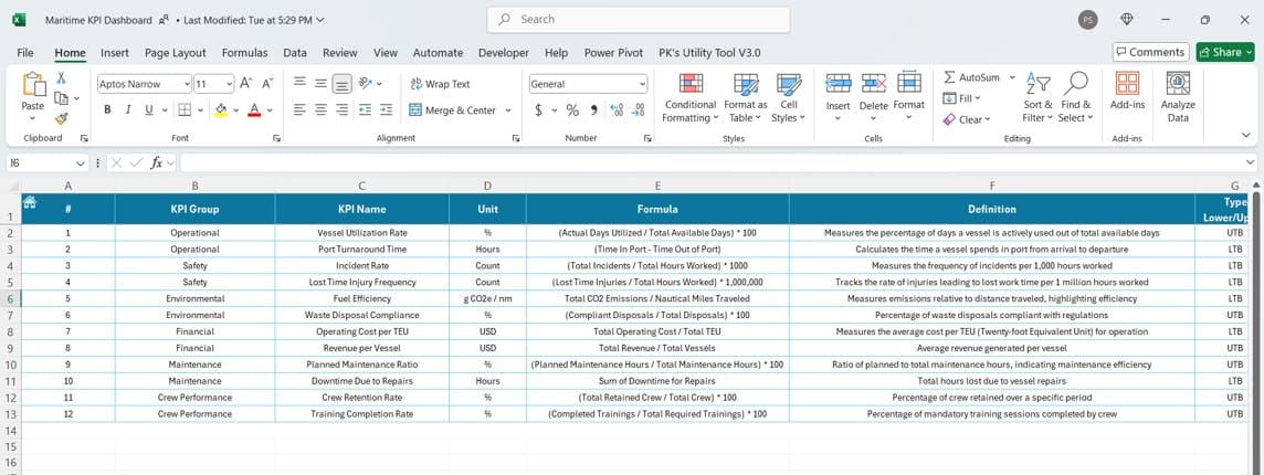
This sheet provides flexibility by allowing users to enter detailed KPI information, including:
- KPI Name and Group
- Measurement Unit
- Formula Used
- Definition: Each KPI is explained in detail, helping users and stakeholders understand the purpose and measurement behind each metric.
Advantages of the Maritime KPI Dashboard
Implementing a Maritime KPI Dashboard in Excel offers several advantages, such as:
- Improved Decision Making: Managers can easily access up-to-date information and analyze KPI trends, leading to better decision-making.
- Increased Transparency: All stakeholders can view performance metrics clearly, promoting transparency and accountability.
- Time Efficiency: Instead of manually consolidating data, this template automates calculations and visualizations, saving valuable time.
Click to buy Maritime KPI Dashboard in Excel
Best Practices for Using the Maritime KPI Dashboard
To get the most out of the Maritime KPI Dashboard, consider these best practices:
- Regularly Update Input Data: Ensure all input sheets, particularly Actual Numbers and Target sheets, are regularly updated to reflect the latest information.
- Define KPIs Carefully: Use the KPI Definition sheet to set clear and measurable goals, choosing the right unit, formula, and target values.
- Review Trends Monthly: Take advantage of the KPI Trend sheet to monitor monthly changes, looking for any sudden deviations that may need intervention.
Click to buy Maritime KPI Dashboard in Excel
Opportunities for Improvement in the Dashboard
While the Maritime KPI Dashboard is robust, there’s always room for enhancements:
- Integration with Real-Time Data: Connecting the dashboard to real-time data sources could eliminate the need for manual updates, making the dashboard even more accurate and efficient.
- Automation Enhancements: Implementing macros or automation scripts can further streamline data entry, reducing manual input errors.
- Customizable KPI Thresholds: Adding adjustable threshold levels for each KPI could make trend analysis more tailored, highlighting only the most relevant information.
Click to buy Maritime KPI Dashboard in Excel
Conclusion
The Maritime KPI Dashboard in Excel is a valuable tool for maritime professionals looking to track, measure, and improve performance across critical areas. By organizing data into well-defined sheets, offering interactive elements, and providing visual trend analysis, this dashboard template ensures that maritime companies can effectively monitor their progress against targets.
Frequently Asked Questions (FAQs)
Q. What are Maritime KPIs, and why are they important?
Maritime KPIs are key performance indicators specific to the maritime industry, focusing on metrics like safety, fleet performance, fuel efficiency, and crew welfare. Tracking these KPIs is essential for optimizing operational efficiency and improving decision-making.
Q. How often should the data in the dashboard be updated?
For optimal accuracy, it is recommended to update the Actual Numbers and Target sheets monthly. This allows the dashboard to reflect the latest trends and ensures that MTD and YTD figures are current.
Q. Can I customize the KPIs in this dashboard?
Yes, the Maritime KPI Dashboard allows for customization through the KPI Definition sheet. Users can define new KPIs, set measurement units, and assign formulas that align with their unique operational needs.
Q. What types of visual indicators are included?
The dashboard includes visual indicators such as conditional formatting arrows, which highlight positive or negative trends in KPI performance. Additionally, the KPI Trend sheet provides trend charts for a more comprehensive view.
Q. How can I improve my dashboard’s efficiency with real-time data?
To improve efficiency, consider integrating the dashboard with real-time data feeds, or using Excel’s Power Query tool for automated data refreshes. This will minimize the need for manual data entry and ensure up-to-date information is always available.
Click to buy Maritime KPI Dashboard in Excel
Visit our YouTube channel to learn step-by-step video tutorials
View this post on Instagram
Click to buy Maritime KPI Dashboard in Excel


