In the fast-paced world of medical research, tracking performance through precise Key Performance Indicators (KPIs) is essential. The Medical Research KPI Dashboard serves as a centralized tool for monitoring the progress of various research activities, helping researchers, institutions, and stakeholders make informed decisions.
Whether you’re working on clinical trials, drug development, or healthcare innovations, using a KPI Dashboard is one of the most effective ways to measure performance, analyze trends, and optimize research processes.
In this article, we’ll guide you through the key features and KPIs of the Medical Research KPI Dashboard, providing insight into how each metric can help your team achieve better outcomes.
What is a Medical Research KPI Dashboard?
A Medical Research KPI Dashboard is a visual tool designed to track key performance indicators (KPIs) that measure the effectiveness of medical research activities. This dashboard consolidates data on research progress, trial success, patient enrollment, cost efficiency, and more, offering a clear overview of the project’s performance. By using this dashboard, stakeholders can quickly assess the status of research projects, identify areas for improvement, and optimize their strategies.
Key Features of the Medical Research KPI Dashboard
The Medical Research KPI Dashboard is a ready-to-use template containing multiple worksheets, each designed to track specific aspects of your research activities. Below are the key features of this comprehensive tool:
1. Home Sheet:
This serves as the index sheet, with six buttons to quickly navigate to the relevant sections of the dashboard.

Click to buy Medical Research KPI Dashboard in Excel
2. Dashboard Sheet Tab:
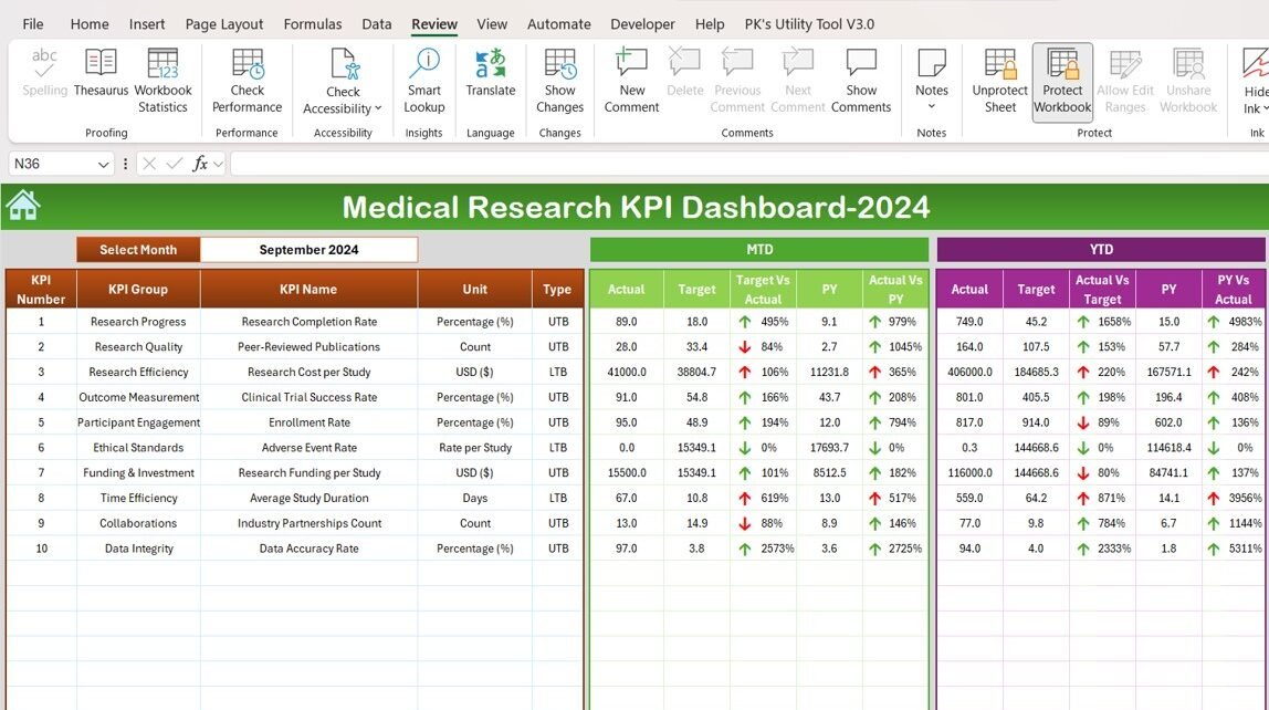
The main dashboard displays all KPIs. The month can be selected from a dropdown menu (Range D3), and the entire dashboard updates automatically for the selected month.
It shows MTD Actual, Target, and Previous Year (PY) data, along with comparisons (Target vs Actual, PY vs Actual) using conditional formatting (up/down arrows).
It also displays YTD Actual, Target, and Previous Year data with similar comparisons.

Click to buy Medical Research KPI Dashboard in Excel
3. KPI Trend Sheet Tab:
In this tab, you can select a specific KPI from a dropdown list in Range C3.
It displays details about each KPI, such as the KPI Group, unit of measurement, type (whether lower or upper is better), formula, and a detailed definition.

Click to buy Medical Research KPI Dashboard in Excel
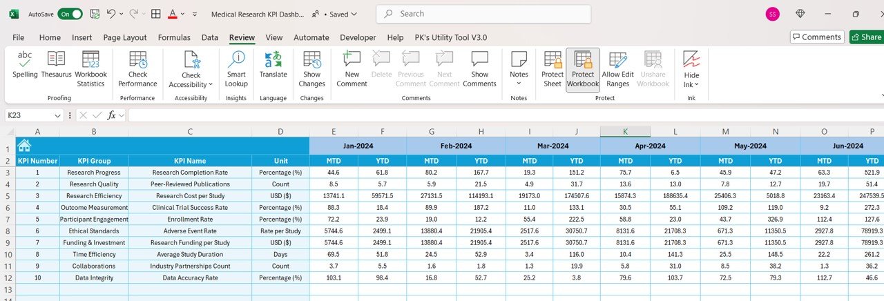
4. Actual Number Sheet Tab:
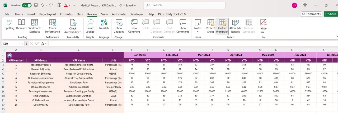
This tab allows you to enter actual data for MTD and YTD for each month. The month can be updated by changing the value in Range E1.
Click to buy Medical Research KPI Dashboard in Excel
5. Target Sheet Tab:
Here, you can enter target values for each KPI for both MTD and YTD periods, allowing for easy tracking against goals.
Click to buy Medical Research KPI Dashboard in Excel
6. Previous Year Data Sheet Tab:
This tab enables the user to enter previous year data for comparison against the current year’s performance.

Click to buy Medical Research KPI Dashboard in Excel
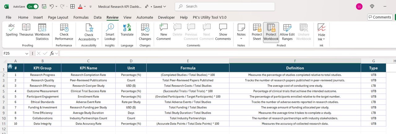
7. KPI Definition Sheet Tab:
This sheet contains the name, KPI group, unit, formula, and definition for each KPI, ensuring all users understand the metrics being tracked.
Click to buy Medical Research KPI Dashboard in Excel
Advantages of Using a Medical Research KPI Dashboard
Using a Medical Research KPI Dashboard provides several key advantages for researchers, institutions, and stakeholders:
- Centralized Tracking: The dashboard consolidates all critical research metrics into one place, allowing for easy tracking and comparison of KPIs across different projects and time periods.
- Real-Time Insights: With data updated monthly, the dashboard offers real-time insights into research progress, making it easier for teams to identify issues early and make adjustments.
- Data-Driven Decisions: The dashboard facilitates data-driven decision-making by offering up-to-date and accurate information, which can improve strategy, resource allocation, and project management.
- Improved Efficiency: By tracking KPIs like Research Cost per Study and Clinical Trial Success Rate, teams can optimize their processes and reduce inefficiencies.
- Enhanced Collaboration :The dashboard supports better collaboration across teams, helping stakeholders stay aligned with research goals, timelines, and performance.
Opportunity for Improvement in the Medical Research KPI Dashboard
While the Medical Research KPI Dashboard is a powerful tool, there is always room for improvement. Here are a few opportunities:
Real-Time Data Integration: Integrating real-time data from ongoing research could provide more immediate insights, allowing for faster decision-making and issue resolution.
Advanced Analytics: Adding advanced analytics, such as predictive modeling or machine learning, could help forecast future outcomes, identify risks, and improve planning.
More Detailed Patient Data Tracking: Including detailed patient data, such as demographics, health status, and trial adherence, could provide deeper insights into patient engagement and trial success rates.
Automated Alerts for KPI Thresholds: Automating alerts for when certain KPIs exceed or fall below predefined thresholds could help stakeholders address issues before they become critical.
Best Practices for the Medical Research KPI Dashboard
To ensure that your Medical Research KPI Dashboard is a valuable and effective tool, follow these best practices:
- Regularly Update Data: Keep the dashboard up to date with the latest data, especially for KPIs like MTD Actual, YTD Actual, and Clinical Trial Success Rate, to ensure accurate insights.
- Focus on Relevant KPIs: Only track KPIs that directly impact the research goals and outcomes. Avoid overwhelming the dashboard with unnecessary metrics that do not contribute to strategic decision-making.
- Use Conditional Formatting: Use conditional formatting (e.g., up/down arrows) to highlight trends and provide a quick visual understanding of whether performance is on track.
- Visual Clarity: Ensure that the dashboard is visually appealing and easy to navigate. Use clear labels, charts, and graphs to display data in a way that is easily digestible.
- Set Clear Benchmarks: Establish clear, measurable targets for each KPI, and regularly compare actual performance against these benchmarks to ensure that research objectives are being met.
Frequently Asked Questions (FAQs)
What are the most important KPIs for medical research?
The most important KPIs include Research Completion Rate, Clinical Trial Success Rate, Patient Enrollment Rate, Research Cost per Study, and Adverse Event Rate. These metrics give a comprehensive view of the research’s progress, quality, and efficiency.
How can I improve clinical trial success rates?
Improving Clinical Trial Success Rates involves optimizing trial design, increasing patient engagement, reducing dropouts, and addressing issues like adverse events early. Tracking the Adverse Event Rate can help in making these improvements.
Why is tracking research costs important?
Tracking Research Costs per Study allows you to assess the financial efficiency of your research. By comparing costs against targets and actual research outcomes, you can identify areas for cost optimization and better allocate resources.
How do I use the Medical Research KPI Dashboard for better decision-making?
The dashboard provides a centralized place to view critical metrics, track progress, and identify issues. By regularly reviewing these KPIs, researchers and stakeholders can make informed decisions about resource allocation, timeline adjustments, and overall research strategy.
Conclusion
The Medical Research KPI Dashboard is an indispensable tool for tracking the performance and effectiveness of research activities. By monitoring key performance indicators like Clinical Trial Success Rate, Research Cost per Study, and Patient Enrollment Rate, research teams can improve their efficiency, optimize their strategies, and ensure the success of their projects. With the right KPIs, an organized dashboard, and regular updates, your team can stay ahead in the competitive world of medical research.
Visit our YouTube channel to learn step-by-step video tutorials
View this post on Instagram
Click to buy Medical Research KPI Dashboard in Excel
