In this article you will learn how to create a beautiful Multilayered Doughnut Chart to display the team level performance. This chart can be used in business dashboard or presentation. We can create this chart to display 5 or 6 teams performance at a time.
Below are the steps to create a multilayered doughnut chart for team performance-
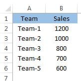
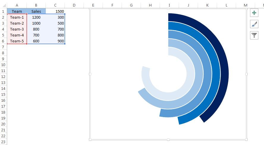
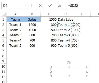
- Below is the data set for 5 teams and their sales. we will create the multilayered doughnut chart for this data set.
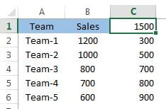
- We will take a support on column C.
- Put the formula “=MAX(B2:B6)*1.25” on cell C1
- Put the formula “=$C$1-B2” on cell C2
- Fill down the formula on “C2:C6”
- Select the range “A2:C6“
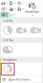
- Go to Insert tab>>Charts>>Insert a Doughnut Chart.
- Right click on the doughnut and click on select data.
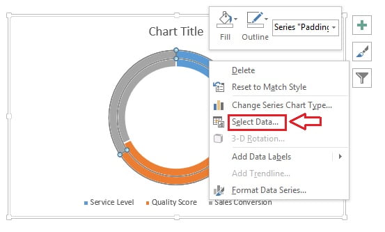
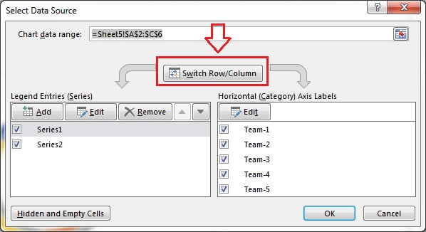
- Select Data Source window will be opened.
- Click on Switch Row/Column button.
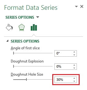
- Now right click on the doughnut and click on Format Data Series.
- In Format Data Series window take the Doughnut Hole Size 30%.
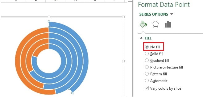
- Select the Orange slice(double click to select) of first doughnut and fill it as No fill.
- Repeat the same activity for other slices.
- Select the blue slice (double click to select) of first doughnut and fill it as dark blue.
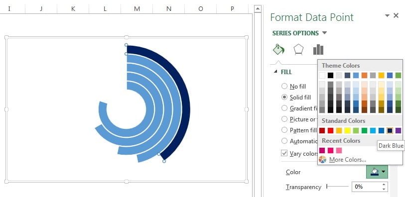
- Fill the color in rest blue slices as given in below image.
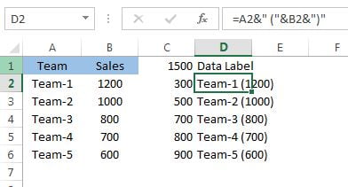
- Create a support column for Data Label on column D.
- Put the formula =A2&”(“&B2&”)” on cell D2.
- Fill down the formula for “D2:D6“
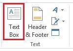
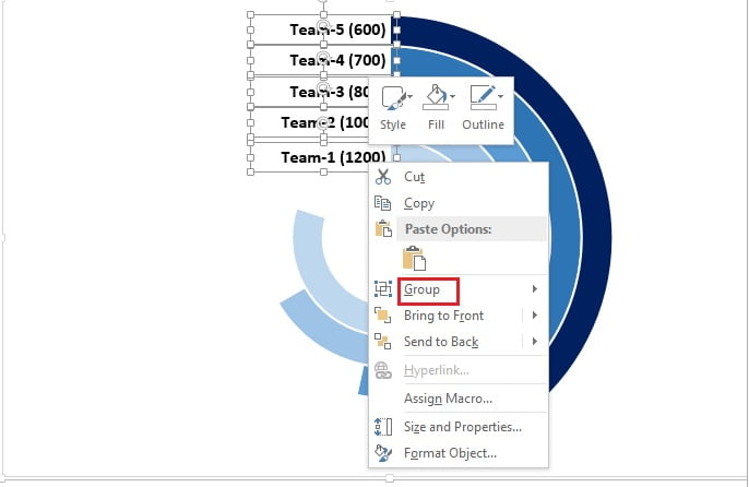
- Go to the Insert tab and insert a Text box.
- Select the text box and go to formula bar and type “=$D$2“
- Text box will be linked with cell D2.
Format the Text box like-
- Text alignment right.
- Shape fill as No fill.
- Shape outline as No outline.
- Make font bold.
Keep this text box with the small doughnut. Create the 4 more text boxes and link with cells D3, D4, D5 and D6. Keep these text boxes with the doughnuts as given in below image.
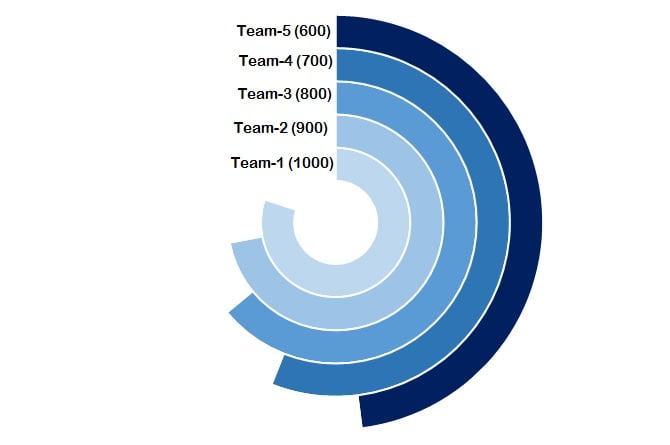
Our Multilayered Doughnut Chart is ready and will look like below given image.
Click to buy Multilayered Doughnut Chart : Part-2
Watch the video tutorial for multilayered doughnut chart-
Click to buy Multilayered Doughnut Chart : Part-2