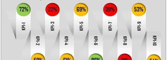
Multiple KPIs Visualization in Excel
We have created an attractive visualization to display multiple KPI performance in Excel. We have used Excel auto shapes to create this visualization. RAG (Red, Amber, and Green) color changes dynamically to display the KPI performance. This is a ready to use template for Multiple KPIs Visualization in Excel This visualization can be used for … Continue reading Multiple KPIs Visualization in Excel
