Municipal services play a crucial role in ensuring the smooth operation of cities and communities. From water supply and waste management to transportation and emergency services, these essential services require constant monitoring and evaluation. A well-designed Municipal Services KPI (Key Performance Indicator) Dashboard can significantly improve the management and oversight of these services, enabling better decision-making, resource allocation, and accountability.
One of the most effective tools for visualizing and managing KPIs in municipal services is Power BI, a powerful data visualization and business intelligence tool from Microsoft. In this article, we will explore how a Municipal Services KPI Dashboard in Power BI can streamline the monitoring of these vital services. We’ll cover the key features, best practices, advantages, and opportunities for improvement in building a comprehensive and user-friendly dashboard.
What is a Municipal Services KPI Dashboard in Power BI?
A Municipal Services KPI Dashboard in Power BI is a dynamic and interactive tool used by municipalities to track the performance of various essential services. This dashboard aggregates data related to multiple KPIs, offering a clear and concise view of how well services are performing. The key purpose of this dashboard is to provide actionable insights that help municipal authorities identify areas for improvement, track progress over time, and allocate resources more effectively.
The dashboard integrates data from multiple sources, including Excel files, and visualizes the data through various charts, tables, and slicers. The main advantage of using Power BI is its ability to present complex data in an intuitive and accessible way, making it easier for decision-makers to monitor the status of municipal services and take corrective actions when needed.
Key Features of the Municipal Services KPI Dashboard
This Power BI dashboard for municipal services comes with several features that make it highly functional and user-friendly. Let’s explore the key components:
1. Summary Page
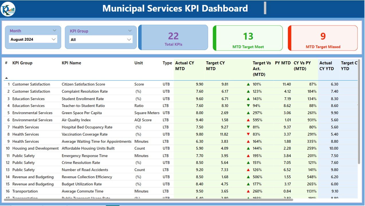
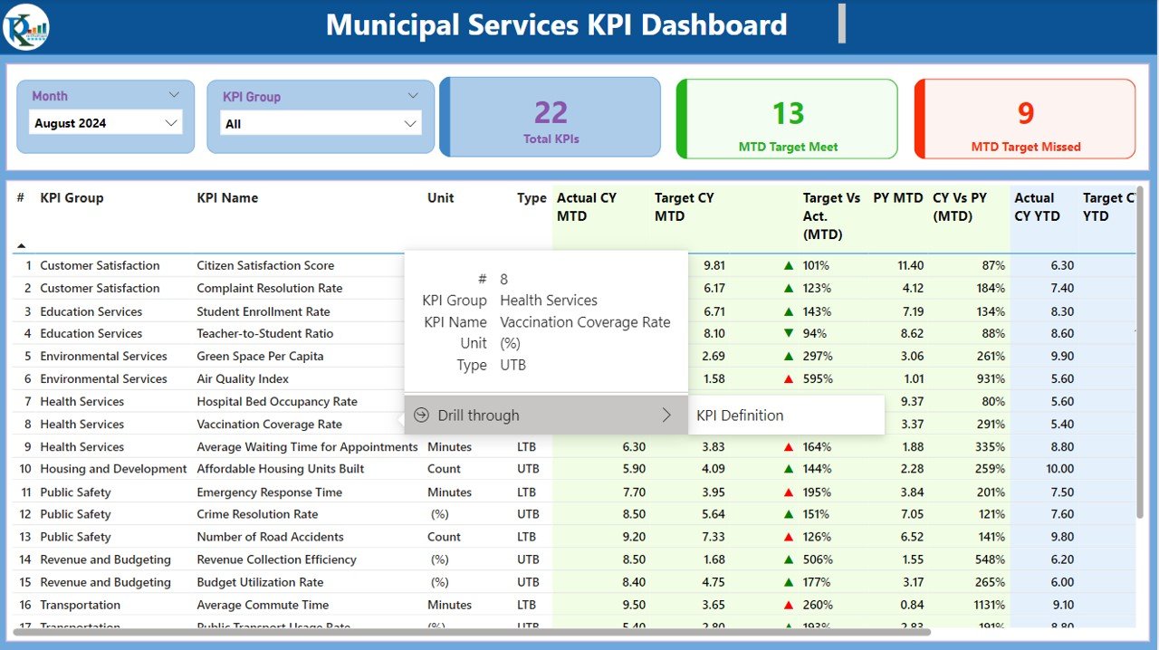
The Summary Page serves as the main hub of the dashboard. It presents a snapshot of all the key data and KPIs related to municipal services. Here are the main elements:
KPI Group and Month Slicers: These slicers allow users to filter the data by the group of KPIs or the month, providing flexibility in viewing different aspects of the data.
KPIs Cards: This section displays three cards that provide high-level metrics:
- Total KPIs Count
- MTD (Month-to-Date) Target Meet Count
- MTD Target Missed Count
KPI Data Table: Below the cards, a detailed table displays individual KPI data, including:
- KPI Number: Sequence number of the KPI.
- KPI Group: The category or group the KPI belongs to.
- KPI Name: The name of the KPI.
- Unit: The measurement unit of the KPI.
- Type: Whether the KPI is a “Lower the Better” (LTB) or “Upper the Better” (UTB) KPI.
- Actual CY MTD and Target CY MTD: The actual and target MTD numbers for the current year.
- MTD Icon: Indicators (▲ and ▼) that show the status of the KPI in relation to the target (green for on-target, red for off-target).
- Target vs Actual (MTD): The percentage of the actual value compared to the target for MTD.
- PY MTD: The MTD number for the previous year.
- CY vs PY (MTD): A percentage comparison between the current year’s MTD and the previous year’s MTD.
- Actual CY YTD and Target CY YTD: The actual and target YTD numbers for the current year.
- YTD Icon: Indicators for the YTD status against the target.
- Target vs Actual (YTD): The percentage comparison of the actual value to the target for YTD.
- PY YTD: The YTD number for the same period in the previous year.
- CY vs PY (YTD): A percentage comparison between the current year’s YTD and the previous year’s YTD.
Click to buy Municipal Services KPI Dashboard in Power BI
2. KPI Trend Page
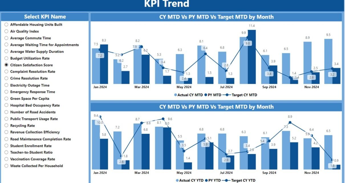
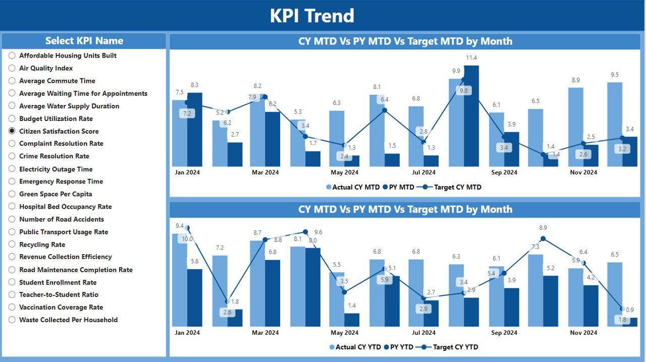
The KPI Trend Page presents a visual representation of the trends for each KPI over time. This page includes:
- Combo Charts: Two combo charts display both actual numbers for the current and previous year, along with the target values for MTD and YTD.
- KPI Name Slicer: A slicer is provided to allow users to filter the data by selecting specific KPIs to view trends for.
Click to buy Municipal Services KPI Dashboard in Power BI
3. KPI Definition Page
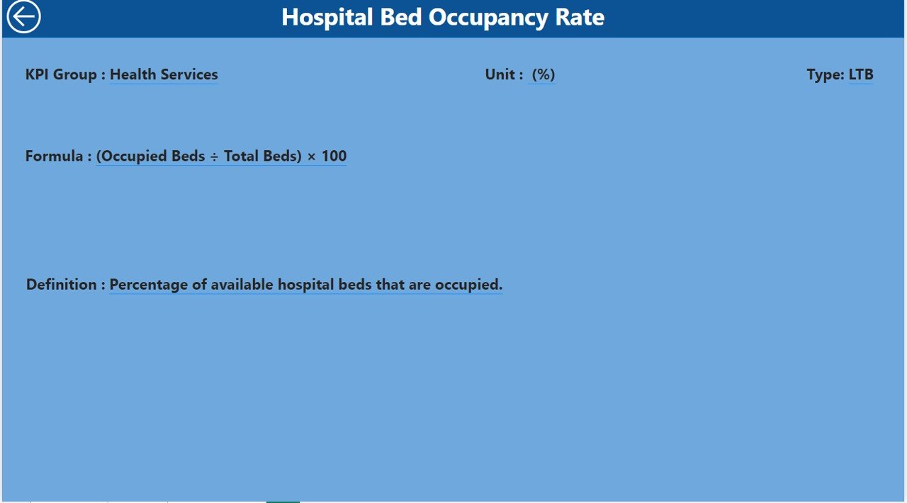
The KPI Definition Page serves as a detailed reference for each KPI. It contains:
Click to buy Municipal Services KPI Dashboard in Power BI
- Formula and Definition: For each KPI, the formula used to calculate the values and a detailed definition are provided.
- Drill-Through Functionality: Users can drill through from the summary page to access this detailed information, helping them understand how each KPI is calculated and what it represents.
Click to buy Municipal Services KPI Dashboard in Power BI
Advantages of Using a Municipal Services KPI Dashboard in Power BI
There are several benefits to implementing a KPI dashboard for municipal services using Power BI. Here are the most notable advantages:
- Enhanced Decision Making: The dashboard allows municipal authorities to monitor key metrics in real time, enabling them to make informed decisions quickly. By comparing actual performance against targets, it becomes easier to identify underperforming areas and take corrective actions.
- Improved Accountability: By tracking KPIs on a centralized dashboard, municipal services can ensure greater transparency and accountability. The dashboard provides clear, quantifiable data that can be used to hold departments or individuals responsible for meeting targets.
- Better Resource Allocation: With a comprehensive view of KPI data, municipalities can better allocate resources to areas that need attention. This data-driven approach ensures that funds and efforts are directed toward improving services that are lagging behind.
- Historical Data Comparison: The ability to compare current performance with previous year data provides valuable insights into trends and performance over time. This historical perspective allows municipalities to forecast future trends and plan accordingly.
Opportunities for Improvement in Municipal Services KPI Dashboard
While the Municipal Services KPI Dashboard in Power BI is a powerful tool, there are always opportunities for improvement. Here are a few areas where the dashboard can be enhanced:
- Integration with Real-Time Data Sources: Currently, the dashboard relies on Excel data input. Integrating live data feeds from municipal services databases would improve the timeliness and accuracy of the KPIs.
- Advanced Analytics and Predictive Modeling: Incorporating predictive analytics can help municipalities forecast future performance based on historical trends. This can provide deeper insights into how certain changes might affect service delivery and help proactively address issues before they arise.
- Customizable Dashboards for Different Users: Offering different dashboard views for various users, such as department heads, municipal executives, and citizens, would enhance the user experience. Customization options could include adding or removing KPIs, changing visualizations, or setting up email alerts for specific thresholds.
- Mobile Compatibility: Ensuring the dashboard is fully functional on mobile devices would allow municipal managers to track performance on-the-go, further improving the accessibility and usability of the system.
Best Practices for Building a Municipal Services KPI Dashboard
To get the most out of your Municipal Services KPI Dashboard in Power BI, follow these best practices:
- Define Clear KPIs: Before building the dashboard, ensure the KPIs are clearly defined and aligned with municipal goals. KPIs should be specific, measurable, achievable, relevant, and time-bound (SMART).
- Keep it Simple and Intuitive: The dashboard should be easy to navigate, with a clean layout that presents the most important information upfront. Avoid cluttering the dashboard with unnecessary elements that could overwhelm users.
- Regularly Update Data: To maintain the accuracy of the dashboard, ensure that the data is updated regularly. A real-time or near-real-time data feed will keep the information up to date and relevant.
- Customize for Different Stakeholders: Create different views of the dashboard for different stakeholders, ensuring that the data presented is relevant to each audience. For example, high-level executives may need to see summary data, while department heads may require more granular details.
- Test and Iterate: Testing the dashboard with actual users before full implementation is crucial. Collect feedback on usability and functionality, and make adjustments accordingly to improve the user experience.
Frequently Asked Questions (FAQs)
1. How does the Municipal Services KPI Dashboard in Power BI work?
The dashboard works by collecting data from Excel worksheets and displaying it in Power BI. It visualizes the KPIs for various municipal services, allowing users to track performance over time and make data-driven decisions.
2. What kind of KPIs can be tracked with this dashboard?
The dashboard can track various KPIs related to municipal services, including water supply, waste management, transportation, emergency services, and more.
3. Can the dashboard be customized for different users?
Yes, the dashboard can be customized to provide different views for different users, such as department heads, executives, and citizens.
4. How do I update the data in the dashboard?
You can update the data by filling in the appropriate Excel worksheets (Actuals, Targets, and KPI Definitions). The dashboard will automatically refresh to display the updated information.
5. Is the Municipal Services KPI Dashboard mobile-friendly?
Currently, the dashboard is optimized for desktop viewing. However, mobile compatibility can be implemented for users who need to access the dashboard on-the-go.
Conclusion
A Municipal Services KPI Dashboard in Power BI offers a powerful solution for monitoring and managing the performance of essential municipal services. By providing clear, real-time insights into key metrics, it helps municipal leaders make informed decisions, allocate resources more efficiently, and improve service delivery. While there are opportunities for improvement, such as integrating real-time data and enhancing mobile compatibility, the dashboard already serves as a valuable tool for municipalities looking to optimize their operations. Following best practices and regularly updating the dashboard will ensure its continued success and effectiveness.
Visit our YouTube channel to learn step-by-step video tutorials
View this post on Instagram
Click to buy Municipal Services KPI Dashboard in Power BI
