In the dynamic world of non-profit management, Key Performance Indicators (KPIs) are crucial for monitoring effectiveness and making data-driven decisions. A Non-Profit KPI Dashboard in Power BI transforms raw data into actionable insights, helping organizations measure their impact and operational efficiency. This article explores how you can utilize such a dashboard effectively, ensuring your non-profit stays on track towards its mission.
Click to Non-Profit KPI
What is a Non-Profit KPI Dashboard in Power BI?
A Non-Profit KPI Dashboard in Power BI is an advanced, ready-to-use tool designed to streamline the monitoring of critical metrics. It allows non-profits to capture and analyze data through an Excel file that feeds into Power BI, presenting a clear visual summary of important performance indicators.
Key Features of the Non-Profit KPI Dashboard
This comprehensive dashboard includes several pages, each tailored to display various data insights:
Click to Non-Profit KPI
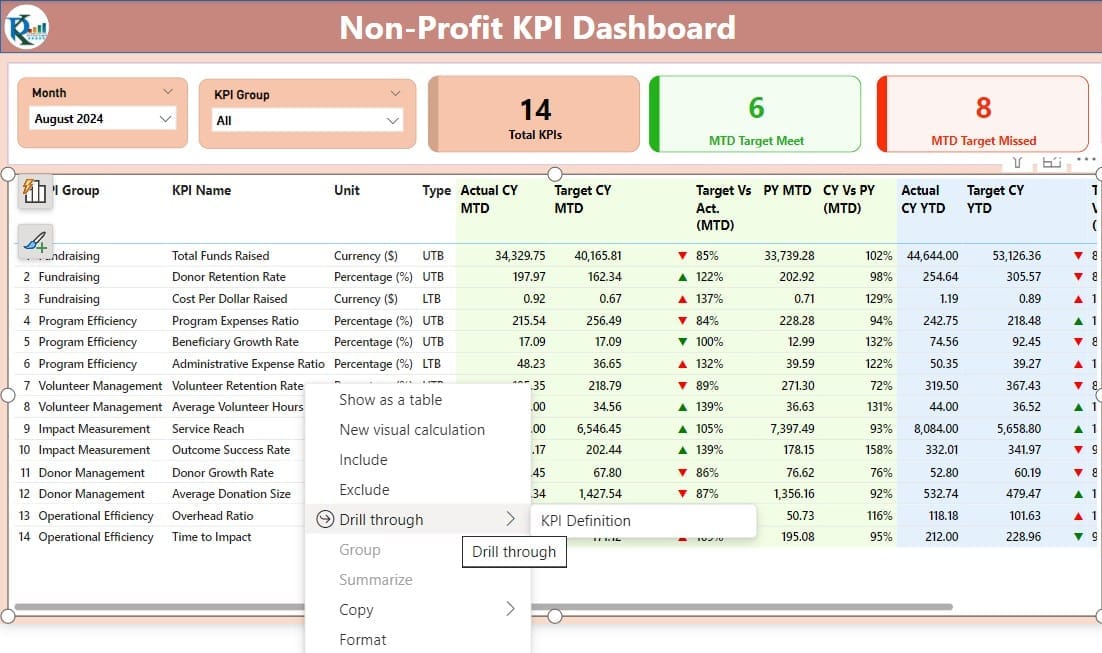
Summary Page:
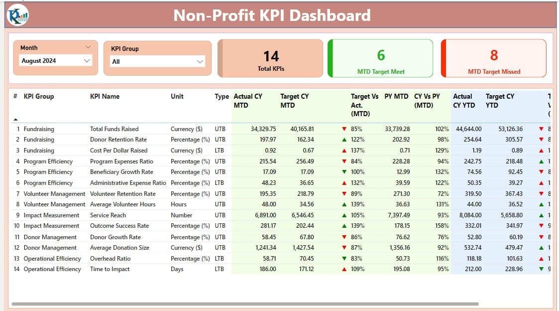
- The heart of the dashboard, featuring slicers for month and KPI groups, and cards that display total KPI counts, Month-To-Date (MTD) target met and missed counts. It also includes detailed tables showing KPI names, groups, and performance against targets with visual indicators (▲ for target met, ▼ for target missed).
KPI Trend Page:
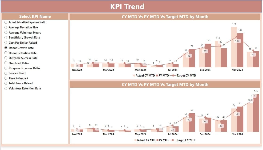
- Displays combo charts for actuals, targets, and year-over-year comparisons for both MTD and Year-To-Date (YTD) figures. A slicer allows users to select specific KPIs for a more detailed view.
KPI Definition Page:
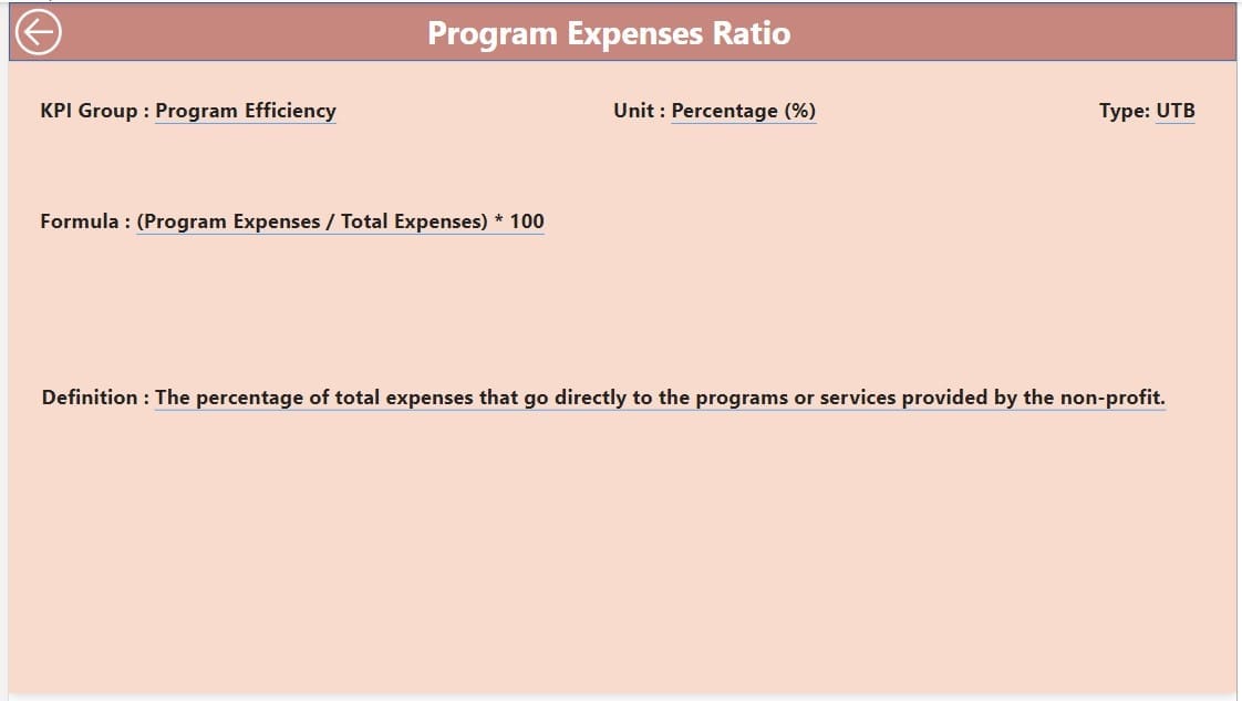
- A drill-through page that provides definitions and formulas for each KPI, which remains hidden until accessed through the summary page.
Excel Data Integration
The data for this dashboard is sourced from an Excel file containing three key worksheets:
Input Actual Sheet:
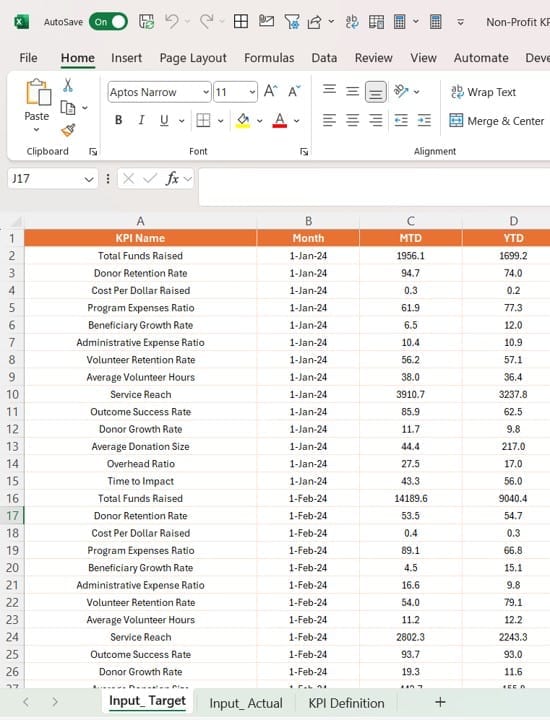
- Where users input actual figures for KPIs.
Input Target Sheet:
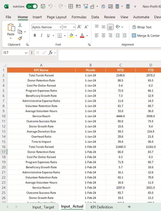
- Where target figures for KPIs are entered.
KPI Definition Sheet:
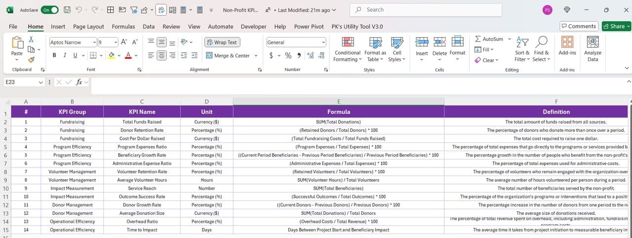
- Contains the definitions, formulas, and details like the unit of measure and type (Lower the Better or Upper the Better).
Advantages of Using a Non-Profit KPI Dashboard in Power BI
Click to Non-Profit KPI
Implementing a KPI dashboard offers numerous benefits for non-profit organizations:
- Enhanced Decision-Making: With real-time data visualizations, stakeholders can make informed decisions quickly.
- Improved Reporting: Automates the reporting process, saving time and reducing the likelihood of errors.
- Strategic Alignment: Ensures all team members are focused on the same objectives, aligning daily operations with long-term goals.
- Performance Tracking: Easily track performance against targets, identifying areas where the organization is excelling or needs improvement.
Best Practices for Implementing Your Non-Profit KPI Dashboard
Click to Non-Profit KPI
To maximize the effectiveness of your Power BI dashboard, consider the following best practices:
- Regular Data Updates: Keep your data fresh to ensure accuracy in reporting and decision-making.
- Tailor KPIs to Your Mission: Choose KPIs that directly reflect your organization’s goals and mission for relevant insights.
- Engage Stakeholders: Make the dashboard accessible to all key stakeholders and train them on how to interpret the data.
- Iterative Improvement: Continuously refine your KPIs and dashboard based on feedback and changing organizational needs.
Frequently Asked Questions About Non-Profit KPI Dashboards
Q: How often should I update my KPI dashboard?
A: Ideally, update your dashboard as frequently as new data comes in, whether daily, weekly, or monthly, to maintain accuracy in your reporting.
Q: Can I customize this dashboard for different non-profit sectors?
A: Absolutely! The dashboard is highly customizable. You can adjust the KPIs and visual elements to suit specific sectors, whether healthcare, education, or environmental conservation.
Q: What is the best way to share the dashboard with stakeholders?
A: Power BI allows for secure sharing through its service, enabling stakeholders to view dashboards on various devices and platforms. Consider setting up regular reviews to discuss insights.
Click to Non-Profit KPI
By leveraging a Non-Profit KPI Dashboard in Power BI, organizations can enhance their operational efficiency and make strides towards achieving their mission. This tool not only simplifies data analysis but also supports strategic decision-making through its intuitive visual reports.
Visit our YouTube channel to learn step-by-step video tutorials
View this post on Instagram
