In today’s business environment, managing and monitoring operational performance is crucial for achieving organizational goals. One of the most effective ways to track and analyze key performance indicators (KPIs) is through an Operations KPI Dashboard. With the right tools and insights, businesses can make informed decisions that drive growth and efficiency. In this article, we will explore how the Operations KPI Dashboard works, its key features, advantages, best practices, opportunities for improvement, and more.
Table of Contents
ToggleWhat is an Operations KPI Dashboard?
An Operations KPI Dashboard is a visual tool used by organizations to track, analyze, and display key performance indicators related to various operational processes. The purpose of the dashboard is to provide decision-makers with real-time insights into business performance, highlighting areas that need attention or improvement. It often incorporates various data visualization tools like charts, graphs, and tables to make complex data more understandable and actionable.
An Operations KPI Dashboard helps businesses ensure that they meet their strategic objectives, by continuously monitoring KPIs across multiple departments and functions. Whether you’re in manufacturing, retail, or services, an Operations KPI Dashboard can provide valuable insights into how well your operations are performing.
Key Features of the Operations KPI Dashboard
A well-designed Operations KPI Dashboard can include a variety of features that enhance its usability and effectiveness. In this section, we’ll discuss some of the key features that are essential for monitoring operational performance:
1. Summary Page
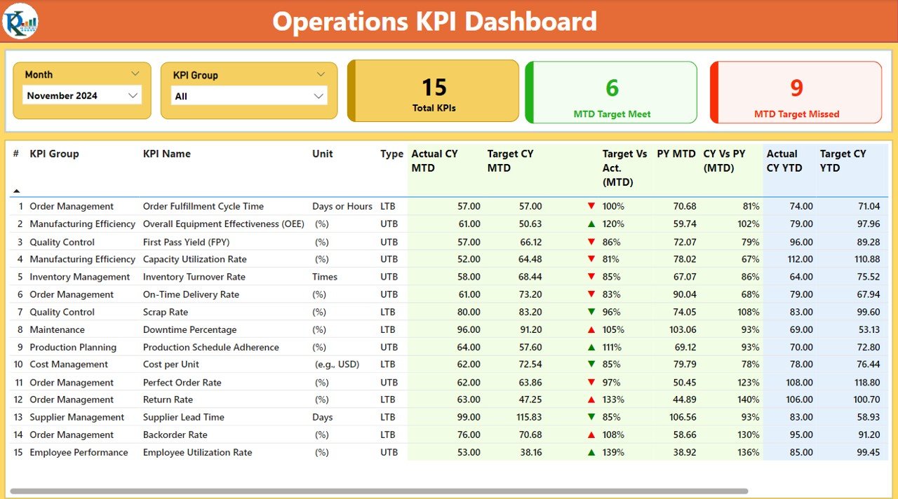
The summary page is the main hub of the Operations KPI Dashboard, providing an overview of the KPIs for easy monitoring. Key elements of this page include:
- Slicers: You can filter the dashboard by month or KPI group for customized views.
- KPI Count Cards: These cards display key metrics like the total number of KPIs, the number of KPIs meeting the target (MTD Target Meet), and the number of KPIs missing the target (MTD Target Missed).
- Detailed Table: This section shows comprehensive KPI data, including the following columns:
- KPI Number – The unique identifier for each KPI.
- KPI Group – The category to which the KPI belongs.
- KPI Name – The name of the KPI.
- Unit – The measurement unit for the KPI.
- Type – Whether the KPI is “Lower the Better” (LTB) or “Upper the Better” (UTB).
- Actual CY MTD & Target CY MTD – The current year’s actual and target values for Month-to-Date (MTD).
- MTD Icon – Visual indicators (red/green arrows) showing whether the KPI has met or missed the target.
- Target vs Actual (MTD & YTD) – The percentage comparison between the actual values and target values.
- CY vs PY (MTD & YTD) – The percentage comparison of the current year vs. the previous year for MTD and YTD.

Click to buy Operations KPI Dashboard in Power BI
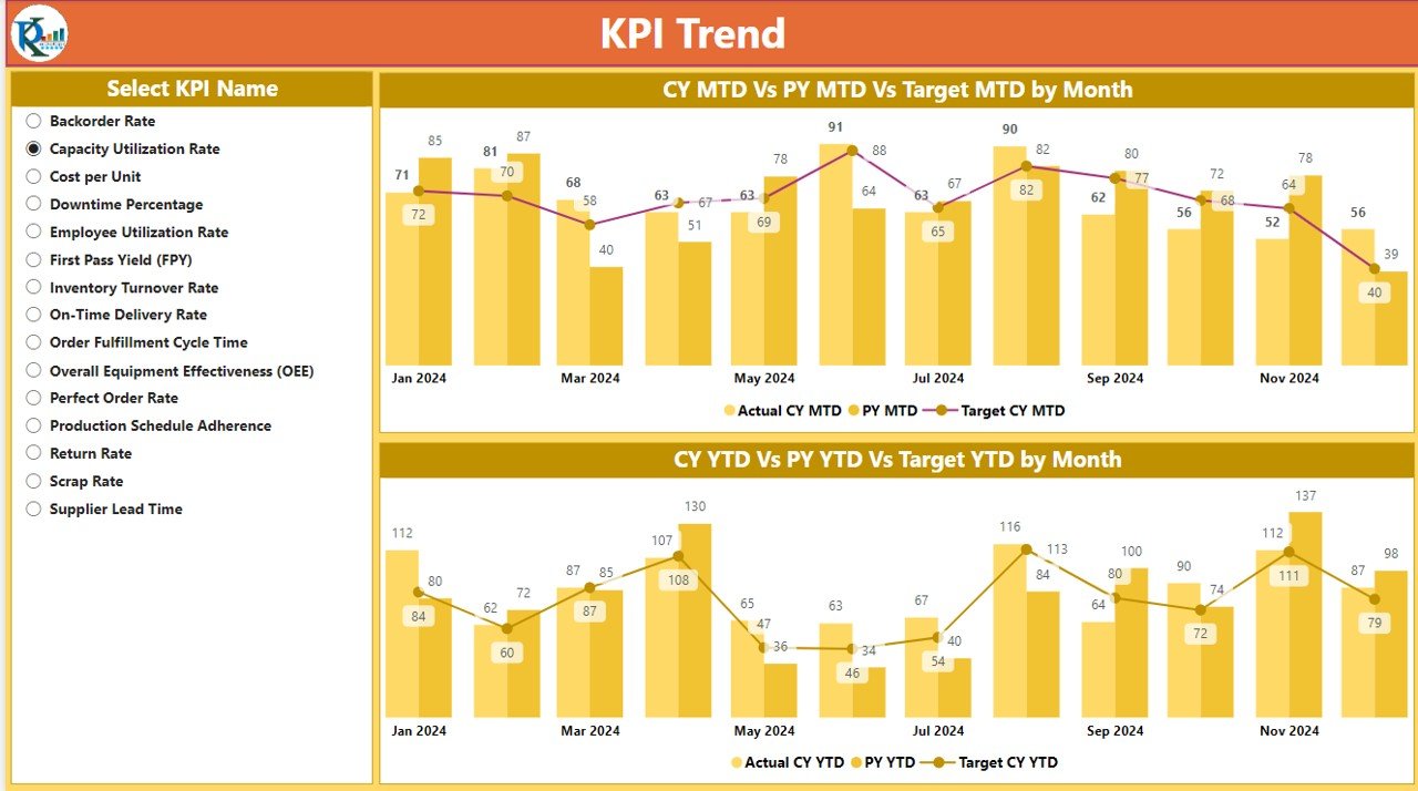
KPI Trend Page
This page includes combo charts to visualize KPI trends over time. The charts show both the actual and target values for the current year (CY) and previous year (PY) for MTD and YTD. You can filter data by selecting specific KPIs, making it easier to analyze the performance of different metrics over time.

Click to buy Operations KPI Dashboard in Power BI
KPI Definition Page
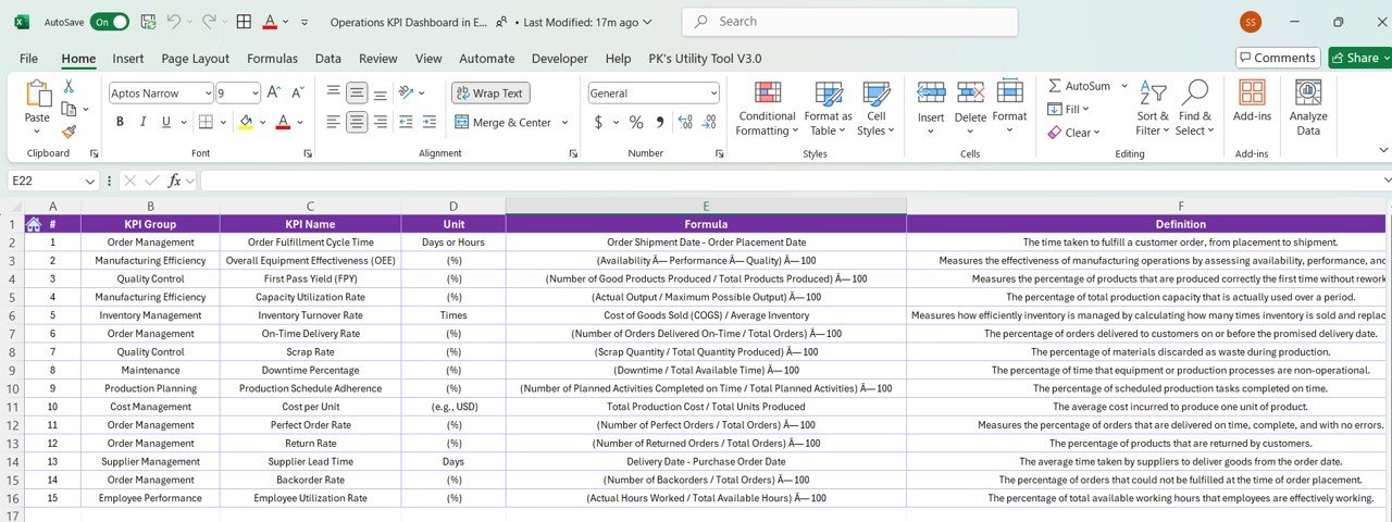
The KPI Definition page serves as a drill-through page where users can see detailed information about each KPI. It includes:
- KPI Formula – The mathematical formula used to calculate the KPI.
- KPI Definition – A brief description of what the KPI measures.

Click to buy Operations KPI Dashboard in Power BI
Users can access this page by drilling through the summary page, allowing for deeper insights into individual KPIs.

Click to buy Operations KPI Dashboard in Power BI
Excel Data Source Integration
The dashboard pulls data from an Excel file, which consists of three main sheets:
- Input_ Actual Sheet Tab – Where actual KPI numbers, MTD, and YTD values are entered.

Click to buy Operations KPI Dashboard in Power BI
- Input_ Target Sheet Tab – This tab is used to input target numbers for KPIs, MTD, and YTD.

Click to buy Operations KPI Dashboard in Power BI
- KPI Definition Sheet – This sheet includes essential details like KPI number, name, group, unit, formula, definition, and type (LTB or UTB).

Click to buy Operations KPI Dashboard in Power BI
Advantages of Using an Operations KPI Dashboard
The Operations KPI Dashboard offers numerous advantages for businesses looking to streamline their performance management processes. Some of the key benefits include:
- Enhanced Decision-Making: With real-time access to KPI data, decision-makers can make informed choices that align with business goals. The dashboard provides a quick overview of key metrics, allowing businesses to identify areas of improvement or underperformance instantly.
- Improved Efficiency: The dashboard helps businesses stay on top of their performance by providing key insights in an easy-to-digest format. Instead of manually tracking KPIs across multiple systems or spreadsheets, the dashboard centralizes all the data, saving time and improving operational efficiency.
- Customization and Flexibility: The dashboard is highly customizable, allowing businesses to track the KPIs most relevant to their objectives. Whether you’re tracking manufacturing outputs, sales performance, or customer satisfaction, the dashboard adapts to your needs, ensuring that you can monitor what’s important.
- Clear Visualization of Trends: By using charts, graphs, and tables, the dashboard allows businesses to visualize trends over time. This helps decision-makers recognize patterns, whether it’s a consistent rise in sales or a drop in customer satisfaction, making it easier to take timely corrective actions.
- Real-Time Data Tracking: An Operations KPI Dashboard is designed to update data in real-time, ensuring that businesses always have the latest information at their fingertips. This real-time tracking enables swift decision-making, which is especially important in fast-paced industries.
Opportunities for Improvement in an Operations KPI Dashboard
While an Operations KPI Dashboard provides immense value, there is always room for improvement. Below are some opportunities for enhancing the dashboard’s functionality:
- Integrate More Data Sources: In addition to Excel, integrating other data sources such as ERP systems, CRM tools, or real-time data feeds can provide a more comprehensive view of operational performance. By pulling data from a variety of sources, businesses can ensure that all aspects of their operations are covered.
- Increase Data Granularity: Providing more detailed data within the dashboard can help users drill down into specific performance issues. Adding layers of information, such as department-level KPIs or team-level performance, can further improve decision-making.
- Automate Alerts and Notifications: Automated notifications or alerts when a KPI falls below a threshold or exceeds a target could improve the timeliness of responses. This feature would ensure that the relevant team members are immediately notified of any potential issues, allowing them to act before problems escalate.
- Mobile Accessibility: Making the Operations KPI Dashboard mobile-friendly or developing a mobile app could significantly enhance its usability. This would allow decision-makers to access real-time data on-the-go, increasing flexibility and responsiveness.
- Enhanced User Interface: Continuously improving the user interface (UI) by adding more intuitive design elements, customizable views, or drag-and-drop options can make the dashboard more user-friendly. A more engaging and visually appealing UI can improve user adoption and overall effectiveness.
Best Practices for Using an Operations KPI Dashboard
To maximize the effectiveness of the Operations KPI Dashboard, businesses should follow these best practices:
Define Clear KPIs: Before using the dashboard, businesses should ensure that their KPIs are clearly defined and aligned with their strategic objectives. Having clear KPIs allows the dashboard to track the most relevant metrics, ensuring that performance is accurately measured.
Set Realistic Targets: Setting achievable and realistic targets for KPIs ensures that the dashboard provides meaningful insights. Targets should be based on historical data, industry benchmarks, and business goals.
Regularly Update Data: To ensure that the dashboard reflects the most up-to-date information, data should be regularly updated. Automation tools can help keep the data current without manual intervention.
Use Data Visualizations Effectively: Choose the right data visualization tools (such as line charts, bar charts, or pie charts) based on the type of data being presented. Clear and concise visuals will help users understand trends and performance metrics more quickly.
Review Dashboard Regularly
Periodically reviewing the dashboard’s content and structure ensures that it remains relevant and aligned with business objectives. It’s also an opportunity to optimize the dashboard for better performance and usability.
Conclusion
The Operations KPI Dashboard is an invaluable tool for businesses looking to monitor and improve their operational performance. By providing real-time insights into key metrics, the dashboard helps decision-makers identify areas of improvement, track trends, and take swift action when necessary. With its customizable features, clear visualizations, and ability to integrate various data sources, the Operations KPI Dashboard enhances efficiency and drives better business outcomes.
By following best practices, embracing opportunities for improvement, and customizing the dashboard to meet specific business needs, organizations can unlock the full potential of this powerful tool.
Frequently Asked Questions (FAQs)
1. What is an Operations KPI Dashboard? An Operations KPI Dashboard is a visual tool used to track and monitor key performance indicators (KPIs) in business operations. It provides insights into operational performance, helping decision-makers make data-driven decisions.
2. How do I use an Operations KPI Dashboard effectively? To use the dashboard effectively, define clear KPIs, set realistic targets, update data regularly, and choose appropriate data visualizations. Regularly review the dashboard to ensure its relevance to your business goals.
3. What are the benefits of using an Operations KPI Dashboard? The key benefits include enhanced decision-making, improved efficiency, customizable views, real-time data tracking, and clear trend visualizations.
4. How can I improve my Operations KPI Dashboard? You can integrate more data sources, increase data granularity, automate alerts, enhance the user interface, and make the dashboard mobile-accessible for better usability.
5. Can the dashboard integrate with other software tools? Yes, the dashboard can be integrated with other software tools like ERP systems, CRM tools, and data feeds to provide a comprehensive view of operations.
Visit our YouTube channel to learn step-by-step video tutorials


