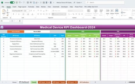
Efficient partner onboarding is crucial for any organization seeking to build and maintain strong business relationships. A well-designed Partner Onboarding KPI Dashboard in Excel can simplify this process by tracking and analyzing key performance indicators (KPIs) seamlessly. This article will guide you through everything you need to know about this dashboard, including its features, benefits, and best practices.
Click to Purchase Partner Onboarding KPI Dashboard in Excel
What is a Partner Onboarding KPI Dashboard?
A Partner Onboarding KPI Dashboard is a structured tool designed in Excel to track and visualize the critical KPIs related to onboarding new partners. It consolidates multiple data points into an interactive and user-friendly format, ensuring that stakeholders can monitor progress and make informed decisions.
Features of the Partner Onboarding KPI Dashboard in Excel
This KPI dashboard includes seven dedicated worksheets, each serving a unique purpose to streamline data management and reporting.
Home Sheet
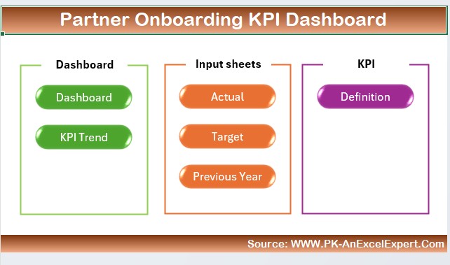
- Purpose: Acts as the navigation hub of the dashboard.
- Features:
- Contains six interactive buttons to jump directly to specific sheets.
- Improves usability by providing easy access to various sections.
Dashboard Sheet Tab
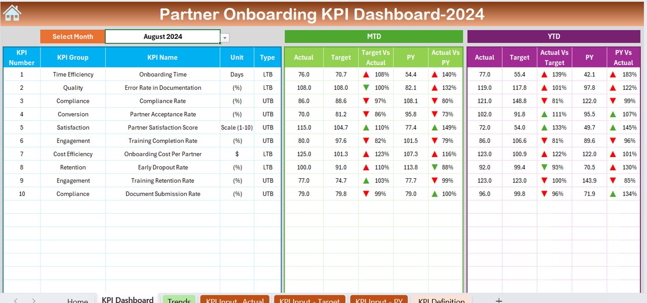
- Purpose: The main reporting and visualization section of the dashboard.
- Features:
- Displays comprehensive KPI information, including:
- MTD Actual, Target, and Previous Year Data: Shows month-to-date (MTD) performance metrics.
- YTD Actual, Target, and Previous Year Data: Tracks year-to-date (YTD) progress.
- Conditional formatting with up/down arrows for:
- Target vs. Actual Comparison
- Previous Year vs. Actual Comparison
Interactive dropdown at cell D3 to select the month and dynamically update the data.
KPI Trend Sheet Tab

- Purpose: Provides a detailed view of KPI trends and definitions.
- Features:
- Dropdown at cell C3 to select a KPI for analysis.
- Displays essential KPI attributes such as:
- KPI Group
- Unit of KPI
- Type (Lower is Better or Upper is Better)
- Formula
- Definition
- MTD and YTD trend charts for Actual, Target, and Previous Year numbers.
Actual Numbers Input Sheet

- Purpose: Input section for actual performance metrics.
- Features:
- Editable range for YTD and MTD data for specific months.
- Month selection via dropdown at cell E1 for flexibility.
Target Sheet Tab
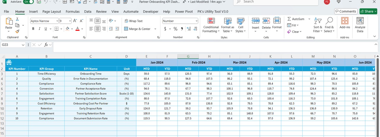
- Purpose: Input section for target metrics.
- Features:
- Allows entry of MTD and YTD target numbers for each KPI.
- Ensures goal-setting is aligned with organizational objectives.
Previous Year Numbers Sheet Tab
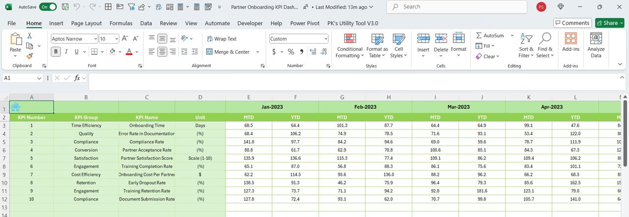
- Purpose: Stores historical data for comparison.
- Features:
- Input section for previous year’s MTD and YTD numbers.
- Facilitates benchmarking against past performance.
KPI Definition Sheet Tab
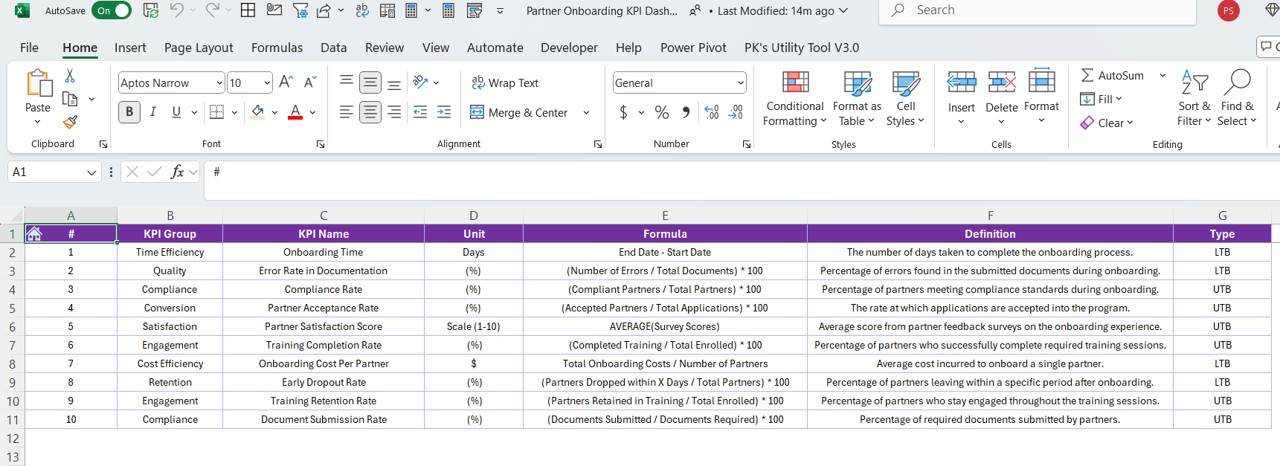
- Purpose: Central repository for KPI details.
- Features:
- Editable fields for:
- KPI Name
- Group
- Unit
- Formula
- Definition
Advantages of the Partner Onboarding KPI Dashboard
Enhanced Decision-Making
- Provides real-time insights into partner onboarding performance.
- Helps identify trends and gaps for immediate action.
User-Friendly Interface
- Simplified navigation through the Home Sheet.
- Intuitive dropdowns for selecting months and KPIs.
- Comprehensive Performance Analysis
- Tracks MTD and YTD metrics with dynamic comparisons.
- Visual trend charts highlight progress and areas for improvement.
Best Practices for Using the Partner Onboarding KPI Dashboard
Define Clear KPIs:
- Ensure that each KPI aligns with your organizational goals.
- Use the KPI Definition Sheet Tab to document clear formulas and definitions.
Update Data Regularly:
- Input actual, target, and previous year data consistently.
- Set reminders to review and update the dashboard monthly.
Leverage Visuals:
- Use the trend charts to communicate performance effectively.
- Focus on key insights while presenting data to stakeholders.
Customize Based on Needs:
- Add or modify KPIs to suit your specific requirements.
- Use Excel formulas and conditional formatting for advanced analysis.
Train Your Team:
- Ensure users understand how to navigate and update the dashboard.
- Provide a quick reference guide for the dropdowns and sheets.
Click to Purchase Partner Onboarding KPI Dashboard in Excel
Conclusion
A Partner Onboarding KPI Dashboard in Excel is an indispensable tool for organizations looking to optimize their onboarding processes. By providing real-time insights and simplifying data management, this dashboard empowers decision-makers to focus on continuous improvement. With its user-friendly interface and customizable features, it caters to diverse business needs, making it a must-have for efficient partner management.
Frequently Asked Questions (FAQs)
What is the purpose of the Partner Onboarding KPI Dashboard?
The dashboard helps track, analyze, and visualize key metrics related to partner onboarding. It simplifies performance monitoring and ensures alignment with organizational goals.
Can I customize the KPIs in the dashboard?
Yes, the dashboard is fully customizable. You can add, remove, or modify KPIs in the KPI Definition Sheet Tab to match your requirements.
How do I update the dashboard for a new month?
To update for a new month:
- Input the new month in cell E1 of the Actual Numbers Input Sheet.
- Update the actual, target, and previous year data in their respective sheets.
How do I interpret the conditional formatting arrows?
The arrows in the Dashboard Sheet Tab indicate:
- Up Arrow: Performance is better than the target or previous year.
- Down Arrow: Performance is below the target or previous year.
Is this dashboard suitable for large organizations?
Yes, the dashboard is scalable and can handle data for multiple KPIs, making it ideal for businesses of all sizes.
Visit our YouTube channel to learn step-by-step video tutorials
View this post on Instagram


