Personalization is the key to enhancing customer experience, improving engagement, and boosting business growth. To measure the effectiveness of personalization strategies, organizations need a robust Personalization Strategy KPI Dashboard in Microsoft Excel. This dashboard helps track, monitor, and analyze key performance indicators (KPIs) that determine the success of personalization initiatives.
In this article, we will explore the Personalization Strategy KPI Dashboard in Excel, its features, advantages, best practices, and how to use it effectively.
Click to Personalization Strategy KPI
What is a Personalization Strategy KPI Dashboard in Excel?
A Personalization Strategy KPI Dashboard in Excel is a ready-to-use template that enables businesses to track and visualize personalization-related KPIs. The dashboard consolidates multiple data points into an interactive and dynamic format, helping users make data-driven decisions to improve their personalization strategies.
Key Features of the Personalization Strategy KPI Dashboard
This Excel dashboard consists of 7 worksheets, each serving a specific purpose:
Home Sheet

- This is the index sheet that provides an overview of the dashboard.
- It contains 6 buttons that allow users to navigate to different sheets effortlessly.
Click to Personalization Strategy KPI
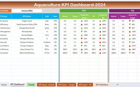
Dashboard Sheet Tab

- This is the main dashboard where all KPIs are displayed in a visually appealing format.
- Users can select a specific month from the dropdown menu in cell D3.
- The dashboard dynamically updates to show:
- MTD (Month-to-Date) Actual, Target, and Previous Year data.
- YTD (Year-to-Date) Actual, Target, and Previous Year data.
- Conditional formatting with up/down arrows for quick comparison.
KPI Trend Sheet Tab

- Allows users to select a KPI from the dropdown in cell C3.
Displays:
- KPI Group, Unit, KPI Type (Lower is better or Upper is better), KPI Formula, and KPI Definition.
- MTD and YTD trend charts comparing Actual, Target, and Previous Year data.
Click to Personalization Strategy KPI
Actual Numbers Input Sheet

- Users enter the actual MTD and YTD values for each KPI.
- The month selection is in cell E1, where users can input the first month of the year.
Target Sheet Tab

- Users define the MTD and YTD target values for each KPI.
Previous Year Number Sheet Tab

- Users enter the MTD and YTD numbers from the previous year for comparative analysis.
KPI Definition Sheet Tab

- Users input detailed KPI names, groups, units, formulas, and definitions.
Advantages of Using the Personalization Strategy KPI Dashboard
- Real-Time Insights: Provides instant data visualization of personalization strategy performance.
- Data-Driven Decision Making: Helps businesses make informed decisions based on KPI trends.
- Customization and Flexibility: Users can modify, add, or remove KPIs based on specific needs.
- Trend Analysis: Displays MTD and YTD trends to track performance improvements over time.
- User-Friendly Navigation: Well-structured sheets with an interactive dashboard for easy access to key data.
Click to Personalization Strategy KPI
Best Practices for Using the Personalization Strategy KPI Dashboard
Define Clear Personalization KPIs
Identify relevant KPIs such as Customer Engagement Rate, Click-Through Rate (CTR), and Conversion Rate.
Regularly Update Actual and Target Numbers
Ensure actual values and targets are updated consistently for accurate tracking.
Use Data Validation and Conditional Formatting
Implement dropdowns and color-coded formatting to enhance readability.
Monitor KPI Trends
Use the KPI Trend Sheet to track monthly and yearly performance variations.
Compare with Previous Year Data
Analyze historical trends to understand improvements or declines in personalization strategies.
Conclusion
The Personalization Strategy KPI Dashboard in Excel is a powerful tool that allows businesses to monitor, analyze, and improve their personalization strategies. With a well-structured dashboard, interactive features, and real-time data tracking, users can gain valuable insights into their personalization efforts.
Frequently Asked Questions (FAQs)
What are the key KPIs to track in a Personalization Strategy KPI Dashboard?
- Some important personalization-related KPIs include:
- Customer Engagement Rate
- Click-Through Rate (CTR)
- Conversion Rate
- Average Session Duration
- Bounce Rate
- Customer Retention Rate
How often should I update the data in the KPI dashboard?
It is recommended to update data on a monthly basis to track MTD and YTD performance trends.
Can I customize the Personalization Strategy KPI Dashboard?
Yes! The dashboard is fully customizable, allowing users to add new KPIs, modify calculations, and change formatting as needed.
What software do I need to use this KPI Dashboard?
This dashboard is built in Microsoft Excel, making it accessible on any device with Excel 2016 or later.
How does conditional formatting help in KPI analysis?
Conditional formatting highlights performance trends using color-coded indicators (e.g., green for positive growth, red for decline), making it easier to analyze data.
Final Thoughts
A Personalization Strategy KPI Dashboard in Excel provides businesses with a structured way to track, analyze, and optimize their personalization strategies. By leveraging this dashboard, organizations can make data-driven decisions that lead to better customer engagement and increased conversions.
Click to Personalization Strategy KPI
Visit our YouTube channel to learn step-by-step video tutorials
View this post on Instagram