Data can be easily represented from a Pivot Table into a Pivot Chart. By using the Pivot chart data comparisons, patterns and trends can be visualized and analyzed graphically.
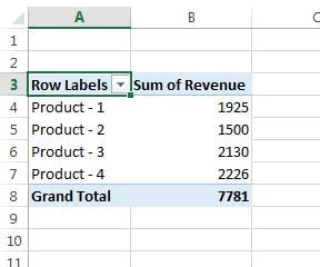
For example if we have Product wise Revenue pivot table.
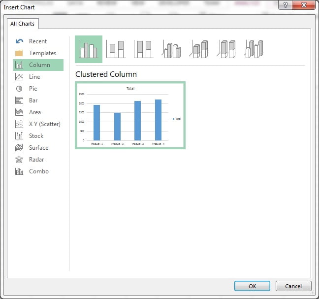
To create the pivot chart from above pivot table, click anywhere in the pivot table and go to Analyze tab>Click on PivotChart in Tools Group.

Insert Chart window will be displayed. Select the chart from here whatever you want to create.
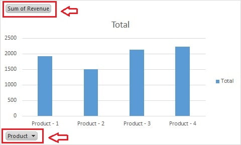
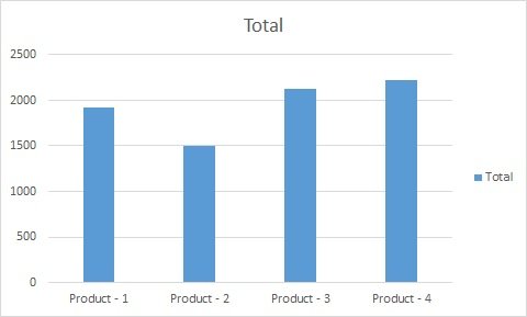
After Inserting Cluster Column chart, Pivot chart will look like below image. Sum of Revenue button and Product filter button is available.
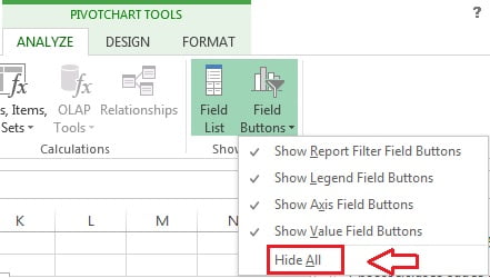
To remove the buttons form the pivot chart, click on the pivot chart and go to Analyze Tab>>Click on Field Buttons in Show/Hide Group>>Click on Hide All
After hiding all button Pivot chart will look like normal chart, however it will be still connected with data like pivot table.
![]()
![]()