In today’s fast-paced business environment, effective project management is crucial for success. One of the most popular tools for managing projects is the Gantt chart, which provides a visual timeline for project activities. In this article, we will explore how to create a Pro Gantt Chart in Excel with a data entry form, enhancing your project management capabilities. We will cover everything from the basics to advanced features, including adding new activities, updating existing ones, and customizing the chart for better visualization. Let’s dive in and discover how to make the most of this powerful gantt Chart.
Introduction to Gantt Charts
A Gantt chart is a type of bar chart that represents a project schedule. It allows project managers to visualize the start and finish dates of various elements of a project. Named after its inventor, Henry L. Gantt, this chart is widely used in project management for planning and scheduling projects of all sizes.
Why Use a Gantt Chart in Excel?
Excel is a versatile tool that is widely available and easy to use. Using Excel to create Gantt charts combines the flexibility of Excel with the powerful visualization capabilities of Gantt charts. This combination is ideal for project managers who need to create, update, and share project schedules quickly and efficiently.
Key Features of Pro Gantt Chart in Excel
Our Pro Gantt Chart in Excel comes with several advanced features that make project management more efficient and effective. Here are the key features:
Click to buy Pro Gantt Chart in Excel with data entry form
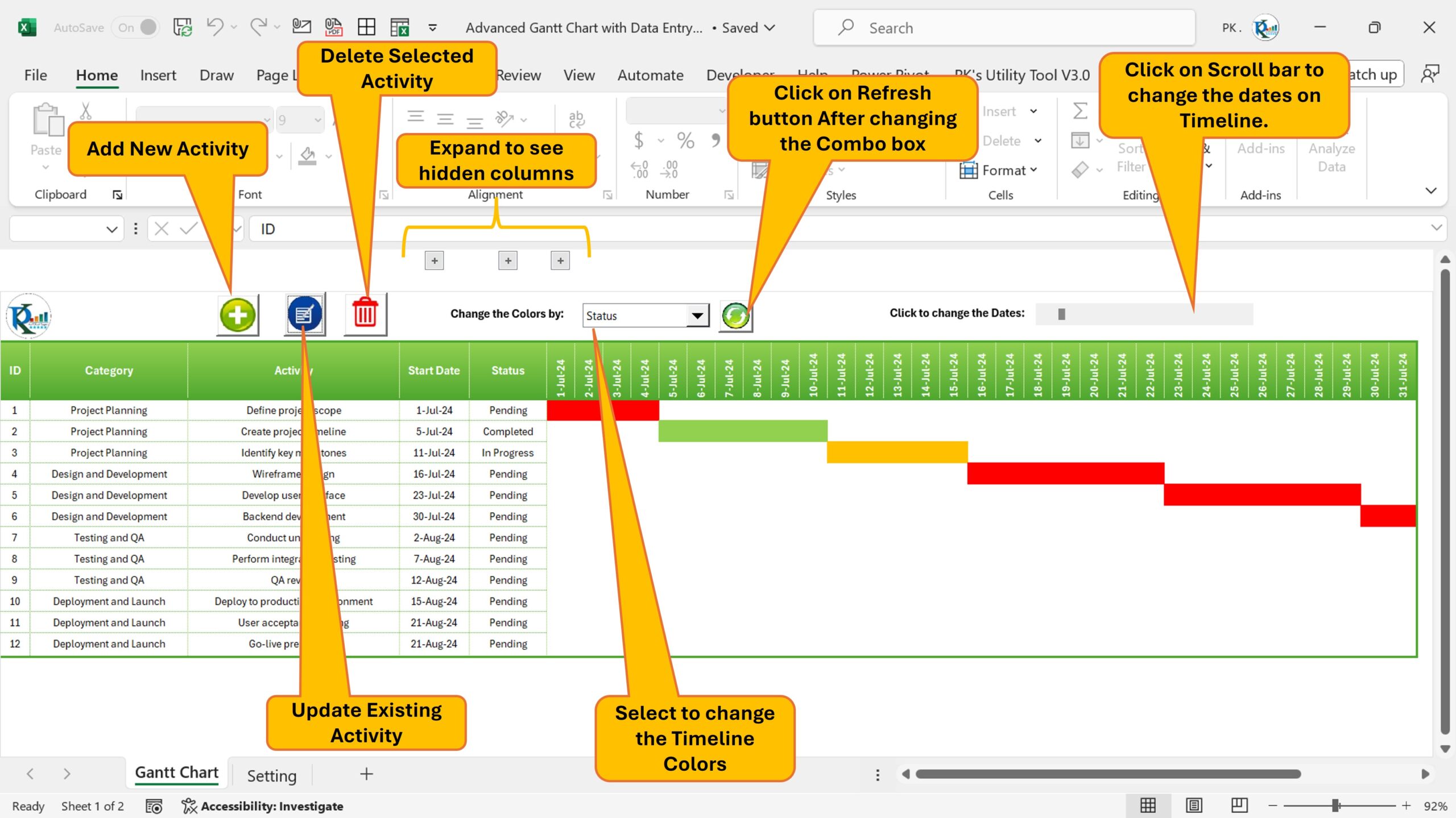
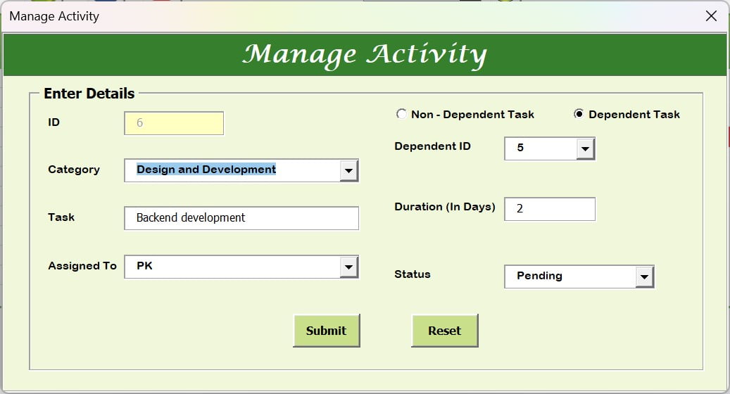
Add New Activity
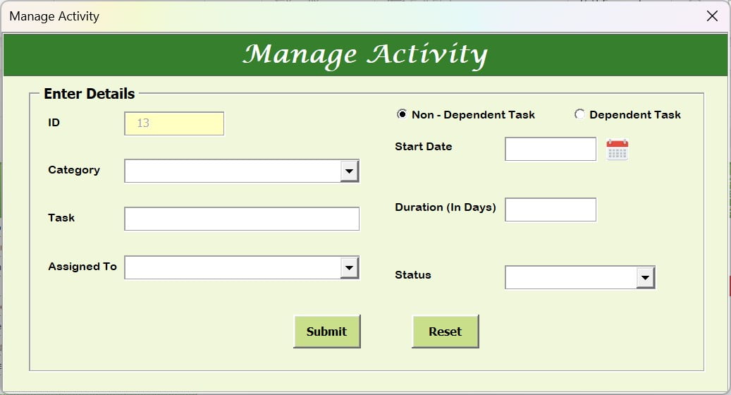
Adding a new activity is straightforward. By clicking the “Add New Activity” button, a new data entry form will open. Fill in the required information and click “Submit.” The new activity will be added to the Gantt chart seamlessly.
Click to buy Pro Gantt Chart in Excel with data entry form
Update Existing Activity
To update an existing activity, select the activity’s ID and click on the “Update Existing Activity” button. A data entry form will open with pre-filled fields. You can then change the information as needed and submit the changes.
Click to buy Pro Gantt Chart in Excel with data entry form
Delete Activity
Deleting an activity is just as simple. Select the ID of the activity you wish to delete and click the “Delete Activity” button. The activity will be removed from the Gantt chart.
Grouped Field
For better organization, you can use the grouped field feature. Click the ‘+’ icon to expand the hidden field and click it again to collapse.
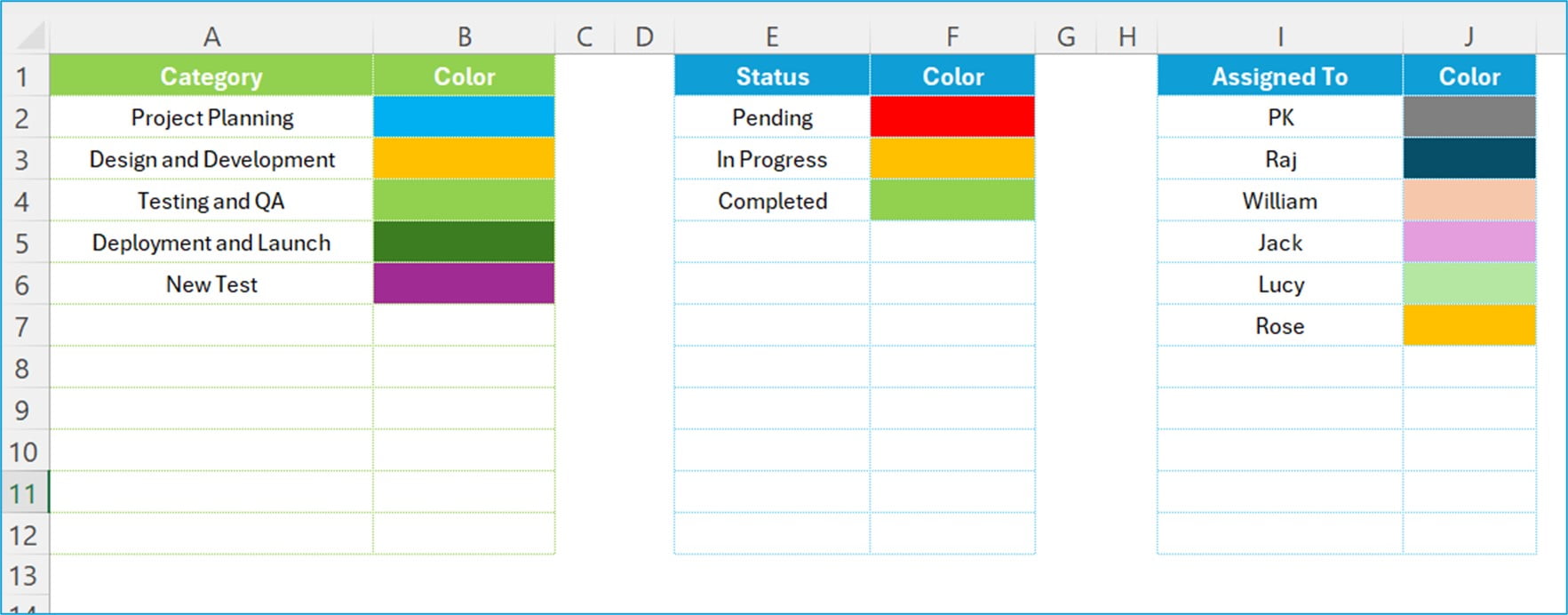
Change the Color by
Customize your Gantt chart by changing the colors of activities based on different criteria such as Category, Status, or Assigned To. Select your preferred option from the dropdown menu and click “Refresh.” The colors on the Gantt chart timeline will update accordingly.
Click to Change the Dates Scroll Bar
By default, the Gantt chart displays a 31-day timeline. You can use the scroll bar to see a rolling 31 days, making it easier to view project timelines without overwhelming the chart with too much information at once.
Setting Sheet Tab
The Setting Sheet Tab allows you to manage lists and colors for categories, statuses, and assigned personnel. This feature ensures that your Gantt chart is tailored to your project’s specific needs.
Best Practices for Using Gantt Charts
To make the most of your Gantt chart, follow these best practices:
- Keep it Simple: Avoid cluttering the chart with too much information. Focus on key activities and milestones.
- Update Regularly: Keep the Gantt chart up to date to reflect the current status of your project.
- Use Colors Wisely: Use color coding to differentiate between categories, statuses, and assigned personnel.
- Communicate Clearly: Share the Gantt chart with your team and stakeholders to ensure everyone is on the same page.
Advantages of Using a Gantt Chart in Excel
Using a Gantt chart in Excel offers several benefits:
- Ease of Use: Excel is user-friendly and widely available, making it accessible to many users.
- Flexibility: Excel allows for customization to meet the specific needs of your project.
- Visualization: Provides a clear visual representation of the project timeline, helping to identify potential bottlenecks and delays.
Opportunities for Improvement in Gantt Charts
While Gantt charts are powerful tools, there are always opportunities for improvement:
- Collaboration: Enhancing collaboration features can make it easier for team members to contribute to and update the chart.
- Advanced Analytics: Integrating advanced analytics can provide deeper insights into project performance and potential risks.
- Mobile Access: Developing mobile-friendly versions of Gantt charts can help project managers stay on top of their projects on the go.
Frequently Asked Questions (FAQs)
What is a Gantt Chart?
A Gantt chart is a visual project management tool that displays the start and finish dates of various project activities. It helps project managers plan and schedule projects effectively.
What Are the Benefits of Using a Gantt Chart?
Gantt charts provide a clear visual representation of project timelines, helping to identify potential delays and bottlenecks. They also enhance communication and coordination among team members and stakeholders.
Can I Customize My Gantt Chart in Excel?
Yes, Excel offers a range of customization options, including conditional formatting, color coding, and data entry forms, allowing you to tailor the Gantt chart to your specific project needs.
How Often Should I Update My Gantt Chart?
To ensure accuracy, update your Gantt chart regularly. This helps reflect the current status of your project and allows you to make timely adjustments as needed.
Conclusion
Creating a Pro Gantt Chart in Excel with a data entry form is a powerful way to enhance your project management capabilities. With its advanced features, ease of use, and customization options, this tool can help you plan, schedule, and monitor your projects more effectively. By following best practices and continuously seeking opportunities for improvement, you can make the most of your Gantt chart and achieve project success.
Visit our YouTube channel to learn step-by-step video tutorials
Watch the step-by-step video tutorial:
Click to buy Pro Gantt Chart in Excel with data entry form