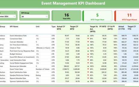
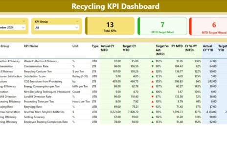
The Procurement KPI Dashboard in Power BI allows procurement managers to visualize key procurement metrics, track targets, and make data-driven decisions. This tool captures data in an Excel file and integrates seamlessly with Power BI for advanced reporting and visualization.
This article will explore the Procurement KPI Dashboard in Power BI, highlighting its features, advantages, opportunities for improvement, best practices, and how you can make the most of it to improve your procurement processes.
What is a Procurement KPI Dashboard in Power BI?
A Procurement KPI Dashboard is a visual tool used to track the performance of various procurement activities within an organization. It monitors key performance indicators (KPIs) that are essential to measure procurement success, such as procurement cost, vendor performance, purchase order cycle time, and supplier lead times.
By using Power BI, organizations can consolidate data from multiple sources and create a comprehensive, interactive dashboard. This allows procurement teams to visualize trends, monitor goals, and make informed decisions in real time. A well-structured procurement KPI dashboard helps ensure transparency, improves decision-making, and enhances overall procurement efficiency.
Key Features of the Procurement KPI Dashboard in Power BI
The Procurement KPI Dashboard in Power BI comes with several powerful features to make tracking procurement performance more accessible and actionable.
Summary Page: The Heart of the Dashboard
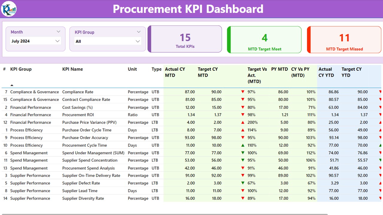
The Summary Page is the main page of the dashboard and provides an overview of the procurement performance for a given period. It includes the following:
- Month and KPI Group Slicer: These filters allow users to select specific months and KPI groups to display relevant data.
- Total KPIs Count: A card showing the total number of KPIs being tracked.
- MTD Target Meet and Missed Count: Two cards displaying how many KPIs met their targets and how many did not for the Month-to-Date (MTD) period.
- Detailed Table: This table is central to the summary page and displays various KPIs with detailed performance metrics, including:
- KPI Number: A unique identifier for each KPI.
- KPI Group: The group/category the KPI belongs to.
- KPI Name: The name of the KPI.
- Unit: The unit of measurement for the KPI (e.g., percentage, currency, etc.).
- Type: Whether the KPI is “Lower the Better” (LTB) or “Upper the Better” (UTB).
- Actual CY MTD: The actual value for the current year (CY) for the MTD.
- Target CY MTD: The target value for the MTD in the current year.
- MTD Icon: Green and red arrows (▲ and ▼) to indicate whether the KPI is meeting or missing the target.
- Target Vs Actual (MTD): The percentage of how the actual number compares to the target.
- PY MTD: The previous year’s MTD data for comparison.
- CY Vs PY (MTD): A percentage comparison between the current year’s MTD and the previous year’s MTD.
- Actual CY YTD and Target CY YTD: Year-to-date data and targets.
- YTD Icon: Icons showing whether the KPI is on target for the year.
- Target Vs Actual (YTD): The percentage comparison for the YTD.
- PY YTD: The previous year’s YTD for comparison.
- CY Vs PY (YTD): A comparison between the current year’s YTD and the previous year’s YTD.
Click to Procurement KPI
KPI Trend Page: Detailed Visual Insights
The KPI Trend Page provides detailed visual representations of procurement trends over time. It includes:
- Combo Charts: These charts display the actual numbers for both the current and previous years, as well as the targets for both MTD and YTD. These trends help procurement teams visualize progress and trends in real time.
- KPI Selector Slicer: A slicer that allows users to select specific KPIs for trend analysis, making it easier to focus on individual performance metrics.

Click to Procurement KPI
KPI Definition Page: Drill-Through for Deeper Insights
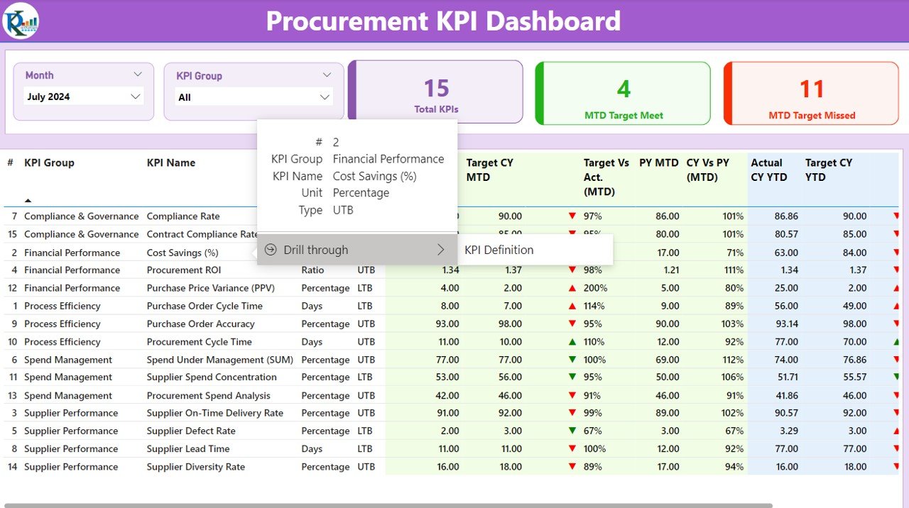
The KPI Definition Page allows users to drill through from the Summary Page to gain more detailed insights into specific KPIs. This page provides:
- KPI Definition: A breakdown of the formula and the purpose of each KPI.
- In-Depth Analysis: Details on how the KPI is calculated and how it aligns with overall procurement goals.

Click to Procurement KPI
The KPI Definition Page is hidden by default, and users can drill through to it for more detailed views. To return to the main page, users can simply click on the back button available in the top-left corner.
Click to Procurement KPI
How to Use the Procurement KPI Dashboard in Power BI
Using the Procurement KPI Dashboard in Power BI is straightforward and highly interactive. Here is a simple guide on how to use the dashboard effectively:
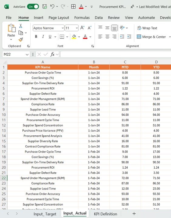
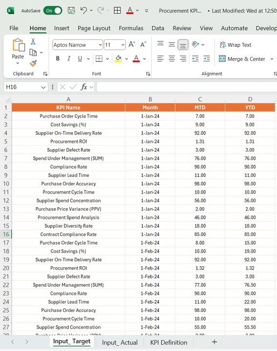
Data Input: The dashboard uses data from an Excel file. Input the actual data for KPIs and targets for MTD and YTD in the respective worksheets.
- Input_Actual Sheet Tab: Fill in the actual numbers for each KPI, including MTD and YTD figures.
Click to Procurement KPI
- Input_Target Sheet Tab: Enter the target numbers for each KPI, including MTD and YTD.
Click to Procurement KPI
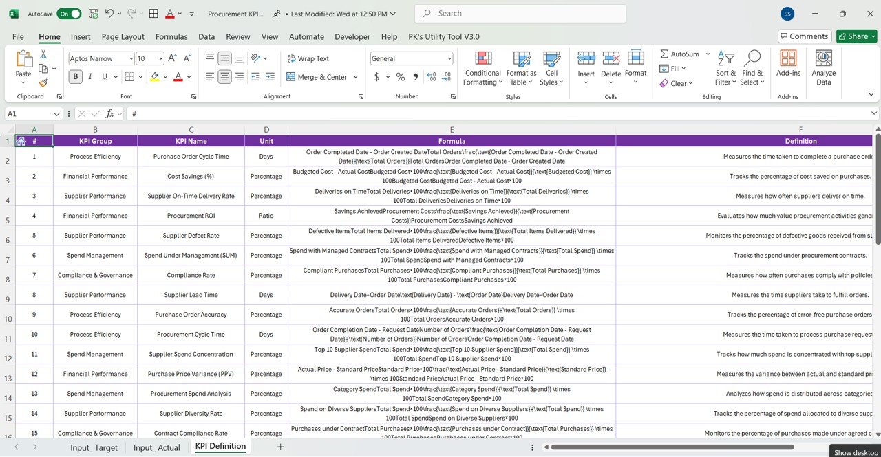
- KPI Definition Sheet Tab: Fill out the KPI number, group, name, unit, formula, definition, and type (LTB or UTB).
Click to Procurement KPI
- Use the Summary Page: The Summary Page is your dashboard’s main interface. Use the slicers to filter KPIs by month or KPI group, and view the performance of each KPI in detail.
- Analyze Trends: Use the KPI Trend Page to visualize trends over time for the KPIs you’re tracking. The combo charts give you insights into whether actual values are meeting the targets.
- Drill Through for Definitions: If you need a deeper understanding of a specific KPI, use the KPI Definition Page to access detailed definitions and formulas. This page helps ensure clarity in your analysis.
Advantages of Using the Procurement KPI Dashboard in Power BI
The Procurement KPI Dashboard offers a range of benefits for businesses. Here are some of the key advantages:
- Centralized Data Visualization: The dashboard consolidates all procurement KPIs into one central hub, making it easier to track and manage performance in real time.
- Enhanced Decision-Making: By providing real-time insights, the dashboard helps procurement teams make data-driven decisions quickly. It highlights areas where performance is lacking and allows for immediate corrective action.
- Improved Accountability: With clear KPI assignments and visual tracking, team members are held accountable for meeting targets, improving the overall procurement process.
- Cost Savings: The dashboard’s detailed comparisons between actual numbers, targets, and previous year’s performance help identify inefficiencies and areas where cost reductions can be made.
- Trend Monitoring: The KPI Trend Page helps procurement teams monitor trends over time, providing insights into long-term performance and areas that require improvement.
Opportunities for Improvement in Procurement KPI Dashboard
While the Procurement KPI Dashboard is a powerful tool, there are always opportunities for improvement. Consider the following strategies:
- Automation of Data Input: Automate the process of importing data into Power BI from external sources, such as ERP systems, to reduce manual input errors and improve data accuracy.
- Integration with Other Systems: Integrate the dashboard with procurement management systems for seamless data flow and more accurate, up-to-date insights.
- Enhanced Mobile Compatibility: Optimize the dashboard for mobile devices so that procurement teams can monitor performance and trends on the go.
- Add More KPIs: Include additional KPIs that reflect other critical procurement activities such as supplier relationship management and purchase order cycle times.
Best Practices for Using the Procurement KPI Dashboard in Power BI
To get the most out of the Procurement KPI Dashboard, follow these best practices:
- Regular Data Updates: Regularly update the data in the Input_ Actual and Input_ Target sheets to ensure the dashboard reflects the latest procurement performance.
- Set Realistic Targets: Ensure that the targets for each KPI are realistic and aligned with the company’s procurement goals. Unrealistic targets can demotivate teams and hinder performance.
- Use Conditional Formatting: Apply conditional formatting in Power BI to make the dashboard more intuitive and highlight areas that need immediate attention.
- Review KPIs Periodically: Periodically review and revise the KPIs to ensure they align with changing procurement priorities and organizational goals.
Conclusion
The Procurement KPI Dashboard in Power BI is a powerful tool for improving procurement efficiency, monitoring performance, and making data-driven decisions. It provides procurement teams with the insights they need to track KPIs, monitor trends, and optimize processes for better results.
By using the dashboard effectively, organizations can streamline their procurement activities, enhance accountability, and reduce costs. Whether you’re looking to manage procurement performance, evaluate supplier effectiveness, or track your procurement spending, this dashboard is an indispensable tool.
Frequently Asked Questions (FAQs)
1. What is the Procurement KPI Dashboard in Power BI?
The Procurement KPI Dashboard in Power BI is a visual tool that tracks key performance indicators (KPIs) related to procurement activities, helping businesses optimize their procurement processes.
2. How do I use the Procurement KPI Dashboard?
Simply input data into the Excel sheets (Actuals, Targets, Definitions) and view the KPIs, trends, and performance metrics in Power BI using slicers and charts.
3. Can I customize the dashboard for my organization’s needs?
Yes, you can customize the dashboard by adding new KPIs, adjusting target values, and modifying the design to fit your business’s specific procurement requirements.
4. How often should I update the Procurement KPI Dashboard?
Update the dashboard regularly—preferably monthly—to reflect the latest performance data for accurate decision-making.
5. Is the dashboard mobile-friendly?
While the dashboard is designed for desktop use, optimizing it for mobile devices would enhance its accessibility for on-the-go performance monitoring.
Visit our YouTube channel to learn step-by-step video tutorials
View this post on Instagram


