Managing projects efficiently requires a clear understanding of key performance indicators (KPIs). A Project Management KPI Dashboard in Power BI is an essential tool that allows project managers to visualize performance metrics in real time. This article will provide a comprehensive guide to creating, using, and benefiting from a Project Management KPI Dashboard, explaining its structure, features, and best practices.
Click to Project Management KPI
What is a Project Management KPI Dashboard in Power BI?
A Project Management KPI Dashboard in Power BI is a data visualization tool designed to track and manage key performance indicators (KPIs) related to project performance. Using Power BI’s powerful analytical and visualization capabilities, project managers can monitor metrics such as target achievement, monthly trends, and yearly progress. This dashboard is particularly effective when data is managed in Excel and linked to Power BI for seamless updates.
Key Features of the Dashboard
The dashboard is designed with three main pages in Power BI Desktop, each serving a unique purpose. Here’s a breakdown of its key features:
Summary Page
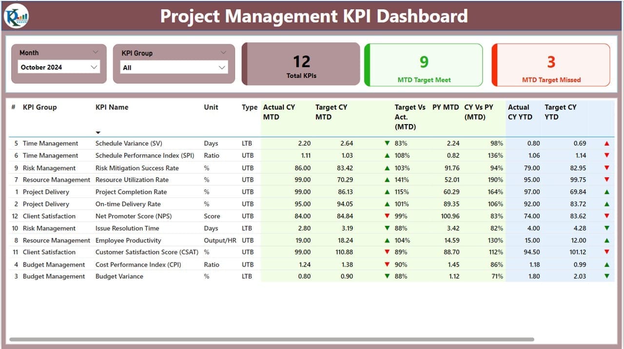
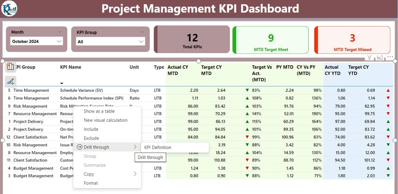
This is the main page of the dashboard and provides a snapshot of the overall performance.
- Slicers: Includes Month and KPI Group slicers for customized views.
- KPI Cards:
- Total KPIs Count: Displays the total number of KPIs being tracked.
- MTD Target Met Count: Shows the count of KPIs meeting targets for the month to date (MTD).
- MTD Target Missed Count: Highlights KPIs that missed targets for MTD.
- Detailed Table: Provides granular details, including:
- KPI Number and Name: For easy identification of KPIs.
- KPI Group and Unit: Indicates the category and measurement unit.
- Type (LTB/UTB): Whether “Lower the Better” or “Upper the Better.”
- Actual CY MTD: Current year’s actual MTD value.
- Target CY MTD: MTD target value.
- MTD Icon: Visual indicators (▲/▼) in red or green for performance against MTD targets.
- CY vs. PY (MTD): Percentage comparison between current and previous year MTD.
- YTD Metrics: Similar data points for year-to-date (YTD) performance.
Click to Project Management KPI
KPI Trend Page
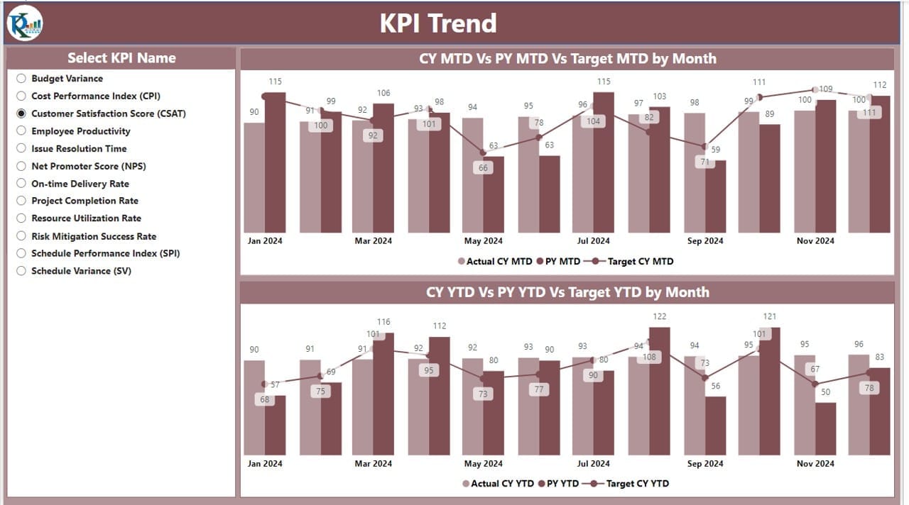
This page focuses on visual trends for better comparison over time.
- Combo Charts: Compare Actual Numbers of Current Year, Previous Year, and Targets for both MTD and YTD.
- Slicer: Enables selection of specific KPIs for trend analysis.
KPI Definition Page
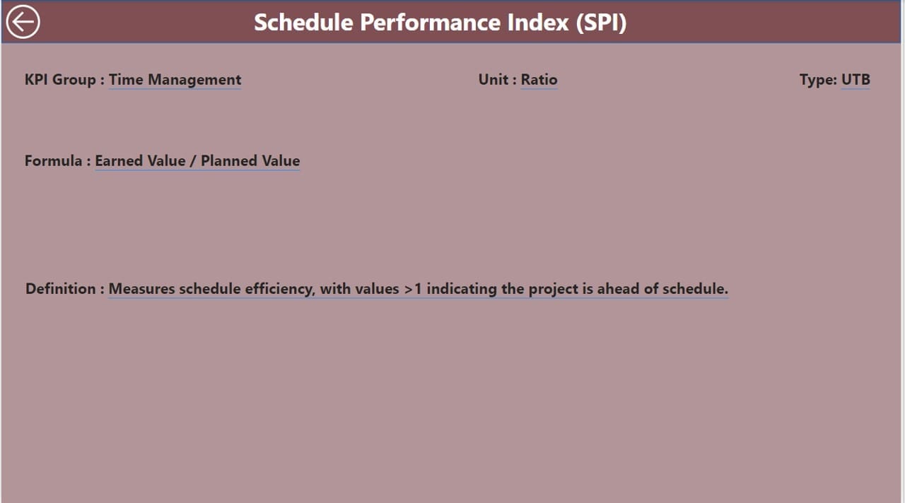
This hidden drill-through page allows detailed analysis of individual KPIs.
- Details Provided: Formula, KPI definition, and metadata for deeper insights.
- Navigation: A back button at the top left corner enables quick return to the Summary Page.
Click to Project Management KPI
Excel Data Management for the Dashboard
The dashboard relies on well-structured data in an Excel file with three key worksheets:
Input Actual Sheet Tab:
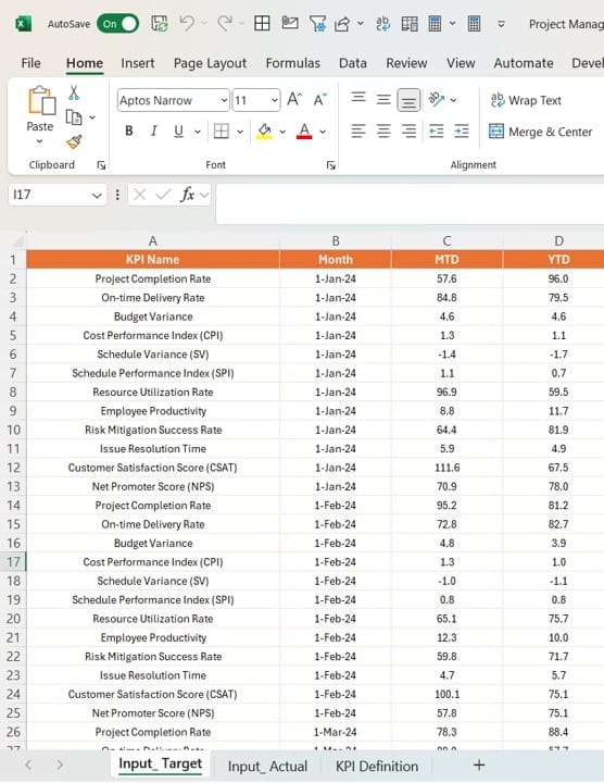
- Enter actual KPI numbers for each month (first date of the month), including MTD and YTD values.
Input Target Sheet Tab:
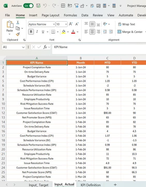
- Populate target values for KPI names, months, MTD, and YTD.
KPI Definition Sheet Tab:
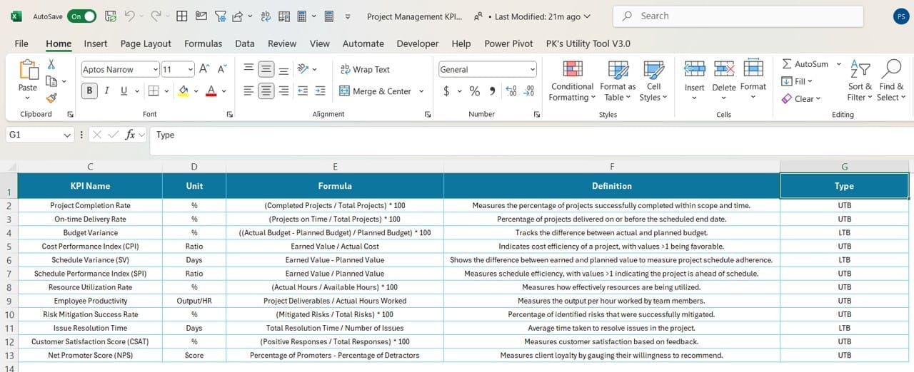
- Provide metadata such as KPI number, group, name, unit, formula, definition, and type (LTB or UTB).
Advantages of a Project Management KPI Dashboard
Why should you use this dashboard in Power BI? Here are some significant advantages:
- Real-Time Insights: Track project performance in real-time with dynamic visualizations.
- Enhanced Decision-Making: Quickly identify areas needing attention through intuitive indicators.
- User-Friendly Interface: Power BI’s sleek design makes data easy to interpret.
Best Practices for the Project Management KPI Dashboard
Click to Project Management KPI
To maximize the benefits of your Power BI dashboard, follow these best practices:
- Define Clear KPIs: Ensure that your KPIs align with the project objectives. Use categories like efficiency, quality, and timeliness for comprehensive tracking.
- Regularly Update Data: Keep your Excel data source current to reflect the latest project performance metrics.
- Utilize Drill-Through Features: Leverage the KPI Definition page to analyze underperforming metrics in detail.
- Incorporate Visual Indicators: Use intuitive icons (▲/▼) and color codes to highlight performance trends effectively.
- Test Dashboard Usability: Before deployment, test the dashboard with end users to ensure it meets their needs.
Opportunities for Improvement
Even the best dashboards can evolve. Here are opportunities to enhance your Project Management KPI Dashboard:
- Add Predictive Analytics: Use Power BI’s AI capabilities to forecast trends.
- Integrate Alerts: Set up notifications for KPIs that deviate significantly from targets.
- Expand Data Sources: Include additional sources like ERP systems for a holistic view.
Click to Project Management KPI
Conclusion
The Project Management KPI Dashboard in Power BI is an indispensable tool for project managers. Its ability to display critical metrics in an intuitive format empowers teams to make informed decisions and achieve project goals efficiently. Whether you’re managing tight deadlines or aiming for budget accuracy, this dashboard will streamline your tracking and analysis process.
Frequently Asked Questions (FAQs)
Q. What is the purpose of a Project Management KPI Dashboard?
A Project Management KPI Dashboard provides a centralized view of project metrics, allowing managers to track performance, identify issues, and make data-driven decisions.
Q. Why use Power BI for KPI dashboards?
Power BI offers robust visualization tools, dynamic filtering options, and seamless integration with Excel, making it ideal for interactive KPI dashboards.
Q. How can I customize the KPI Dashboard?
Customize by updating the Excel data source, modifying slicers, or adding new visualizations to the Power BI file.
Q. What are the common KPIs included in such dashboards?
Typical KPIs include on-time delivery rate, project completion rate, budget variance, and customer satisfaction scores.
Q. Is it necessary to update the Excel data manually?
Yes, updating the Excel data is essential unless you integrate it with an automated data source.
Click to Project Management KPI
Visit our YouTube channel to learn step-by-step video tutorials
View this post on Instagram


