Tracking and improving public health metrics is more important than ever. With the right tools, healthcare professionals, policymakers, and administrators can make data-driven decisions that positively impact communities. A Public Health KPI Dashboard in Power BI is an efficient way to monitor key performance indicators (KPIs) in real time. In this article, we will explore the details of this dashboard, including its features, advantages, best practices, and answers to frequently asked questions.
Click to Public Health KPI
What is a Public Health KPI Dashboard?
A Public Health KPI Dashboard is a powerful analytics tool designed to track, measure, and visualize critical healthcare performance indicators. Using Power BI, this dashboard presents data in an interactive and easy-to-understand format, allowing users to analyze trends, assess performance, and make informed decisions.
Key Features of the Public Health KPI Dashboard
- This Public Health KPI Dashboard is structured with three main pages in Power BI:
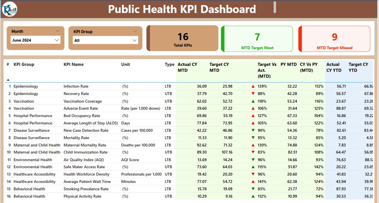
Summary Page
Click to Public Health KPI
The Summary Page serves as the main hub, where users can quickly access key information. Here’s what it includes:
- Month and KPI Group Slicer: Users can filter data based on specific time periods and KPI categories.
Three Key Metric Cards:
- Total KPIs Count
- MTD (Month-to-Date) Target Met Count
- MTD Target Missed Count
Detailed KPI Table, displaying:
- KPI Number: A unique identifier for each KPI.
- KPI Group: Categorizes KPIs into specific groups.
- KPI Name: Describes the KPI’s purpose.
- Unit: Displays the measurement unit.
- Type: Specifies whether the KPI is Lower The Better (LTB) or Upper The Better (UTB).
- Actual CY MTD (Current Year MTD): Displays the actual value for the current period.
- Target CY MTD (Current Year MTD Target): Shows the predefined target.
- MTD Indicator: Uses red ▼ and green ▲ icons to indicate whether the KPI is on track.
- MTD Target vs. Actual %: Represents the percentage of target achievement.
- PY MTD (Previous Year MTD): Displays last year’s MTD value for comparison.
- CY vs. PY MTD Comparison: Highlights the percentage difference between current and previous years.
- Actual CY YTD (Year-To-Date): Accumulates actual KPI data for the year.
- Target CY YTD (Year-To-Date Target): Displays the goal for the year.
- YTD Indicator: Uses red ▼ and green ▲ icons to show whether the KPI is on track.
- YTD Target vs. Actual %: Compares actuals with the target for YTD.
- PY YTD (Previous Year YTD): Shows previous year’s YTD values.
- CY vs. PY YTD Comparison: Displays the percentage difference between current and previous years.
KPI Trend Page
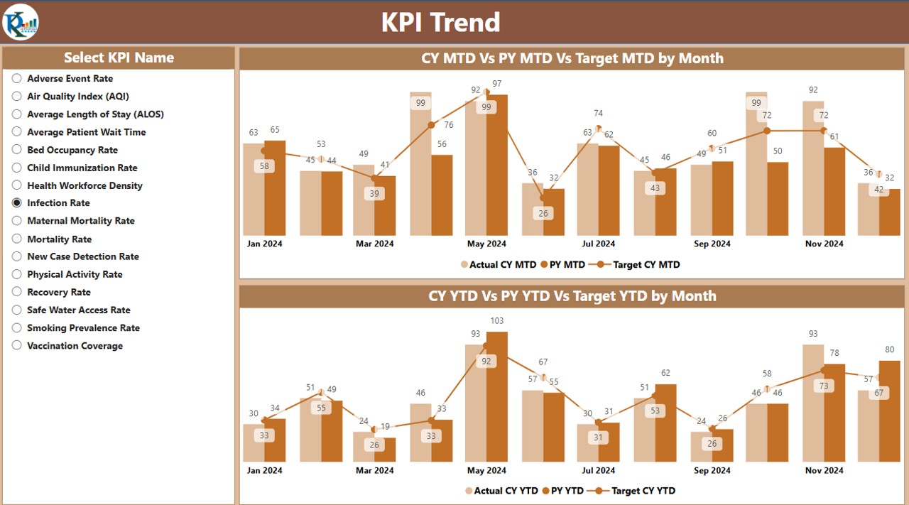
This page presents KPI trends using two combo charts:
- MTD Chart: Visualizes actual, target, and previous year numbers.
- YTD Chart: Displays cumulative progress.
- KPI Name Slicer: Allows users to focus on specific KPIs.
Click to Public Health KPI
KPI Definition Page
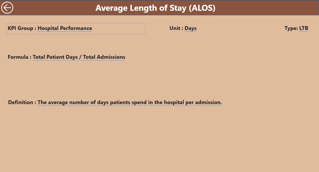
This is a hidden drill-through page, accessible from the Summary Page, where users can view detailed KPI definitions and formulas. Additionally, a Back Button in the top-left corner makes it easy to return to the main page.
- Data Source: Excel File Structure
The Public Health KPI Dashboard pulls data from an Excel file, which contains three key worksheets:
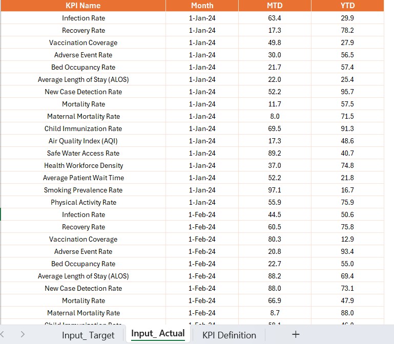
Input Actual Sheet
- Stores actual KPI numbers.
- Includes KPI Name, Month, MTD Values, and YTD Values.
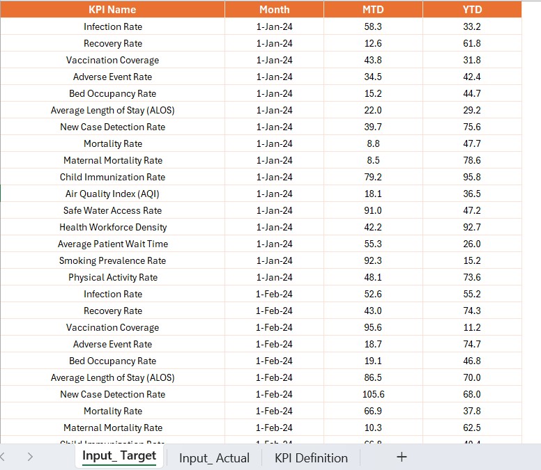
Input Target Sheet
- Holds target KPI values.
- Includes KPI Name, Month, MTD Values, and YTD Values.
Click to Public Health KPI
KPI Definition Sheet
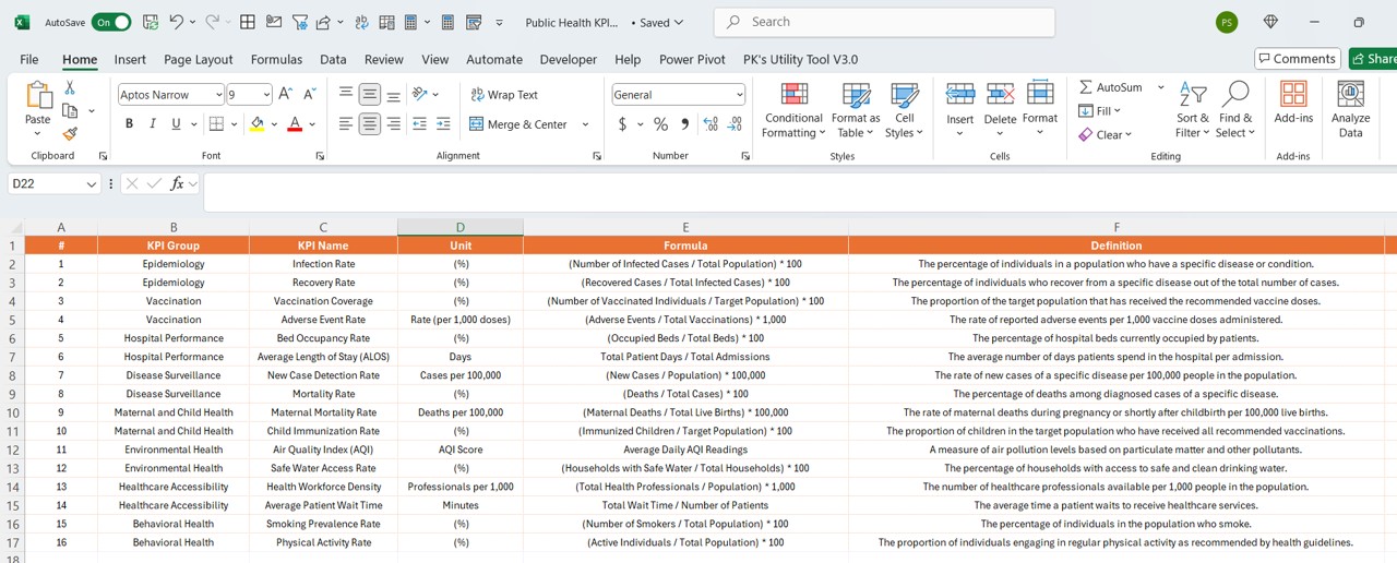
- Contains essential KPI details, such as:
- KPI Number
- KPI Group
- KPI Name
- Unit of Measurement
- Formula Used
- Definition
- Type (LTB or UTB)
Advantages of Using a Public Health KPI Dashboard in Power BI
Real-Time Insights
- Provides instant access to updated health data.
- Enables quick identification of trends and problem areas.
Data Visualization & Interactive Analytics
- Makes data easier to understand through charts and tables.
- Allows users to filter and explore specific KPIs.
Enhanced Decision-Making
- Assists healthcare professionals in allocating resources efficiently.
- Helps in setting achievable public health goals.
Comparative Analysis
- Enables easy comparison of current vs. past performance.
- Ensures alignment with set targets.
Automated Data Integration
- Eliminates manual data entry.
- Reduces errors and improves accuracy.
Best Practices for Implementing a Public Health KPI Dashboard
- Ensure Data Accuracy: Always validate data before importing it into Power BI.
- Keep It User-Friendly: Avoid excessive details that may overwhelm users.
- Refresh Data Regularly: Update your data source frequently for real-time accuracy.
- Leverage Drill-Through Pages: Enable users to explore KPIs in-depth.
- Monitor Trends Over Time: Use trend analysis to anticipate public health challenges.
Click to Public Health KPI
Frequently Asked Questions (FAQs)
Who should use this Public Health KPI Dashboard?
- Healthcare Administrators
- Public Health Officials
- Hospitals and Clinics
- Government Health Agencies
Can I use data sources other than Excel?
Yes! Power BI supports multiple data sources like SQL Server, APIs, and cloud platforms.
How often should I update the data?
To maintain accuracy, it is best to update data daily or weekly, depending on reporting needs.
Can this dashboard be customized?
Absolutely! You can modify slicers, charts, and KPIs to suit your organization’s requirements.
Is Power BI knowledge required to use this dashboard?
No, it’s designed to be user-friendly, with easy navigation and interactive features.
Conclusion
A Public Health KPI Dashboard in Power BI is a valuable tool for tracking healthcare performance, analyzing trends, and making data-driven decisions. With its interactive features, real-time data insights, and user-friendly design, it enhances public health management. By following best practices and ensuring accurate data input, organizations can maximize the benefits of Power BI dashboards for healthcare analytics.
Click to Public Health KPI
Visit our YouTube channel to learn step-by-step video tutorials
View this post on Instagram