In today’s fast-paced world, ensuring the quality of your products and services is essential to staying competitive. One of the most efficient ways to measure quality and track progress is by using a Quality KPI Dashboard in Excel. This tool helps you easily monitor key performance indicators (KPIs) related to quality, all within the familiar environment of Excel.
In this guide, we’ll dive deep into the features of the Quality KPI Dashboard in Excel and explain how it can help you streamline your quality management process. We will also cover best practices, opportunities for improvement, and answer frequently asked questions to ensure you have all the information you need to make the most out of this tool.
Click to buy Quality KPI Dashboard in Excel
What is a Quality KPI Dashboard?
Simply put, a Quality KPI Dashboard in Excel is a visual tool that allows you to track and analyses the most critical metrics related to quality performance. These metrics, often called KPIs, provide insights into how well your team or business is meeting quality targets. By using a dashboard, you can quickly see where improvements are needed and act before small problems turn into bigger issues.
In this article, we’ll focus on a pre-built Quality KPI Dashboard in Excel. This ready-to-use template has been designed to help you track key metrics efficiently and effectively.
Click to buy Quality KPI Dashboard in Excel
Key Features of the Quality KPI Dashboard in Excel
The dashboard template includes seven main worksheets, each designed to make tracking and managing your KPIs as simple as possible. Let’s break down each sheet:
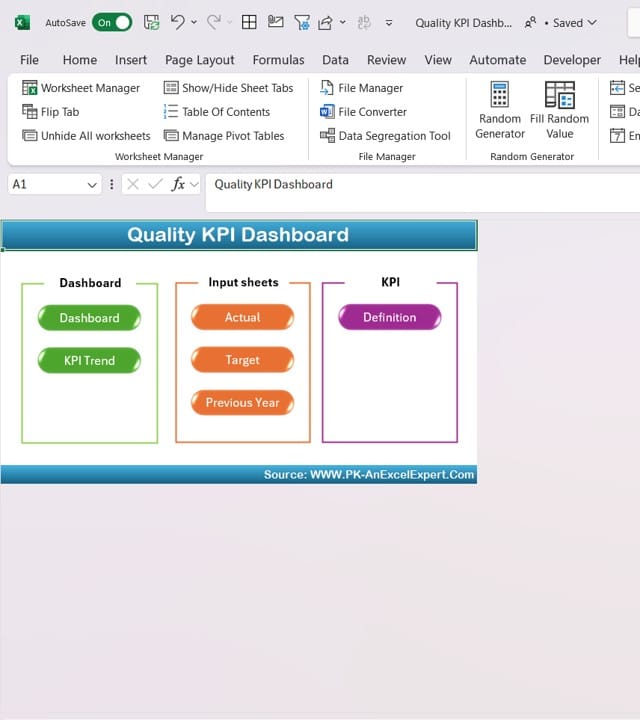
Home Sheet
Click to buy Quality KPI Dashboard in Excel
- This is the main page of your dashboard, acting as a navigation hub. There are six buttons on this page that let you jump to specific sections of the dashboard quickly and easily.
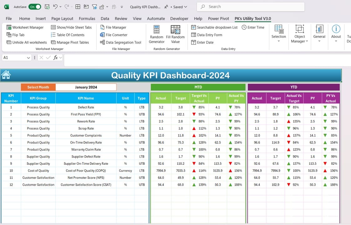
Dashboard Sheet Tab
Click to buy Quality KPI Dashboard in Excel
- This sheet contains the core information about your KPIs. On cell D3, you can select the month you want to analyze from a drop-down menu. The dashboard will automatically update the metrics for the selected month.
- It displays MTD (Month-to-Date) actuals, targets, and previous year data. You’ll also see comparisons between the current year and the previous year, as well as between actual and target figures. This sheet uses conditional formatting with arrows to highlight whether performance is up or down.
- Additionally, it shows YTD (Year-to-Date) numbers, which provide a longer-term view of how your quality metrics are progressing.
KPI Trend Sheet
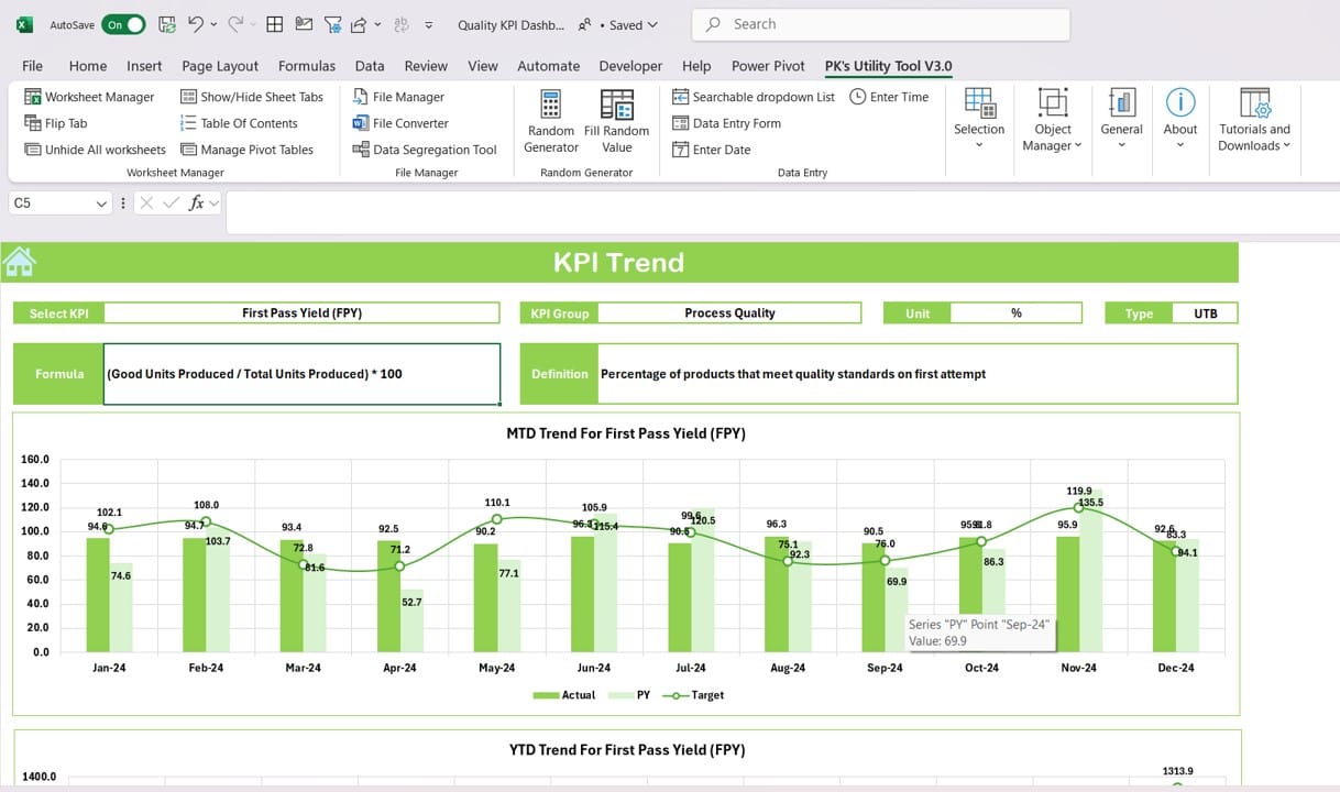
KPI Trend Sheet
Click to buy Quality KPI Dashboard in Excel
- In this sheet, you can select a KPI from a drop-down menu (located in cell C3) to view more detailed information. This sheet displays KPI group, unit, whether the KPI should increase or decrease (referred to as “Upper the Better” or “Lower the Better”), and the formula for calculating the KPI.
- You’ll also find trend charts for MTD and YTD performance, giving you a visual representation of how your KPIs are performing over time.
Actual Numbers Input Sheet
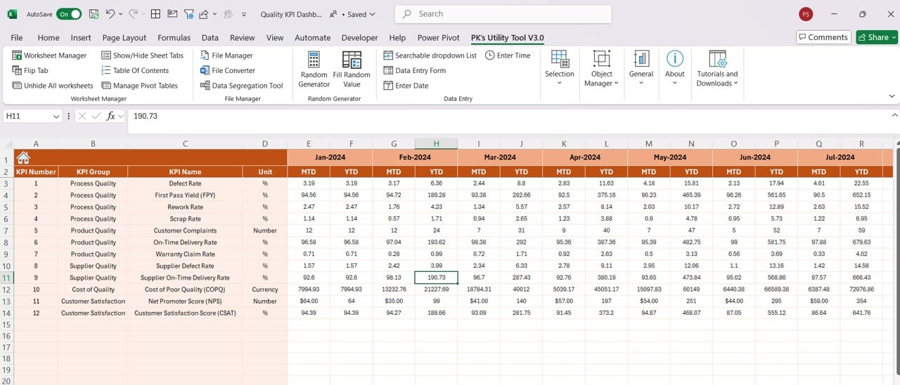
Click to buy Quality KPI Dashboard in Excel
- This sheet is where you enter the actual performance numbers for each KPI. It’s organized by month, and you can easily switch between months by changing the value in E1.
Target Sheet Tab
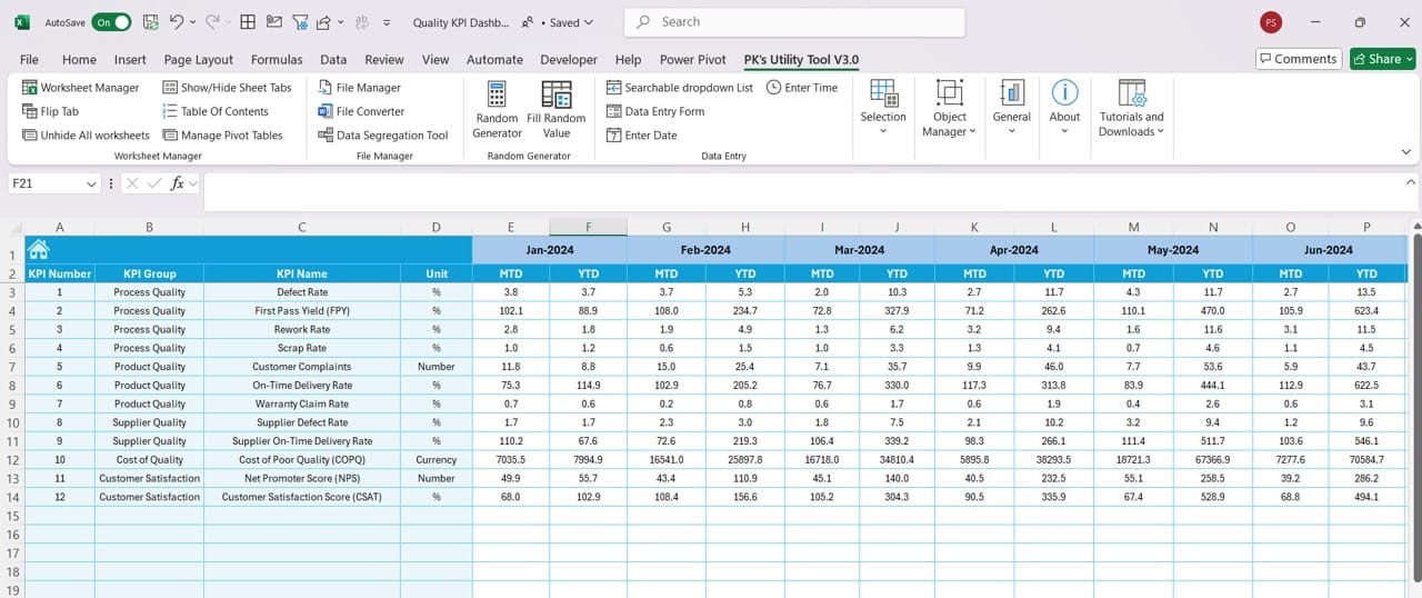
Click to buy Quality KPI Dashboard in Excel
- Here, you enter the target numbers for each KPI. You’ll be inputting both MTD and YTD target values to compare against the actual performance.
Previous Year Numbers Sheet
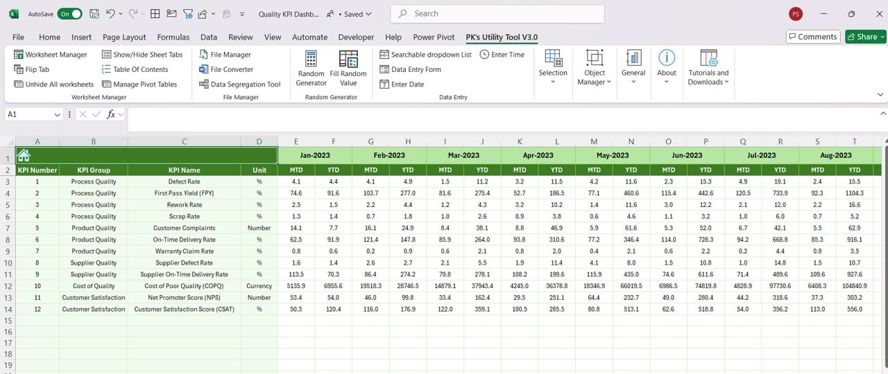
Click to buy Quality KPI Dashboard in Excel
- This sheet stores last year’s numbers for each KPI. It serves as a reference to help you measure year-over-year progress.
KPI Definition Sheet Tab
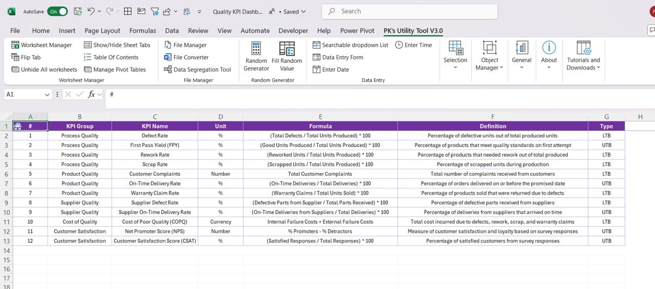
Click to buy Quality KPI Dashboard in Excel
- This sheet is where you define your KPIs. You’ll enter the name of each KPI, the group it belongs to, the unit of measurement, the formula used, and a brief description of the KPI’s purpose. This helps ensure everyone understands what each KPI is tracking.
Why Use a Quality KPI Dashboard in Excel?
Now that we’ve walked through the main features, let’s discuss why this type of dashboard is so valuable:
- Centralized Data Tracking: One of the most significant benefits of using a dashboard is that it pulls all of your quality-related data into one place. This makes it easier to track, analyze, and report on key metrics without the need for multiple tools or complex systems.
- Real-Time Data Insights: The dashboard allows you to select a specific month and instantly see updated data for that period. This helps you make decisions based on the latest information, rather than relying on outdated reports.
- Clear Visual Representation: The conditional formatting and trend charts make it easy to see at a glance how your KPIs are performing. Whether you need to see how your team is doing month-over-month or year-over-year, the dashboard provides a visual snapshot that helps highlight areas of success and areas that need attention.
Best Practices for Using the Quality KPI Dashboard
To get the most out of your Quality KPI Dashboard, it’s essential to follow a few best practices. These tips will help you maintain accurate data and make sure your dashboard provides meaningful insights:
- Update Data Regularly: For the dashboard to be effective, you’ll need to input the actual performance data regularly. Whether it’s done on a weekly or monthly basis, staying on top of data entry is key.
- Set Realistic Targets: When entering target values for your KPIs, ensure that they are both challenging and attainable. Overly ambitious targets can demotivate teams, while too easy goals won’t drive improvement.
- Involve Multiple Stakeholders: It’s important to involve different departments or team members in the process. This helps ensure that the data is accurate and that everyone is aligned on the key metrics being tracked.
- Use the Trend Charts for Analysis: The trend charts are a valuable tool for identifying patterns in your data. By reviewing these charts regularly, you can spot issues early on and take corrective action before they become major problems.
Opportunities for Improvement in the Quality KPI Dashboard
Even though the Quality KPI Dashboard in Excel is a powerful tool, there are always opportunities to make it even better. Here are a few suggestions for improving the functionality of the dashboard:
- Automate Data Entry: While the current template requires manual data input, you could use Excel’s Power Query or a VBA macro to automate data collection. This would save time and reduce the chances of human error.
- Expand Visualizations: Although the dashboard already includes useful trend charts, you could further enhance it by adding additional chart types, such as pie charts or heat maps. These visual tools can make it even easier to understand the data.
- Custom Reports: Adding features that allow users to generate custom reports based on specific date ranges or KPIs would make the dashboard even more flexible and user-friendly.
Click to buy Quality KPI Dashboard in Excel
Best Practices for Setting Up KPIs in Excel
When defining KPIs for your dashboard, it’s important to follow certain best practices to ensure you’re tracking the right metrics:
- Align KPIs with Business Goals: KPIs should reflect your broader business objectives. If your goal is to improve product quality, make sure that the KPIs you track are directly related to achieving that goal.
- Focus on Actionable Metrics: It’s easy to get caught up in tracking too many metrics. Stick to KPIs that provide actionable insights. Every metric should help you understand whether you’re moving closer to your quality goals.
- Keep it Simple: Avoid overloading the dashboard with too much data. Focus on the most important KPIs, and make sure the dashboard is easy to read and interpret.
- Define KPIs Clearly: Each KPI should have a clear definition that’s easy for all stakeholders to understand. This is where the KPI Definition Sheet in your dashboard comes in handy.
Click to buy Quality KPI Dashboard in Excel
Conclusion
A Quality KPI Dashboard in Excel is an invaluable tool for tracking and improving quality performance across your organization. It allows you to monitor key metrics in real-time, visualize trends, and make data-driven decisions to ensure your quality targets are met. By following the best practices outlined in this guide and exploring opportunities for improvement, you’ll be well on your way to using the dashboard effectively.
Frequently Asked Questions (FAQs)
Q. How do I update the dashboard for a new month?
To update the dashboard for a new month, simply select the desired month from the drop-down menu in cell D3 on the Dashboard Sheet. The data will automatically update based on your selection.
Q. Can I add new KPIs to the dashboard?
Yes, you can easily add new KPIs by updating the KPI Definition Sheet. Once you’ve added the new KPI, be sure to update the Target Sheet and Actual Numbers Input Sheet as well.
Q. Is it possible to automate data entry?
Yes, you can use Excel’s Power Query or VBA macros to automate data collection. This can help streamline the process and reduce manual entry errors.
Q. Can the dashboard be customized for different industries?
Absolutely! The dashboard template is highly customizable, so you can modify the KPIs and metrics to suit the specific needs of your industry.
Q. How do I compare multiple years of data?
Currently, the dashboard compares data from the current year to the previous year. However, you can add additional sheets to track data from multiple years if needed.
By following this guide and utilizing the features of the Quality KPI Dashboard in Excel, you’ll be able to track, analyze, and improve your quality metrics effectively.
Click to buy Quality KPI Dashboard in Excel
Visit our YouTube channel to learn step-by-step video tutorials
Click to buy Quality KPI Dashboard in Excel