In today’s data-driven world, research and development (R&D) teams need to track and measure key performance indicators (KPIs) effectively. An R&D KPI Dashboard in Power BI can be an essential tool to monitor progress, identify trends, and optimize performance. This article explores the features, advantages, best practices, and opportunities for improvement in using an R&D KPI Dashboard in Power BI.
What is an R&D KPI Dashboard in Power BI?
An R&D KPI Dashboard in Power BI is a powerful tool that helps R&D teams visualize their key performance indicators in real time. It allows for the tracking of both short-term and long-term goals, making it an essential asset for data-driven decision-making. By integrating various metrics, this dashboard can monitor the effectiveness of R&D activities, measure progress against targets, and highlight areas for improvement. In this guide, we will focus on a comprehensive Power BI dashboard that integrates Excel data to track KPIs, featuring a clear structure with intuitive pages and detailed tables.
Key Features of the R&D KPI Dashboard in Power BI
This R&D KPI Dashboard is designed to capture and present data efficiently, providing actionable insights for R&D teams. The dashboard consists of three primary pages, all of which are seamlessly integrated into the Power BI desktop application.
Summary Page
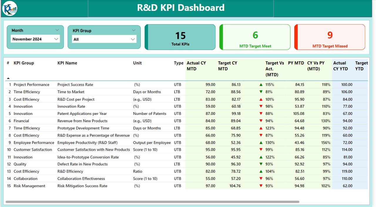
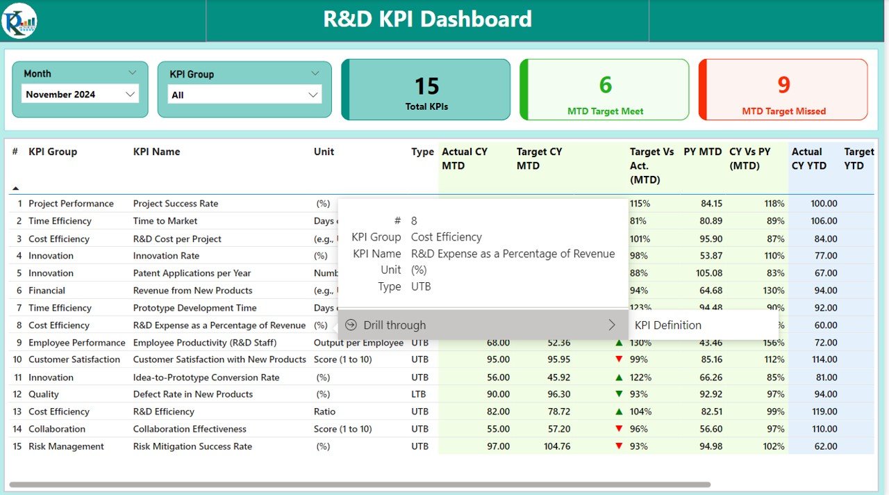
The Summary Page is the main screen of the dashboard, where essential metrics are displayed for quick and easy monitoring.
Key components of the Summary Page include:
- Month and KPI Group Slicer: These slicers allow you to filter data based on the selected month and KPI group, providing flexibility in viewing the data.
- KPI Summary Cards: Three key performance cards are prominently displayed:
- Total KPIs Count: Displays the total number of KPIs being tracked.
- MTD Target Met Count: Shows how many KPIs have met their targets for the month-to-date (MTD).
- MTD Target Missed Count: Indicates the KPIs that have not met their MTD targets.
Below the summary cards, a detailed table presents in-depth information for each KPI. The table columns include:
- KPI Number: A sequence number for each KPI.
- KPI Group: The category or group to which the KPI belongs.
- KPI Name: The name or label of the KPI.
- Unit: The measurement unit for the KPI.
- Type: Whether the KPI follows a “Lower the Better” (LTB) or “Upper the Better” (UTB) rule.
- Actual CY MTD: Actual value for the current year month-to-date (MTD).
- Target CY MTD: Target value for the current year month-to-date (MTD).
- MTD Icon: A red or green arrow (▼ or ▲) representing whether the current MTD performance meets the target.
- Target vs Actual (MTD): The percentage comparison between the actual and target values for MTD.
- PY MTD: The month-to-date value for the previous year (PY).
- CY vs PY (MTD): A percentage comparison between the current year and previous year’s MTD numbers.
- Actual CY YTD: The actual value for the current year year-to-date (YTD).
- Target CY YTD: The target value for the current year year-to-date (YTD).
- YTD Icon: Red or green arrows indicating how the current YTD performance compares to the target.
- Target vs Actual (YTD): The percentage comparison between actual and target values for YTD.
- PY YTD: The year-to-date value for the previous year.
- CY vs PY (YTD): A comparison of the current year’s YTD value to that of the previous year.
This layout ensures that all critical data points are available for review in a clear, concise manner.
Click to buy R&D KPI Dashboard in Power BI
KPI Trend Page
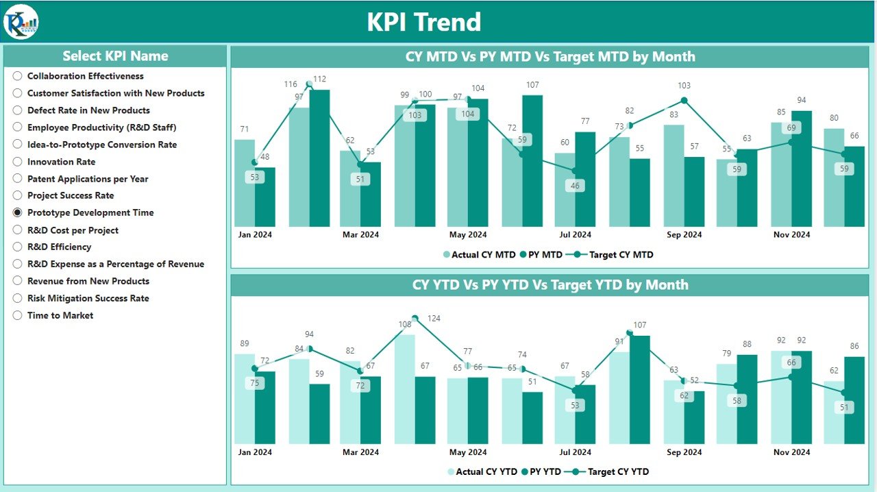
The KPI Trend Page visualizes the trends of KPIs over time. It contains two combo charts that show:
- Actual Numbers: Comparing current-year performance with the previous year’s values for both MTD and YTD periods.
- Target: A comparison of targets versus actual values for both MTD and YTD.
The trend analysis allows you to visualize changes in the KPIs across different periods, helping you make timely decisions to address any performance gaps.
A slicer on the left allows users to select specific KPIs to focus on, making it easy to drill down into individual KPI trends.
Click to buy R&D KPI Dashboard in Power BI
KPI Definition Page
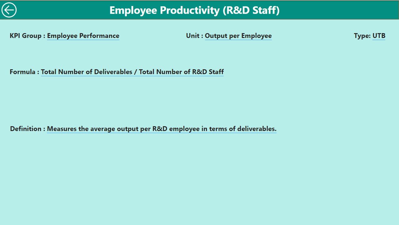
The KPI Definition Page serves as a drill-through page containing detailed information about each KPI. It provides insights into:
- KPI Formula: The formula used to calculate the KPI.
- KPI Definition: A detailed explanation of the KPI’s purpose and its significance.
Click to buy R&D KPI Dashboard in Power BI
This page is hidden by default but can be accessed by selecting a KPI from the Summary Page. The “Back” button in the top-left corner allows users to return to the main dashboard.
Click to buy R&D KPI Dashboard in Power BI
Excel Data Integration for R&D KPI Dashboard
The data for this R&D KPI Dashboard is sourced from an Excel file, making it easy to manage and update. The Excel workbook contains three key sheets:
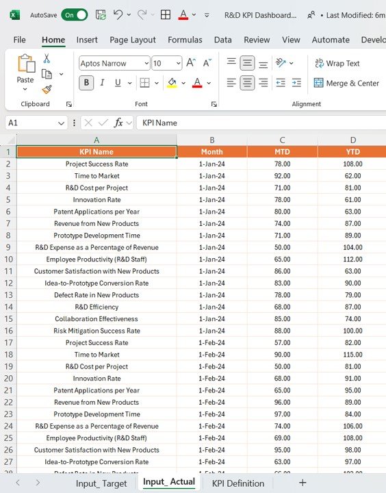
Input_Actual Sheet Tab:
- This sheet is used to enter the actual KPI numbers for the current month and year-to-date (YTD). Include values for each KPI, MTD, and YTD.
Click to buy R&D KPI Dashboard in Power BI
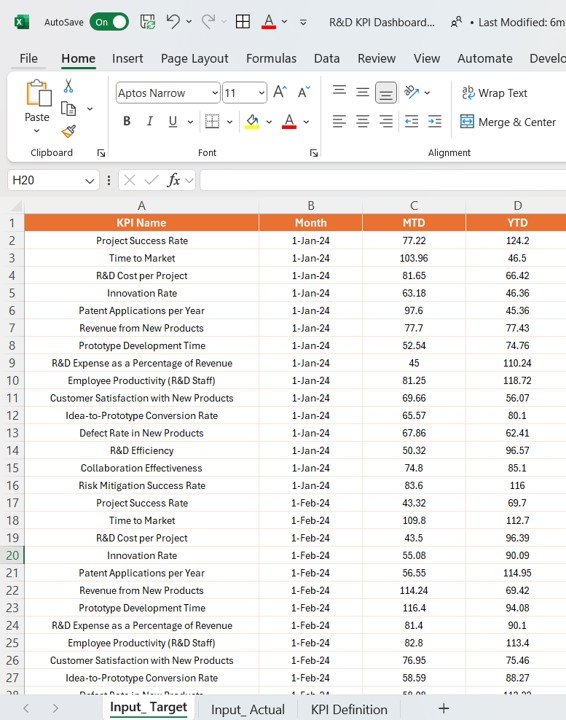
Input_Target Sheet Tab:
- In this tab, input the target numbers for the KPIs, broken down by MTD and YTD.
Click to buy R&D KPI Dashboard in Power BI
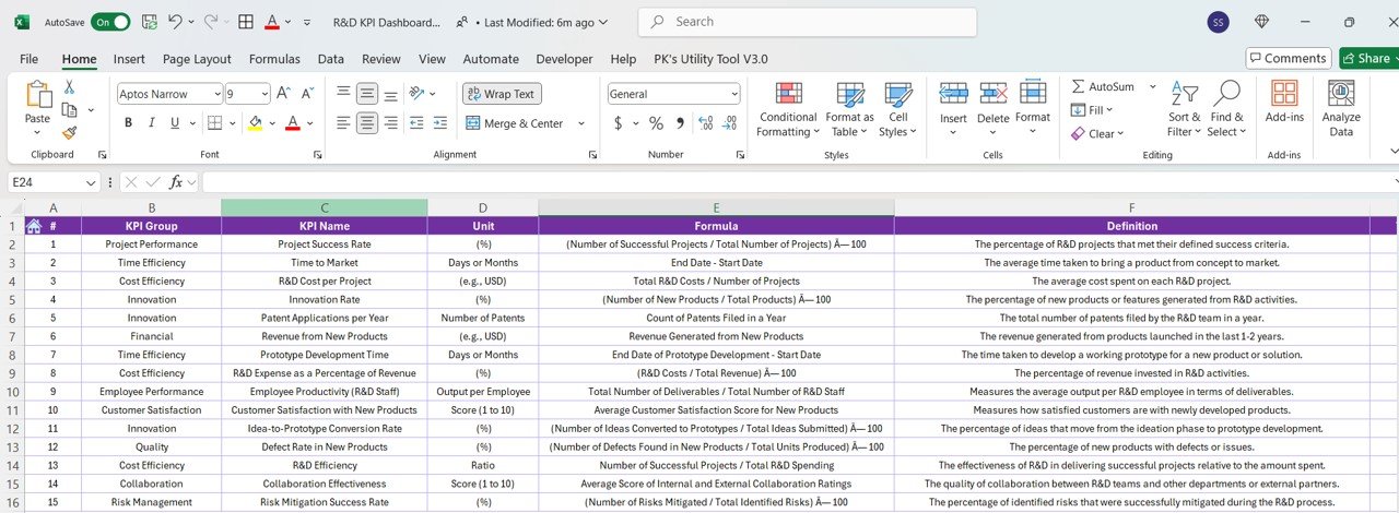
KPI Definition Sheet Tab:
- This tab contains essential information about each KPI, such as KPI number, group, name, unit, formula, definition, and type (LTB or UTB).
By regularly updating this Excel file, the Power BI dashboard will automatically reflect the latest data, providing real-time insights.
Click to buy R&D KPI Dashboard in Power BI
Advantages of Using an R&D KPI Dashboard in Power BI
Implementing an R&D KPI Dashboard in Power BI offers several significant advantages for organizations involved in research and development.
- Improved Decision-Making: The dashboard helps R&D teams track performance against targets in real time. By visualizing key data, decision-makers can quickly identify trends and take timely actions to optimize resources and performance.
- Centralized Data: Instead of managing data across multiple platforms, an R&D KPI Dashboard consolidates all performance metrics in one central location. This allows for easier monitoring, analysis, and reporting.
- Enhanced Collaboration: Power BI’s sharing and collaboration features enable R&D teams to work together more effectively. Teams can view the same dashboard, make real-time changes, and discuss insights.
- Streamlined Reporting: With automated updates and visualizations, the need for manual reporting is minimized. This saves time and ensures that reports are accurate and up to date.
Opportunities for Improvement in R&D KPI Dashboards
While R&D KPI Dashboards offer numerous benefits, there are always opportunities for improvement to enhance the effectiveness of the tool.
- Customization of Dashboards: Allowing users to customize the dashboard based on their specific needs can add significant value. This can include adding custom KPI categories, adjusting time periods, or personalizing visualizations.
- Advanced Analytics: Integrating machine learning models or predictive analytics can help forecast future trends and outcomes, providing even more proactive insights for R&D teams.
- Mobile Compatibility: Many R&D professionals are on the go. Ensuring that the dashboard is compatible with mobile devices would increase accessibility and improve data tracking across different environments.
Best Practices for Using an R&D KPI Dashboard in Power BI
To get the most out of your R&D KPI Dashboard in Power BI, it’s essential to follow some best practices.
- Set Clear and Measurable KPIs: Ensure that the KPIs selected are relevant, measurable, and aligned with your R&D objectives. Well-defined KPIs are essential for tracking progress and making data-driven decisions.
- Regular Data Updates: Maintain the dashboard by regularly updating the data in the Excel file. Accurate, up-to-date data is critical for real-time monitoring and informed decision-making.
- User Training: Make sure that users are trained on how to navigate the dashboard effectively. Provide tutorials or documentation to help them understand the KPIs, filters, and features of the dashboard.
- Utilize Power BI’s Sharing Features: Leverage Power BI’s sharing and collaboration features to keep stakeholders informed. Share dashboards regularly with key team members to encourage collaboration and ensure everyone is aligned on goals.
Frequently Asked Questions (FAQs)
Click to buy R&D KPI Dashboard in Power BI
1. How do I add custom KPIs to the R&D Dashboard?
To add custom KPIs, simply update the Excel file with the new KPI information and ensure it follows the same format as the existing KPIs. The Power BI dashboard will automatically reflect the new data.
2. Can I integrate this dashboard with other data sources?
Yes, Power BI allows you to integrate data from multiple sources such as SQL databases, SharePoint, or even APIs, making it versatile for various use cases.
3. How do I ensure data accuracy in the dashboard?
Data accuracy can be ensured by setting up automated data validation rules and performing regular quality checks before uploading the data into the Excel file.
4. Can this dashboard be used for R&D in other industries?
Yes, the R&D KPI Dashboard can be tailored to suit the needs of any industry, from pharmaceuticals to technology development. The KPIs can be customized according to the specific goals and metrics of the organization.
Conclusion
An R&D KPI Dashboard in Power BI is a valuable tool for organizations to track performance, optimize processes, and make data-driven decisions. By consolidating data into an easy-to-read format and providing interactive features, it helps R&D teams stay aligned with their objectives and targets. With the right KPIs, data updates, and best practices, this tool can significantly improve the efficiency of R&D operations.
Visit our YouTube channel to learn step-by-step video tutorials
View this post on Instagram
Click to buy R&D KPI Dashboard in Power BI

