In today’s competitive job market, recruitment plays a critical role in shaping the workforce of any organization. However, the recruitment process can be complex and time-consuming, making it essential for HR professionals to track and analyze candidate data efficiently. A Recruitment Pipeline Dashboard in Power BI simplifies this process by providing an interactive, data-driven tool that helps recruitment teams monitor progress, evaluate performance, and make informed decisions.
This article will explain how to create a Recruitment Pipeline Dashboard using Power BI, a powerful business analytics tool. We will guide you through each page of the dashboard, explain its components, and highlight best practices to ensure you get the most out of your recruitment data.
What Is a Recruitment Pipeline Dashboard in Power BI?
A Recruitment Pipeline Dashboard in Power BI is a comprehensive tool designed to help HR teams manage the hiring process from start to finish. It enables users to track critical recruitment data, such as candidate applications, the stages of the hiring process, time-to-hire, interview performance, and salary offers. By transforming raw data into meaningful visualizations, Power BI makes it easier to analyze recruitment trends, identify bottlenecks, and optimize strategies for future hires.
Setting Up a Recruitment Pipeline Dashboard
Power BI allows you to create a customized dashboard with various pages, each focusing on a different aspect of the recruitment process. Below, we’ll walk you through six essential pages and explain the components of each.
Page 1: Overview
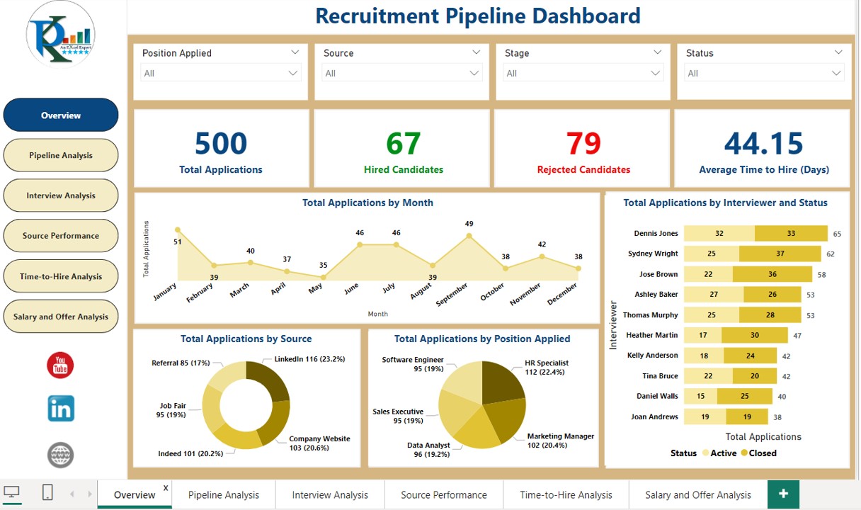
The Overview page is designed to provide a high-level view of the recruitment process, showcasing the total number of applications, their distribution across various stages, and the sources driving these applications. Here’s a breakdown of the charts and their functions:
- Total Applications by Month: A line chart is used to track the total number of applications received over time, giving you an overview of recruitment trends. By visualizing this data, you can identify patterns and peak months, helping your team allocate resources effectively.
- Total Applications by Stages and Status: This bar chart displays the number of applications in each stage of the recruitment process (e.g., initial screening, interview, offer, rejected). It also categorizes the data by status (e.g., shortlisted, in-progress, or rejected), allowing you to assess where candidates are most frequently dropping off or advancing.
- Total Applications by Source: The donut chart visually represents how applications come from different sources such as job boards, social media, employee referrals, and company websites. This chart helps you determine which recruitment channels are the most effective, allowing you to focus efforts on high-performing sources.
- Total Applications by Position Applied: The pie chart shows the distribution of applications based on job positions. This helps you understand which roles are attracting the most candidates and can inform your hiring priorities.
Click to buy Recruitment Pipeline Dashboard in Power BI
Page 2: Pipeline Analysis
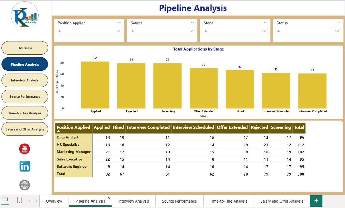
The Pipeline Analysis page dives deeper into the progression of candidates through different stages in the recruitment process. Here’s a look at the components:
- Total Applications by Stages: A column chart is used to represent the total number of applications at each stage of the recruitment process. This gives HR teams a clear visual of where the highest number of candidates are, helping them spot bottlenecks or stages that need more attention.
- Stage Progression Breakdown by Position: The matrix view breaks down how candidates are progressing from one stage to the next, sorted by position. This visualization helps you understand which positions have the most candidates moving through each stage, and which ones might need extra effort to keep things moving forward.
Click to buy Recruitment Pipeline Dashboard in Power BI
Page 3: Source Performance
This page focuses on evaluating the effectiveness of various sources of candidate applications, helping you optimize your sourcing strategy.
- Average Salary Offered by Source: A bar chart displays the average salary offered to candidates sourced from different platforms. This helps you determine if your salary offerings align with industry standards across various sources and whether specific platforms yield better talent.
- Hires by Source: This bar chart tracks the number of hires made from each source. It provides insight into which sources yield the most hires, allowing you to allocate more resources to high-performing channels.
- Applications by Source: The pie chart shows the percentage of applications coming from each source, providing a clear view of where your candidates are coming from. This is crucial for optimizing your recruitment strategy and ensuring that your efforts are focused on the right platforms.
Click to buy Recruitment Pipeline Dashboard in Power BI
Page 4: Interview Analysis
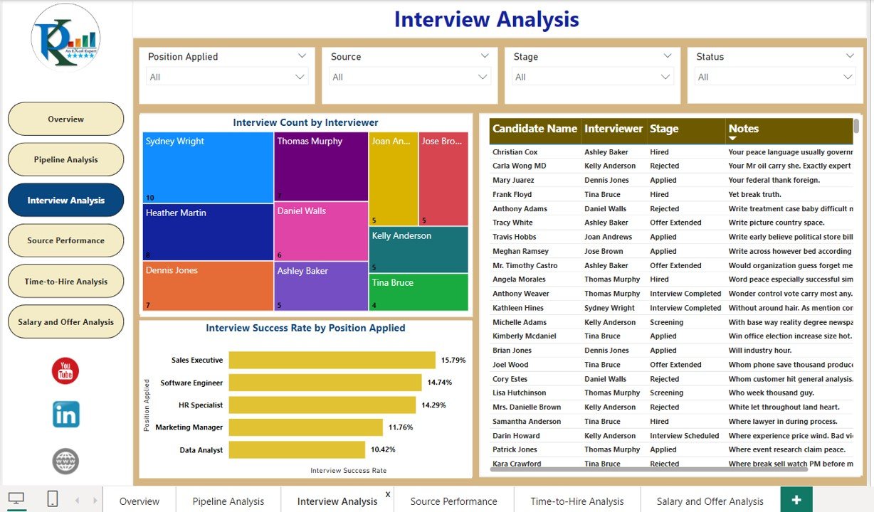
The Interview Analysis page highlights the efficiency and success of the interview process. It provides detailed data on interviews conducted, success rates, and specific candidate details.
- Interviews Conducted by Interviewer: A treemap displays the number of interviews conducted by each interviewer. This helps you assess how evenly interviews are distributed among interviewers and whether there are any outliers in terms of interviewer workload.
- Interview Success Rate by Position: This bar chart compares the success rates of candidates moving from the interview stage to the offer stage, broken down by position. It helps you evaluate whether certain positions are having more success in interviews or if certain stages in the process need improvement.
- Detailed View of Interviews: A table shows a detailed list of interviews, including candidate name, interviewer, interview stage, and interview notes. This is valuable for HR teams who need to assess individual interview performance and track candidate feedback.

Click to buy Recruitment Pipeline Dashboard in Power BI
Page 5: Time-to-Hire Analysis
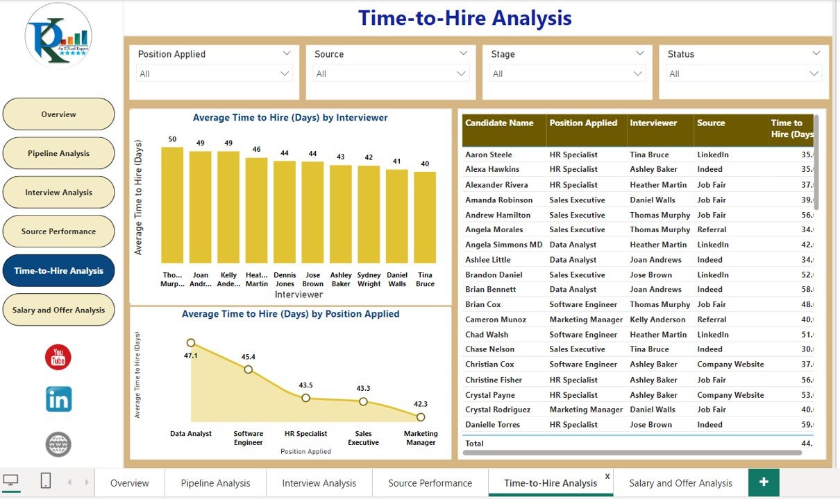
The Time-to-Hire Analysis page provides insight into the time it takes to move candidates from application to hiring. This data helps HR teams streamline their recruitment process and reduce delays.
- Average Time to Hire by Interviewer: A column chart visualizes the average time taken by each interviewer to move candidates through the hiring process. This helps identify any potential delays caused by specific interviewers and provides an opportunity to improve the interview process.
- Average Time to Hire by Position: This line chart tracks the average time-to-hire for different positions, helping you understand how long it takes to hire for each role. This data is essential for identifying any roles that take longer to fill and addressing inefficiencies in the process.
- Candidate-Level Time Analysis: A table presents individual candidate-level data on the time spent at each stage of the recruitment process. This granular data provides HR teams with insights into how long each candidate stays at different stages, allowing them to identify candidates who may need additional attention or follow-up.
Click to buy Recruitment Pipeline Dashboard in Power BI
Page 6: Salary and Offer Analysis
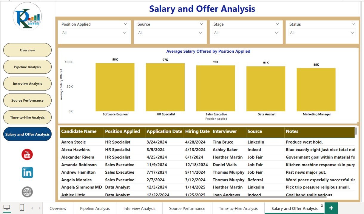
The Salary and Offer Analysis page focuses on salary trends and offer details. It helps you track compensation packages and ensure that you are offering competitive salaries to candidates.
- Average Salary Offered by Position: A column chart shows the average salary offered across different positions. This helps you compare salary offerings for various roles and ensure that compensation packages are aligned with market rates and company standards.
- Detailed View of Offers: A table provides a detailed view of offers extended to candidates, including candidate name, salary offered, and expected joining date. This view is essential for HR teams to track the status of offers and ensure that all necessary follow-up actions are taken in a timely manner.
Click to buy Recruitment Pipeline Dashboard in Power BI
Advantages of a Recruitment Pipeline Dashboard in Power BI
- Centralized Data Access: One of the key benefits of using Power BI for your recruitment pipeline is the ability to centralize all recruitment data. Instead of managing multiple spreadsheets or systems, Power BI allows you to consolidate everything in one place, making it easier to access and analyze all necessary information.
- Informed Decision-Making: With a recruitment dashboard, you can rely on data-driven insights rather than subjective opinions. Real-time data, such as the number of applications, candidate conversion rates, and time-to-hire, ensures that your decisions are grounded in facts.
- Increased Efficiency: A recruitment pipeline dashboard helps HR teams spot inefficiencies in the hiring process. Whether it’s an overly long time-to-hire or a source of candidates underperforming, the dashboard will highlight areas for improvement, allowing you to optimize your efforts.
- Improved Candidate Experience: By tracking progress and providing timely communication, the dashboard ensures that candidates receive a seamless experience throughout the hiring process. This can help improve employer branding and attract top talent in the future.
- Better Transparency: Transparency is a crucial factor in recruitment. The dashboard provides visibility into the recruitment process at every stage, making it easier to communicate with other departments or stakeholders about candidate progress and hiring decisions.
Best Practices for a Recruitment Pipeline Dashboard
To maximize the effectiveness of your Recruitment Pipeline Dashboard in Power BI, consider these best practices:
- Use Simple and Clear Visuals: Ensure your visuals are easy to understand and not overly complicated. Clear charts and graphs are essential for quick data interpretation.
- Make It Interactive: Incorporate interactive features like slicers and drill-down options to allow users to explore data in greater detail.
- Automate Data Refresh: Set up automatic data refreshes so your dashboard always shows the most current data.
- Ensure Data Quality: Accurate and reliable data is crucial. Always verify the data feeding into your dashboard to ensure its integrity.
- Optimize for Mobile: Ensure your dashboard is mobile-friendly. Many HR professionals may need to access it on the go, so it’s important that it’s responsive and easy to navigate on mobile devices.
Frequently Asked Questions (FAQs)
- What is a Recruitment Pipeline Dashboard in Power BI?
A Recruitment Pipeline Dashboard in Power BI is a visual tool that helps HR teams track and manage the recruitment process, including candidate sourcing, stages, time-to-hire, and interview performance.
- How do I create a Recruitment Pipeline Dashboard?
To create a Recruitment Pipeline Dashboard in Power BI, you need to connect your recruitment data, design visualizations (such as charts and tables), and organize them into meaningful pages that reflect key recruitment metrics.
- What metrics should be included in the Recruitment Pipeline Dashboard?
Key metrics include total applications, hired and rejected candidates, time-to-hire, source performance, interview success rates, and salary offers.
- How can Power BI improve the recruitment process?
By providing real-time insights into various aspects of the recruitment process, Power BI helps HR teams identify inefficiencies, streamline operations, and make informed, data-driven decisions.
- Can I customize the dashboard for different recruitment teams?
Yes, you can create customized dashboards tailored to different teams, such as recruiters, hiring managers, or HR executives, focusing on the metrics most relevant to each role.
Conclusion
A Recruitment Pipeline Dashboard in Power BI is a powerful tool that offers HR teams valuable insights into the hiring process. By visualizing key metrics, such as time-to-hire, source performance, and interview success rates, Power BI helps HR professionals optimize their recruitment strategies, reduce inefficiencies, and ultimately make better hiring decisions. By following best practices and continuously improving your dashboard, you can create an efficient and effective recruitment pipeline that supports your organization’s hiring needs.
Visit our YouTube channel to learn step-by-step video tutorials
Watch the step-by-step video tutorial:
Click to buy Recruitment Pipeline Dashboard in Power BI


