In today’s data-driven environment, effective recycling management is crucial. The Recycling KPI Dashboard in Power BI is a sophisticated tool designed to optimize recycling processes through detailed analytics. This dashboard integrates seamlessly with Excel, allowing you to harness powerful visualizations and insights from your data. This article will guide you through the key features, advantages, and best practices for utilizing this dashboard, along with answering some frequently asked questions.
Click to buy Recycling KPI Dashboard in Power BI
Key Features of the Recycling KPI Dashboard
Overview of the Dashboard Structure
The Recycling KPI Dashboard is meticulously crafted with three main pages within the Power BI desktop application, each serving a specific function:
Summary Page:
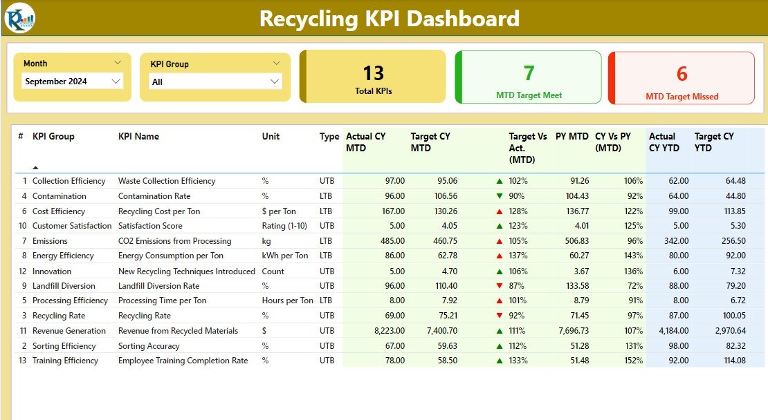
- KPI Cards: Displays cards for Total KPIs count, MTD Target Met count, and MTD Target Missed count.
- Detailed Table: Showcases KPI Number, KPI Group, KPI Name, and more, with visual indicators (▼, ▲) for performance against MTD and YTD targets.
KPI Trend Page:
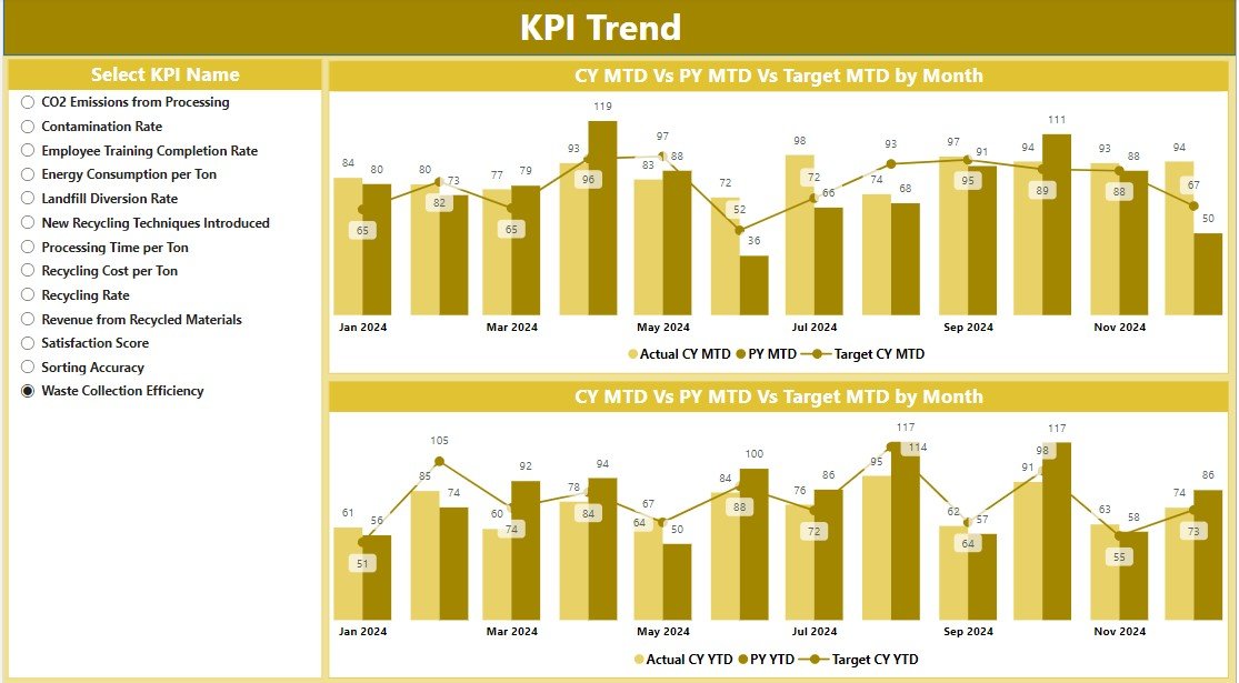
- Visualization: Features two combo charts comparing Actual Numbers, Targets for MTD and YTD, and Previous Year’s data.
- Slicers: Allows filtering by KPI name for focused analysis.
Click to buy Recycling KPI Dashboard in Power BI
KPI Definition Page:
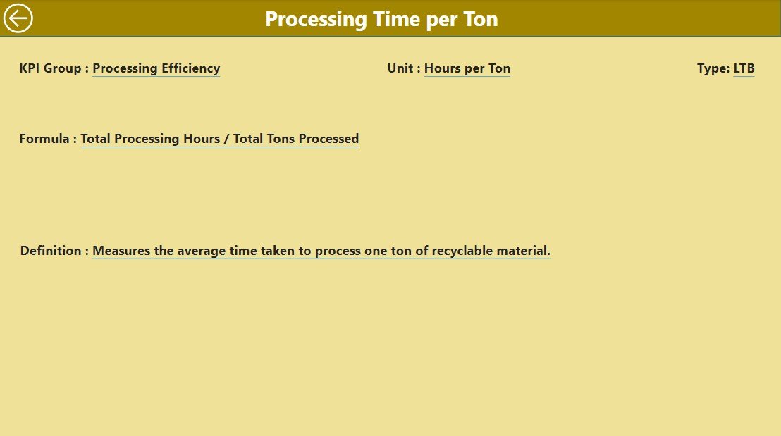
Drill-Through Capability:
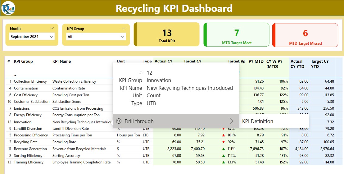
- Provides a hidden, detailed view of each KPI’s formula and definition accessible from the Summary page.
Integration with Excel
- The dashboard leverages data from an Excel file comprising three worksheets:
Click to buy Recycling KPI Dashboard in Power BI
Input Actual Sheet:
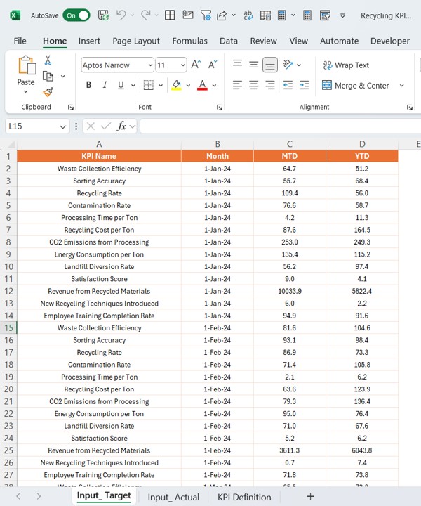
- For entering actual KPI data including monthly, MTD, and YTD figures.
Input Target Sheet:
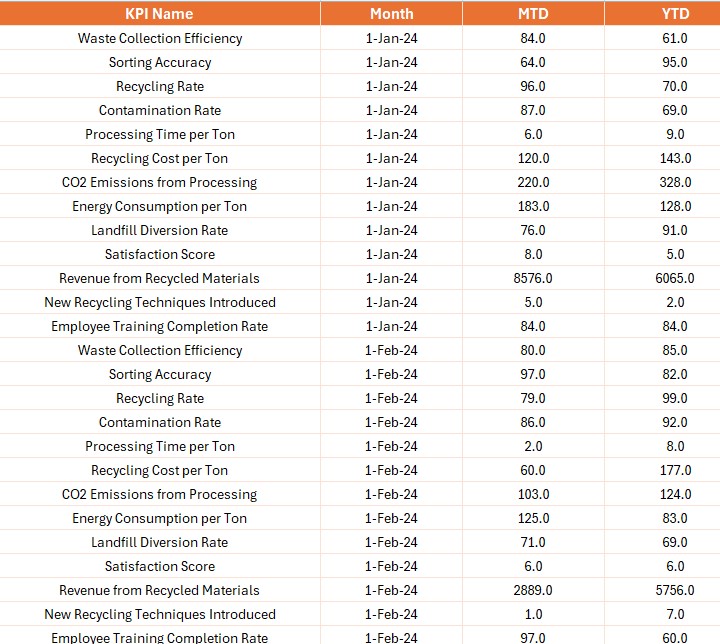
- For entering target KPI data similarly structured as the actuals.
KPI Definition Sheet:
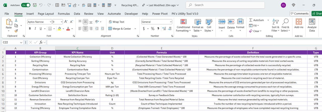
- To detail KPI Number, Group, Name, Unit, Formula, Definition, and Type.
Advantages of the Recycling KPI Dashboard in Power BI
- Enhanced Decision-Making: Utilize real-time data to make informed decisions on recycling processes.
- Efficient Data Management: Easily update and maintain KPI data through structured Excel inputs.
- Comprehensive Performance Insights: Visual indicators and trend analyses provide clear insights into performance metrics, facilitating quick identification of areas needing attention.
Click to buy Recycling KPI Dashboard in Power BI
Best Practices for the Recycling KPI Dashboard
- Regular Data Updates: Ensure data in the Excel sheets is updated regularly to maintain accuracy in the dashboard.
- Utilize Slicers: Make use of the slicers on the KPI Trend page to drill down into specific KPIs for detailed analysis.
- Review Dashboard Regularly: Regular review of the dashboard is essential to stay on top of KPI performances and make adjustments as needed.
Conclusion
The Recycling KPI Dashboard in Power BI is a powerful tool that transforms complex data into actionable insights, helping organizations optimize their recycling processes. With its deep integration with Excel, it offers a robust platform for tracking, analyzing, and reporting on key performance indicators.
Frequently Asked Questions with Answers
Q. How do I update data on the Recycling KPI Dashboard?
Data can be updated by filling in the Actual and Target numbers in the respective Excel sheet tabs.
Q. Can I customize the KPIs on the dashboard?
Yes, KPIs can be customized and defined in the KPI Definition sheet tab, including adjustments to formulas and units.
Q. What should I do if the visual indicators do not reflect updates?
Ensure that the data in Excel is correctly updated and refreshed in Power BI to reflect in the visual indicators.
Visit our YouTube channel to learn step-by-step video tutorials
View this post on Instagram
Click to buy Recycling KPI Dashboard in Power BI

