Introduce the importance of tracking KPIs in the renewable energy sector and how an Excel-based dashboard simplifies and centralizes this process Renewable Energy KPI Dashboard in Excel.
Click to buy Renewable Energy KPI Dashboard in Excel
Key Features of the Renewable Energy KPI Dashboard in Excel
Home Sheet:
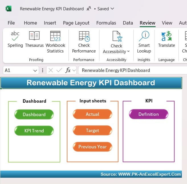
Explain how the home sheet acts as the index and central navigation hub, detailing the functionality of the six buttons that provide direct access to other sheets.
Click to buy Renewable Energy KPI Dashboard in Excel
Dashboard Sheet Tab:
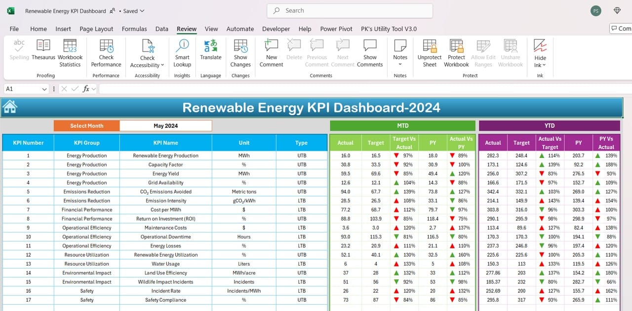
Describe the Dashboard tab, where users can select a specific month, update the data dynamically, and track month-to-date (MTD) and year-to-date (YTD) figures. Explain how conditional formatting arrows (up/down) enhance readability by highlighting performance trends.
KPI Trend Sheet Tab:
Click to buy Renewable Energy KPI Dashboard in Excel
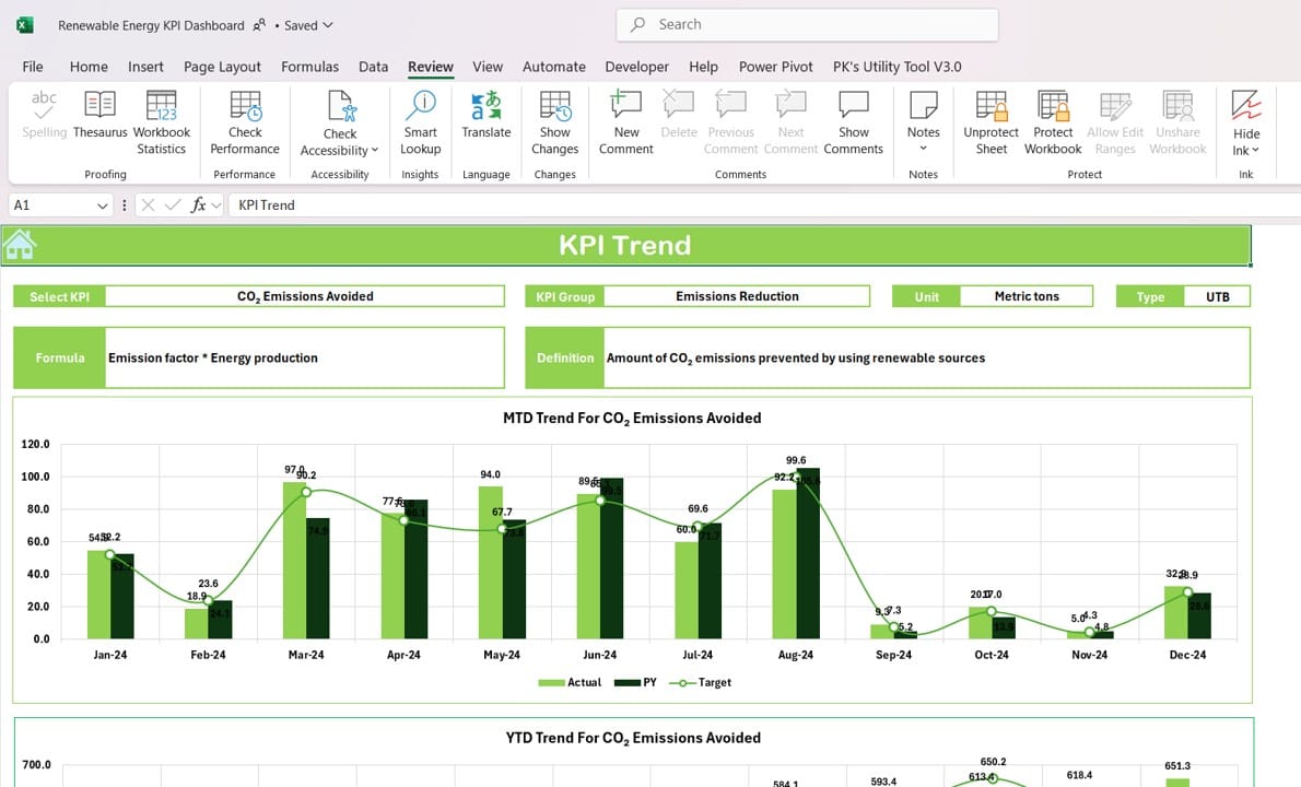
Discuss the KPI Trend tab, highlighting how users can select KPIs to see trends for MTD and YTD values. Explain the KPI Group, Unit, Type (e.g., “Lower the Better” or “Upper the Better”), and how these details, along with graphical trend lines, provide actionable insights.
Actual Numbers Input Sheet:
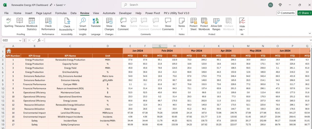
Explain the purpose of this sheet, where users input MTD and YTD actual values, and how easy it is to adjust for any given month, streamlining data input processes.
Target Sheet Tab:
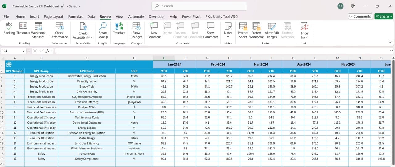
Detail how this sheet enables input of monthly targets, making it easy for teams to establish and track progress toward monthly and yearly goals.
Click to buy Renewable Energy KPI Dashboard in Excel
Previous Year Number Sheet Tab:
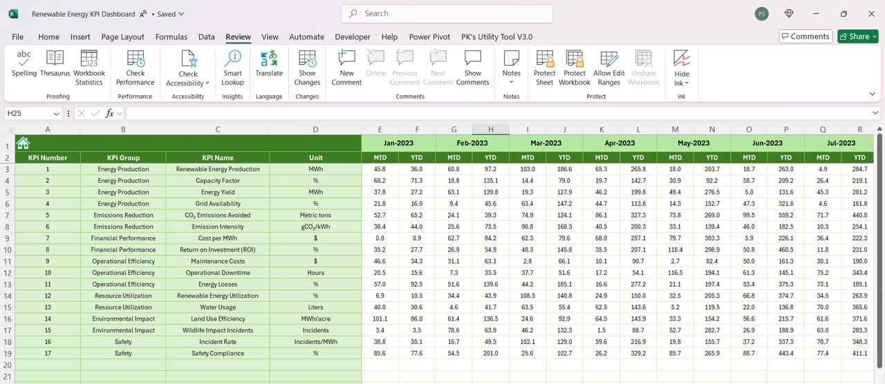
Describe how users input prior-year data, allowing for quick and effective comparison between current and previous performance.
KPI Definition Sheet Tab:
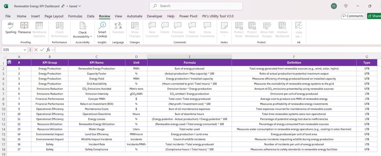
Emphasize the importance of this sheet as a centralized repository for KPI definitions, formulas, and grouping details, ensuring a common understanding of metrics across the team.
Click to buy Renewable Energy KPI Dashboard in Excel
Advantages of Using a Renewable Energy KPI Dashboard in Excel
- Enhanced Data Centralization: Centralized data collection across KPIs enables easy access and reference.
- Real-Time Insights: Immediate updates when data changes allow for quick, informed decision-making.
- Improved Comparisons: Clear month-to-month and year-over-year comparisons enhance trend visibility and strategic planning.
Best Practices for Utilizing the Renewable Energy KPI Dashboard
- Regular Data Updates: Ensure monthly updates to actuals, targets, and prior-year data for the most accurate dashboard insights.
- Utilize Conditional Formatting: Take full advantage of Excel’s formatting options to highlight key trends and identify underperforming areas swiftly.
- Encourage Team Collaboration: Foster a collaborative environment where each team member understands and contributes to data entry and KPI tracking.
- Review KPI Definitions Frequently: Regularly review and update the KPI Definition sheet to keep it aligned with evolving organizational priorities and strategies.
Opportunities for Improvement in Renewable Energy KPI Dashboards
- Automate Data Entry: Integrating data from other sources or automating data input could reduce manual entry time and improve accuracy.
- Incorporate More Visuals: While charts and trend lines are beneficial, incorporating additional visuals such as gauges or heat maps can make data interpretation even faster.
- Enable Mobile Access: Creating a mobile-friendly version of the dashboard or offering a Google Sheets version could enhance accessibility for remote teams.
Click to buy Renewable Energy KPI Dashboard in Excel
Conclusion
Summarize how the Renewable Energy KPI Dashboard in Excel provides a powerful solution for managing renewable energy performance metrics, enhancing efficiency, accuracy, and strategic alignment.
Frequently Asked Questions (FAQs)
Q1: Can this dashboard handle KPIs for multiple renewable energy projects?
A1: Yes, the dashboard can be modified to include KPIs for various projects by adding new sections or tabs for each project.
Q2: How often should we update the data in the dashboard?
A2: It’s best to update the actual numbers monthly to keep the dashboard accurate and reflective of current performance.
Q3: What if our KPIs change over time?
A3: The KPI Definition sheet makes it easy to adjust or add new KPIs, keeping the dashboard relevant as your metrics evolve.
Q4: Is it possible to share this dashboard with external stakeholders?
A4: Absolutely. Excel dashboards can be saved as PDFs or shared via cloud services like OneDrive, making them accessible to external parties.
Q5: How do I change the conditional formatting arrows if we want a different style?
A5: You can customize the arrows by selecting the relevant cells, going to Conditional Formatting options, and choosing your preferred icons.
Click to buy Renewable Energy KPI Dashboard in Excel
Visit our YouTube channel to learn step-by-step video tutorials
View this post on Instagram
Click to buy Renewable Energy KPI Dashboard in Excel

