In today’s competitive business landscape, tracking revenue growth is crucial for making informed decisions and ensuring financial stability. A Revenue Growth KPI Dashboard in Excel provides an efficient and data-driven way to monitor key revenue metrics, compare trends, and visualize performance over time.
In this article, we will discuss how to use the Revenue Growth KPI Dashboard in Excel, explore its key features, understand its advantages, and discover best practices for maximizing its potential. Whether you are a financial analyst, business owner, or decision-maker, this guide will help you leverage this powerful tool effectively.
Click to Revenue Growth KPI
What is a Revenue Growth KPI Dashboard in Excel?
A Revenue Growth KPI Dashboard is a structured Excel-based tool designed to track and analyze Key Performance Indicators (KPIs) related to revenue. It helps organizations measure financial performance, compare actual results against targets, and identify trends over time.
This ready-to-use template simplifies revenue monitoring, making it easier to track Month-to-Date (MTD) and Year-to-Date (YTD) performance while comparing actual revenue figures with targets and previous year data.
Key Features of the Revenue Growth KPI Dashboard
The Revenue Growth KPI Dashboard in Excel includes seven key worksheets, each serving a unique purpose:
Click to Revenue Growth KPI
Home Sheet
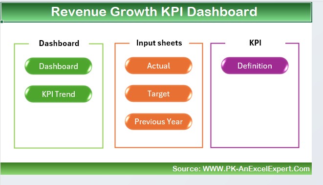
- The index sheet contains six buttons for quick navigation between different sheets.
- This feature allows users to jump directly to the required section without manually scrolling through tabs.
Dashboard Sheet Tab
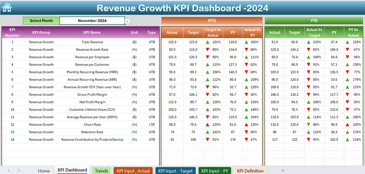
This is the main sheet displaying all KPI-related information.
- A drop-down in cell D3 lets users select a specific month, updating the dashboard accordingly.
- MTD Actual vs. Target vs. Previous Year (with conditional formatting and up/down arrows for trend visualization).
- YTD Actual vs. Target vs. Previous Year with the same comparison format.
KPI Trend Sheet Tab
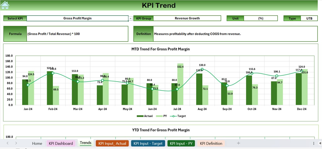
- Users can select the KPI name from the drop-down in cell C3.
- Displays KPI group, unit, type (Lower the Better or Upper the Better), formula, and definition.
- MTD and YTD trend charts visualize actual, target, and previous year (PY) data for better insights.
Click to Revenue Growth KPI
Actual Numbers Input Sheet
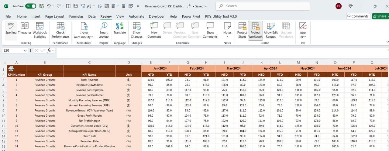
- Users input actual numbers for MTD and YTD revenue.
- The month can be changed in cell E1, allowing users to update data dynamically.
Target Sheet Tab
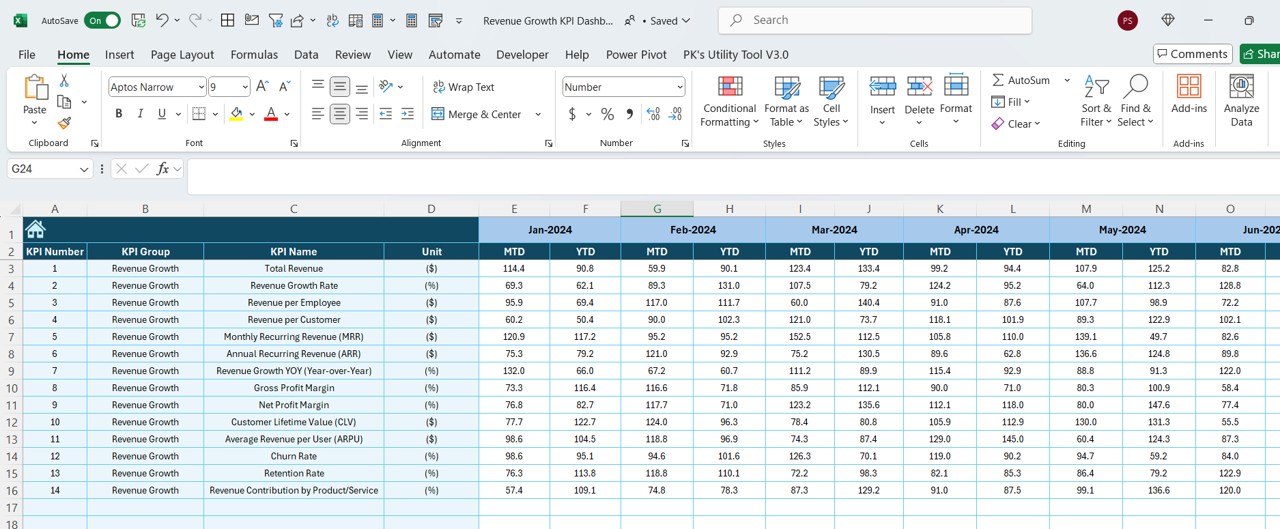
- This sheet is used to enter target revenue numbers for each KPI on an MTD and YTD basis.
Previous Year Numbers Sheet
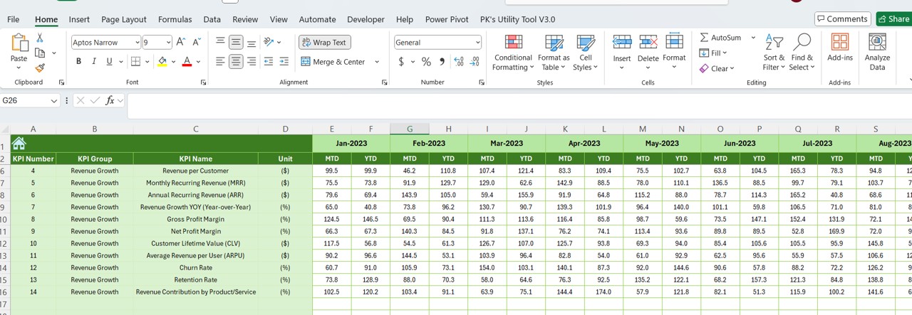
- Users enter last year’s revenue figures, maintaining consistency in trend comparisons.
KPI Definition Sheet
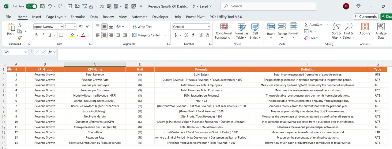
Contains detailed KPI information, including:
- KPI Name
- KPI Group
- Unit of Measurement
- Formula
- KPI Definition
Advantages of Using a Revenue Growth KPI Dashboard in Excel
- Enhanced Decision-Making – Provides real-time data to help businesses make data-driven decisions.
- Better Financial Planning – Identifies revenue trends to assist in budgeting and forecasting.
- Improved Target Tracking – Compares actual performance vs. targets with visual indicators.
- User-Friendly Interface – Simple Excel-based interface, making it easy to use without coding knowledge.
- Customizable and Scalable – Can be modified and expanded as per business needs.
- Historical Data Analysis – Allows comparison of current revenue with previous year data.
Best Practices for Using the Revenue Growth KPI Dashboard
To maximize the benefits of the Revenue Growth KPI Dashboard, follow these best practices:
- Keep Data Updated – Regularly update actual revenue and target values to ensure accuracy.
- Analyze Trends Monthly – Use the KPI Trend Sheet to analyze revenue patterns and identify opportunities for improvement.
- Use Visual Cues – Leverage conditional formatting (up/down arrows) to quickly assess performance.
- Compare MTD and YTD Metrics – Always analyze MTD vs. YTD numbers to get a holistic view of revenue growth.
- Make Data-Driven Decisions – Use insights from the dashboard to optimize pricing strategies, sales efforts, and marketing investments.
- Customize as Needed – Modify the dashboard to add more KPIs or additional trend charts.
Click to Revenue Growth KPI
Conclusion
A Revenue Growth KPI Dashboard in Excel is a powerful tool for tracking and improving financial performance. It simplifies revenue monitoring, provides clear insights, and enhances decision-making with easy-to-understand visualizations.
Frequently Asked Questions (FAQs)
What is the purpose of a Revenue Growth KPI Dashboard in Excel?
The dashboard helps businesses track, analyze, and compare revenue growth over time. It provides insights into actual revenue, target performance, and previous year comparisons.
How often should I update my Revenue Growth KPI Dashboard?
It is best to update the dashboard monthly to ensure accurate data analysis. However, businesses with high transaction volumes may update it weekly or even daily.
Can I add more KPIs to the dashboard?
Yes! The dashboard is customizable, allowing users to add new KPIs, modify existing ones, or include additional trend charts.
What are the key metrics to track in a Revenue Growth KPI Dashboard?
Key metrics include:
- MTD and YTD Actual Revenue
- Revenue Target vs. Actual
- Revenue Growth Rate
- Previous Year Comparisons
Do I need advanced Excel skills to use this dashboard?
No, the dashboard is user-friendly and requires basic Excel knowledge. However, familiarity with Excel formulas, pivot tables, and conditional formatting can enhance usability.
How can I visualize revenue trends effectively?
Utilize the KPI Trend Sheet, which provides dynamic trend charts showcasing revenue growth over time. The up/down arrows in the Dashboard sheet also help quickly assess performance.
Is this dashboard useful for small businesses?
Absolutely! Small businesses can track revenue growth, identify trends, and make informed financial decisions using this dashboard without investing in expensive analytics tools.
Click to Revenue Growth KPI
Visit our YouTube channel to learn step-by-step video tutorials
View this post on Instagram