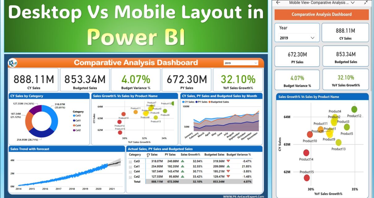
With an increasing number of people accessing their data on mobile devices, Power BI Sales Dashboard Design for Mobile for mobile has become essential. It has the power to revolutionize BI sales by making data more accessible, understandable, and actionable on the go. In this article, we’ll delve deep into the mobile layout view in Power BI, shedding light on its importance, features, and best practices.
Also see the original dashboard: Comparative Analysis Dashboard in Power BI
Understanding Power BI Sales Dashboard Design for Mobile
What exactly is this mobile layout view? Let’s break it down:
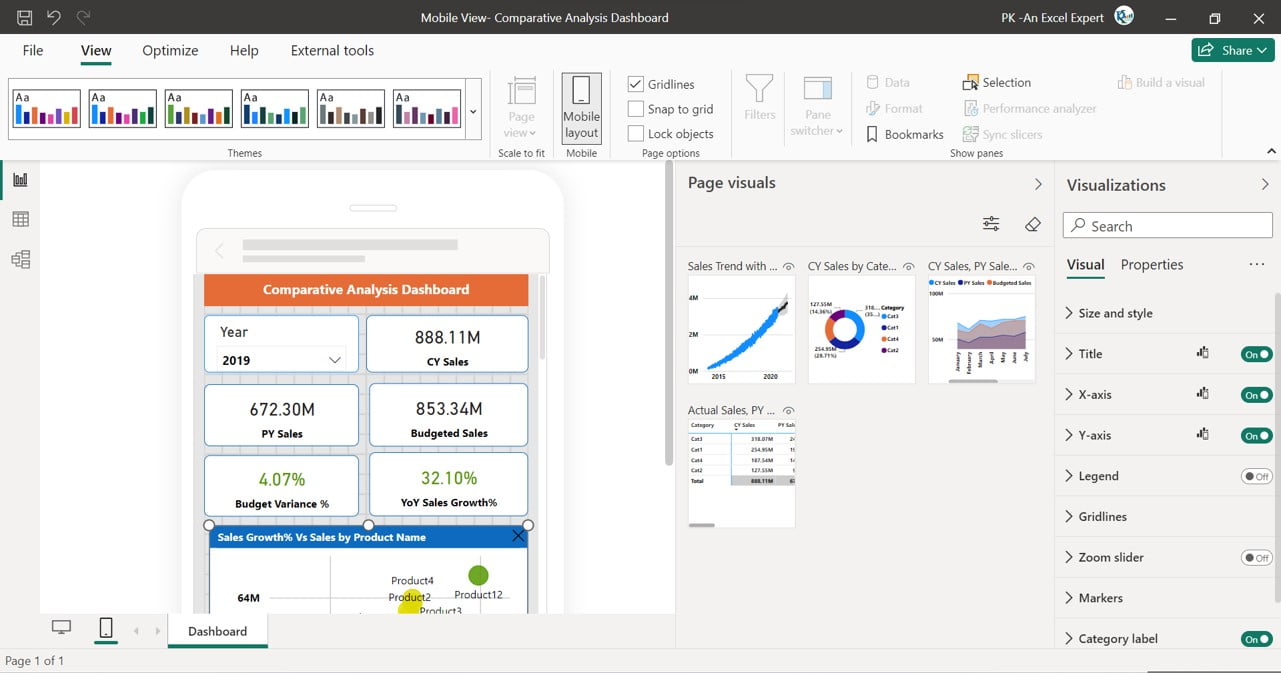
Power BI’s mobile layout view is a feature that crafts views of report pages tailored specifically for mobile devices. Whether you’re using Power BI Desktop or the Power BI service, this layout view is available. Simply put, it’s a specialized view that ensures your report visuals look impeccable on mobile screens.
Accessing the Mobile Layout View:
To get started with the mobile layout view, you can:
- Navigate to Power BI Desktop or Power BI service.
- Choose the ‘View’ ribbon and select ‘Mobile layout’.

Mobile Layout View in Power BI
Click to buy Power BI Sales Dashboard Design for Mobile
Key Features of the Mobile Layout View
Mobile Layout Canvas:
A canvas that’s interactive, allowing you to draft your mobile-optimized layout. This canvas comes with a granular grid assisting in the precise placement of your visuals. Plus, it’s dynamic, adjusting based on the phone’s size to ensure a consistent look across devices. It’s designed to preview how your buttons, slicers, and other visuals would appear in the final report.
Page Visuals Pane:
This is a catalog of all the visuals present on your original report page. How to create your mobile layout? Just drag and drop these visuals onto the canvas.
Visualizations Pane:
Once a visual is selected on the canvas, this pane showcases its format settings. This is where the magic happens – styling and formatting the visuals to perfection.
Selection Pane:
Want to adjust the visual layers on your canvas? The selection pane is your tool.
After understanding the features, it’s time to begin the crafting process. Start by picking your preferred visuals and structuring an initial layout.
Advantages Power BI Sales Dashboard Design for Mobile
- Enhanced Accessibility: Access crucial data anytime, anywhere.
- Improved Decision Making: Real-time data at your fingertips aids in making informed decisions swiftly.
- Boosted Engagement: An optimized mobile dashboard ensures users engage more frequently, driving BI sales.
Best Practices for Power BI Dashboard Design for Mobile
- Simplicity is Key: On smaller screens, clutter is a big no. Ensure your visuals are clean and straightforward.
- Prioritize Important Data: Place crucial data points at the top or center for immediate visibility.
- Optimize for Touch: Remember, mobile users will be tapping, not clicking. Design with touch in mind.
Frequently Asked Questions
Q: Can I preview how my dashboard will look on different mobile devices?
A: Yes, the mobile layout canvas adjusts to various phone sizes, allowing previews on both small and large screens.
Q: Are there any visuals that don’t work well on mobile?
A: While most visuals adapt well, metric visuals aren’t interactive on the mobile layout canvas.
Conclusion
Power BI dashboard design for mobile is not just a luxury; it’s a necessity in this rapidly evolving digital world. By optimizing your BI dashboards for mobile devices, you’re not only enhancing user experience but also paving the way for augmented BI sales. Dive into Power BI today and leverage its immense capabilities for mobile optimization.
Watch the step-by-step video tutorial:
Visit our YouTube channel to learn step-by-step video tutorials
Click to buy Power BI Sales Dashboard Design for Mobile


